Given how much I've been focusing on the red/blue divide when it comes to the COVID pandemic (both in terms of cases & deaths as well as vaccinations), I figured it'd be a good idea to take a look at the case and death rates based purely on vaccination rates instead.
The following graphs are up to date as of yesterday (10/12/21). Both measure the county-level case and death rates since the end of June compared against what percentage of the population is fully vaccinated (i.e., 2 doses of Pfizer/Moderna or 1 dose of Johnson & Johnson).
I've broken the population of the 50 states +DC (~331 million people...this doesn't include the U.S. territories) has been broken out into ten brackets of roughly 33.1 million apiece.
As you can see, case rates since June are 2.3x higher in the least-vaccinated tenth of the country (under 40.2% fully vaccinated) than in the most-vaccinated tenth (66.9% or higher):
I go by FULLY vaccinated residents only (defined as 2 doses of the Pfizer or Moderna vaccine or one dose of the Johnson & Johnson vaccine).
I base my percentages on the total population, as opposed to adults only or those over 11 years old.
For most states + DC I use the daily data from the Centers for Disease Control, but there are some where the CDC is either missing county-level data entirely or where the CDC data is less than 90% complete at the county level. Therefore:
For California, I'm using the CDC data for most counties and the state health dept. dashboard data for the 8 small counties which the CDC isn't allowed to post data for.
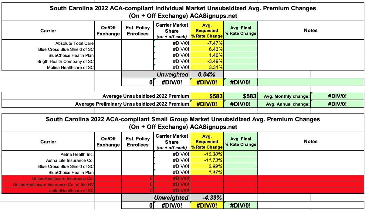
Unfortunately, the South Carolina Insurance Dept. website isn't particularly helpful when it comes to getting the annual rate filing data for these analyses--they post a link to the federal Rate Review website and the SERFF database, but that's it...and most of the filings don't show up in SERFF, while the Rate Review database actuarial memos are all heavily redacted.
As a result, all I have is the unweighted 2022 average rate changes, which are basically flat for the individual market and down around 4.4% for small group plans.
The other noteworthy item is that it looks like UnitedHealthcare is pulling completely out of South Carolina's ACA-compliant small group market, though it's possible that they just haven't been added to the federal Rate Review database yet.
State of Rhode Island Office of the Health Insurance Commissioner Requested and Approved Summary for 2022 Rates in the Individual, Small Group, and Large Group Markets
The Rhode Island Office of the Health Insurance Commissioner (OHIC) has completed its review of plan year 2022 rates for the individual, small group, and large group markets. This document is a summary of the requested and approved amounts for each insurer by market.
As required by the ACA, OHIC reviews premiums in the individual and small group markets by examining the following components:
Since Delta began circulating widely in the U.S., Covid has exacted a horrific death toll on red America: In counties where Donald Trump received at least 70 percent of the vote, the virus has killed about 47 out of every 100,000 people since the end of June, according to Charles Gaba, a health care analyst. In counties where Trump won less than 32 percent of the vote, the number is about 10 out of 100,000.
Oklahoma Consumers Have More Health Insurance Options for 2022 ACA Plans
OKLAHOMA CITY – The Oklahoma Insurance Department (OID) announced today which health health insurance companies will be offering plans in the Oklahoma Affordable Care Act (ACA) Marketplace for 2022. Two new insurers will be joining the Marketplace next year giving Oklahoma consumers more health insurance options. Starting this year, consumers will also have an extra 30 days to make plan selections during the ACA Open Enrollment Period for individual health insurance plans running from November 1, 2021 through January 15, 2022.
For the small group market I don't think they even do that; I have to rely on the federal Rate Review site, which almost never provides enrollment data.
Fortunately, for the indy market at least, all of the requested rate filings are available via the SERFF database, along with enrollment figures for 9 of the 10 carriers in the market. For the tenth (AuitCare), I used an estimate based on last years' hard number. Unfortunately, I still don't know the approved rates for any of them, but it looks like the state regulators chopped them down somwhat, since the weighted average comes in at 4.8% vs. the requested 8.4% statewide.
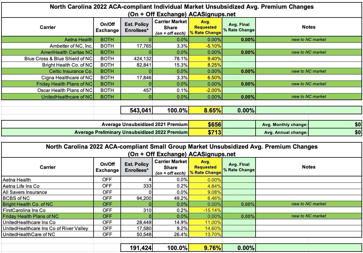
The most remarkable thing about North Carolina's 2022 ACA carrier rate filings aren't the rate changes themselves--they range from -15% to +14.6%, nothing shocking--but the sheer explosion in competition coming to both the individual and small group markets.
NC's indy market is going from five carriers to ten in one shot, with Aetna, AmeriHealth, Celtic, Friday and UnitedHealthcare all jumping into the risk pool. On the small group side, there are two new entrants: Bright Health and Friday Health Plans.
In any event, overall, the average preliminary rate increase for unsubsidized enrollees is averaging 8.7%, while small group plans are going up by an average of 9.8%.
New Mexico's final/approved 2022 premium rate changes are now live, though the searchable database seems to be having some technical layout glitches. For some reason there's a good 5-6 entries for each carrier instead of just 2 (one for the individual market, one for small group plans); I think this is because New Mexico requires separate filings for on- and off-exchange policies, although there seem to be duplicates even then.
In any event, of the 30+ states I've written up so far, New Mexico has by far the highest average unsubsidized rate increases, at 15.5%. Most of this is due to Molina Healthcare's shocking 25.6% increase, which seems to have been approved as is. True Health is also asking for double-digit increases on the individual market.
The Small Group market in the Land of Enchantment is also in the double digits, at +11.5% on average. Presbyterian not only has two small group entries, they seem to have dramatically different enrollment numbers for each; I'm not sure what to make of that.
Back in July, I posted a summary of Washington State's preliminary 2022 ACA premium rate change filings for the individual and small group markets. At the time, WA carriers were requesting average increases of 5.5% for the former and 4.1% for the latter.
A few weeks back (Sept. 20th), the state insurance dept. issued their final/approved rate changes for 2022...but only for the individual market, and even then, only for carriers offering on-exchange policies. The small group filings and those for 3 of the 15 individual market carriers which only offer off-exchange policies are still pending review. However, those three only have a combined total enrollment of around 1,300 people, and the requested rate change for one of them partly cancels out the other two, so unless there's some truly eyebrow-raising changes to the final rates, I don't expect this to move the needle much:
Average 4.17% rate change approved for 2022 Exchange health insurance market