As widely expected, just one day after the Food & Drug Administration (FDA) approved updated mRNA COVID-19 vaccines to help battle the XBB.1.5 strain of the disease, a panel of Centers for Disease Control (CDC) advisors have also given the updated vaccine their blessing. All that's left now is for CDC director Mandy Cohen (who was newly appointed as of July 10th) to sign off on it in order for distribution to the general public to begin. Via NPR:
A panel of advisers to the Centers for Disease Control and Prevention backed the broad use of new COVID-19 vaccines, as cases of the respiratory illness rise.
The advisers voted 13-1 to recommend the vaccines for people ages 6 months and older. While the benefits appear to be greatest for the oldest and youngest people, the benefits of vaccination exceed the risks for everyone, according to a CDC analysis.
FDA Takes Action on Updated mRNA COVID-19 Vaccines to Better Protect Against Currently Circulating Variants
Today, the U.S. Food and Drug Administration took action approving and authorizing for emergency use updated COVID-19 vaccines formulated to more closely target currently circulating variants and to provide better protection against serious consequences of COVID-19, including hospitalization and death. Today’s actions relate to updated mRNA vaccines for 2023-2024 manufactured by ModernaTX Inc. and Pfizer Inc. Consistent with the totality of the evidence and input from the FDA’s expert advisors, these vaccines have been updated to include a monovalent (single) component that corresponds to the Omicron variant XBB.1.5.
UPDATE: It turns out that this is not a "new" study; it's the final, peer-reviewed version of the same pre-print study from last fall by the same researchers, which makes a lot more sense.
Excess Death Rates for Republican and Democratic Registered Voters in Florida and Ohio During the COVID-19 Pandemic
Jacob Wallace, PhD; Paul Goldsmith-Pinkham, PhD; Jason L. Schwartz, PhD
If this study title and its authors sound vaguely familiar, it's because the same three researchers (from the Yale School of Public Health/Management) published a similar study last fall...which I wrote about at the time:
Back in 2021 when I was posting weekly (and later, monthly) analysis of COVID vaccination rates at the county level, several counties in particular caught my eye for different reasons. One of these was Marin County, California. As I noted at the time:
Of counties with more than 100,000 residents, the top-vaxxed are Marin County, CA (76.9% vaxxed); Sumter County, FL (76.4%); and Montgomery County, MD (76.2% vaxxed).
As I noted last month, as we've reached the 3rd anniversary of the COVID-19 pandemic hitting U.S. shores and with the Public Health Emergency winding down, it's become more & more difficult for data analysts and researchers to acquire comprehensive, county-level data about cases, hospitalizations, deaths, vaccinations and so forth.
With two of these already discontinued and the third set to do so within the next few weeks, this story is somehow even more depressing to me (via Robert King at Fierce Healthcare; h/t Katherine Hempstead for the heads up):
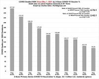
As of this writing, 69.3% of the total U.S. population has completed their primary COVID-19 vaccination series (including 94.3% of those 65+), but a mere 16.2% of the total population has also gotten their updated bivalent booster shot. Even among seniors it's only at 41.4% nationally.
Well, the lines didn't flip after all in January--the reddest quintile jumped up faster than the bluest quintile after all--two months earlier than I expected:
Bluest Quintile: 4.70 per 100K residents
Reddest Quintile: 5.33 per 100K residents (13% higher)
The January gap wasn't that significant by itself...except that it had looked like the rate in the reddest quintile might be lower last month.
Sure enough, the COVID death rate gap between the reddest and bluest fifths of the country widened out more in February, with the rate in the reddest quintile running 63% higher than the bluest quintile (4.22/100K vs. 2.39/100K). The rate actually dropped from January to February in every quintile, but it dropped considerably more in the bluest fifth (to the lowest rate since April 2022) than the reddest.
As of this writing, 69.2% of the total U.S. population has completed their primary COVID-19 vaccination series (including 94.2% of those 65+), but a mere 15.8% of the total population has also gotten their updated bivalent booster shot. Even among seniors it's only at 40.8% nationally.
Last month I noted that the partisan COVID death rate gap, which had been significantly higher in the reddest U.S. counties than the bluest counties every month since July 2020, appeared to be on the verge of finally disappearing entirely:
The initial COVID wave in March - May 2020, of course, devastated Blue America, primarily densely populated (and heavily Democratic) New York and New Jersey, while leaving Red America (mostly sparsely populated, rural Republican counties) relatively unscathed.
This situation quickly began to reverse itself only a few months later. Starting in July 2020--the same month the Vanity Fair expose was published, as it happens--the situation had already reversed itself: The reddest fifth of the U.S. was already experiencing a higher COVID death rate than the bluest fifth...and it has stayed that way ever since.