At the time, I sliced all 3,100+ counties across all 50 states + DC into 9 regions based on a 3x3 grid:
Vaccination rates: Under 40%, 40-60%, over 60%
Trump 2020 vote: Under 40%, 40-60%, over 60%
I then dug deeper into two of these: Low-Trump/Low-Vaxx counties and High-Trump/High-Vaxx counties.
I found 77 counties in the first category...the population in 62 of which is more than 40% Black (and another 7 are majority Native American).
At the opposite corner, there were only 4 counties...one of which includes The Villages, the massive, MAGA retirement community. I didn't have much insight into the other 3.
I was planning on only updating the county-level vaccination graph monthly, but given the attention this has received via high-profile folks like David Frum and Paul Krugman, I've decided to post updates weekly.
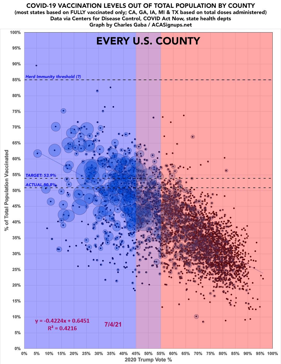
For the updated graph below, I've made a few more tweaks to both my data sources and the graph itself, neither of which makes that much of a difference in terms of impact on the final results:
As I've been noting for months (and as the mainstream press has finally started picking up on), while there are several factors explaining why so many people haven't gotten vaccinated yet, the single biggest determining factor is their political lean and, even more specifically, who they voted for President last fall.
However, the impact of partisan lean varies widely from state to state. In some states the regression line is a steep partisan slope, in others the slope is barely there at all. In some states the R-squared (R^2) figure, which helps determine correlation of the partisan lean variable, is high (above 0.7) while in others it's below 0.1.
As I've been noting for months (and as the mainstream press has finally started picking up on), while there are several factors explaining why so many people haven't gotten vaccinated yet, the single biggest determining factor is their political lean and, even more specifically, who they voted for President last fall.
However, there are some outliers, as you would expect when you're looking at a nation of over 330 million people.
According to the latest data, if you take the original "every county" graph...
It's been over a month since I last ran a scatter plot displaying current COVID-19 vaccination rates across every COUNTY nationwide according to the 2020 election results...all 3,100+ of them. With today being the 4th of July, which also happens to be the target date for President Biden's call for at least 70% of all U.S. adults to have received their first vaccination shot.
Missouri just voted #YesOn2 to expand Medicaid, and now, because of YOUR vote, over 230,000 hardworking people will have access to life-saving healthcare!pic.twitter.com/azHN0GJjEW
— YesOn2: Healthcare for Missouri (@YesOn2MO) August 5, 2020
Republican lawmakers blocked Medicaid expansion funding from reaching the Missouri House floor on Wednesday, posing a setback for the voter-approved plan to increase eligibility for the state health care program.
As my regular readers know, a few weeks ago I dove head first into a 2-week project to graph out the COVID-19 vaccination levels per capita across all 3,100+ counties to see where things stood in all 50 states.
Given how insanely politicized the COVID pandemic has been due to the Trump Administration deliberately doing so right from the outset, I ran scatter plot graphs based on what percent of the popular vote was received in each county by Trump last November for every state.
Sure enough, I found a strong inverse correlation between the two in most states, and a weaker (but still significant) correlation in many others. Correlation does not equal causation, of course, and there are plenty of other factors involved in how rapidly a population gets vaccinated, but there's no denying that partisanship is pretty clearly a significant one.
Now that I've developed a standardized format/layout & methodology for tracking both state- and county-level COVID vaccination levels by partisan lean (which can also be easily applied to other variables like education level, median income, population density, ethnicity, etc), I've started moving beyond my home state of Michigan.
Now that I've developed a standardized format/layout & methodology for tracking both state- and county-level COVID vaccination levels by partisan lean (which can also be easily applied to other variables like education level, median income, population density, ethnicity, etc), I've started moving beyond my home state of Michigan.