I know, the headline is clickbait, but hear me out; lemme play Devil's Advocate for a moment here.
Last week, when writing about Phoenix Health Plans becoming the latest carrier to drop out of the Arizona exchange, I noted that...
Ironically, this may prove to have a silver lining, according to one expert:
If Cigna decides to stick with the exchange marketplace, it will have access to a solid mix of healthy and unhealthy patients, said Jim Hammond, publisher of the Hertel Report.
"The first question is, will Cigna stay in," Hammond said. "If Cigna bails, then we have a real problem and the state and federal officials are going to have to figure out what to do about it. They've made this mandate and there's no way for people to actually meet the mandate."
Once an insurance carrier gets a decent mix of healthy and unhealthy patients, and targets the unhealthy patients with special programs, then it should be fine, he said.
I didn't really make a big thing out of it, but thought it was an interesting perspective.
The Massachusetts Health Connector has posted their latest monthly enrollment report (through the end of August), and the news is good. As I note every month:
Unlike most states, the Massachusetts Health Connector has not only seen no net attrition since the end of Open Enrollment, but has actually seen a net increase in enrollment...mainly due to their unique "ConnectorCare" policies, which are fully Qualified Health Plans (QHPs) but have additional financial assistance for those who qualify and which are available year-round instead of being limited to the open enrollment period.
The amount of the increase depends on which "official" number you start with; the MA exchange claimed 196,554 people as of 1/31/16...while the ASPE report gives it as 213,883 as of the next day....yet their March report claims 208,000 effectuated enrollees as of February.
In light of Hillary Clinton's "half of Trump supporters belong in the racist/bigot basket" brouhaha, I figured since I'm known as a data/numbers guy, let's do some quick math:
Taking Clinton's "half" literally (which is of course unbelieveably silly), that's 50% of his supporters, or around 32.2 million registered voters.
32.2 million / 324 million = appx. 10% of the total U.S. population.
In other words, if you take Hillary Clinton's statement literally, she's effectively saying that 10% of the U.S. population is racist.
This is hardly a controversial statement.
If you turn that around, the real reason Trump supporters are getting all bent out of shape this morning (hey, I thought they hated it when people are too "PC"!) isn't so much that Hillary said that a lot of Trump supporters are racist...it's because she (effectively) said that pretty much all racists are Trump supporters.
The cost of health insurance plans offered under the Affordable Care Act will jump 20 percent or more next year under rates to be announced Friday by Maryland regulators.
His remarks came as the Maryland Insurance Administration approved double-digit rate increases for the four companies that sell health plans through the state exchange, an online marketplace set up under the law for people who cannot buy coverage through their employer.
...CareFirst, which holds 68 percent of the market, received an average hike of 31.4 percent on its PPO plan and 23.7 percent on its HMO — the highest increases of any insurer.
...Rates in Maryland also have been typically lower than those nationally under the Affordable Care Act, so there could be some normalizing going on, said John Holahan, a fellow in the Urban Institute's Health Policy Center.
"Maryland rates have been lower than the rest of the nation so it seems some catching up should be expected," said Holahan.
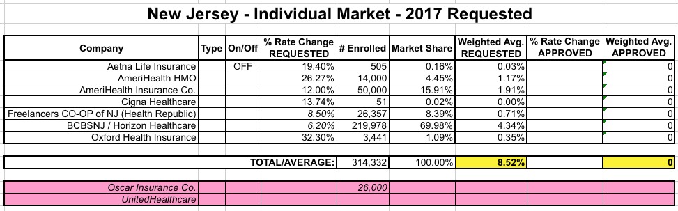
Over the past few days I've been doing some serious number-crunching in an attempt to break out the entire individual market between exchange-based, ACA-compliant off-exchange, grandfathered and transitional plans. For the most part, I believe most of my data is pretty close...but there's still some pieces of the puzzle missing here and there.
For New Jersey, my current numbers (as of March 2016) are:
When I first ran the numbers for New Mexico back in May, the average requested rate hike for the indy market appeared to be about 24.9%. Since then, however, there have been three major changes: First, Presbyterian Health Plan decided to drop off the exchange (although they'll still be around off-exchange). Second, it looks like CHRISTUS bumped up their request from 12.3% to 15.78%; and third, Molina Healthcare, which had been requesting a refreshingly modest 3.8% hike, resubmitted their request at a much higher 24% average increase.
Three of the 5 carriers had their final requests approved exactly as is by state regulators. CHRISTUS and Molina have yet to be approved, but based on a lengthy online conversation with someone very much in the know about the New Mexico health insurance market, I'm highly inclined to believe that both of their final asks will be approved as is as well.
The Washington Insurance Commissioner just issued the following press release. On the surface, it looks straightforward: 13.5% avg. requested, 13.1% approved. However, it's more complicated than that, because that 13.1% figure only applies to fewer than half of the plans (46 out of 98). The other 52 are still being reviewed:
OLYMPIA, Wash. – The Office of the Insurance Commissioner (OIC) has approved 46 individual health plans from seven insurers who will offer them in the Exchange, Wahealthplanfinder (www.wahealthplanfinder.org), for sale in 2017. The Washington Health Benefit Exchange Board is scheduled to certify the approved insurers and their plans at its board meeting later today.
Regence Blueshield also filed 21 plans for sale in the Exchange and Bridgespan filed 31 plans. Both companies’ filings and rates are still under review. They must be approved by the OIC before they can be considered for certification by the Exchange.
WARNING: This is a pretty long, wonky, number-crunchy post...if you want to skip to the point of it about 2/3 down, click here.
Yesterday I posted an extensive entry in which I reiterated, with a substantial amount of hard data (h/t to Bob Laszewski & Steve Davis) to back me up, that the off exchange individual health insurance market is consdierably larger than many pundits, reporters, politicians and policy wonks seem willing to admit; in fact, it appears to make up around 36% of the ACA-compliant indy market if you include grandfathered/transitional plans, or around 40% if you don't include them.