

HC.gov's Rate Review: Incredibly useful AND completely useless at the same time!
Mon, 06/01/2015 - 11:55am
The new Rate Review searchable database added to Healthcare.Gov should make it much easier to figure out the weighted average rate change requests for every state. It's clean, simple to use, includes all 50 states (plus DC and even throws in U.S. Territories to boot!), lets you filter out transitional policies and pre-2016 years and so on. In addition, the layout is consistent and doesn't require downloading 6,000 page PDF files (!)
Yes, in terms of following the requirements of the HHS Dept, it's very useful for people to look up their particular company in their state, see what their "average" rate increase request is and submit cranky public comments (which will in most cases probably be ignored, but hey, you never know).
And yes, this certainly makes it easier to fill in some of the missing pieces of the puzzle, and helps cut down on how much hunting around people like myself have to do to track down some of this data. For that alone, I'm extremely glad to see this tool added.
HOWEVER, at the same time, there are several major gaps in this tool. Some of them, such as not breaking out the rate requests by metal levels, are merely unfortunate. One, however, is extremely important, and from a media perspective could make this tool worse than not having it at all: It only includes companies which are asking for increases of more than 10%.

Again, from the perspective of following the regulations, this makes perfect sense; if they don't have to justify increases of less than 10%, there's no need to list them for public comment.
HOWEVER, there's a slew of reporters, pundits and activists who are going to be poring over these rate filings...and by only listing those higher than 10%, the HHS Dept. is setting themselves up for a whole bunch of OMG!!! SKY IS FALLING!!! CRAZY HIGH RATE SPIKES FOR 2016!! headlines over the next week or so.
Case in point: Connecticut. Here's what it looks like if you use RateReview.Healthcare.Gov as your source for 2016 rate requests:
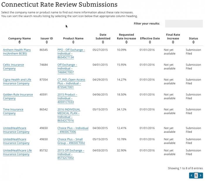
According to this, it looks like CT is staring at an 18.6% average rate increase next year.
Of course, if you weight it by company market share based on the above, it appears to be something like the following:
- Anthem: 10.09% x 55,000 people (33% market share) = 3.33%
- Celtic: 15.95% x 0% market share = 0%
- Cigna: 14.27% x 660 people (0.4% market share) = 0.06%
- Golden Rule: 18.5% x 3,414 people (2.05% market share) = 0.38%
- Time: 34.12% x 0% market share (new!) = 0%
- United Healthcare (on): 12.4% x 1.01% = 0.13%
- United Healthcare (off): 32.9% x 0.43% = 0.14%
- TOTAL: Just 4.04%! Wow, that's fantastic!
Except, when you add up those market shares, you might notice something: It only adds up to around 37% of the total market! Where's the other 63%??
Well, ConnectiCare holds about 45% of the market all by itself...but because they're only asking for around a 2% increase, they aren't even included in the Rate Review database!
On the other hand, HealthyCT, which makes up over 14% of the market isn't listed here either, even though they're requesting a 13.96% increase.
In other words, without including EVERY policy being sold, it's impossible to tell what the true overall "average" rate hike requests are based on the above.
But wait, there's more! You may notice that even Anthem's 10.09% doesn't seem right; according to the actual rate filings I pulled a couple of weeks ago, this should be just 6.7%, not 10.09%. What's going on here?
The answer is in the 3rd column for Aetna: "PPO Off Exchange - Individual". When you click through you get this:
Anthem Blue Cross and Blue Shield of Connecticut submitted proposed premium rate changes to the Connecticut Department of Insurance for its ACA-compliant individual health plan products. This filing includes an average rate increase of 6.7 percent, excluding the impact of aging, effective January 1, 2016. This rate change will impact approximately 55,000 Connecticut members, new and renewing, in 2016 with Anthem.
- HMO On-Exchange is a 7.32 percent rate increase
- PPO On-Exchange is a 6.71 percent rate increase
- HMO Off-Exchange is a 5.39 percent rate increase
- PPO Off-Exchange is a 10.09 percent rate increase
- Overall average rate increase is 6.7 percent
Yes, that's right: The 10.09% request is only for OFF-exchange PPO enrollees! It doesn't include people enrolled in HMOs, and doesn't include any of the ON-exchange enrollees whether in PPO or HMO policies. Why aren't they included? Because in this case, those groups were filed separately and none of them hit 10%, so they aren't listed at all. If they were, Anthem's rate request in Connecticut would be 6.7% overall instead of 10.09%.
In short, the Rate Review tool can be highly useful...but proceed with extreme caution before jumping to any conclusions about what it means for the "average" rate changes in a particular state or even within a particular company.
In addition, this word of warning from HHS Dept. spokesman Aaron Albright:
@charles_gaba @rebeccastob @sangerkatz caution anyone using the data yet. We'll announce when things are live and updated.
— Aaron Albright (@AaronKAlbright) June 1, 2015
My advice to the HHS Dept is this:
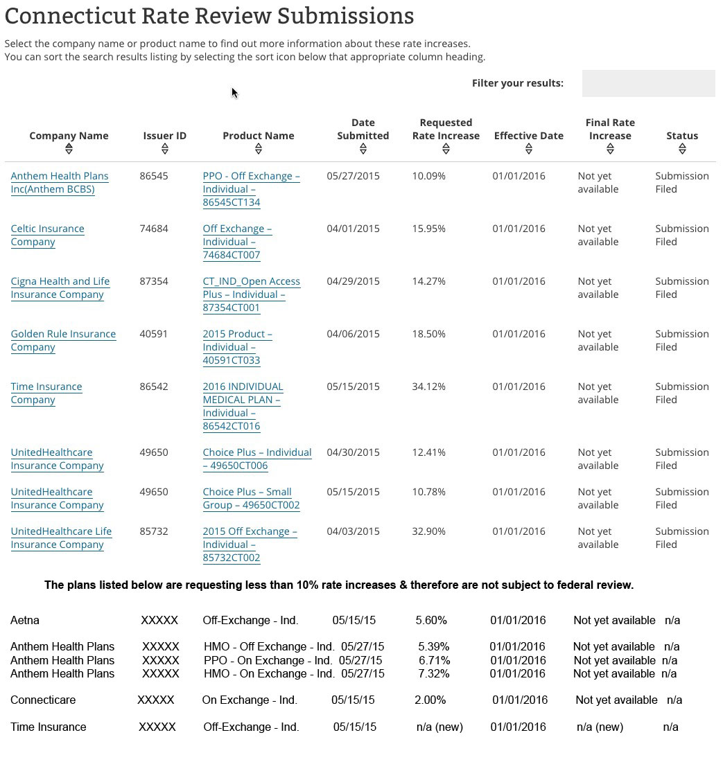
- Ideally, they should include the rate change filing requests for every company operating on either the individual or small group market in this database.
- If they can't/won't do that, they should make sure to strongly emphasize the fact that companies requesting less than a 10% rate hike are not included. (Yes, this is already mentioned in passing, but as you can see above, it'd be easy to miss for a casual visitor).
- Similarly, in cases where the listing doesn't even include all of a particular company's policies (such as the Anthem example above), they should take extra care to note that fact. Yes, the Anthem listing does say "Off Exchange PPO", but a casual visitor might assume that those are the only policies even being offered by Anthem (some companies offer on & off exchanges, some on only, some off only, etc).
Here's what the results would ideally look like (actually, ideally they'd also include the number of covered lives impacted as another column, but I'm willing to give that a pass):
Otherwise, I'm afraid those out-of-context screaming headlines are gonna be all over the place.
Advertisement
