The data below comes from the GitHub data repositories of Johns Hopkins University, except for Utah, which comes from the GitHub data of the New York Times due to JHU not breaking the state out by county but by "region" for some reason.
I've made some more changes:
I've now completed updating the partisan lean for every county except Alaskato the 2020 Biden/Trump results. Alaska still uses the Clinton/Trump 2016 results, although I can't imagine more than one or two regions changed status there this year.
I've also added columns listing the actual Biden/Trump vote percentage for each county to give a feel for how partisan it is. Again, I'm defining "Swing District" as any county where the difference is less than 6.0%. There's 188 swing districts (out of over 3,100 total), with around 33.8 million Americans out of 332 million total, or roughly 10.2% of the U.S. population.
I've also added all U.S. territories, including a county-equivalent breakout for Puerto Rico, as well as American Samoa, Guam and the U.S. Virgin Islands. None of these vote in the general Presidential election, of course, but I'm still tracking their COVID-19 case & death rates. None show up in the top 100 of either ranking, however. Note that Puerto Rico only includes the case breakout, not deaths, which are unavailable for some reason.
With these updates in mind, here's the top 100 counties ranked by per capita COVID-19 cases as of Thursday, December 31st, 2020 (click image for high-res version).
Blue = Joe Biden won by more than 6 points; Orange = Donald Trumpwon by more than 6 points; Yellow = Swing District
The data below comes from the GitHub data repositories of Johns Hopkins University, except for Utah, which comes from the GitHub data of the New York Times due to JHU not breaking the state out by county but by "region" for some reason.
I've made some more changes:
I've now completed updating the partisan lean for every county except Alaskato the 2020 Biden/Trump results. Alaska still uses the Clinton/Trump 2016 results, although I can't imagine more than one or two regions changed status there this year.
I've also added columns listing the actual Biden/Trump vote percentage for each county to give a feel for how partisan it is. Again, I'm defining "Swing District" as any county where the difference is less than 6.0%. There's 188 swing districts (out of over 3,100 total), with around 33.8 million Americans out of 332 million total, or roughly 10.2% of the U.S. population.
I've also added all U.S. territories, including a county-equivalent breakout for Puerto Rico, as well as American Samoa, Guam and the U.S. Virgin Islands. None of these vote in the general Presidential election, of course, but I'm still tracking their COVID-19 case & death rates. None show up in the top 100 of either ranking, however. Note that Puerto Rico only includes the case breakout, not deaths, which are unavailable for some reason.
With these updates in mind, here's the top 100 counties ranked by per capita COVID-19 cases as of Friday, December 25th (click image for high-res version).
Blue = Joe Biden won by more than 6 points; Orange = Donald Trumpwon by more than 6 points; Yellow = Swing District
The data below comes from the GitHub data repositories of Johns Hopkins University, except for Utah, which comes from the GitHub data of the New York Times due to JHU not breaking the state out by county but by "region" for some reason.
I've made some more changes:
I've now completed updating the partisan lean for every county except Alaska (I'm having trouble getting that broken out by "County-Equivalent Region") to the 2020 Biden/Trump results. Alaska still uses the Clinton/Trump 2016 results, although I can't imagine more than one or two regions changed status there this year.
I've also added columns listing the actual Biden/Trump vote percentage for each county to give a feel for how partisan it is. Again, I'm defining "Swing District" as any county where the difference is less than 6.0%. There's 188 swing districts (out of over 3,100 total), with around 33.8 million Americans out of 332 million total, or roughly 10.2% of the U.S. population.
I've also added all U.S. territories, including a county-equivalent breakout for Puerto Rico, as well as American Samoa, Guam and the U.S. Virgin Islands. None of these vote in the general Presidential election, of course, but I'm still tracking their COVID-19 case & death rates. None show up in the top 100 of either ranking, however. Note that Puerto Rico only includes the case breakout, not deaths, which are unavailable for some reason.
Finally, I corrected a significant error on my part in the Blue/Red County Ratio graph (see below)
With these updates in mind, here's the top 100 counties ranked by per capita COVID-19 cases as of Friday, December 18th (click image for high-res version).
Blue = Joe Biden won by more than 6 points; Orange = Donald Trumpwon by more than 6 points; Yellow = Swing District
The data below comes from the GitHub data repositories of Johns Hopkins University, except for Utah, which comes from the GitHub data of the New York Times due to JHU not breaking the state out by county but by "region" for some reason.
I've made some more changes:
I've now completed updating the partisan lean for every county except Alaska (I'm having trouble getting that broken out by "County-Equivalent Region") to the 2020 Biden/Trump results. Alaska still uses the Clinton/Trump 2016 results, although I can't imagine more than one or two regions changed status there this year.
I've also added columns listing the actual Biden/Trump vote percentage for each county to give a feel for how partisan it is. Again, I'm defining "Swing District" as any county where the difference is less than 6.0%. There's 188 swing districts (out of over 3,100 total), with around 33.8 million Americans out of 332 million total, or roughly 10.2% of the U.S. population.
Finally, new this week: I've added all of the U.S. territories, including a county-equivalent breakout for Puerto Rico, as well as American Samoa, Guam and the U.S. Virgin Islands. None of these vote in the general Presidential election, of course, but I'm still tracking their COVID-19 case & death rates. None show up in the top 100 of either ranking, however.
With these updates in mind, here's the top 100 counties ranked by per capita COVID-19 cases as of Friday, December 11th (click image for high-res version).
Blue = Joe Biden won by more than 6 points; Orange = Donald Trumpwon by more than 6 points; Yellow = Swing District
Way back on January 17th, 2020, I posted a long, wonky blog entry about how important risk pools are, using my own family making the move from an ACA exchange plan to a university student plan as an example. It included several data-entry system errors which made the switch more complicated than it should have been, though everything was straightened out in the end.
This morning, in response to a tweet by Sarah Kliff referencing an article by Margot Sanger-Katz about the difficulty of choosing the right health insurance policy, I was reminded of my own post from nearly a year ago and decided to re-read it.
“Get Covered America Day” — Dec. 10 — is a call to wear a mask to prevent the spread of COVID-19 and a public statement that you want your family and friends to get health insurance.
With COVID-19 cases surging nationally, the day is a call to action to encourage people to post a picture of themselves wearing a mask on social media, include a personal message about the importance of being COVID-safe and how friends, family and neighbors can get financial help for insurance now, sharing the website GetCovered2021.org and using the hashtag #GetCovered2021.
With an estimated 16 million uninsured Americans eligible for financial help — through their Affordable Care Act marketplace, or free coverage through Medicaid — Get Covered 2021 encourages people to check their health care options and get insured.
The data below comes from the GitHub data repositories of Johns Hopkins University, except for Utah, which come from the GitHub data of the New York Times due to JHU not breaking the state out by county but by "region" for some reason.
I made some important changes starting last week:
First: I had been using the 2016 Trump/Clinton election results for partisan lean for each county. Now that the dust has (mostly) settled on the 2020 election, I've updated this to the Biden/Trump results for 2020. There's a few states where I don't have county-level data for 2020 yet (AK, CT, NY). I hope to have the final three states updated by next weekend, but am using 2016 data until then.
Second: I've also added columns listing the actual Biden/Trump vote percentage for each county to give a feel for how partisan it is. Again, I'm defining "Swing District" as any county where the difference is less than 6.0%. There's 185 swing districts (out of over 3,100 total), with around 35 million Americans out of 331 million total, or roughly 10.6% of the U.S. population.
With these updates in mind, here's the top 100 counties ranked by per capita COVID-19 cases as of Saturday, December 5th (click image for high-res version).
Blue = Joe Biden won by more than 6 points; Orange = Donald Trumpwon by more than 6 points; Yellow = Swing District
The data below comes from the GitHub data repositories of Johns Hopkins University, except for Utah, which come from the GitHub data of the New York Times due to JHU not breaking the state out by county but by "region" for some reason.
I've made some important changes starting this week:
First: Until now, I've been using the 2016 Trump/Clinton election results for partisan lean for each county. Now that the dust has (mostly) settled on the 2020 election, I've updated this to the Biden/Trump results for 2020. There's a few states where I don't have county-level data for 2020 yet (AK, CT, MA, NH, NY, RI & VT). In most of these states it's only broken out by city- or legislative district-level so far; in New York, they still haven't reported a large chunk of the vote itself yet. For those 7 states I still have them categorized by the 2016 results, but will update these with 2020 status in the future.
Second: I've also added columns listing the actual Biden/Trump vote percentage for each county to give a feel for how partisan it is. Again, I'm defining "Swing District" as any county where the difference is less than 6.0%. There's 188 swing districts (out of over 3,100 total), with around 35 million Americans out of 331 million total, or roughly 10.6% of the U.S. population.
With these updates in mind, here's the top 100 counties ranked by per capita COVID-19 cases as of Saturday, November 28th (click image for high-res version). Blue = Joe Biden won by more than 6 points; Orange = Donald Trumpwon by more than 6 points; Yellow = Swing District
The data below comes from the GitHub data repositories of Johns Hopkins University, except for Utah, which come from the GitHub data of the New York Times due to JHU not breaking the state out by county but by "region" for some reason.
Note that a few weeks ago I finally went through and separated out swing districts. I'm defining these as any county which where the difference between Donald Trump and Hillary Clinton was less than 6 percentage points either way in 2016. There's a total of 198 Swing Counties using this criteria (out of over 3,200 total), containing around 38.5 million Americans out of over 330 million nationally, or roughly 11.6% of the U.S. population.
With these updates in mind, here's the top 100 counties ranked by per capita COVID-19 cases as of Saturday, November 21st (click image for high-res version). Blue = Hillary Clinton won by more than 6 points; Orange = Donald Trump won by more than 6 points; Yellow = Swing District
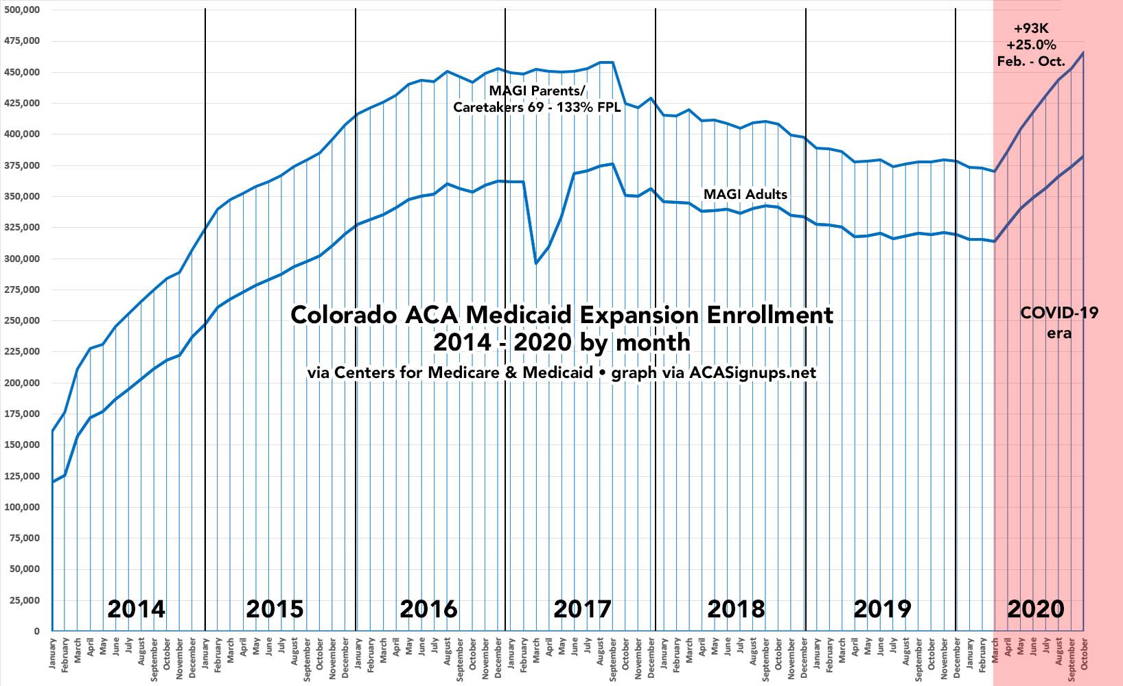
Over at Xpostfactoid, my colleague Andrew Sprung has been doing a great job of tracking ACA Medicaid expansion enrollment growth since the onset of the COVID-19 pandemic this past February/March at the macro (national) level, by looking at around a dozen states which have monthly reports available. He puts the overall enrollment growth rate at 23.6% from February thorugh October 2020.