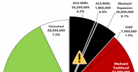
With the pending dire threat to several of these programs (primarily Medicaid & the ACA) from the House Republican Budget Proposal which recently passed, I'm going a step further and am generating pie charts which visualize just how much of every Congressional District's total population is at risk of losing healthcare coverage.
USE THE DROP-DOWN MENU ABOVE TO FIND YOUR STATE & DISTRICT.
Political battles are usually won based on appealing to emotion, not to facts, policy or logic.
However, you should still have those facts at your disposal for two reasons: First, they still help you craft appeals to emotion. Second, they also help you craft the actual policy. Besides, I'm a data guy; my primary job is to help put facts & policy into easily-understandable context.
With the pending dire threat to several of these programs (primarily Medicaid & the ACA) from the House Republican Budget Proposal which recently passed, I'm going a step further and am generating pie charts which visualize just how much of every Congressional District's total population is at risk of losing healthcare coverage.
USE THE DROP-DOWN MENU ABOVE TO FIND YOUR STATE & DISTRICT.
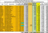
There are 29 House districts where Republicans won by 12 points or less.
Below I've posted district-wide enrollment in ACA exchange-based Qualified Health Plans (QHPs), ACA Basic Health Plans (BHPs) and Medicaid via ACA expansion.
Across these 29 districts alone, a total of nearly 2.7 million Americans are at risk of either losing healthcare coverage entirely or, if they don't, having to deal with MASSIVE premium hikes and/or a MOUNTAIN of paperwork on a regular basis to keep it due to a combination of H.R. 1 (the "One Big Beautiful Bill Act") being implemented, the GOP allowing the IRA subsidies to expire at the end of this year, and the Trump Administration implementing CMS's recent "Integrity Rule" starting this fall.
That's around 12% of the total populations of these districts.