With the pending dire threat to several of these programs (primarily Medicaid & the ACA) from the House Republican Budget Proposal which recently passed, I'm going a step further and am generating pie charts which visualize just how much of every Congressional District's total population is at risk of losing healthcare coverage.
USE THE DROP-DOWN MENU ABOVE TO FIND YOUR STATE & DISTRICT.
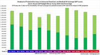
If this happens, it would mean the ACA exchange market would drop by more than 1/3 from the ~24.2 million currently enrolled (myself & my own family included).
However, I've repeatedly stated that even this is likely a low estimate--the remaining ~16 million exchange enrollees would still be hit with MASSIVE (and in some cases eye-poppingly huge) premium hikes which would force them to drop to far worse plans (meaning much higher deductibles & co-pays; worse provider networks and so on).
Last month, in response to House Republicans passing their version of the budget resolution bill, I broke out total enrollment in Medicaid via ACA expansion, ACA exchange Qualified Health Plan (QHP) enrollment and ACA-based Basic Health Plan (BHP) enrollment by Congressional District in order to try and get a sense of just how many Americans healthcare coverage is at risk from the bill...and how that breaks out along partisan lines at the House District level.
As I noted at the time, Republicans seem to be under the impression that it will mostly be Democrats who get screwed by their bill, since 9 of the 10 non-expansion states are Republican strongholds...while some Democrats seem to be under the impression that it will mostly be rural MAGA republicans who get screwed.