Methodology reminders, including some important updates:
I go by FULLY vaccinated residents only (defined as 2 doses of the Pfizer or Moderna vaccine or one dose of the Johnson & Johnson vaccine).
I base my percentages on the total population, as opposed to adults only or those over 11 years old.
For most states + DC I use the daily data from the Centers for Disease Control, but there are some where the CDC is either missing county-level data entirely or where the CDC data is less than 90% complete at the county level. Therefore:
For California, I'm using the CDC data for most counties and the state health dept. dashboard data for the 8 small counties which the CDC isn't allowed to post data for.
The 5 major U.S. territories don't vote for President in the general election, preventing me from displaying them in the main graph, but I have them listed down the right side.
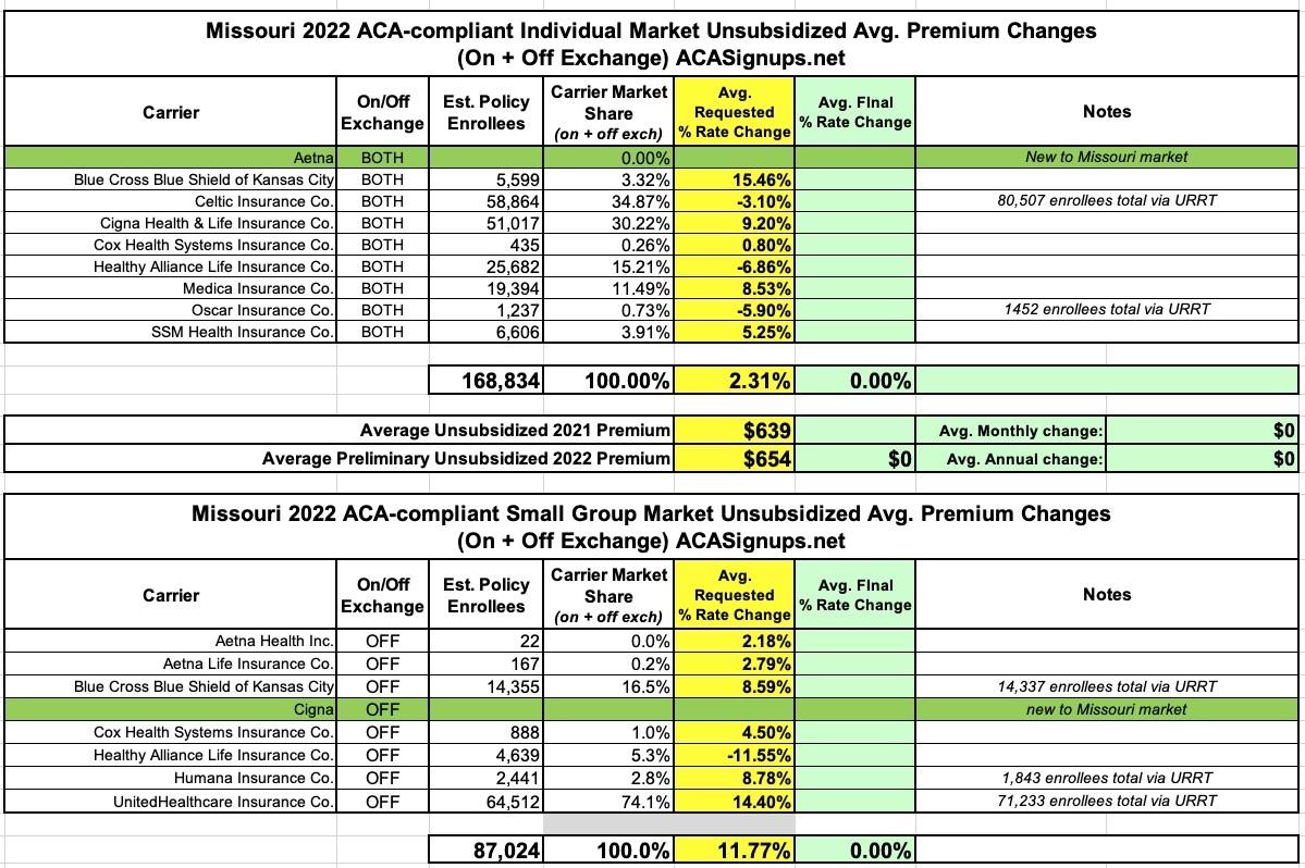
It's worth noting that each market has a new entrant for 2022: Aetna is joining the individual market while Cigna is jumping into the off-exchange Small Group market.
The differences in enrollment noted for some carriers is likely due to some product lines being discontinued--for instance, if Celtic drops premiums by 3.1% on most of their policies but discontinues some others entirely, those enrolled in the discontinued lines won't have any official rate change to their existing policies.
I've received an important reminder from the folks at HealthCare.Gov:
Continued Enrollment Opportunity for Consumers with Unemployment Compensation
The American Rescue Plan (ARP) provides additional savings to help consumers access affordable, quality health coverage options, including expanded opportunities for those who received or are approved to receive unemployment compensation in 2021.
Starting July 1, 2021, the Centers for Medicare & Medicaid Services (CMS) added a new function to HealthCare.gov to allow consumers who receive or are approved to receive unemployment compensation for any week beginning during 2021 to access new savings on health insurance coverage, if they qualify.
Methodology reminders, including some important updates:
I go by FULLY vaccinated residents only (defined as 2 doses of the Pfizer or Moderna vaccine or one dose of the Johnson & Johnson vaccine).
I base my percentages on the total population, as opposed to adults only or those over 11 years old.
For most states + DC I use the daily data from the Centers for Disease Control, but there are some where the CDC is either missing county-level data entirely or where the CDC data is less than 90% complete at the county level. Therefore:
For California, I'm using the CDC data for most counties and the state health dept. dashboard data for the 8 small counties which the CDC isn't allowed to post data for.
The 5 major U.S. territories don't vote for President in the general election, preventing me from displaying them in the main graph, but I have them listed down the right side.
NEW: Until now I've been using 2016 election data for Alaska; starting today, thanks to an updated analysis by RRH Elections, I'm finally able to use 2020 election results for Alaska (all other states +DC have been using 2020 county-level election data all along).
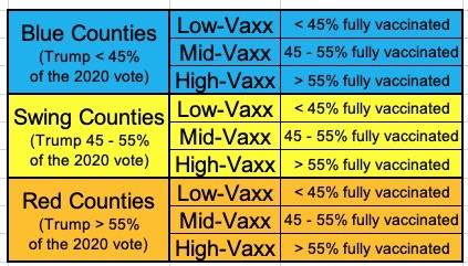
Back in late July, I posted an analysis which looked at the COVID-19 vaccination rate across all 3,144 U.S. counties, parishes & boroughs by two additional criteria: Population Density and Urban/Rural Status.
As I noted at the time, it's reasonable to assume there might be a strong correlation by these criteria, since it's presumably a lot more difficult to get vaccinated if you live out in the middle of the boonies where the nearest hospital, clinic or pharmacy is 50 miles away or whatever...not to mention that if you're the only one for miles around, you might be less likely to see getting vaccinated as a high-priority task regardless of your ideology.
Therefore, the reasoning goes, instead of looking at the partisan lean of each county, it would make much more sense to see how much correlation there is based on population density or whether it's a more urban or rural region, right?
Methodology reminders, including some important updates:
I go by FULLY vaccinated residents only (defined as 2 doses of the Pfizer or Moderna vaccine or one dose of the Johnson & Johnson vaccine).
I base my percentages on the total population, as opposed to adults only or those over 11 years old.
For most states + DC I use the daily data from the Centers for Disease Control, but there are some where the CDC is either missing county-level data entirely or where the CDC data is less than 90% complete at the county level. Therefore:
For California, I'm using the CDC data for most counties and the state health dept. dashboard data for the 8 small counties which the CDC isn't allowed to post data for.
The 5 major U.S. territories don't vote for President in the general election, preventing me from displaying them in the main graph, but I have them listed down the right side.
Methodology reminders, including some important updates:
I go by FULLY vaccinated residents only (defined as 2 doses of the Pfizer or Moderna vaccine or one dose of the Johnson & Johnson vaccine).
I base my percentages on the total population, as opposed to adults only or those over 11 years old.
For most states + DC I use the daily data from the Centers for Disease Control, but there are some where the CDC is either missing county-level data entirely or where the CDC data is less than 90% complete at the county level. Therefore:
For Colorado, Georgia, New Mexico and Texas, I'm using their COVID vaccine dashboards set up by the state health departments.
For California, I'm using the CDC data for most counties and the state health dept. dashboard data for the 8 small counties which the CDC isn't allowed to post data for.
NEW: I discovered that there's several additional states where the state health department dashboard data seems to be more comprehensive and accurate than the CDC data, including Illinois, Minnesota and North Carolina. I've switched to these states health department reports starting today.
The 5 major U.S. territories don't vote for President in the general election, preventing me from displaying them in the main graph, but I have them listed down the right side.
200,000 MARYLANDERS GAINED HEALTH COVERAGE THROUGH THE CORONAVIRUS SPECIAL ENROLLMENT
Special enrollment in response to pandemic ran from March 2020 to August 2021
(BALTIMORE) — A total of 201,141 Marylanders enrolled through the Coronavirus Emergency Special Enrollment on Maryland Health Connection from March 16, 2020 to its conclusion on Aug. 15, 2021.
The numbers here are certainly good news and pretty impressive, but it's really, really important to keep that start date in mind when looking at them.
The 17-month special enrollment in response to the pandemic was one of the longest of any state in the country. It was extended several times in 2020 and 2021 as the emergency continued. In all:
I go by FULLY vaccinated residents only (defined as 2 doses of the Pfizer or Moderna vaccine or one dose of the Johnson & Johnson vaccine).
I base my percentages on the total population, as opposed to adults only or those over 11 years old.
For 42 states + DC I use the daily data from the Centers for Disease Control, but there are some where the CDC is either missing county-level data entirely or where the CDC data is less than 90% complete at the county level. Therefore:
For Colorado, Georgia, New Mexico and Texas, I'm using their COVID vaccine dashboards set up by the state health departments.
For California, I'm using the CDC data for most counties and the state health dept. dashboard data for the 8 small counties which the CDC isn't allowed to post data for.
The 5 major U.S. territories don't vote for President in the general election, preventing me from displaying them in the main graph, but I have them listed down the right side.
At the time I was mostly interested in looking at the outlier counties--the poorly-vaccinated solidly blue counties and the highly-vaccinated solid red counties.
I also noted that, to no great surprise, the makeup of those 146 "Blue Low-Vaxx" counties is pretty telling: