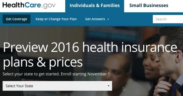
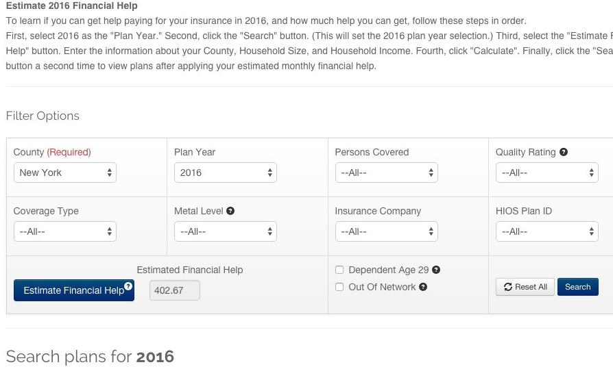
...and sure enough, even the Window Shopping experience has changed since last year; here are the new screens, step by step (I'm using fake data here):
Chock-full of negative spin, it's trashing the ACA for the following:
Lower than expected private policy enrollments (ie, exchange QHPs)
Not enough young people to keep the risk pool in check
Problems with the premiums and/or deductibles making exchange QHPs too expensive
the Medical Loss Ratio for 2014 being way too high (ie, some insurers losing money last year)
Now, all four of these attacks are partially valid. Yes, enrollment in private Qualified Health Plans via the ACA exchanges is definitely below expectations. Yes, the risk pool is skewing older than expected. Yes, (full price) premiums (to some degree) and (full price) deductibles (definitely) are a serious issue this year. And yes, some insurers did take a bath and even go belly up due to the first-year premium "blind dart throwing" (especially 9 ill-fated CO-OPs, along with at least one private insurer in Wyoming).
I'm not going to criticize the WSJ for several of their attacks; some are valid and some are outside my area of expertise. HOWEVER, I've found a couple of serious problems with the piece regarding the first bullet point.
I've held off posting an estimate of the weighted average rate increase for the final state on my list, Wisconsin, until now because there's a major gap in the data which likely makes my estimate off by quite a bit.
However, given that open enrollment is coming up a week from today, "window shopping" on HealthCare.gov is (supposedly) going live at any minute and the fact that with 49 other states (+DC) already included, I finally decided to go ahead and post this, along with a major caveat warning.
As y ou can see from the table below, there are two issues here. The first is a minor one: I have no idea what the rate change request from the Common Ground CO-OP is, except that it's under 10%. I also don't know exactly what Common Ground's enrollment figure is, other than "between 30,000-40,000" according to this article from February.
With all the bad news about the Colorado Dept. of Insurance pulling the plug on CO HealthOP a week or so ago, here's some (relatively) good news out of the Centennial State (and yes, I had to look that up to find out what Colorado's nickname is).
Colorado was one of the first states I included in my 2016 Weighted Average Rate Hike Project. At the time, I only had requested rate changes available, and was missing the requests and/or actual enrollment numbers for several insurance carriers. As a result, my estimate of the average requested rate hike came in at 13.1%, but was pretty fuzzy.
Thomas G. Stemberg, who cofounded Staples Inc. and invented the office superstore, died Friday at his home in Chestnut Hill, two years after he was diagnosed with gastric cancer. He was 66.
...With the backing of Bain Capital and its cofounder Mitt Romney, the first Staples store opened in Brighton in 1986. Growing rapidly, Staples took the top spot on the Globe’s 1991 list of the 50 fastest-growing companies in the state, with a sales growth rate of 83 percent. Today Staples is worth more than $8 billion.
...Romney also credited Mr. Stemberg with persuading him to push for health care reform in Massachusetts when he was governor.
As I noted a couple of weeks ago, for 2016 HealthCare.Gov has added several very welcome new features. Early window shopping at HC.gov will be starting later than expected this year due to some last-minute technical issues with two of the new tools, but it looks like they're going to resolve this by simply delaying the launch of some of them as necessary in order to bring the ones which are ready live. The following press release just showed up in my in box; assuming the listed improvements all work properly (!), all of these should be incredibly helpful in both streamlining and (hopefully) increasing enrollment for #OE3.
UPDATE: Also, I've received confirmation from HHS Spokesman Aaron Albright that yes, Window Shopping at HealthCare.Gov will launch on Sunday, October 25th.
I admit that given the carnage of the past couple of weeks, I'm almost afraid to post this entry...but I had to write something positive about the CO-OP situation.
With the ACA-created CO-OPs seemingly dropping like flies due to the #RiskCorridorMassacre, I thought this would be a good time to flip things around and look at which CO-OPs are doing well (or at least not badly).
This isn't much, but it'll do for now:
Wisconsin's insurance department says it has no intention of shutting down its #ACA co-op, which appears it will remain solvent next year.
Fresh on top of the Covered California data drop, the Washington Health Benefit Exchange (the 3rd-largest state-based exchange after California and New York) has published an updated, detailed enrollment report:
The Washington Health Benefit Exchange, which operates the state’s insurance marketplace,Washington Healthplanfinder, today announced over 1.5 million Washingtonians accessed health coverage through wahealthplanfinder.org from Oct. 1, 2014 through Sept. 30, 2015.
The announcement was part of a new Health Coverage Enrollment Report that includes an updated enrollment total of 152,517 individuals in private health plans – called Qualified Health Plans (QHPs) – as well as executed enrollment for more than 1.4 million Washington Apple Health (Medicaid) eligible enrollees.
COVERED CALIFORNIA RELEASES REPORT ON CALIFORNIANS’ KNOWLEDGE OF THE AFFORDABLE CARE ACT IN ADVANCE OF UPCOMING OPEN ENROLLMENT
Awareness of Covered California Is High, but Many Who Are Uninsured Still Don’t Know They Are Eligible for Financial Help to Buy Insurance
SACRAMENTO — With new research showing that many uninsured consumers who can benefit most still do not understand they can get financial help to buy health insurance, Covered California announced on Thursday that it will launch its third open-enrollment period Nov. 1 by spotlighting basic information about health insurance offerings, enrollment and care.
“We cannot ignore the reality that too many uninsured Californians still don’t know they can get financial help to buy brand-name insurance through Covered California,” said Covered California Executive Director Peter V. Lee. “We are going to take to the airwaves and hit the road with a new campaign to make sure consumers know what we offer and where they can enroll.”