

March (& likely FINAL monthly) Update: County-Level Red/Blue COVID Death Rate Divide widens again
Wed, 03/01/2023 - 8:37am
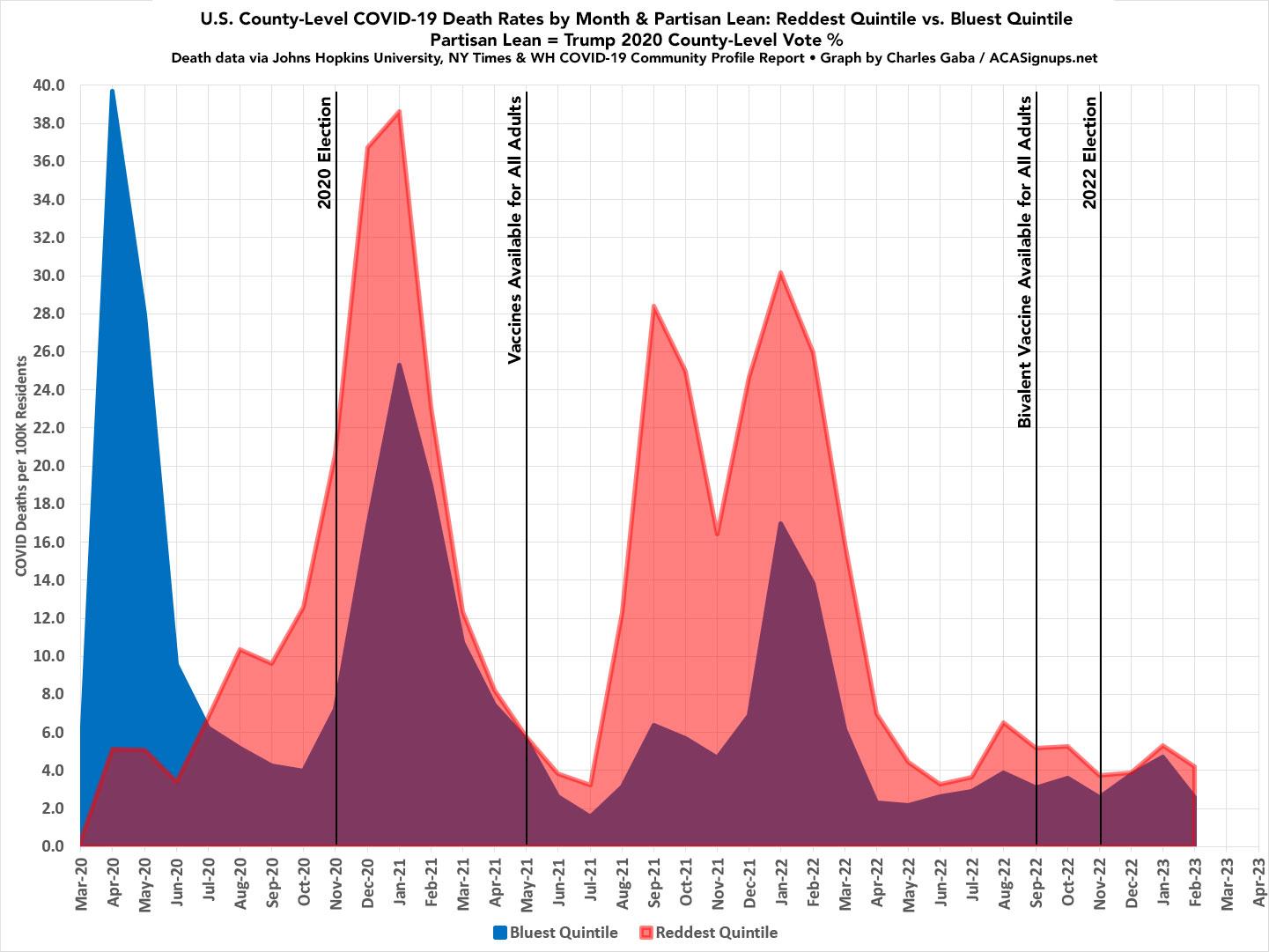
Last month I noted that the partisan COVID death rate gap, which had been shrunk down to almost nothing in December for the first time since COVID vaccines became widely available back in May 2021, had started to widen again:
Well, the lines didn't flip after all in January--the reddest quintile jumped up faster than the bluest quintile after all--two months earlier than I expected:
Bluest Quintile: 4.70 per 100K residents
Reddest Quintile: 5.33 per 100K residents (13% higher)
The January gap wasn't that significant by itself...except that it had looked like the rate in the reddest quintile might be lower last month.
Sure enough, the COVID death rate gap between the reddest and bluest fifths of the country widened out more in February, with the rate in the reddest quintile running 63% higher than the bluest quintile (4.22/100K vs. 2.39/100K). The rate actually dropped from January to February in every quintile, but it dropped considerably more in the bluest fifth (to the lowest rate since April 2022) than the reddest.
Again, the graph below looks at the reddest 20% and bluest 20% of the total U.S. population based on the 2020 Presidential election results at the county level. The reddest quintile includes roughly 65.1 million people living in counties where Donald Trump received 62.4% or more of the vote in 2020; the bluest quintile includes around 66.8 million living in counties where Trump received less than 31.6%. While the raw numbers aren't quite equal, both have been adjusted for actual population.
It's important to note that this will likely be my last county-level COVID death rate analysis, as the Johns Hopkins University COVID tracking project, the New York Times COVID data github and the White House COVID-19 Team's weekly Community Profile Report have all either shut down or are expected to wind down within the next few weeks.
There will still be state-level data available, and many larger counties across the country are still providing updates, but the granular county-level data for all 3,100+ counties nationally will be difficult to come by, at least on a daily, weekly or even monthly basis going forward. Ironically, while the CDC itself will likely still be reporting county-level data, that will likely still be less comprehensive due to things like federal privacy rules (the CDC has to "mask" data in counties with fewer than 10 deaths, for instance, which is the case in several hundred smaller rural counties).
Advertisement
