22 Percent Increase Over Last Year • New Yorkers Show Demand for Quality, Affordable Healthcare
ALBANY, N.Y. (January 6, 2017) – NY State of Health, the state’s official health plan Marketplace, today announced that more than 3.4 million people have enrolled in health insurance through December 24, 2016.
With almost a month to go until the end of the 2017 Open Enrollment period, participation in the NY State of Health Marketplace has already increased more than 22 percent since the last Open Enrollment period ended, January 31, 2016. Enrollment has increased in all 62 counties of the state. The overall share of New Yorkers now enrolled through the NY State of Health has reached nearly 18 percent of the state’s population.
As I noted when I crunched the numbers for Texas, it's actually easier to figure out how many people would lose coverage if the ACA is repealed in non-expansion states because you can't rip away healthcare coverage from someone who you never provided it to in the first place.
As I noted when I crunched the numbers for Texas, it's actually easier to figure out how many people would lose coverage if the ACA is repealed in non-expansion states because you can't rip away healthcare coverage from someone who you never provided it to in the first place.
My standard methodology applies:
Plug in the 2/01/16 QHP selections by county (hard numbers via CMS)
Project QHP selections as of 1/31/17 based on statewide signup estimates
Knock 10% off those numbers to account for those who never end up paying their premiums
Multiply the projected effectuated enrollees as of March by the percent expected to receive APTC subsidies
Then knock another 10% off of that number to account for those only receiving nominal subsidies
Whatever's left after that are the number of people in each county who wouldn't be able to afford their policy without tax credits.
In the case of Georgia, assuming 567,000 people enroll in exchange policies by the end of January, I estimate around 396,000 of them would be forced off of their policy upon an immediate-effect full ACA repeal.
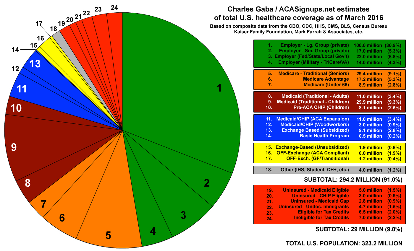
Last March I cobbled together this pie chart, which attempted to break out the health coverage status of every single person living in the United States (yes, including undocumented immigrants). It gained quite a bit of attention at the time from healthcare reporters, wonks and so forth. While my numbers may have been slightly fuzzy here and there, it received a general seal of approval from Larry Levitt of the Kaiser Family Foundation, who stated "Obviously some of the estimates are approximations, but I don't see any glaring problems."
OK. Today saw fresh enrollment updates from Rhode Island (nominal), Covered California (impressive) and, most significantly, HealthCare.Gov (which not only covers 39 states, but also finally includes auto-renewals). I now have auto-renewal for 48 states + DC included in the mix, and the numbers are current through 12/31/16 or later for 41 of them. I still have no data whatsoever from Vermont (ironic, given their history of progressive healthcare policy, Bernie Sanders, etc), and only very limited data out of New York (they mentioned 55,000 enrollments over a 3-day period just ahead of the December deadline, but nothing from before or after that).
As i noted last week, with all renewing enrollees accounted for, Rhode Island's ACA exchange is likely to come up short not only of my pre-election projection (40,000 enrollees), but will likely see a drop from last year's 34,670 QHP selections. They had only hit 29,312 QHPs as of Christmas Eve, and have only tacked on another 580 people since then:
INDIVIDUAL AND FAMILY ENROLLMENT • As of December 31, 2016
Hot on the heels of Covered California's update just moments ago, the HHS Dept. has posted their latest bi-weekly Snapshot report. While the extra 2 weeks of data is obvoiusly important, the key number I've been anxiously awaiting is the auto-renewal number, which is finally included in today's report:
Biweekly Enrollment Snapshot • WEEKS 8 AND 9, DEC 18 – DEC 31, 2016
8.8 million Americans have signed up for coverage through HealthCare.gov since Open Enrollment began on November 1st. This compares to about 8.6 million plan selections last year at this time, demonstrating Americans’ strong and growing demand for affordable, quality coverage. Total plan selections as of December 31st, which include auto reenrollments, consist of 2.2 million new consumers and 6.6 million returning consumers. Among returning consumers, two thirds, or 4.4 million, actively selected a plan, an increase from last year’s already high levels of consumer engagement.
Between the big December deadline (for January coverage) having passed and the holiday season, the actual OE4 enrollment data has been pretty sparse the past few weeks. A few minutes ago, however, Covered California broke the enrollment news drought (no pun intended) with a press release which, while not primarily focused on the actual enrollment data, nonetheless includes a solid update:
Covered California Brings Health Care Within Reach and Shows How Consumers Can Save by Shopping
Hat tip to Dan Goldberg for the heads up. (also thanks to Amy Shefrin)
Yesterday I crunched some numbers and estimated that, assuming a full ACA repeal w/immediate effect and no replacement, roughly 800,000 New Yorkers would almost certainly lose their healthcare coverage, including:
Over 2.7 Million New Yorkers Would Lose Coverage Estimated State Budget Impact of $3.7 Billion
Counties Across New York Would Lose Over $595 Million in Direct Spending
New York Residents Would Lose $250 Million in Health Care Savings Tax Credits