2015 Special Enrollment Period Report – February 23 – June 30, 2015
The next open enrollment period for Marketplace coverage begins on November 1, 2015 for coverage starting on January 1, 2016. Some people can sign up for health coverage outside of open enrollment, before November 1, because they qualify for a special enrollment period (SEP). A consumer can qualify for a SEP for such circumstances as loss of health coverage, losing Medicaid eligibility, changes in family status (for example, marriage or birth of a child), or other exceptional circumstances.
This snapshot provides information about consumers who selected a plan between February 23 and June 30, 2015 through the HealthCare.gov platform, which includes 37 states with Federally Facilitated Marketplaces, State Partnership Marketplaces, and supported State-Based Marketplaces.
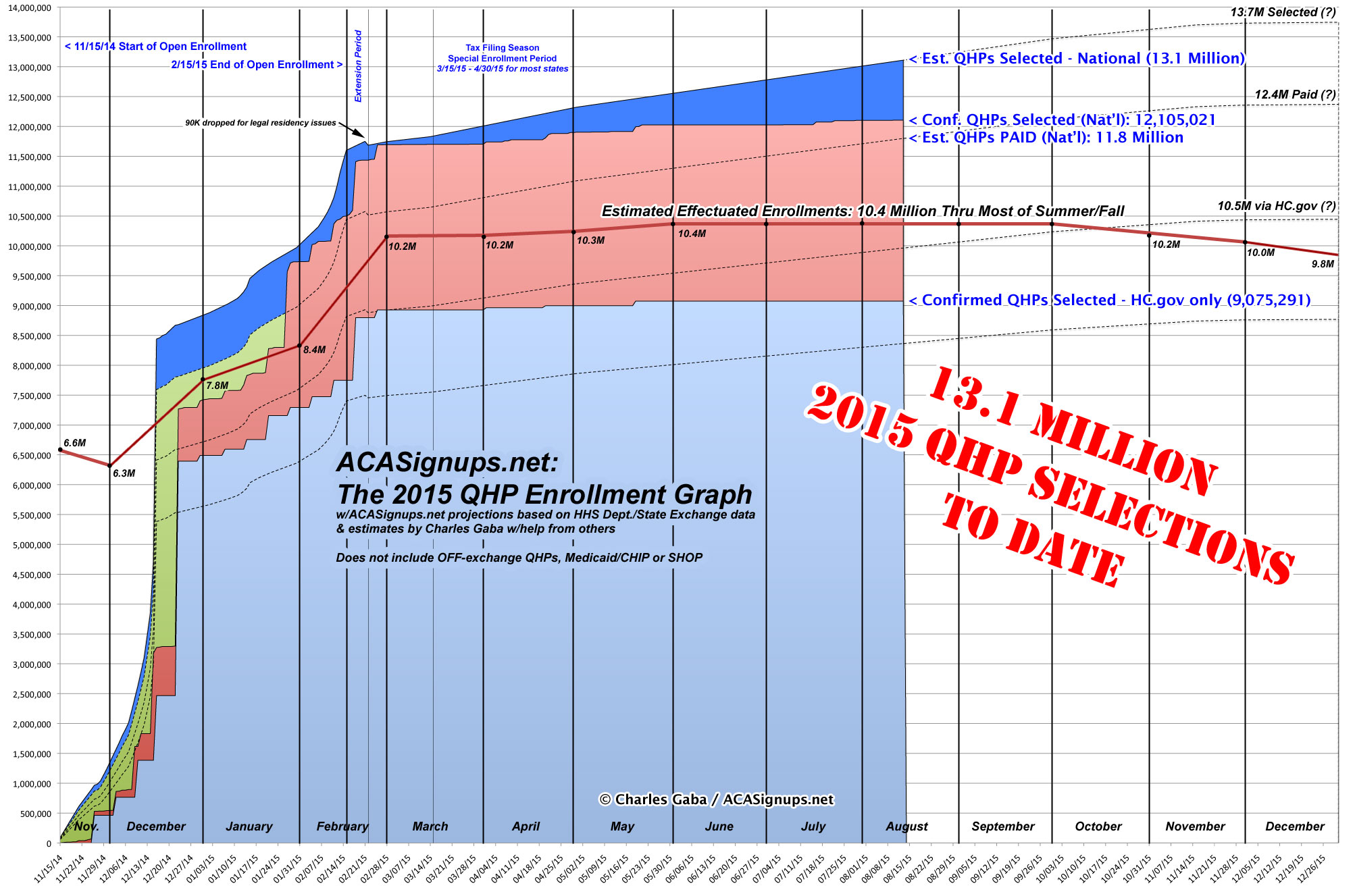
Assuming my ballpark estimate of appx. 7,500 Off-Season QHP Selections Per Day is accurate, the grand total nationally should be breaking the 13 million milestone right about...now-ish (or at least sometime this week).
YES, I KNOW ABOUT THE BIG CMS OFF-SEASON QHP REPORT released a couple of hours ago, and I'll be posting about that next, but I just got back from an end-of-summer camp carnival thing with my kid, and want to make sure I get Massachusetts crossed off the list first.
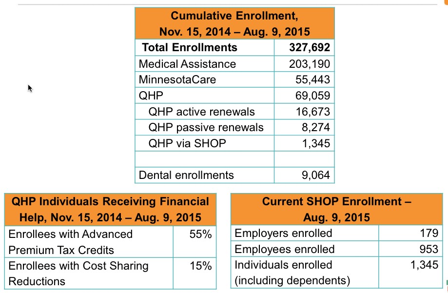
The Massachusetts Health Connector just held their monthly board meeting this morning, and have released the July dashboard report with a whole mess of demographic data for Baystate-obsessed nerds to revel in.
I've pasted screen shots of every page of the report below (and there's a link to the PDF version above), but here's the main takeaways:
Effectuated QHPs have reached 170.5K...a whopping 45,161 higher than at the end of Open Enrollment!
While the national effectuation number is likely only 2% or so higher today than it was in March (likely 10.4 million vs. 10.2 million), in Massachusetts it's 36% higher. There's two main reasons for this, both connected to "ConnectorCare", which is unique to Massachusetts. ConnectorCare consists of the same low-end Qualified Health Plans that anyone can purchase (ie, they're still counted as QHPs in the national tally), except that in addition to the federal Advanced Premium Tax Credits (APTC), enrollees in ConnectorCare also receive additional state-based financial assistance, making them even more attractive to enrollees. In addition, however, unlike "normal" APTC or Full Price QHPs, which are limited to the official open enrollment period for most people, ConnectorCare enrollment, like Medicaid/CHIP, is open year round. That makes a dramatic difference, as you can see below; over 85% of the net QHP enrollment increase since March is thanks to ConnectorCare additions.
In addition, MA is the only state I know of which actively reports their attrition numbers--that is, so far this year they've had just 16,631 people drop their QHP policies, meaning a total of 187,194 people have selected a plan and paid at least their first monthly premium.
Assuming a 90% payment rate (confirmed for Massachusetts back in April), this also suggests that the cumulative QHP selection total should be roughly 208,000 people to date, which is only significant to me and The Graph.
But wait, there's more! Look below and you'll see a whole mess of pie charts, bar charts and line charts, breaking out everything from Metal Level selections and Market Share by Provider to SHOP enrollments (5,302 lives covered as of August 1st) and even Dental Plans!
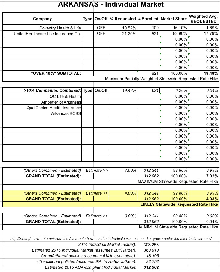
IMPORTANT:See this detailed explanation of how I've come up with the following estimated maximum requested weighted average rate increases for this state.
As explained in the first link above, I've still been able to piece together rough estimates of the low, mid-range and maximum possiblerequestedaverage rate increase for the Arkansas individual market. Note: While the table & methodology for Arkansas are the same as most of the other states I've posted on, there's one important difference here; see below for details:
Today's the aniversary of my dad passing away. He was an Osteopathic physician, so today's Big News® would make him very happy, but I have to keep things short today so just a quick write-up:
Health and Human Services Secretary Sylvia M. Burwell announced today $169 million in Affordable Care Act funding to 266 new health center sites in 46 states, the District of Columbia and Puerto Rico for the delivery of comprehensive primary health care services in communities that need them most. These new health center sites are projected to increase access to health care services for over 1.2 million patients. These awards build on the $101 million awarded to 164 new health center sites in May 2015.
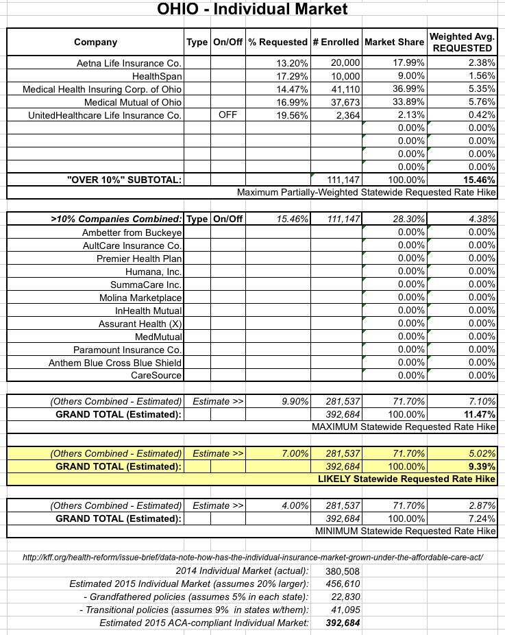
IMPORTANT:See this detailed explanation of how I've come up with the following estimated maximum requested weighted average rate increases for this state.
As explained in the first link above, I've still been able to piece together rough estimates of the maximum possible and mid-range requested average rate increase for the Ohio individual market:
Again, the full explanation is included here, but to the best of my knowledge, it looks like the companies with rate increases higher than 10% come in at a weighted 15.5% increase, but only make up about 28% of the total ACA-compliant individual market, with several other companies with requested increases of less than 10% (decreases in some cases) making up the other 72%.
Last week I reported that insurance companies offering individual healthcare policies in New Mexico were asking for some pretty ugly rate hikes (on a percentage basis, anyway), mainly due to Blue Cross Blue Shield of NM (aka "Health Care Services Corp.") putting in for a jaw-dropping 57% hike. This resulted in 30% overall requested increases when weighted by market share.
Then, a few days later, the New Mexico state insurance commissioner announced the approved rate hikes for all 5 (or is it 6? see below...) of the companies in question. For BCBSNM (aka HCSC), they lopped the 57% hike down massively:
IMPORTANT:See this detailed explanation of how I've come up with the following estimated maximum requested weighted average rate increases for this state.
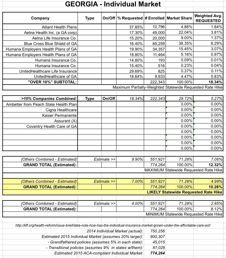
As explained in the first link above, I've still been able to piece together rough estimates of the maximum possible and mid-range requested average rate increase for the Georgia individual market:
Again, the full explanation is included here, but to the best of my knowledge, it looks like the companies with rate increases higher than 10% come in at a weighted 18.3% increase, but only make up about 29% of the total ACA-compliant individual market, with several other companies with requested increases of less than 10% (decreases in some cases) making up the other 71%.

