Hawaii Health Connector offers individual plans from two carriers: BCBS’s Hawaii Medical Service Association (HMSA), and Kaiser Permanente.
For 2016, HMSA has proposed a 45.5 percent rate increase for their individual HMO plan, and nearly a 50 percent rate hike for their individual PPO plan (49.1 percent overall). The carrier justified their rate hikes based on claims costs, explaining that while virtually everyone in Hawaii was already insured, the uninsured pool – many of whom purchased new ACA-compliant plans – had significant medical needs.
Ouch. Yup, that's a pretty ugly requested increase, no way around it.
The following day, Kaiser proposed an 8.7 percent rate increase for their individual market policies.
Once again, the Affordable Care Act (ACA) is proving its critics wrong. Opponents of the ACA, or Obamacare, have been falling all over themselves proclaiming that an influx of new patients will overburden the healthcare system, creating a dire doctor shortage.
At least in Michigan, that’s proven to be absolutely false.
A new University of Michigan study shows that the availability of primary care appointments actually improved for people with Medicaid in the first months after the state launched the Healthy Michigan Plan, the state’s Medicaid expansion under the ACA. What’s more, it remained mostly unchanged for those with private insurance.
At the end of May, I noted some very promising news out of the Nutmeg State: Out of the 111,268 people (109,839 during Open Enrollment + another 1,429 during the #ACATaxTime SEP) who had selected a private policy via AccessHealthCT as of last spring, around 93% were still enrolled in effectuated coverage, which is fantastic considering that last year, 12% of those who selected QHPs didn't pay in the first place, aside from any additional net attrition which happened after the first month.
Well, it's mid-July now, and the AccessHealthCT board just had their monthly meeting at which they gave a bunch of solid updates. Thanks to Arielle Levin Becker for most of the Tweetstorm:
There are a total of 608,231 processed applications. 96,966 CT residents are insured in a Qualified Health Plan (QHP). #AHCTBoDMeeting
I am not an insurance broker.
I am not an insurance agent.
I am not an ACA Navigator.
I am not an insurance company.
I am not a healthcare exchange or marketplace.
Most importantly (this one seems to be a common mistake):
I AM NOT THE HEALTH & HUMAN SERVICES DEPT. OF THE UNITED STATES.
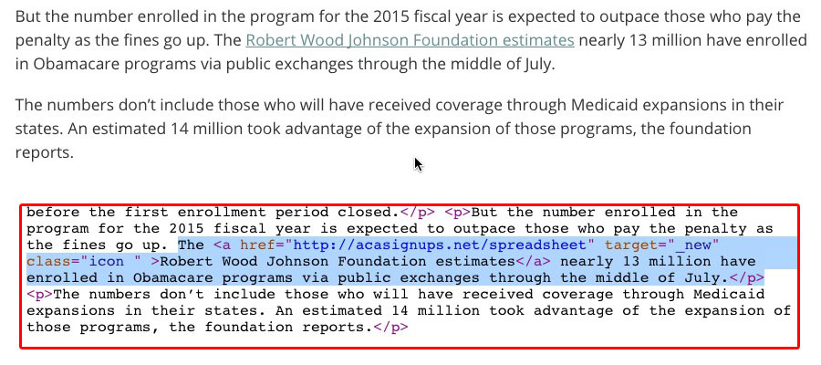
Well, it looks like I need to add one more: I'm also NOT the Robert Wood Johnson Foundation:
I'm not trying to embarrass anyone; I've alerted the reporter to the error and they quickly made the correction, but just to be safe, going forward I've also gotten the OK to include an "Advertisement" tag to the RWJF banner ads as Esther F. suggested recently...
Long-time readers (and anyone from Maryland, I presume) know that the Old Line State (I have no idea whether that nickname is actually widely used?) was among those whose 2014 ACA exchange website turned out to be a huge technical mess. Oregon and Nevada received most of the headlines because they both ended up scrapping theirs completely and moving home to HealthCare.Gov this year (to be followed by Hawaii in 2016), but along with Massachusetts, Maryland went the "Try, Try Again" route.
This AP article provides snippets about a handful of states; it'd be nice if they just released the actual report so we could see the hard expansion numbers (as opposed to the total increase numbers, which are still obviously useful but don't distinguish between traditional Medicaid and ACA expansion enrollees):
In Kentucky, for example, enrollments during the 2014 fiscal year were more than double the number projected, with almost 311,000 newly eligible residents signing up. That's greater than what was initially predicted through 2021.
...At least 14 states have seen new enrollments exceed their original projections, causing at least seven to increase their cost estimates for 2017, according to an Associated Press analysis of state budget projections, Medicaid enrollments and cost details in the expansion states. A few states said they could not provide original projections.
Just 4 days ago (Friday), you'll recall that both Investor's Business Daily (and myself in my response to them) made a big deal out of a report from the Taxpayer Advocate dept. of the IRS which gave the initial estimates of how many households/people ended up paying the Individual Shared Responsibility Payment (aka the "individual mandate tax"), and just how much that ended up generating in tax revenue.
According to that report, about 6.6 million tax returns (this distinction is vitally important) ended up paying a total of roughly $1.254 billion, or $190 per return.
Before I get to the actual visualization itself, some important disclaimers/caveats:
Most of the numbers shown are rough estimates.
All estimates have been rounded off to the nearest 100,000, and in most cases to the nearest million.
There's a tremendous amount of churn in the U.S. insurance market; tens of thousands of people are shifting around from one form of coverage to another daily.
Some of the numbers shown were as of a given month, while others were quarterly or even yearly averages.
In some cases, the estimates shown are extrapolations from earlier hard numbers. (for example, "Medicare/Medicaid Dual Enrollment" went from 8.6 million to 10.2 million between 2006 - 2011; at that rate I estimated it at roughly 11 million in 2013 and 12 million as of this summer)
Some estimates are composites from several different reliable sources, including the U.S. Census Bureau, the Centers for Medicare & Medicaid, the Kaiser Family Foundation, Gallup, etc.
I originally attempted to keep everyone in a single column. Needless to say, with 320-odd million people involved, it proved impossible to make this fit on the screen, so I've moved Employer-Sponsored Insurance (which makes up nearly half the total) onto a second column. Even so, I'm pushing it.
As a result of all of the above (not to mention population growth), it's entirely possible--in fact, quite likely--that some of the estimates shown are off by a bit. Employer-Sponsored Insurance, Medicare and Medicaid, in particular, could be too high or low by up to 1-2 million people each given the large numbers involved.
With all of that out of the way, here's my best crack at trying to portray the current healthcare coverage status of every single person in the United States of America as of October 2013 (just prior to the launch of the ACA exchanges and Medicaid expansion program) and July 2015. Comments welcome. I've added some additional notes below the graphic.