For weeks now, I've been tracking the daily COVID-19 numbers at the county level in several states; particularly Michigan, Wisconsin and Pennsylvania. While the pandemic hit the more densely-populated areas first (which tend to lean Democratic), the trendlines in Michigan and Wisconsin have been clearly moving towards the more rural, Republican-leaning counties increasing their share of the cases and corresponding deaths as time has passed.
Pennsylvania has been different--after a less dramatic shift from blue to red counties in late March, PA seems to have levelled off, with new cases holding pretty steady between the two.
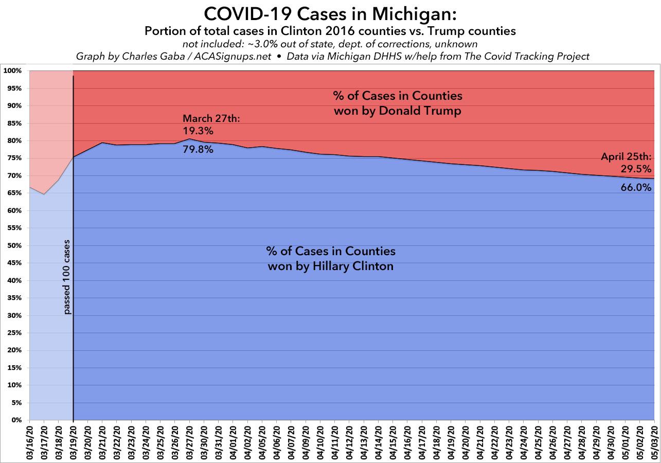
It's been another week, so I figured I should post and update...and it's more of the same in all three cases. First up, Michigan:
Since tracking and analyzing data is what I'm best known for...and since I'm mostly stuck sitting in front of the computer all day whether I like it or not these days anyway...I've started my own daily COVID-19 spreadsheet.
Again, I'm not the one who compiled the data itself--many other teams with far better resources than I have are doing that--but I'm pulling their work together and adding some additional context, such as per capita info by state/territory.
Covered California for Small Business Works to Help Struggling Businesses Keep Employees Covered During the COVID-19 Pandemic
Covered California for Small Business will allow small businesses an additional 30-day grace period to make their premium payments for the months of April and May.
Employers interested in the program will be able to defer up to 75 percent of their premium payments for April and May in an effort to keep thousands of small business employees insured during the current health care crisis.
A survey found that more than three out of every four Covered California for Small Business employers are either operating in a limited capacity or are temporarily closed.
Since tracking and analyzing data is what I'm best known for...and since I'm mostly stuck sitting in front of the computer all day whether I like it or not these days anyway...I've started my own daily COVID-19 spreadsheet.
Again, I'm not the one who compiled the data itself--many other teams with far better resources than I have are doing that--but I'm pulling their work together and adding some additional context, such as per capita info by state/territory.
As I've explained many times over the years, the idea behind the ACA's Risk Corridor program was that the launch of the major ACA regulations starting in 2014 involved such a radical reworking of requirements for private health insurance policies (especially on the individual market) that it was unreasonable to expect insurance companies to be able to accurately predict how well or poorly they would fare under the new rules. While the "free market" is supposed to be a "sink or swim" environment, it was agreed that this was so dramatic a change that the carriers should be given "training wheels" of sorts to smooth out the bumpy ride for the first three years.
Since tracking and analyzing data is what I'm best known for...and since I'm mostly stuck sitting in front of the computer all day whether I like it or not these days anyway...I've started my own daily COVID-19 spreadsheet.
Again, I'm not the one who compiled the data itself--many other teams with far better resources than I have are doing that--but I'm pulling their work together and adding some additional context, such as per capita info by state/territory.
US Chamber of Commerce, which supported ACA repeal bills in 2017, now among those calling for *increasing* ACA subsidies temporarily due to coronavirus crisishttps://t.co/QtxCkKqCqX
Dear Speaker Pelosi, Leader McConnell, Leader McCarthy and Leader Schumer: Thank you for your swift action to help overcome the COVID-19 crisis. Your action is speeding support to hospitals, doctors, nurses, businesses and workers from critical investments in equipment to direct assistance to cover immediate expenses. More must be done, and we stand united in our commitment to work with you and to work together.
Two weeks ago, Covered California reported that 58,000 residents had enrolled in ACA exchange coverage during their COVID-19 Special Enrollment Period, of which roughly 20,000 did so via standard SEPs (losing coverage, moving, getting married/divorced, etc), while an additional 38,000 took advantage of the COVID-specific SEP.
Over the past few days, I've collected and analyzed the daily COVID-19 cases at the county level in Michigan and Wisconsin to see what patterns are emerging as time goes by. I've tried to do this via two criteria: Population density (urban vs. rural) and politically (red vs. blue). The latter, of course, shouldn't even be a thing, but of course it is; pretty much every policy decision being made by the Trump Administration is based on tribal politics, so it'd be naive not to look at the data in that light.
So far, I've found clear and obvious trends in both midwest states, which happen to be two of the three most closely-watched swing states this year: While the urban centers (Detroit/Metro Detroit in Michigan; Milwaukee/Madison in Wisconsin) started out with much higher rates of infection than the rest of the state, over the past few weeks this has shifted dramatically, and appears set to continue to do so.