

Michigan (and elsewhere): For anyone using the "It's a Detroit problem!" dog whistle, I have some bad news for you.
Sun, 04/26/2020 - 10:00am
For the past month, I've spent an awful lot of time tracking COVID-19 cases and fatalities on a state-by-state level. I'm obviously not the only one doing this; there's literally dozens of other much more respected and capable organizations and websites doing so, and in fact my data originally comes from several of those sources (primarily Worldometers and the COVID Tracking Project).
I have, however, included a few extra data points which some sites haven't in order to add some perspective:
- Per capita: I've included the population of every state and have columns listing per capita tests completed, positive cases and fatalities.
- Weekly increases: Since I create a new worksheet every day, I still have the historic data available on other tabs, so I'm able to list each state by how much their case total and death tolls have increased over the past week. This helps give a better sense of which states are trending better or worse, since there are a lot of one-time spikes which can skew impressions.
- % of Annual Deaths: I've included the total number of Americans who died in each state in 2017 to give a sense of proportion of how deadly COVID-19 is. For instance, as of today, in just two months the COVID-19 pandemic alone has taken the lives of 14% as many New Yorkers as die each year of every other cause combined.
Finally, I've included the partisan lean of each state. This may seem crass or inappropriate at first...unless you haven't been in a coma the past few months and have seen how horrifically Donald Trump has politicized the pandemic by giving red states (or at least the ones who act as his sycophants) all the assistance they need, while deliberately cutting off help (or only providing the absolute bare minimum) to blue states (as well as any red or purple state which doesn't give him the respect and praise that he feels entitled to, God knows why).
This ugly, divisive attitude can also be found right down the line to his supporters, of course...fueled in large part by the way viruses tend to spread in the first place: They're a lot more likely to spread quickly in densely-populated areas...and as it happens, Democrats tend to be more likely to live in densely-populated cities, while Republicans tend to be be more likely to live in more sparsely-populated areas.
This is temporary, of course; people travel and interact with each other a lot, and even if you live in a rural area you may work in the city, or vice versa. This, of course, is precisely why most states have implemented strict "shelter at home" orders and have closed down every business except for those necessary to sustain life (primarily food, water, heat, electricity/gas, sanitation, etc...and in our society, internet services as well). These measures still can't completely prevent the virus from spreading, of course...and even to the extent that they do, they're only effective if EVERYONE actually takes them seriously.
All of this brings me to the point of this entry, which was explained by Washington Post writer Greg Sargent the other day:
The political geography of our pandemic is shifting. And that’s bad news for President Trump.
I don’t mean that this is bad news for Trump’s reelection chances, though that might prove the case. Rather, the point is that this evolution could further undermine Trump’s argument for reopening the economy quickly — in a way that exposes the underbelly of that argument in a highly unflattering way.
A new analysis from demographer William Frey finds that coronavirus is now spreading into whiter and more Republican-leaning areas of the country. Despite initially being concentrated in blue and urban areas, it has slowly extended into new parts of the Midwest and the south, into outer suburbs and small metropolitan areas, and into parts of the country carried by Trump.
“Coronavirus is becoming more evident in Red America than it was a few weeks ago,” Frey, a senior fellow at the Brookings Institution, told me in an interview.
I haven't read Frey's analysis yet...but I don't have to, because as it happens, I've already been noticing this trend via my own spreadsheet. You see, in addition to tracking every state, I've also started tracking several states at the county level as well...primarily my own state of Michigan.
In addition to living in Michigan my whole life, Michigan was also the closest state in the 2016 Presidential election...Donald Trump beat Hillary Clinton by just ~11,000 votes out of 4.8 million cast, or a mere 0.3%. Michigan is, needless to say, Ground Zero for the 2020 matchup between Trump and Joe Biden. Clinton won just 8 counties (or 9 if you separate out the City of Detroit from the rest of Wayne County), while Trump won the other 75...yet their total vote count was almost identical due to the demographics involved.
Of course, there are hundreds of thousands of Trump voters who live in those Clinton counties (800,000, to be precise), and nearly a million Clinton voters who live in the other 75 Trump-voting counties, and the virus doesn't care which party you belong to. Therefore, another important way of looking at this is by actual geography...specifically, the "Why should we have to suffer out here in the "heartland"? Coronavirus is a Detroit problem!" mantra being tossed around by certain (ahem) rural Michigan residents, among others.
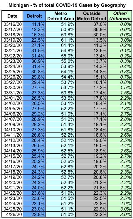
I've therefore also broken out the numbers into three distinct geographic parts of Michigan: The City of Detroit itself; the surrounding Metro Detroit area (i.e., the rest of Wayne County along with all of Oakland and Macomb Counties); and The Rest of Michigan.
With that in mind, I've gone ahead and plotted every COVID-19 case in Michigan to date since March 16th (which is the earliest date I was able to get county-level data for) by breaking every case out both ways (Blue/Red and Urban/Rural).
The graphs below aren't really relevant until March 19th, which is the day when confirmed cases broke 100 Michiganders (the official count actually jumped from 80 to 334 that day).
I should also note that the Michigan Dept. of Health & Human Services gradually started adding a few other categories of cases and fatalities which don't fit into any specific location--these mostly consist of prisoners (I guess they aren't counted as living in Jackson County even if they're in the Jackson state prison?), as well as a handful of cases of residents of other states who were stricken with the virus while visiting Michigan, and a few whose home county isn't known.
Combined, these cases represent just 3% of all cases statewide as of today. I didn't include them below, which is why the percentages don't quite add up to 100% in either graph below.
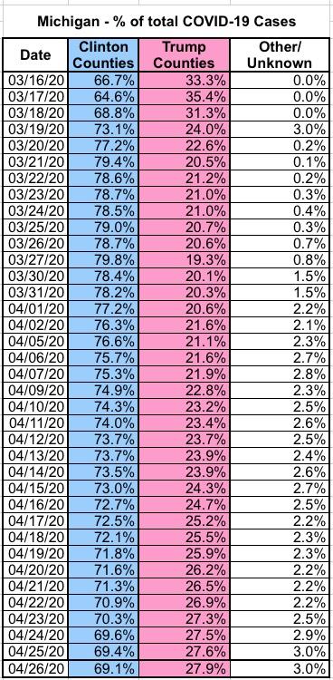
First, let's look at blue vs. red counties.
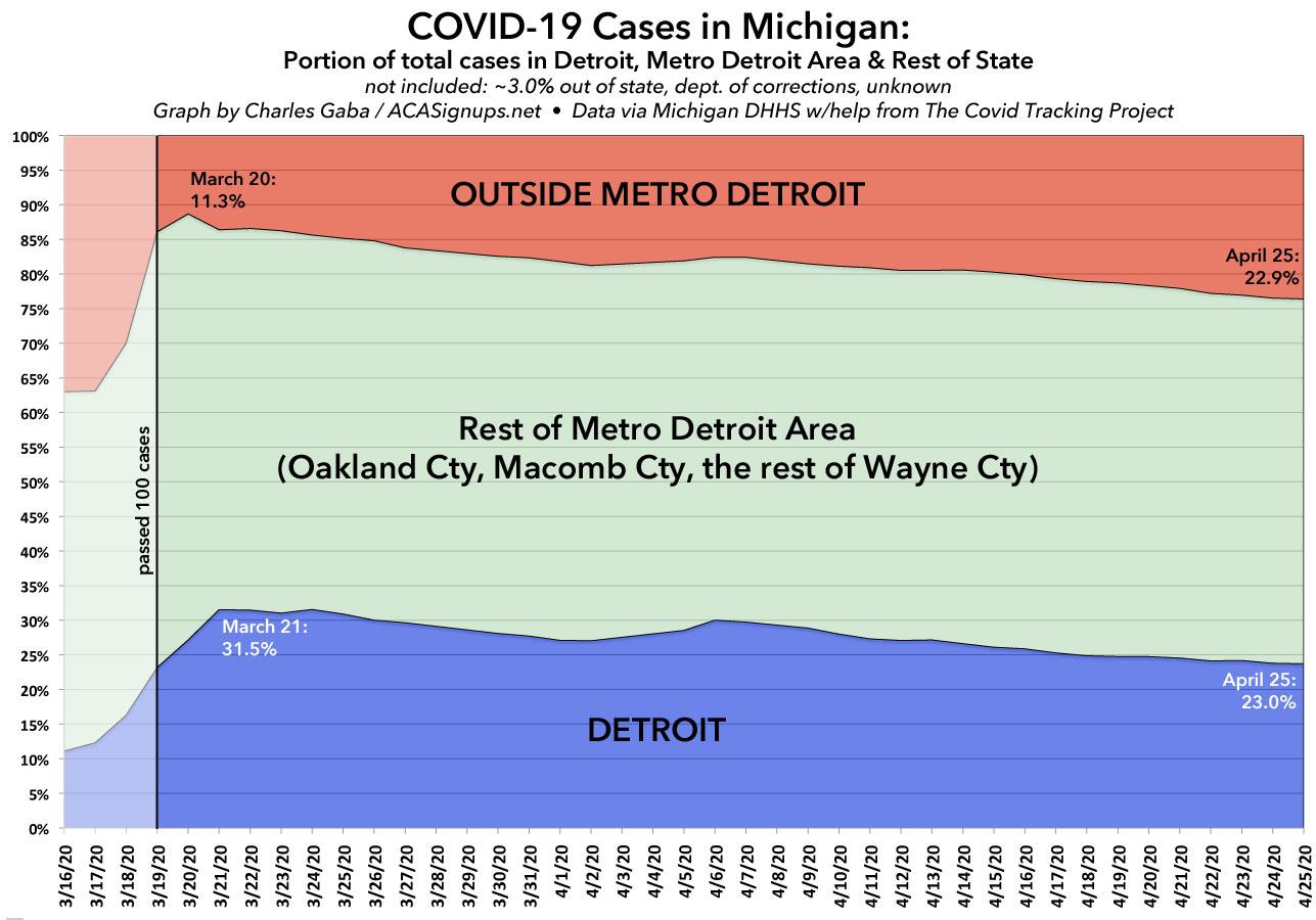
The trend is gradual but inevitable. round March 21st, Detroit was home to nearly 1/3 of all known Michigan COVID-19 cases, while "Not Detroit" (the other 80 counties outside of Wayne/Oakland/Macomb) only had 11.3% of all known cases...but since then, as the disease has spread and testing has ramped up, the tables have gradually turned: Just over 1 month later, Detroit is down to 23% of all cases statewide...while "Not Detroit" has more than doubled its share to 22.9%. Put another way, the ratio of COVID-19 cases has gone from Detroit having 3x as many as "NotDetroit" to a 1:1 ratio.
Next, let's look at the Urban vs. Rural trend now. As you'd expect, nearly 4 out of 5 cases were found in Detroit and the 8 counties won by Clinton...at first. Since then, however...well, take a look for yourself:
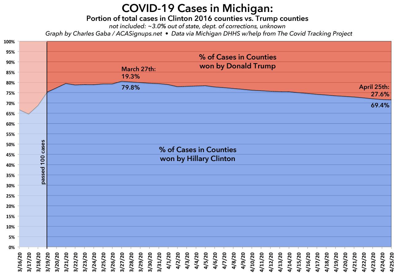
Again: The trend is gradual but clear: Every day which passes, the virus is shifting from being a "blue area" problem to being an everywhere problem...and rapidly. The percent found in Trump-voting counties has grown by an average of 0.29 percentage points per day since March 27th. At this rate, it'll reach 50/50 in 75-80 days, or right around mid-June (assuming cases continue to increase at their current rate, that is, which I sure as hell hope doesn't happen).
What about other states? Well, I don't have the day-by-day numbers for other states, but I have been spot-tracking the county-level data for Florida, Wisconsin and Pennsylvania. Let's take a look:

The trend is extremely clear in Wisconsin, but much less clear in Florida, and in Pennsylvania it's actually slipping ever so slightly the other direction so far. I only have data in these three states from the past week, however, so it'll be another week or two before I can draw any larger conclusions on them.
I'll see what I can do about digging up day-by-day county-level data for these and/or other states, but the point is pretty clear: If you think you're immune to COVID-19 because you live in the boonies or because it's "just a Democrat problem," you're in for a rude awakening.
UPDATE: Here's the tables for each of the graphs above:
Advertisement
