

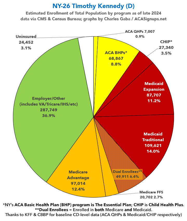
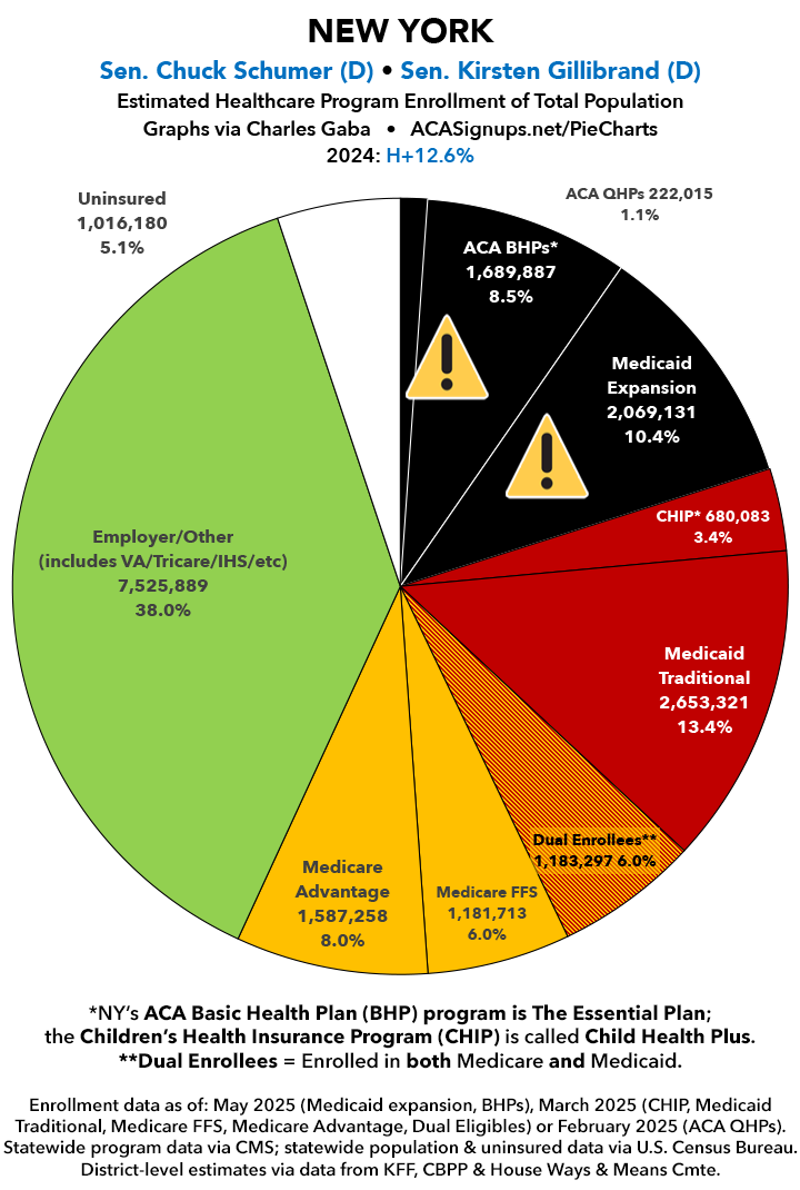
House District Enrollment: New York (14 - 26) (updated)
Wed, 07/09/2025 - 11:39am
Originally posted 3/10/25
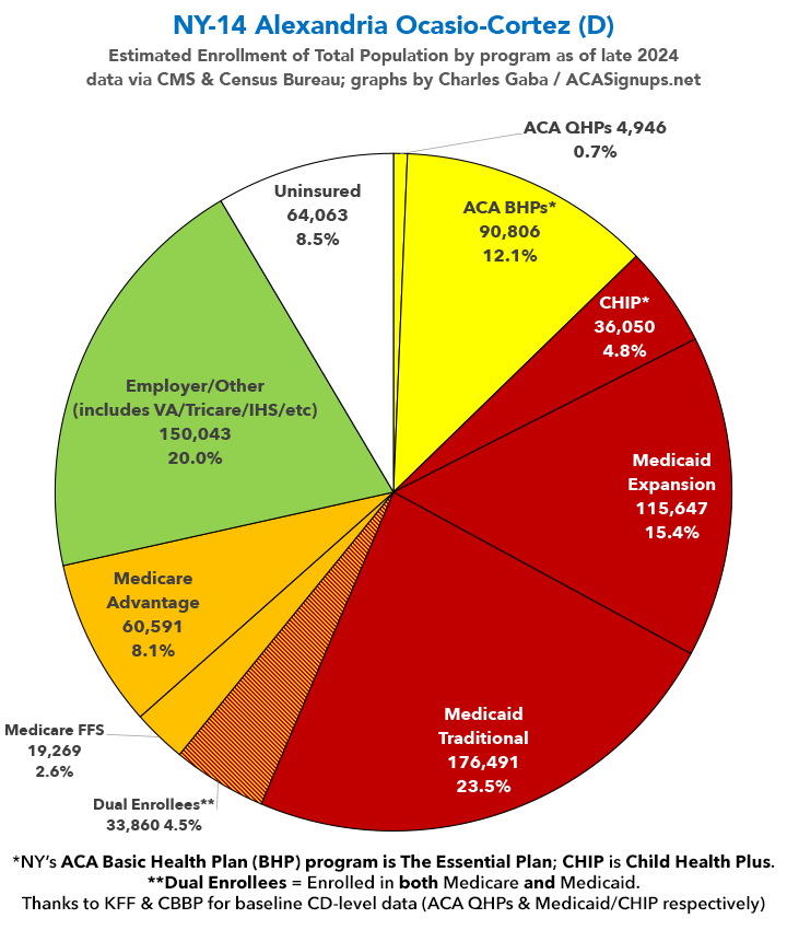
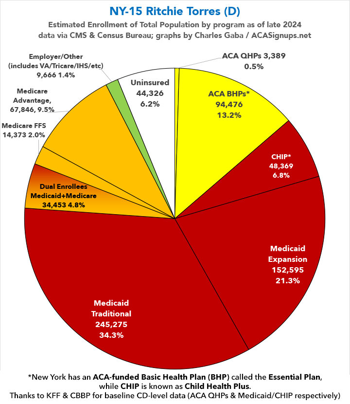
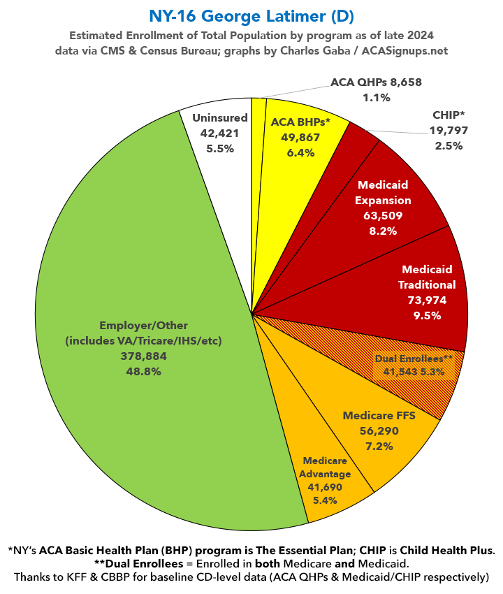
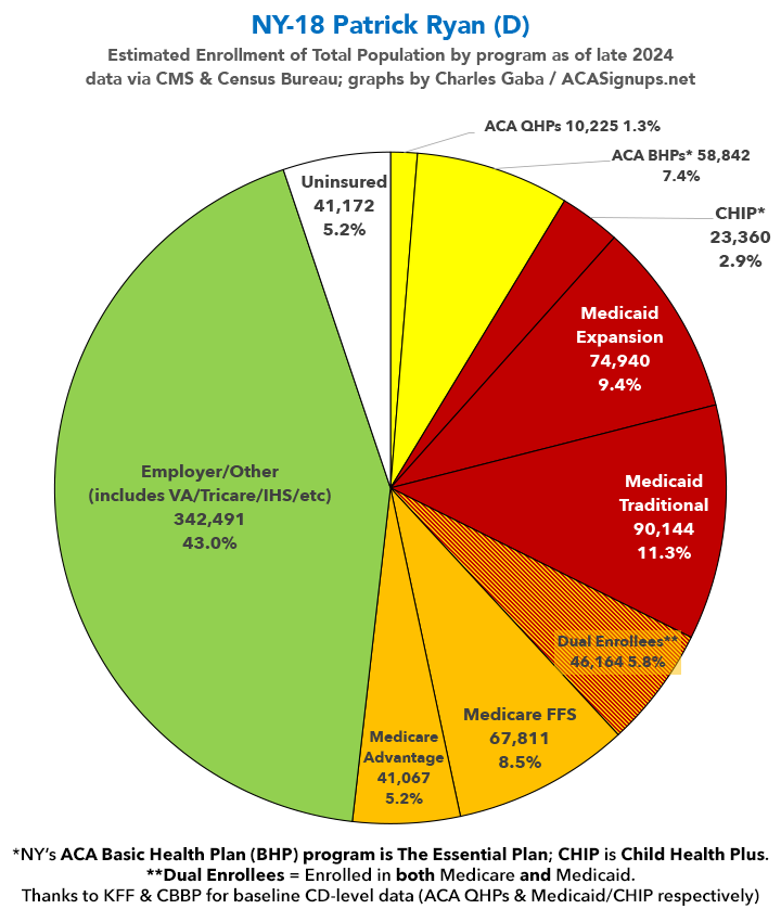
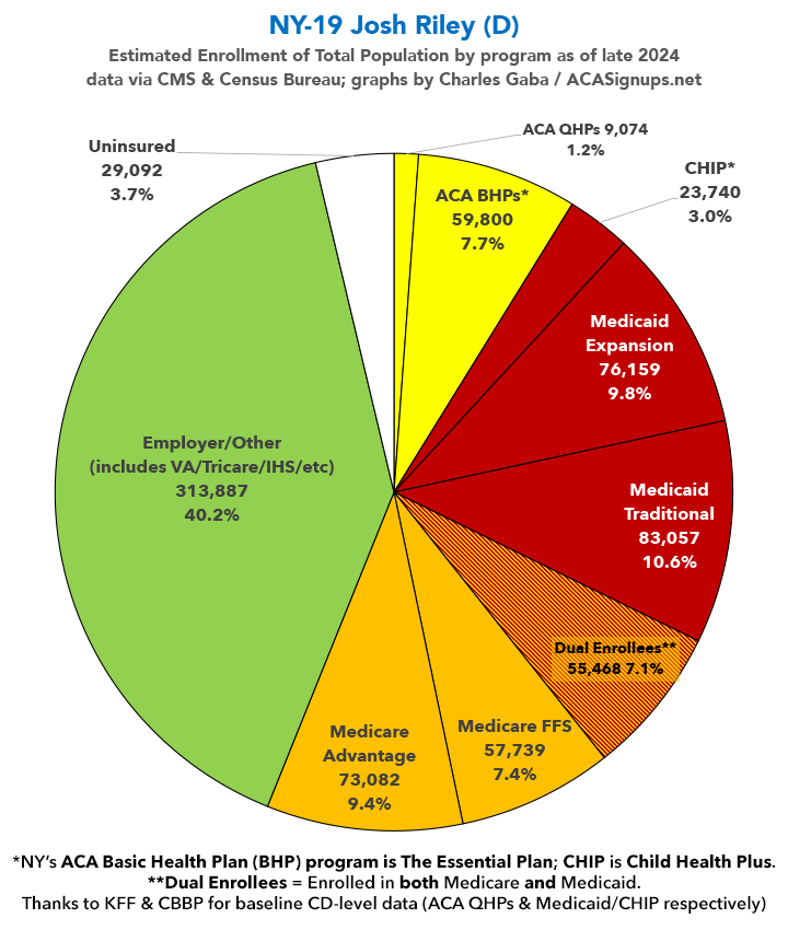
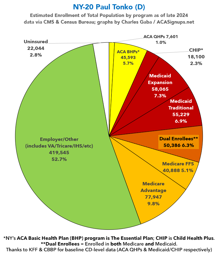
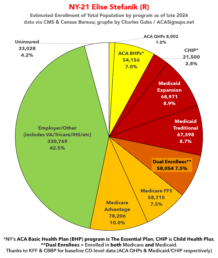
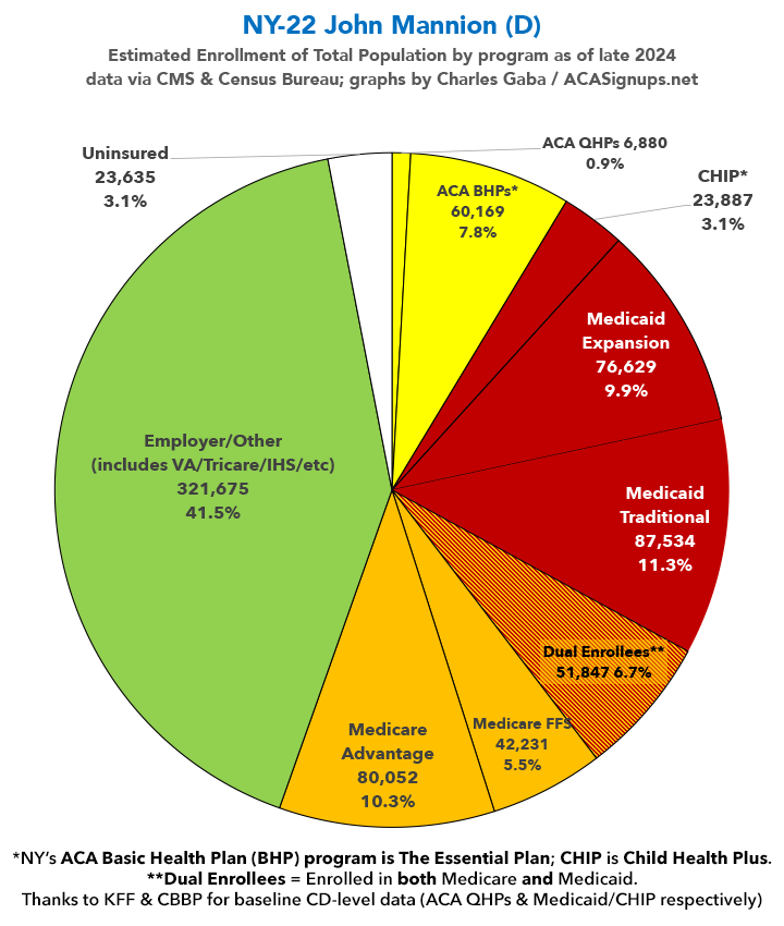
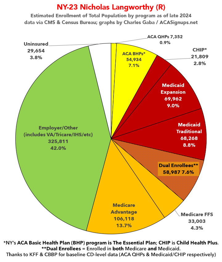
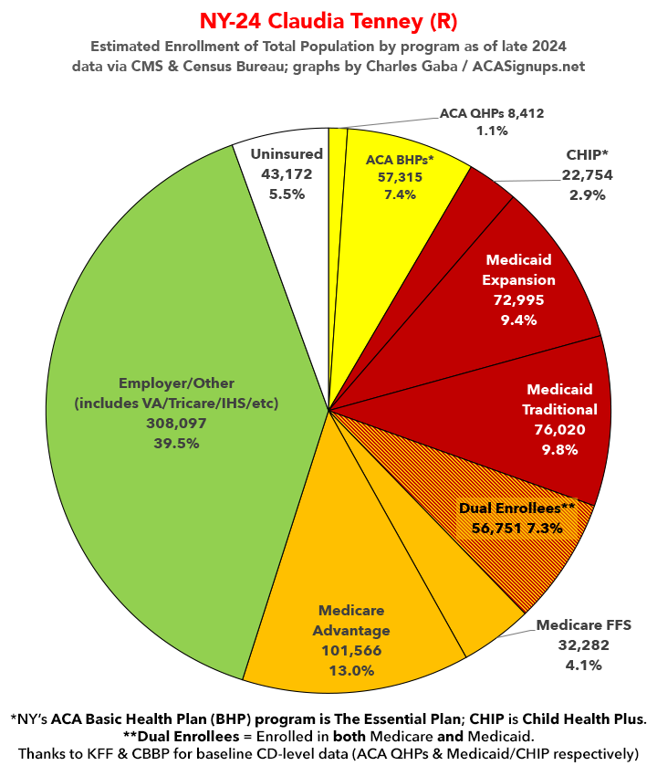
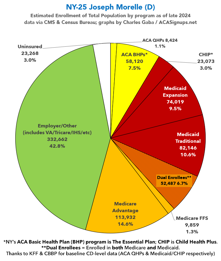
Over the past couple of months I've compiled a master spreadsheet breaking out enrollment in ACA plans (Qualified Health Plans & Basic Health Plans), Medicaid/CHIP coverage (both traditional & via ACA expansion) and Medicare (both Fee-for-Services & Advantage) at the Congressional District levels.
With the pending dire threat to several of these programs (primarily Medicaid & the ACA) from the House Republican Budget Proposal which recently passed, I'm going a step further and am generating pie charts which visualize just how much of every Congressional District's total population is at risk of losing healthcare coverage.
USE THE DROP-DOWN MENU ABOVE TO FIND YOUR STATE & DISTRICT.
You can find the data sources & methodology explanation links here.
(Note: I've broken New York's 26 House districts into 2 pages. This one includes districts 14 - 26. Use the dropdown menu to select districts 1 - 13).
UPDATE 4/20/25: Scroll down for high-def printable PDF versions of each district!
UPDATE 7/9/25: I've updated the web versions of the graphics with the most up-to-date enrollment data I have access to. The black sections w/the ⚠️ symbol are those most at risk of losing healthcare coverage due to H.R. 1, the "One Big Beautiful Bill Act" (aka the #MAGAMurderBill).

| Attachment | Size |
|---|---|
| 2.31 MB | |
| 2.3 MB | |
| 2.24 MB | |
| 2.2 MB | |
| 2.21 MB | |
| 2.33 MB | |
| 2.26 MB | |
| 2.35 MB | |
| 2.3 MB | |
| 2.34 MB | |
| 2.31 MB | |
| 2.29 MB | |
| 2.25 MB | |
| 2.29 MB |
Advertisement
