Every once in awhile, I like to take a look at the analytics reports for ACASignups. Usually it's just keeping track of the number of site visitors; occasionally I'll poke around a bit more in depth, especially when there's a huge traffic spike like the one caused by Michael Hiltzik's L.A. Times story showcasing my "Total Coverage Type" Pie Chart a few days back.
However, once in a blue moon I'll snoop around a bit more and look at who's visiting...and the results can be surprising, even after you cull out the random typo visits and bot crawlers.
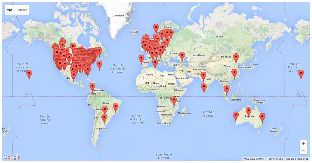
Case in point: Check out this map showing where the most recent 1,000 visitors to the site were located. For the most part it's not terribly surprising, with the vast bulk of traffic coming from the U.S. (including at least one visitor from Hawaii) or Europe, followed by scattered instances from other countries here and there...
OK, this is totally off-topic, and I know I'm gonna face an earful in the comments over this, but I have to make a few comments on the ongoing "Democratic Superdelegate" brouhaha amongst Bernie Sanders's supporters.
First of all, there are 712 "unpledged" delegates (or "superdelegates") for the Democratic Party this year out of 4,763 total. That's around 15% of all Democratic delegates. The eventual nominee needs at least 2,382 total delegates to win the nomination.
So, it's important to keep in mind that pledged delegates from primaries and caucuses determine around 85% of the total. It's the remaining 15% who people are getting all worked up about.
Normally, of course, this isn't an issue because one candidate or another ends up securing more than half of the grand total via the caucuses/primaries anyway, making the SDs a moot point.
So, the Big Story today is a new report from the Blue Cross Blue Shield Association revealing that (wait for it)...people who signed up for private health insurance via the new Obamacare exchanges over the past two years are a lot sicker and more expensive to treat than those previously enrolled in the individual healthcare market. From their opening summary of findings:
Comparing the health status and use of medical services among those who enrolled in individual coverage before and after the ACA took effect, as well as those with employer-based health insurance, the study finds that:
UPDATE: I just asked Larry Levitt, Senior Vice President for Special Initiatives at the Kaiser Family Foundation, to take a look at my analysis to see if anything below seems to be significantly off-base in terms of my logic, analysis, estimates and so forth. I was particularly concerned because I've modified/extrapolated from a lot of data which was originally reported on by KFF. His response:
@charles_gaba Obviously some of the estimates are approximations, but I don't see any glaring problems.
Over the past few days, I've been fine-tuning an ambitious attempt to boil down the entire U.S. population into a single pie chart broken out by type of healthcare coverage (or lack thereof).
Today I'm looking at the December 31, 2015state-by-state data. I'll return to the actual ASPE report (for Part 3) next:
On December 31, 2015, about 8.8 million consumers had effectuated Health Insurance Marketplace coverage – which means those individuals paid their premiums and had an active policy at the end of December. Of the approximately 8.8 million consumers nationwide with effectuated Marketplace enrollments at the end of December 2015, about 84 percent, or about 7.4 million consumers, were receiving an advance payment of the premium tax credit (APTC) to make their premiums more affordable throughout the year. The average APTC for those enrollees who qualified for the financial assistance was $272 per month.
Ouch. There's no putting a pretty face on this number. Last fall I projected that the Q4 (12/31/15) effectuated enrollment figure would be around 9.7 million (although I was obviously proven wrong when the Q3 9/30/15 report was released; the number had already dropped down to 9.3 million by that point). This alone is a large part of the reason I was so far off in my projection of 14.7 million total OE3 enrollees; I assumed 9 million 2015 enrollees would renew, when in fact there didn't end up being 9 million people still enrolled in 2015 policies total. However, the actual number fell short of even the HHS Dept's lower projection of roughly 9.1 million. Needless to say, this is pretty disappointing from their POV.
ATTENTION L.A. TIMES READERS:
This is actually an older version of the blog post.
I later RE-DID THE WHOLE THING HERE.
IMPORTANT UPDATE 3/27/16 1:30pm: At the suggestion of several people to make the color-coding more distinctive and after re-reviewing a couple of surveys/reports, I've made the following revisions to the chart:
I want to make one thing very clear right off the bat: Some of the numbers in this post are very rough estimates, a combination of hard data and guesstimates extrapolated from the information I have on hand from the Kaiser Family Foundation, the Congressional Budget Office and the HHS Dept.
Having said that, here's a crude table and "stacked area" chart depicting how the U.S. Individual Health Insurance Market has changed over the past 2 1/2 years, from the launch of the ACA exchanges in October 2013 through the end of March 2016.
As you can see, there are 6 columns/sections: Three exchange-based (subsidized QHPs, full price QHPs and Basic Health Plan enrollments) and three OFF-exchange (ACA compliant, "Transitional" and "Grandfathered").
Back in 2013-2014 when I started this project, the most frustrating data to track down was OFF-exchange individual market healthcare policy enrollments. I tried my best to do so, painstakingly verifying around 560,000 across a handful of states, but with the knowledge that there were at least a few million more out there.
While this may sound obvious now, at the time, there were a lot of people who should've damned well known better, like Avik Roy, who actively tried to claim that the off-exchange individual market was nominal at best, documented in this jaw-dropping Tweet from him:
@UriManor@charles_gabaOff-exchange enrollments don’t affect exchange risk pool; usually previously insured. Not a big number either way.
Welcome, fellow Wonks! It's a great honor to be asked to host Health Wonk Review, especially the week of the 6th Anniversary of the Affordable Care Act!
Since this is the first time I've hosted HWR, I'll keep things pretty straightforward:
David Harlow of HealthBlawg addresses the question of "Narrow Networks in California?", pointing out that "Managing cost and quality requires use of narrow networks. A proposal up for consideration in California is deemed “novel” by some. Opponents seem afflicted by the Lake Wobegone Effect."


