

By Request: How the Delta Wave has ravaged Red America, month by month.
Wed, 12/15/2021 - 5:16pm
Instead of looking at the cumulative county-level COVID death rates by 2020 partisan lean since the Delta Variant wave hit the United States in June, the graphs below look at how that has played out for each individual month since then.
Again, the COVID death data comes from Johns Hopkins University for 47 states + DC; the data for Nebraska and Utah comes from the New York Times COVID tracker github; and for Florida, it comes from the White House COVID-19 Team Community Profile Report.
The data does not include the U.S. territories (since they don't vote in the November Presidential election), and it's also missing around 4% of total COVID deaths across the 50 states + DC due to their county of residence being unknown.
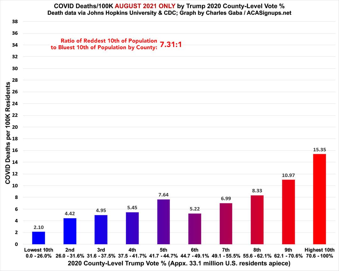
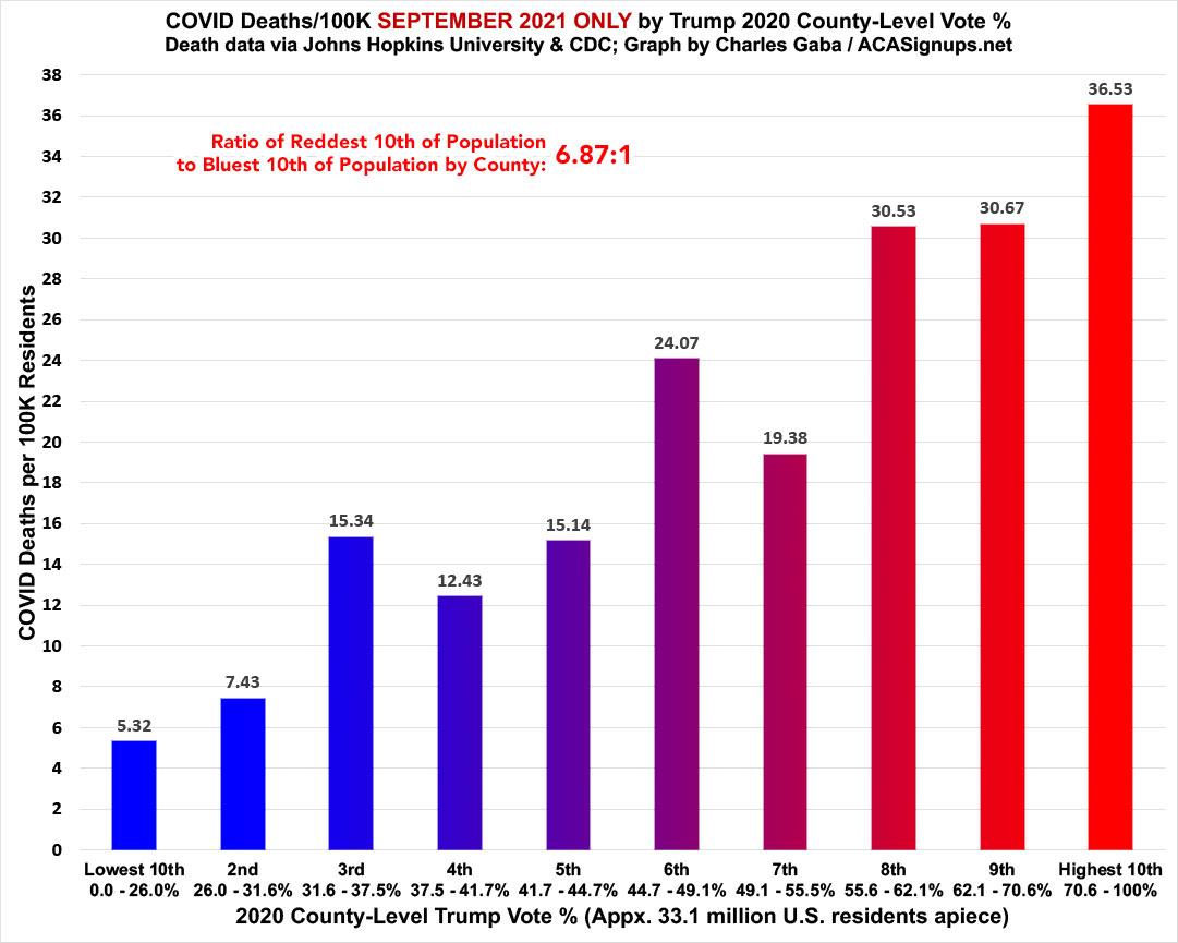
With that in mind, here's what the Delta wave has looked like in June, July, August, September, October, November and the first 2 weeks of December 2021:
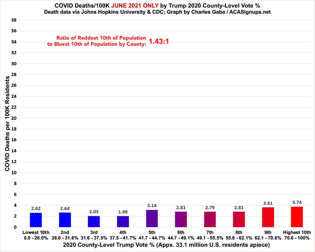

The first thing worth noticing is that while Delta hit the U.S. shores sometime in June, the death toll from it didn't really start hitting on a significant scale until August. In fact, August is when the Red/Blue death rate ratio has been the highest since the Delta wave started, which surprised me (I assumed the gap was highest in October). During the full month of August 2021, the COVID death rate was over 7.3x higher in the reddest tenth of the U.S. than in the bluest tenth.
The next thing to note is that September has been by far the ugliest month of the Delta wave to date (so far). Over 65,000 Americans died in September 2021. The reddest bracket was nearly 6.9x higher than the bluest:
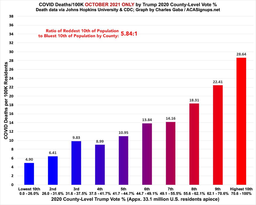
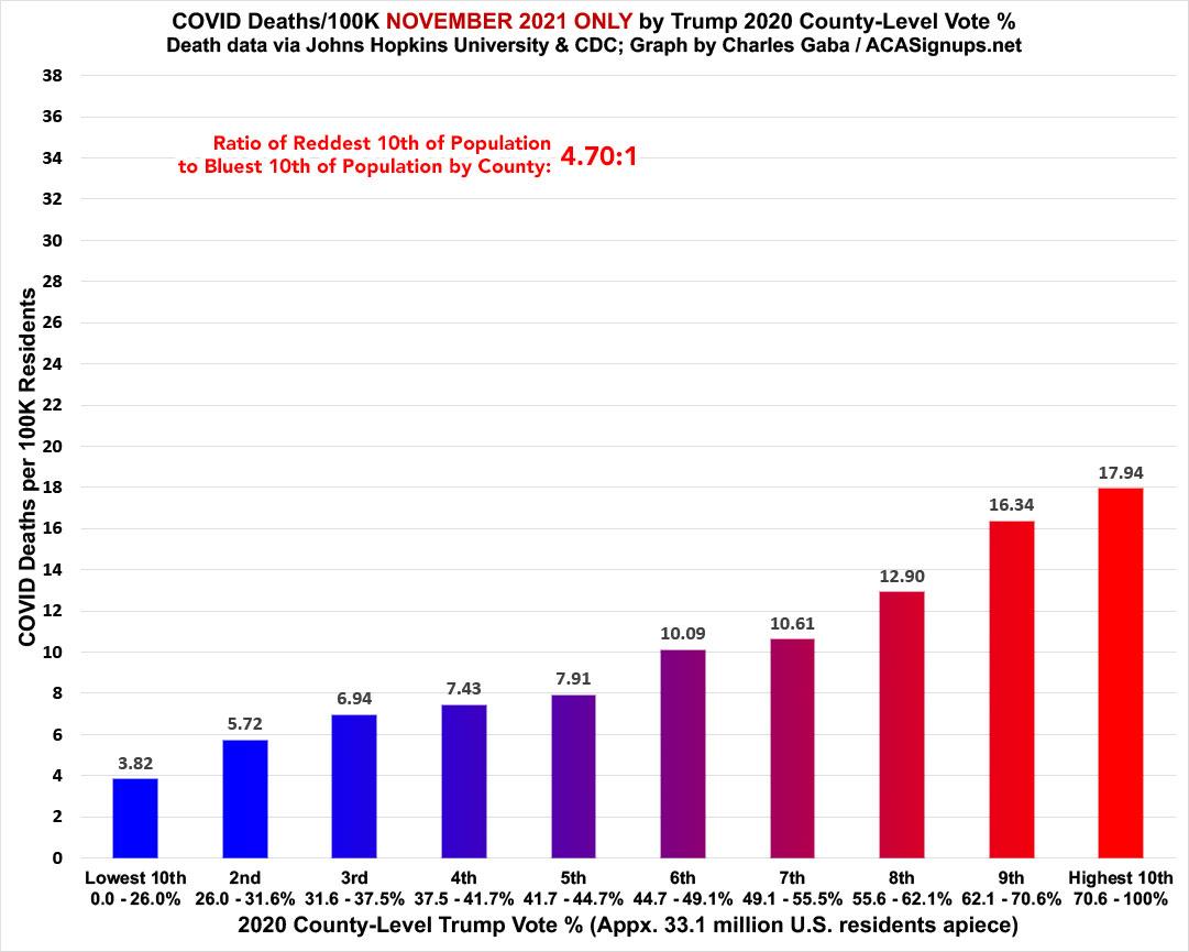
Finally, here's what it looks like for the first 2 weeks of December. Notice how, after the red/blue ratio dropped substantially from October to November (from 5.8x to 4.7x), it's since shot back up again for the first half of December:
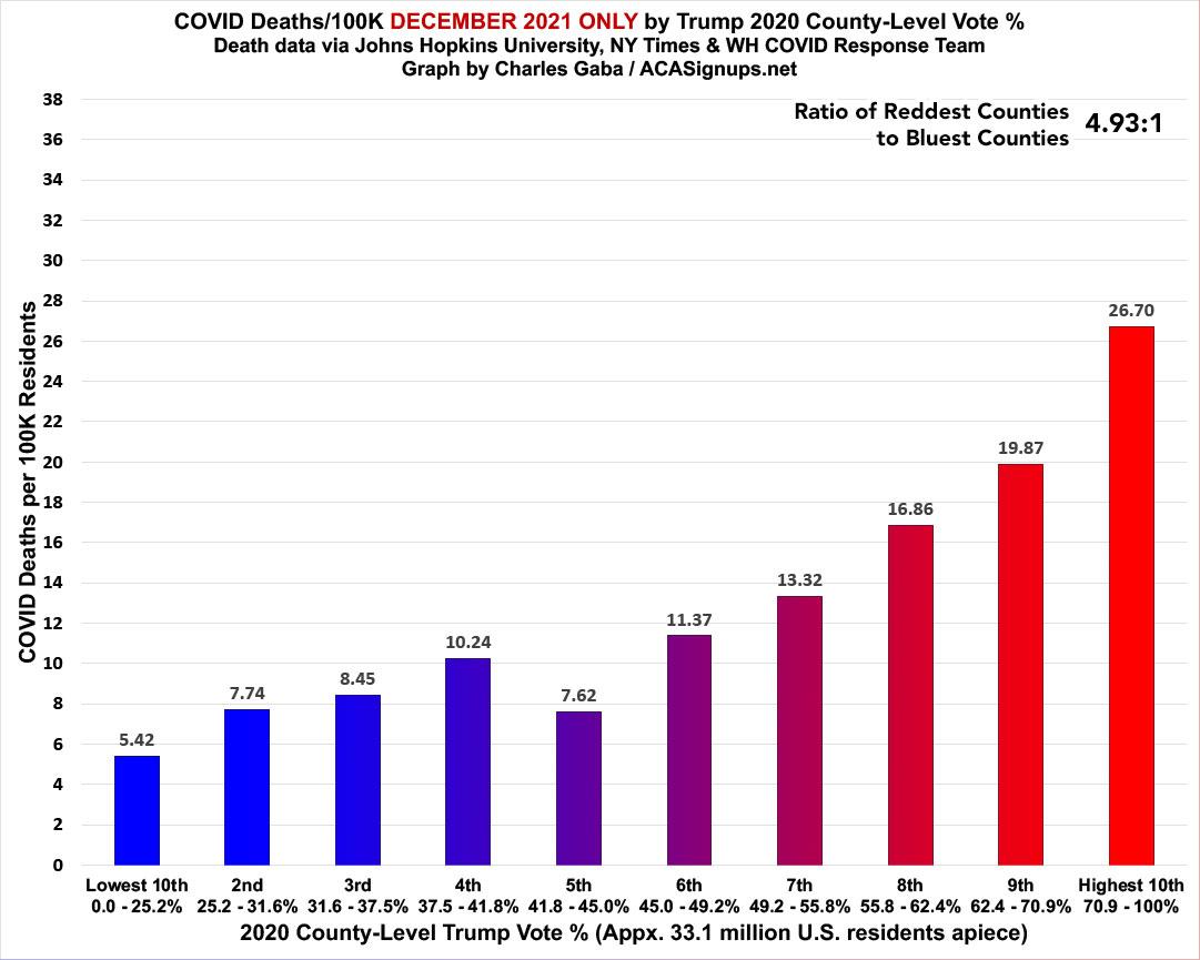
Update 8:05am 12/17/21: Welcome NY Times readers! My original graph for December only included 12/01 - 12/14; I've updated it to include 2 more days, and have also added a projection for the full month of December based on the first 16 days of the month.
Update 12/20/21: I've updated the December-only graph to run from 12/01 - 12/19. The gap isn't quite as steep as my projection from last week but the reddest bracket is still running 5.6x higher than the bluest bracket.
UPDATE 2/01/21: For completeness sake, I've updated the December-only graph to include the full month of December. The second half of the month started to bleed over into the Omicron variant. For the full month, the Reddest bracket was 4.9x higher than the Bluest.
Update 10:05am 12/17/21: In response to some frequently asked questions:
- "What about adjusting for age? Don't Republicans tend to be older than Democrats?"
- "Aren't you cherry picking by only starting in June 2021? What about all those heavily-Dem cities which were hit hard in the first wave?"
- "All this shows is WHERE Americans are dying, not WHO'S dying. Even deep red counties still have blue patches and vice-versa, so for all you know, most of the deaths in the red counties could still be Democrats!"
- You're correct, and I've made that point repeatedly. I have attempted to estimate how many actual GOP vs. Dem voters have died of COVID based on the county-level data since the 2020 election, and my crude estimate suggests that perhaps 50% more Republicans have died than Democrats...but this estimate makes some big assumptions.
Advertisement
