

Rumors of age being a major "confounding factor" in county-level death rates have been greatly exaggerated.
Mon, 10/04/2021 - 11:51pm
A couple of weeks ago, one of my COVID "partisan lean" graphs was cited by David Leonhardt of the New York Times. This paragraph in question gained plenty of attention, and ended up being referenced by Nicole Wallace on Deadline: White House; Morning Joe; Raw Story and Paul Waldman of the Washington Post:
Since Delta began circulating widely in the U.S., Covid has exacted a horrific death toll on red America: In counties where Donald Trump received at least 70 percent of the vote, the virus has killed about 47 out of every 100,000 people since the end of June, according to Charles Gaba, a health care analyst. In counties where Trump won less than 32 percent of the vote, the number is about 10 out of 100,000.
I even got a nice shout-out from Paul Krugman.
Well, this didn't go over too well with a couple of people...specifically, Glenn Greenwald and some guy named Jeremy Beckham.
Beckham actually wrote the critique of both the NY Times story and my own red/blue COVID analysis. Gregory Travis, a technology & fellow healthcare writer, actually beat me to the punch with his own response to Beckham's piece; I'll be quoting him here, along with my own additional points.
As Travis notes, Beckham's main gripes seem to be:
1. The NYT times piece did not normalize for age differences between Republican and Democrat-voting counties and everyone knows that a) age is a huge factor in COVID death rates and b) Republican voters are older than Democratic voters.
The first assertion is not actually true and I’ll go into why below. The second assertion is true but only by a technicality. Voting participation rates skew very highly towards older voters of either party and the net result is that the average age of a Republican voter is less than two years older than the average age of a Democratic voter.
2. There is a large disparity in rural/urban voting patterns with rural counties overwhelmingly going for Trump and urban counties going for Biden (true). And that differences in health access and outcomes between rural and urban counties could explain the difference.
They do not. Again, I go into why below
3. This is all a plot by liberals to paint Republicans / Trump voters as idiots.
This may be but it’s irrelevant. The primary take-away from the Times’ piece is that death rates are higher in Republican-voting US counties than in Democratic-voting US counties.
I strongly advise reading Travis' entire analysis (which includes his own nifty maps & graphs) before reading the rest of mine, but here's some of his main points:
What the observation (that COVID deaths from infection rise with age) overlooks is the fact that COVID infection rates decline with age. And that it is impossible to die of COVID disease unless one is first infected with the SARS2 virus that causes it.
...We know why older people are more likely to die of a COVID infection than younger people: because older people are more likely to die of anything than younger people.
But why are older people less likely to become infected than younger people? And, remember, you cannot die of a COVID infection unless you are infected.
He goes on to note that unlike younger people, seniors are far less likely to spend much of their time at in-person office work, going to crowded bars & nightclubs, sitting in a poorly-ventilated classroom and so forth. They're also far more aware of their own mortality, and are therefore far more likely to take mitigating actions such as wearing a mask and, of course, getting vaccinated (I'll discuss this more below).
Travis then addresses the supposed Urban/Rural divide by noting that Vermont (rural) has the 2nd-lowest COVID death rate in the country, while New Jersey (urban) has the 2nd-highest. Of course, during the first wave of the pandemic a year and a half ago, you couldn't throw a stone without hearing about the horrifically high death rate in New York City, Los Angeles and other major urban centers.
Finally, Travis notes that Beckhams' third accusation, that Democrats/liberals are "doing this" to "get revenge" on Republicans/conservatives for their blatant politicization of the pandemic in 2020, he makes an even simpler case:
It does not matter if liberals are looking for payback. The data is the data and, when asked, Republican Trump supporters will openly admit that they engage in risky lifestyle choices that make them significantly more likely to become infected — and then to die — than do Democratic Biden supporters.
What is surprising is that so few are willing to accept this at its face value.
As for my own thoughts, before I begin, I want to post updated versions of the various graphs in question. After all, it's been over a week since Leonhardt's piece ran, and every day there's more COVID vaccinations injected into arms...as well as more COVID cases and deaths reported.
Let's look at the vaccination side first: Here's the latest vaccination rates for every county in the 50 United States (+DC) as of October 4th, 2021, broken out into roughly even 10ths of the population (~33.1 million each) by partisan lean:
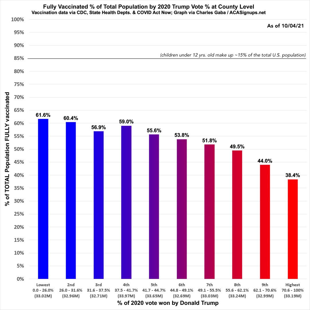
Again, none of the brackets have exactly 33.1 million residents because the counties which cut across that threshold are usually several hundred thousand in size. Since there's no way to slice the county in half, I have to include them in one or the other. I have them broken out as evenly as possible, however.
As you can see, the vaccination rate in the bluest tenth of the country is a whopping 60% higher than in the reddest tenth.
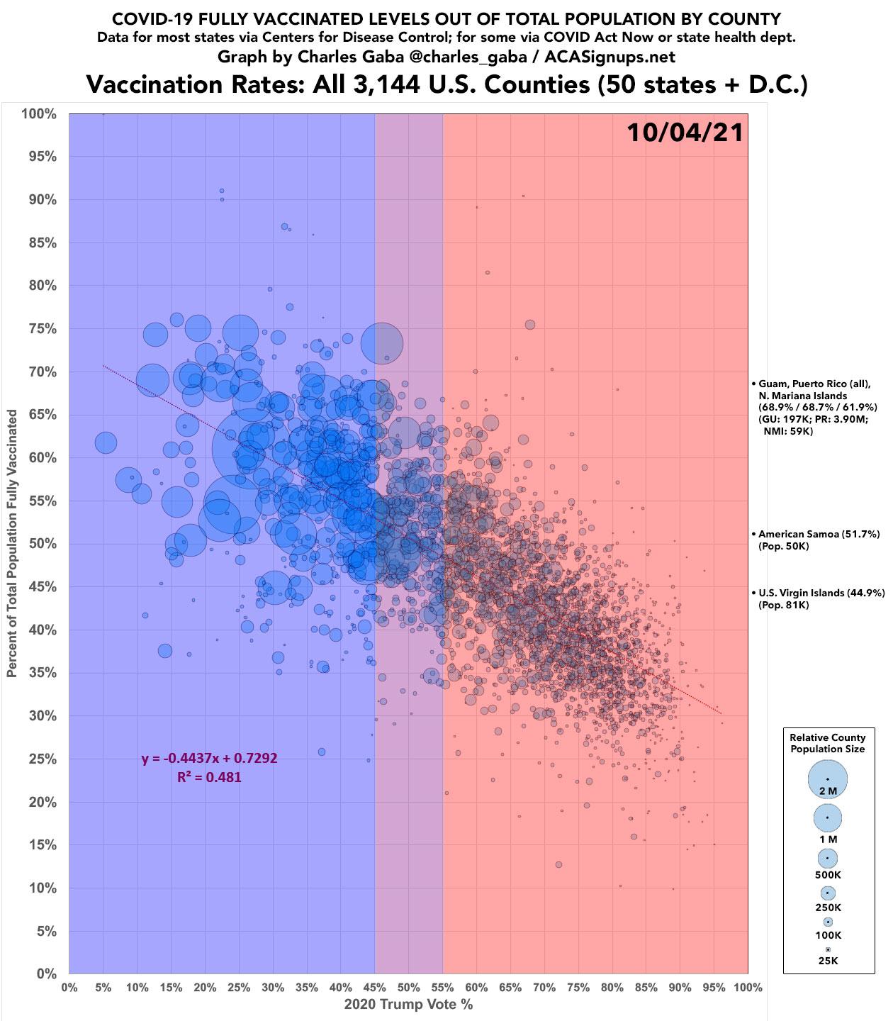
Let's view this another way, using my now-famous county-level "scatter-plot" graph:
One of Beckham's biggest beefs with my "death rate" graph is that it doesn't adjust for age. Beckham feels this is extremely important because Republicans tend to be older than Democrats. Of course, if that's the case, using this same logic, red counties should be VACCINATED at a higher rate than blue counties as well. According to the CDC, fully 94.4%* 83.7%* of all senior citizens 65+ in the U.S. have been fully vaccinated as of today, versus just 64.9%* 56% of the population at large. This means that if you only include those under 65, only 50.5% of non-seniors are fully vaccinated in the U.S.
*Thanks to Jeremy Fischer for the correction!
If those red counties are so chock-full of elderly people, you'd expect them to have a higher vaccination rate than the blue counties...and yet, with few exceptions (most notably Sumter County, Florida, home of The Villages retirement community), this clearly isn't the case at all.
But...I digress.
Let's move on to the COVID case rate since the end of June:
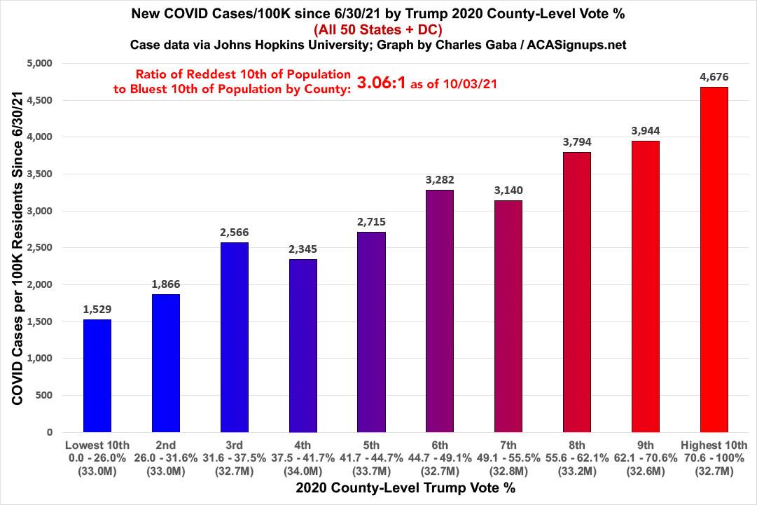
The ratio between the reddest and bluest tenths of the country has remained exactly the same over the past week: The former is still 3.06x higher than the latter.
Note that this doesn't include several thousand cases where the county of residence is unknown.
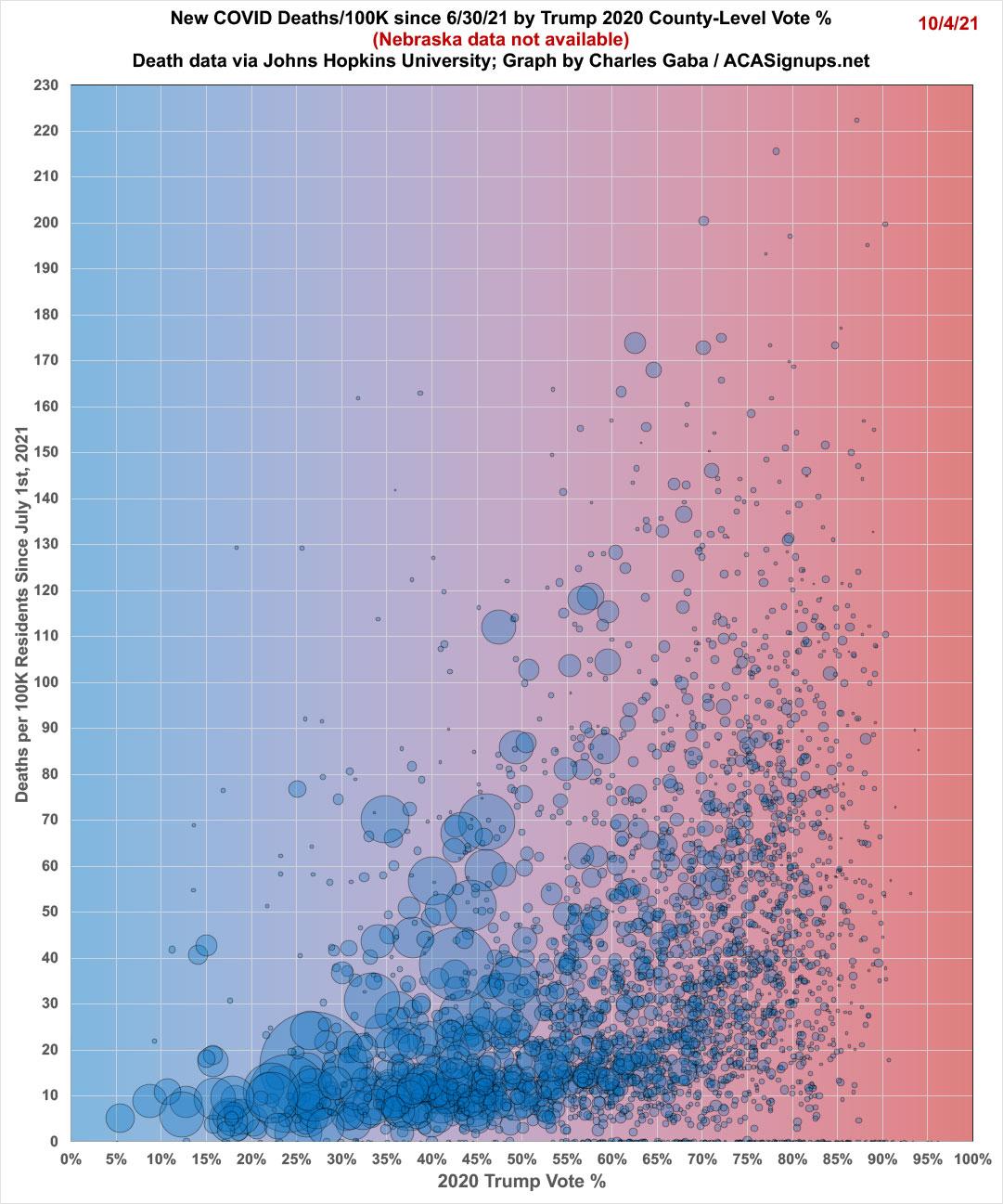
Next, here's death rates since the end of June for every state except Nebraska (which is still refusing to publish a county-level breakout of their COVID deaths). THIS is the graph which Leonhardt used in his piece, and it's also the one getting Beckham so worked up:
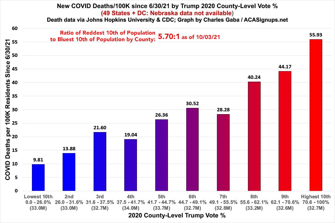
Yowza. The death rate since June 30th in the reddest bracket is now 5.7x higher than the bluest bracket. That's an increase from a week ago, when it was "only" 5.5x higher.
At this point I want to note the following important caveats:
- These graphs only include the 50 U.S. states + DC (well, 49 in the case of the death rate graph). U.S. territories aren't included since they don't vote for President in the general election.
- The case & death rate graphs only start as of 7/01/21. As I've noted before, both graphs looked very different in spring/summer of 2020, fall/winter 2020, and spring of 2021...and that could change again one way or the other going forward.
- Most importantly: These graphs only lay out where the higher/lower vaccination, case and death rates are, not necessarily WHO. Remember, the reddest counties still usually have blue patches and vice-versa.
Just for the heck of it, let's throw in another scatter-plot graph. This is the same data as the graph above, just plotted out in a different visual format:
Finally, let's step back from the partisan angle for a moment and break the entire population out by vaccination rate to see whether that's reducing the COVID case and death rates:
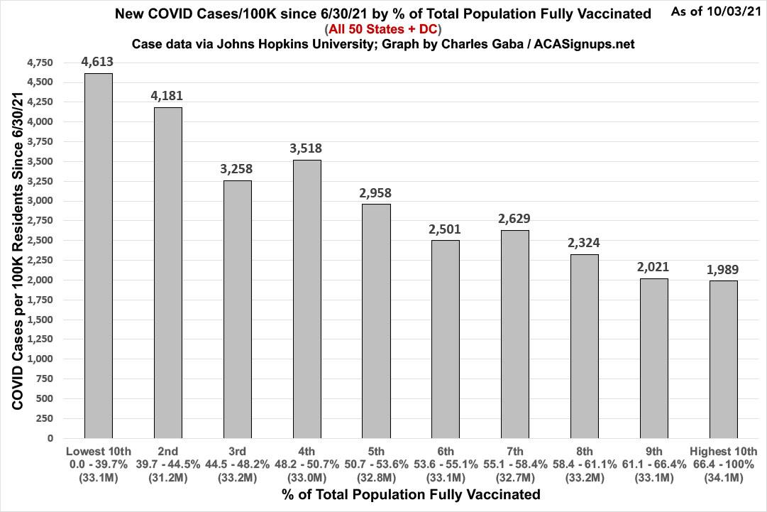
Sure enough, counties with the highest full vaccination rate (66% of the total population vaccinated or higher) have had less than half as many new cases reported per capita since June 30th than those which have vaccinated fewer than 40% of their residents.
What about the death rate since the end of June, however?
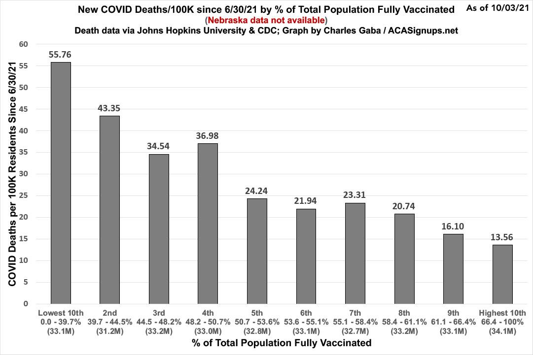
Here the difference is even more stark: COVID deaths since June in the most-vaccinated counties in America have been running less than one fourth the rate of the least-vaccinated counties.
OK, now it's finally time to tackle the two "confounding factors" which Mr. Beckham raised: Population density (alternately: Urban/Rural status) and Age, which he seems to be convinced is The Big One.
First, let's look at population density. On this issue, unlike Travis, I'm actually going to give Mr. Beckham at least partial credit: Yes, the ten percent of the U.S. population living in the most sparsely-populated counties of the country have indeed seen a death rate more than three times higher than that of the ten percent living in the most densely-populated counties:
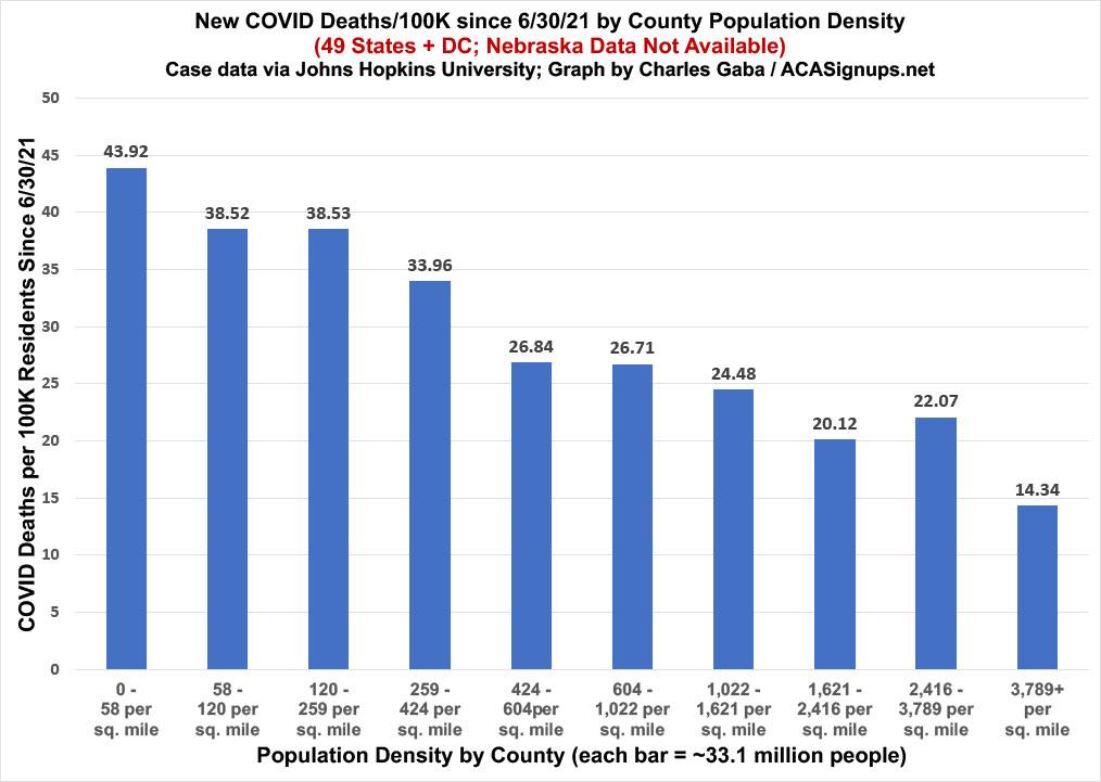
"Ah-hah!" Beckham says; "See? I was right when I said..."
"...people who live in rural areas also experience significant disparities in health care access, with higher rates of uninsured, diminishing available health care facilities, and longer travel times to the nearest hospital."
The problem with his logic, as Travis pointed out in his own analysis, is that this was the exact opposite a year and a half ago, when COVID was ravaging the Big, Densely-Packed Cities while folks living in Rural America were barely touched by the pandemic. Unless I'm missing something, I'm pretty sure that those rural areas didn't suddenly see thousands of hospitals and other healthcare facilities shut down in just the past 18 months (Beckham notes that 138 rural hospitals have closed in the past decade, which is a tragedy, but I don't think that all happened since February 2020).
In other words, the factors Beckham points to were already at play when the pandemic began, yet it wasn't until the third wave last fall (I think) when the death toll in rural areas began to outnumber urban areas.
More problematic is the fact that by itself, population density doesn't necessarily mean much at the county level. After all, you could have a densely-populated large city...located in a massive (geographically) county with almost nothing else outside that city. That would give you a middling density even though the city itself is extremely urban.
That's where the USDA Economic Research Service's Rural-Urban Continuum Codes come into play:
The 2013 Rural-Urban Continuum Codes form a classification scheme that distinguishes metropolitan counties by the population size of their metro area, and nonmetropolitan counties by degree of urbanization and adjacency to a metro area. The official Office of Management and Budget (OMB) metro and nonmetro categories have been subdivided into three metro and six nonmetro categories. Each county in the U.S., municipio in Puerto Rico, and Census Bureau-designated county-equivalent area of the Virgin Islands/other inhabited island territories of the U.S. is assigned one of the 9 codes.
This scheme allows researchers to break county data into finer residential groups, beyond metro and nonmetro, particularly for the analysis of trends in nonmetro areas that are related to population density and metro influence.
From left to right, these are:
- Metro - Counties in metro areas of 1 million population or more
- Metro - Counties in metro areas of 250,000 to 1 million population
- Metro - Counties in metro areas of fewer than 250,000 population
- Nonmetro - Urban population of 20,000 or more, adjacent to a metro area
- Nonmetro - Urban population of 20,000 or more, not adjacent to a metro area
- Nonmetro - Urban population of 2,500 to 19,999, adjacent to a metro area
- Nonmetro - Urban population of 2,500 to 19,999, not adjacent to a metro area
- Nonmetro - Completely rural or less than 2,500 urban population, adjacent to a metro area
- Nonmetro - Completely rural or less than 2,500 urban population, not adjacent to a metro area
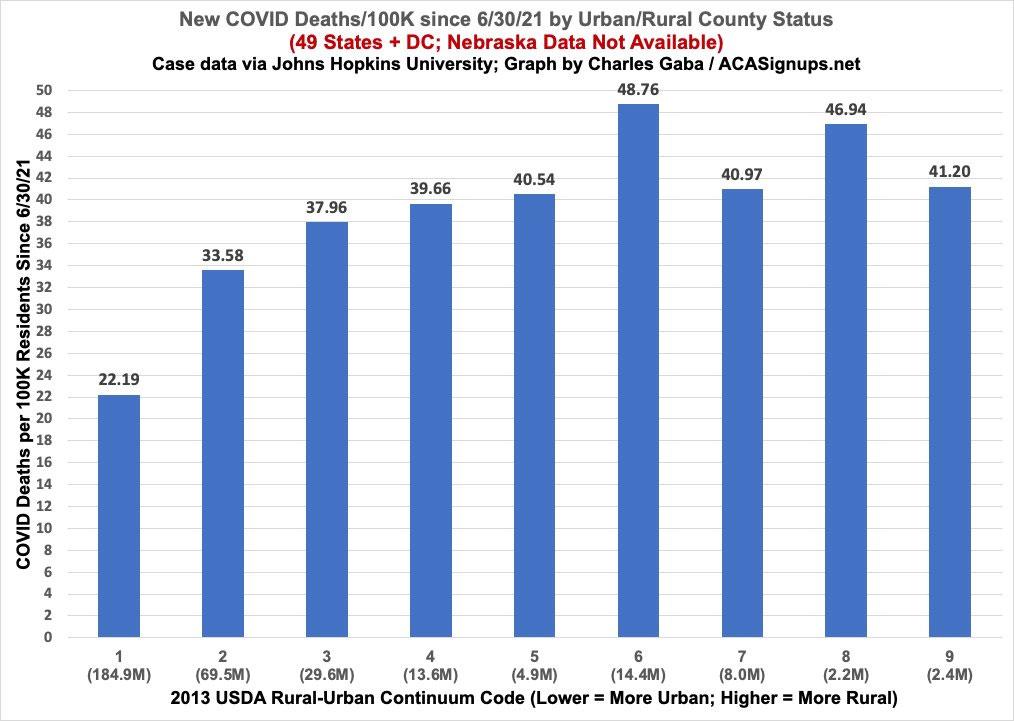
When you break the population out this way, it's a fuzzier picture, though the six non-metro categories are running somewhat higher than the three metro categories. On the other hand, all six of those brackets only comprise 45.5 million Americans vs. the first three, which have 284 million.
FINALLY, we come to the heart of the matter: Age.
Travis does a great job of explaining the core flaws in Beckham's logic. In addition, Yevgeniy Feyman, former health policy at the Harvard School of Public Health and a PhD candidate at Boston University, posted his own detailed analysis which concludes:
Main takeaway for me is that age-adjustment *does not* remove the Trump gradient. Not even close.
I decided to approach this issue in a slightly different way from either of them: I sorted out every county in the 50 U.S. states (+DC) by 2020 Trump vote based on what percent of their populations are 65 or older:
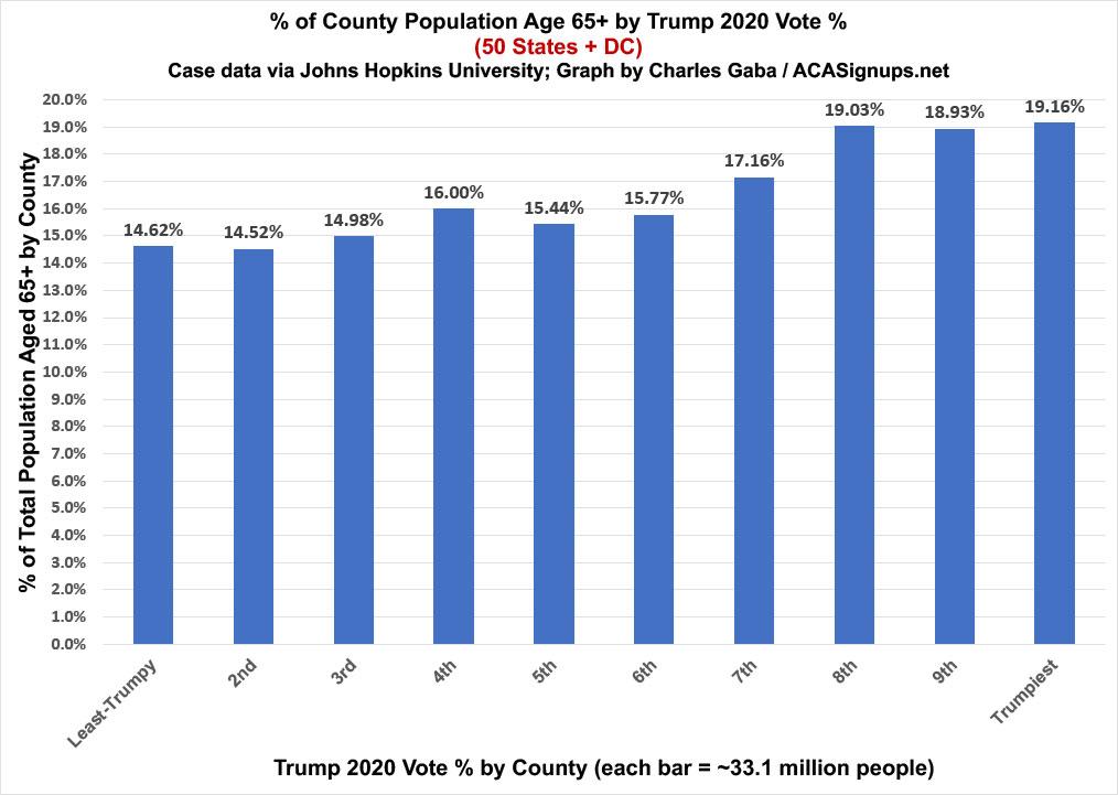
Sure enough, as Beckham notes, the counties with the highest percent of senior citizens also happen to be the ones where Trump received the highest portion of the vote. However...it's not really that dramatic of a spread. The bluest counties average around 14.6% of their populations age 65+, while the reddest counties average 19.2%. That's around 31% more seniors per capita on average.
So what does this translate to in COVID deaths per capita since June 30th? Let's take a look:
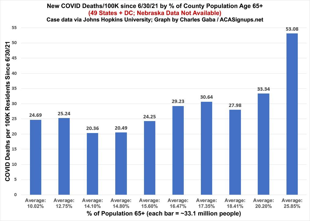
At first glance, this graph would seem to support Beckham's premise: Look at that! The chunk of America with the highest percent of senior citizens (25.9%) is also the chunk with the highest recent COVID death rate (53.1/100K)...over twice as high as the bracket with the lowest percent of seniors!
HOWEVER, there's one more important thing to keep in mind: Not everyone in either of the highest bracket is a Republican...nor is everyone in the lowest bracket a Democrat.
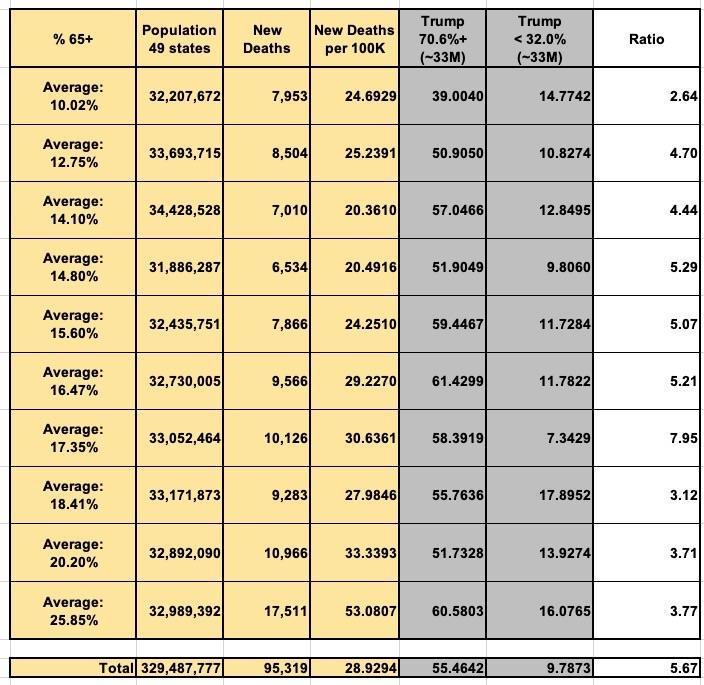
What happens if we compare just the reddest and bluest portions of the population within each of these brackets? That is, what if we look only at counties where Trump received more than 70% of the vote or less than 32% of the vote? This is precisely the comparison David Leonhardt used in the viral paragraph which kicked off this entire issue.
Here's what that looks like in a table...(remember, Nebraska data isn't available)...
...and here's what it looks like visually:
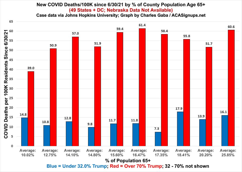
That's right: Even if you limit it to only counties with the highest percent of those age 65+, the death rate in the reddest counties is still nearly 3.8x higher than in the bluest counties. In fact, it's at least 2.6x higher in deep red counties than deep blue ones at every single bracket.
And so it goes. Get vaccinated and wear a mask until the pandemic is past us.
Advertisement
