

How much will YOU save with expanded subsidies under the #AmRescuePlan?
Wed, 03/10/2021 - 12:27pm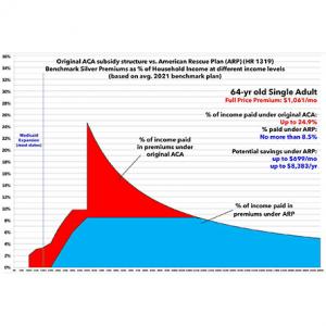
In early February, I posted a deep dive into HR 369, the Health Care Affordability Act, and how it would reduce net ACA premiums by permanently eliminating the income "subsidy eligibility cliff" (#KillTheCliff) and making the underlying subsidy formula more generous for all enrollees (#UpTheSubs).
I'm re-posting an updated, modified version of this analysis for two reasons:
- First, because HR 1319, the American Rescue Plan, is about to actually pass and be signed into law, with a slightly different formula from HR 369 embedded within it (if only for two years).
- Second, because my earlier analysis also threw in two other subsidy enhancement tables which confused the issue (California's state-based subsidies, and the predecessor to HR 369, both of which are/were less generous)
In this version I'm using the actual Advanced Premium Tax Credit (APTC) table under the American Rescue Plan, and I'm cutting out all references to the other two tables to avoid confusion.
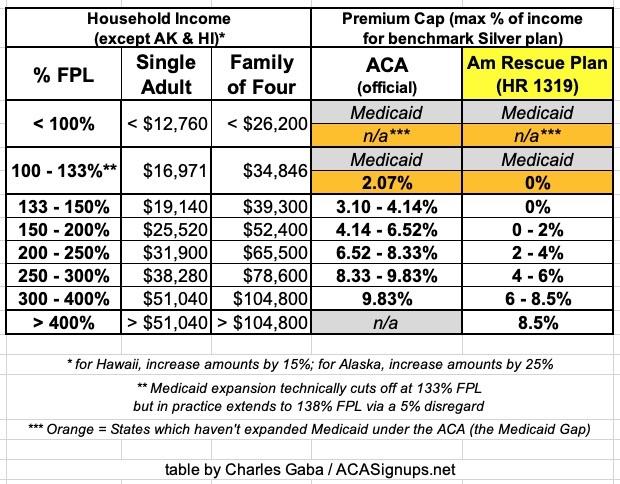
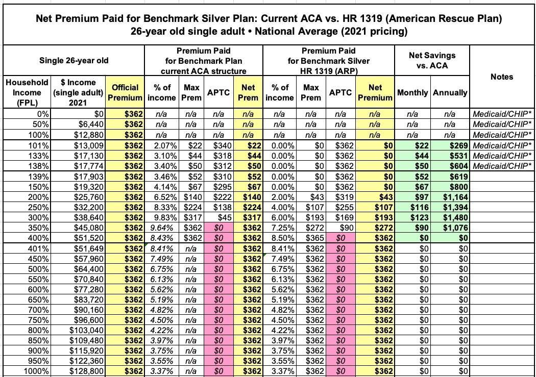
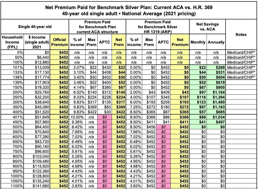
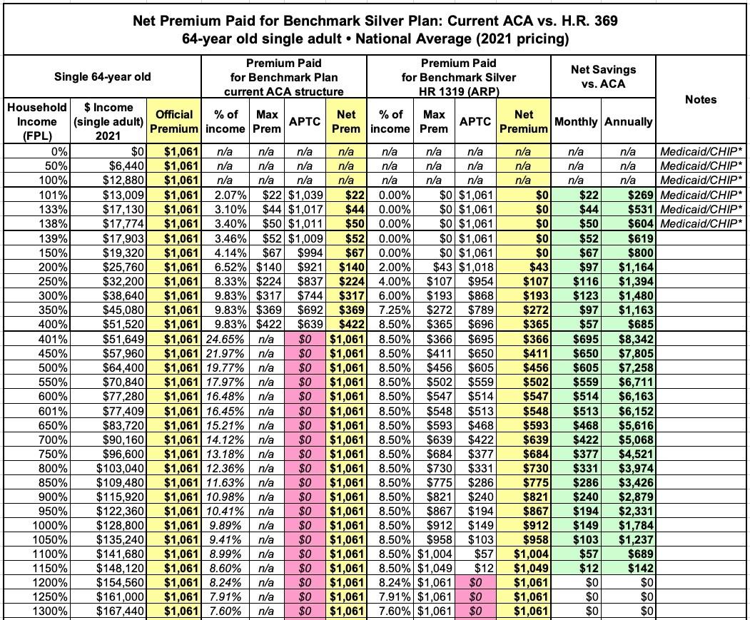
First of all, here's the final, official subsidy table under the ACA today vs. under the American Rescue Plan (ARP). This is the table which will be used at least for 2021 & 2022 (and yes, it's supposed to be retroactive to January 1st, 2021 for current ACA exchange enrollees):
As I've done in my earlier ACA 2.0 analyses, I'm using a total of eight different theoretical household examples:
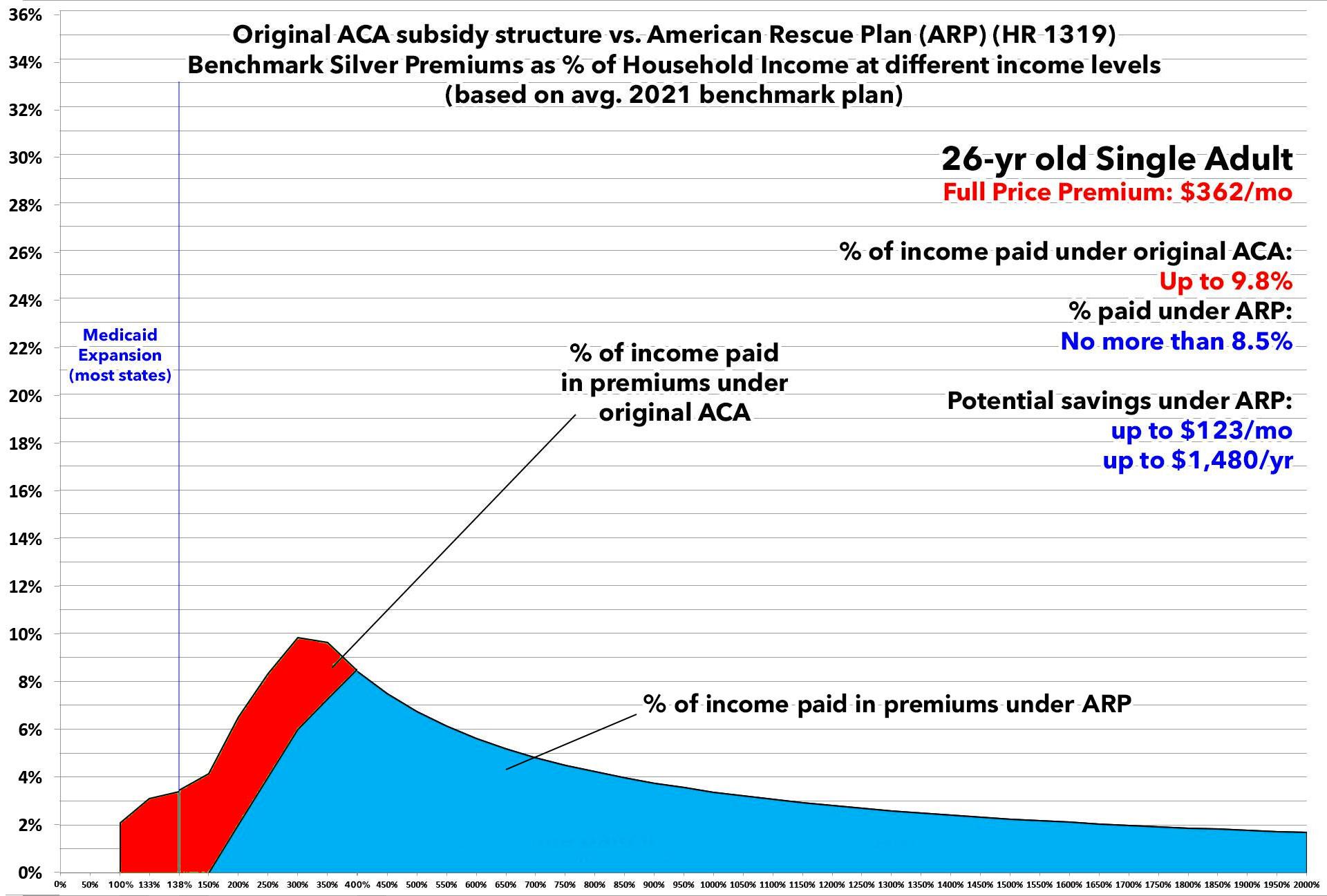
- A single 26-year old adult ("Young Invincible")
- A single 40-year old adult
- A single 50-year old adult
- A single 64-year old adult (waiting for Medicare)
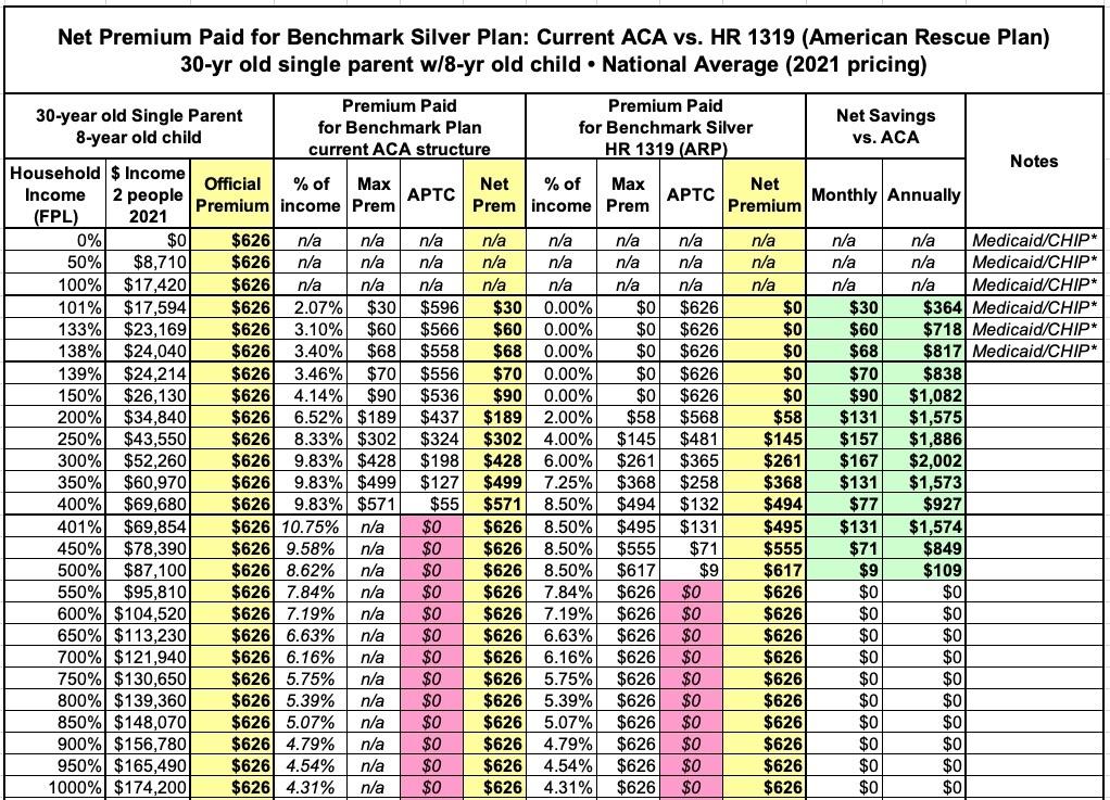
- A 30-year old single parent with an 8-yr old child
- A 40-year old couple with 2 children age 12 & 10 (Nuclear Family)
- A 50-year old couple with a 21-yr old adult child on their plan
- A 60-year old couple
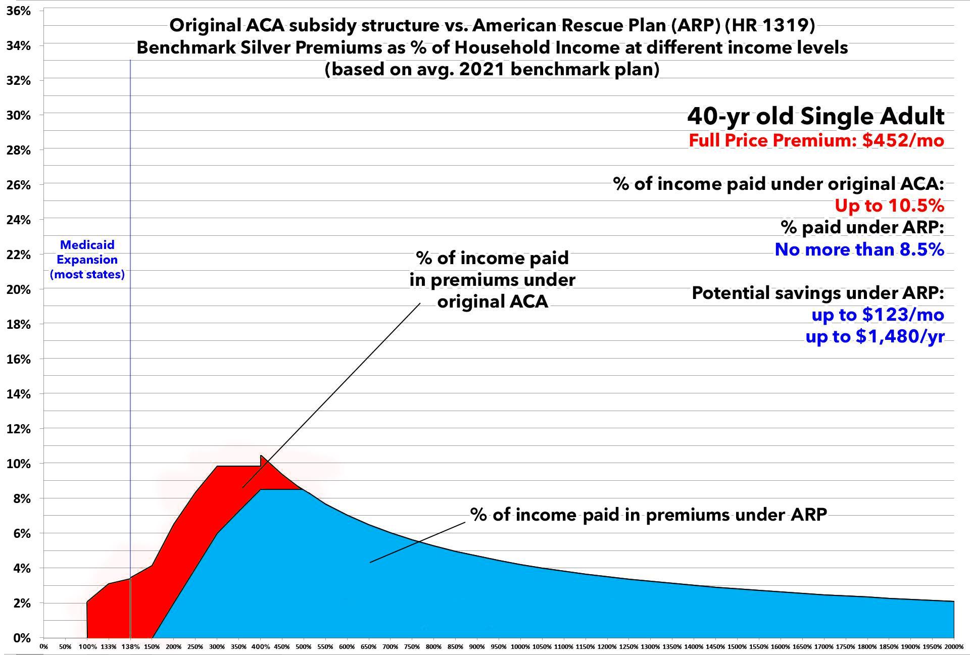
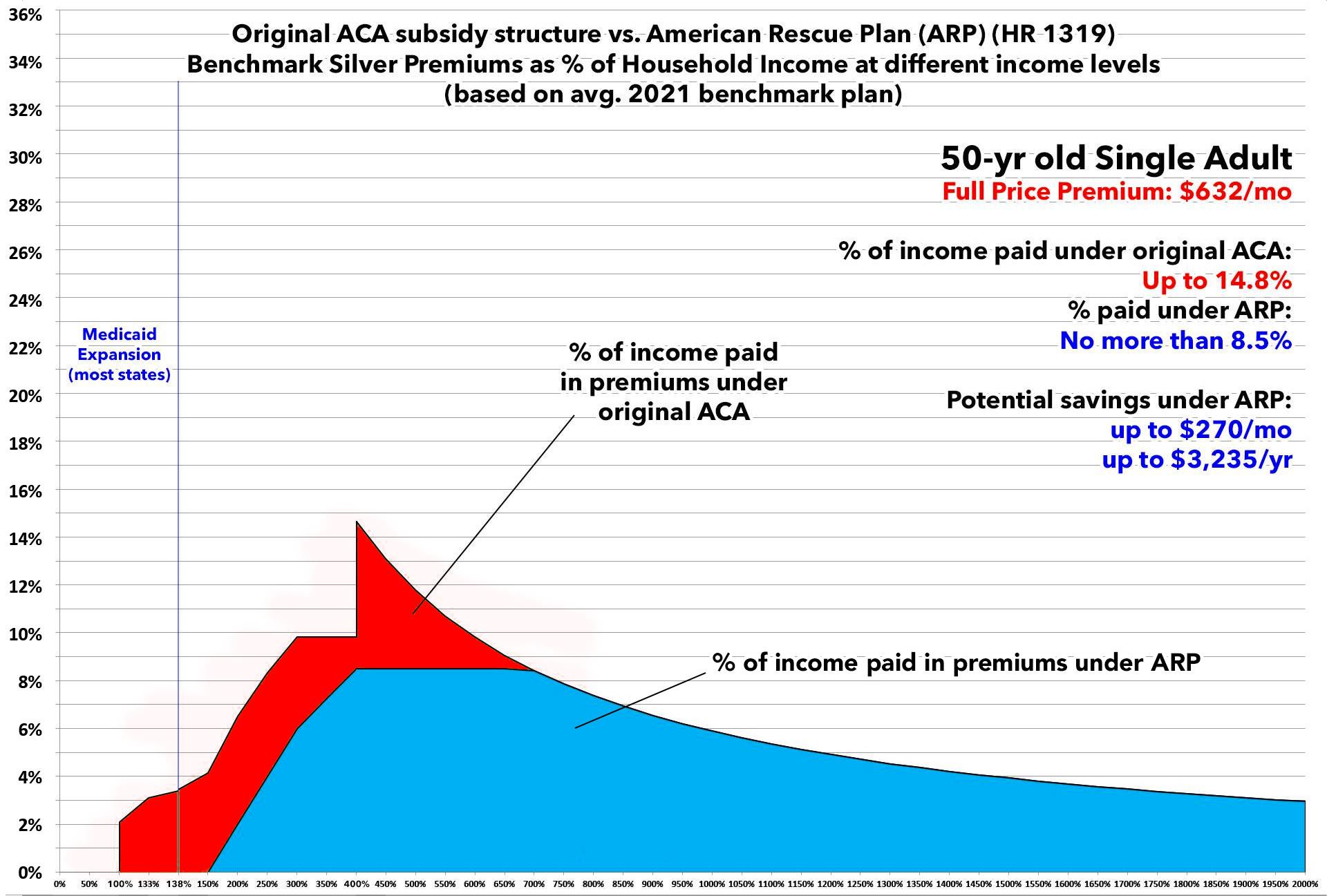
For the actual full-priced benchmark Silver plan, I'm basing all eight graphs on the average national benchmark premium for a 40-year old single adult in 2021, according to the Kaiser Family Foundation ($452/month). I then figured out the full-price premium for each of the other seven households based on the ACA's 3:1 age band premium ratio table.
It's important to remember that this is based on the national average benchmark premium; the actual benchmark premium varies greatly from state to state and even from county to county, so the actual savings could be significantly higher or lower depending on where you live (as well as the makeup of your household, of course).
One other caveat: In addition to Medicaid expansion for adults earning up to 138% FPL, some states also allow minor children to enroll in the Children's Health Insurance Program (CHIP) or Medicaid at higher income levels as well. Since this varies so widely from state to state and the thresholds vary so much, I haven't included it in the "Single Parent" or "Nuclear Family" graphs.
OK, with all that out of the way, let's get to the graphs! (you can click on each to get high-res versions). After the graphs, I've also posted a summary table listing the maximum potential savings for each household beyond any ACA subsidies they're currently receiving from the federal government.


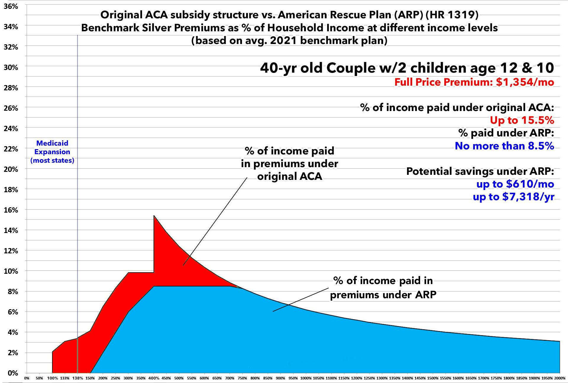

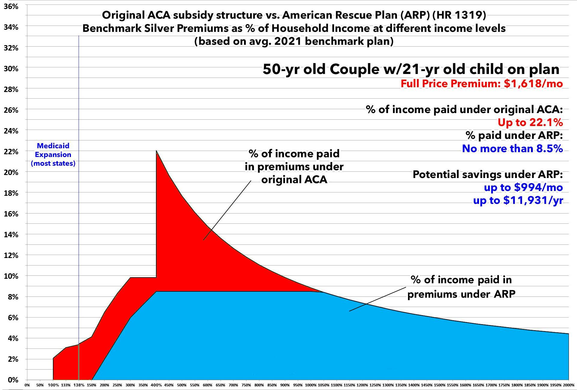
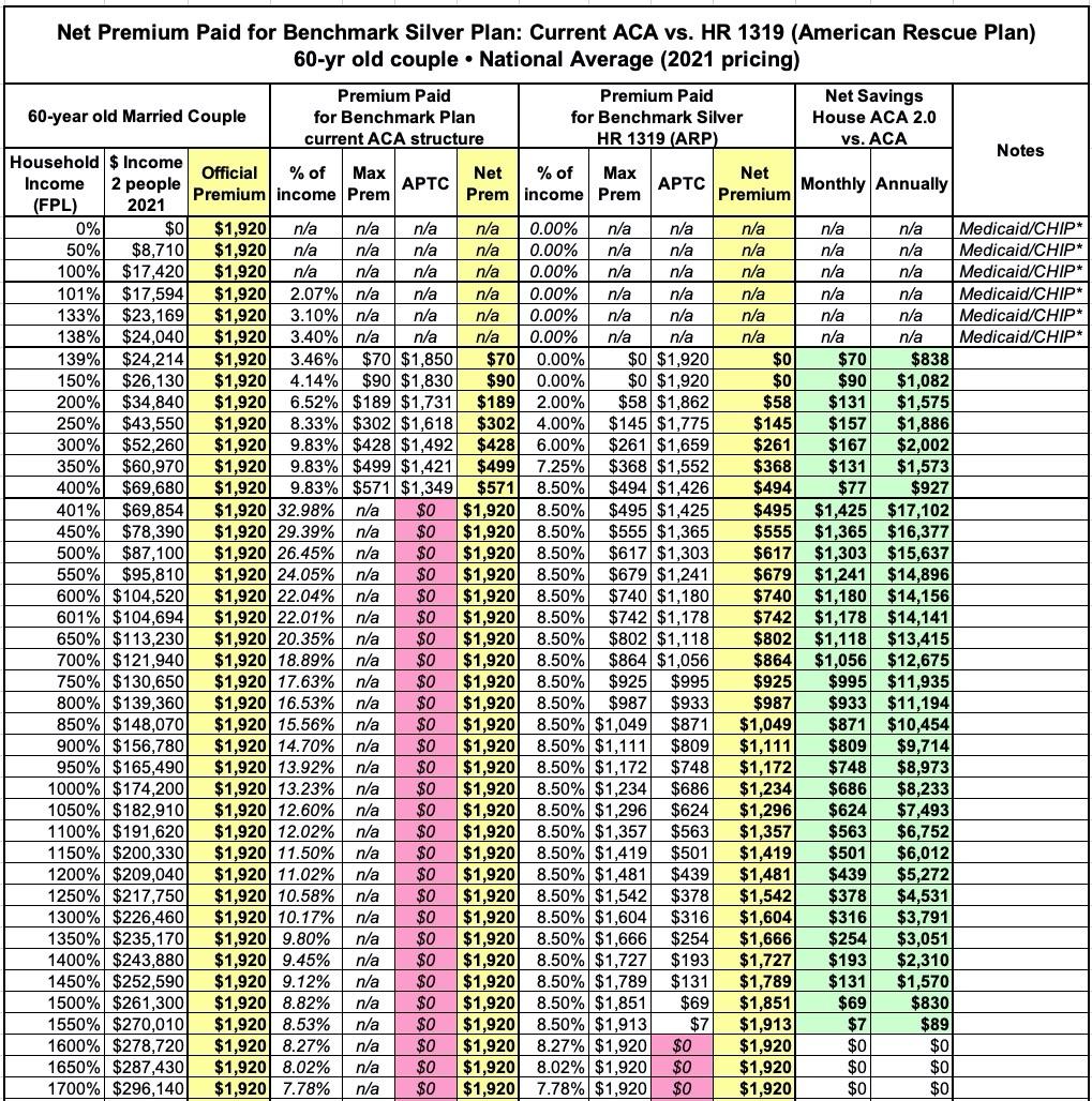

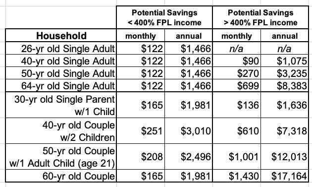
Again, the potential savings listed above are based on the average benchmark plan premium nationally and could vary greatly. Wyoming still has the highest average benchmark prices ($791/mo for a 40-year old)...but there are 10 counties in Oklahoma which have the highest benchmark prices ($886/mo) at the county level. This means the savings for the same households in those counties would be substantially higher. Minnesota has the lowest average benchmark prices ($307/mo)...but there's a couple of counties in Michigan (Lapeer and Genesee) which have the least-expensive benchmark ($295 for a 40-yr old), so the savings relative to that would be lower overall.
Advertisement
