

ACA 2.0: How much would YOU save in premiums under H.R. 369 (or H.R. 1319, aka the #AmRescuePlan)?
Tue, 02/02/2021 - 12:46pm
UPDATE: Everything below refers to HR 369, but the American Rescue Plan, HR 1319, contains a virtually identical expansion of ACA subsidies...if only for two years.
Note that under HR 1319 (AmRescuePlan), the first year would be retroactive, meaning that current ACA enrollees should receive additional subsidies dating back to January 2021, though I don't know what form that will take...rebate checks, credit towards future premiums or an extra tax refund next spring.
Over the past couple of years, one of the things I've become known for is my obsessive fixation on visually displaying how much various households would save on healthcare premiums if various ACA subsidy-boosting bills were passed compared with the current ACA subsidy structure.
For the most part, I've focued on the Advance Premium Tax Credit (APTC) subsidy table first proposed way back in August 2015 by Linda J. Blumberg and John Holahan of the Urban Institute. The previous Big Supreme Court ACA Lawsuit Ruling had just come out (King vs. Burwell), and with the ACA having just been spared yet again (temporarily), Blumberg & Holahan proposed two major enhancements to the law:
- #KillTheCliff: That is, eliminate the upper-bound subsidy eligibility income cap of 400% of the Federal Poverty Line (FPL).
- #UpTheSubs: That is, beef up the the underlying subsidy table to be more generous across the board.
Their proposed table would have changed the maximum net premiums various households pay for an ACA benchmark Silver plan (the 2nd lowest-cost ACA plan available in their area) like so:
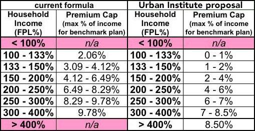
For five years, the proposed table above was the gold standard among "ACA 2.0" Democrats (metaphorically, that is; it would still keep the benchmark plan based on Silver plans, not Gold). Everyone from Hillary Clinton (in 2016) to the House Democrats to Elizabeth Warren (in her 2018 "CHIPA" ACA 2.0 bill) to Pete Buttigieg and even Joe Biden appeared to adopt this proposal as one of the most important parts of the next phase of improving the ACA (Warren and Biden did, however, also propose upgrading the benchmark plan from Silver to Gold). This exact formula was the basis of both Rep. Lauren Underwood's 2019 "Health Care Affordability Act" (H.R. 1868) as well as the larger, more comprehensive ACA 2.0 bill proposed by House Democrats (H.R. 1884).
Last summer, however, an interesting thing happened: The House Democrats actually passed a revised version of H.R. 1884 called, appropriately enough, the Affordable Care Enhancement Act (H.R. 1425)...and along with a whole bunch of other important ACA protections and improvements, it included a more generous APTC subsidy table.
The new table still maxes premiums out at 8.5% of household income, but the formula below that threshold was beefed up further yet, like so (I've also added the actual income cut-off in dollars for each bracket for both a single adult and a family of four for reference.):
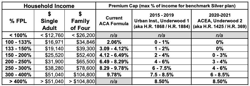
As I noted last week, it seems virtually certain at this point that the new formula in the right-hand column, which sets net premiums to $0 for incomes up to 150% FPL, is the new consensus table among Democrats. Not only is this the table used in H.R. 1425 (which, again, actually passed the House last summer, even if it was doomed in the then-GOP controlled Senate at the time), but it's also used in Rep. Underwood's new Health Care Affordability Act of 2021 which was just introduced a week or so ago.
Furthermore, as my colleague Dave Anderson noted recently, this new table also appears to be the one used in Senator Mark Warner's just-announced Health Care Improvement Act of 2021 (sure enough, here's the text...the same table is on Page 3). It is almost certain that this is the same APTC table which will be included in President Biden's pending American Rescue Plan.
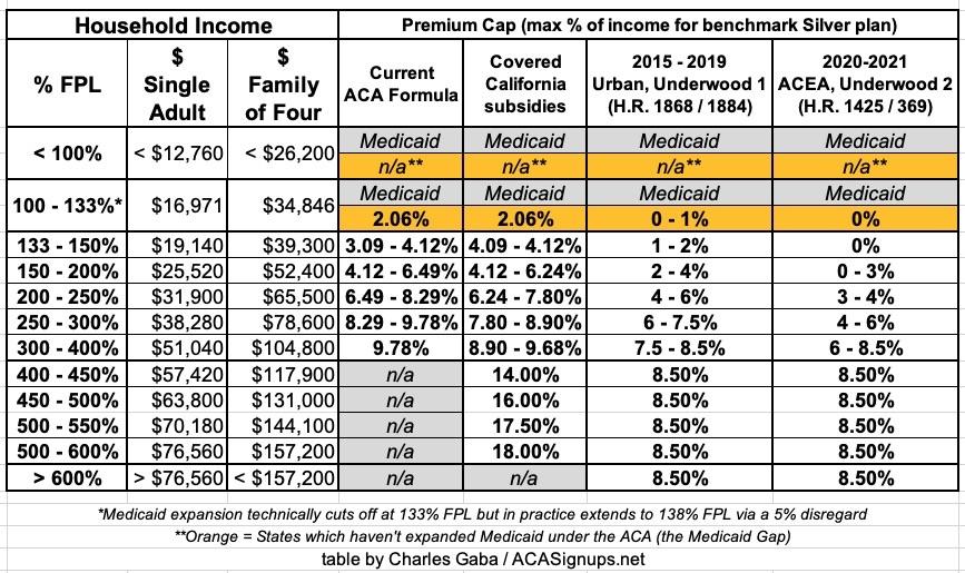
With all of this in mind, I've recompiled and recreated brand-new subsidy savings tables and graphs for a variety of household situations using the new ACA 2.0 table so people can get a sense of how much they'd save in premiums at different income levels compared to the current ACA subsidy formula.
In additon, I'm also including both the prior table as well as the vastly scaled-down state subsidy enhancements already being offered by Covered California for comparison. Covered CA's state subsidies max premiums out at 18% of income at the upper end and don't kill the subsidy cliff entirely (they extend it out to 600% FPL instead of 400%), but it's still a huge help to many Californians in the short term, especially older enrollees in the 400 - 500% FPL income range.
Here's a final table which includes all four formulas. I've also added rows to distinguish between states which have expanded Medicaid under the ACA and those which haven't, which makes a big difference for those in the 100 - 138% FPL income range:
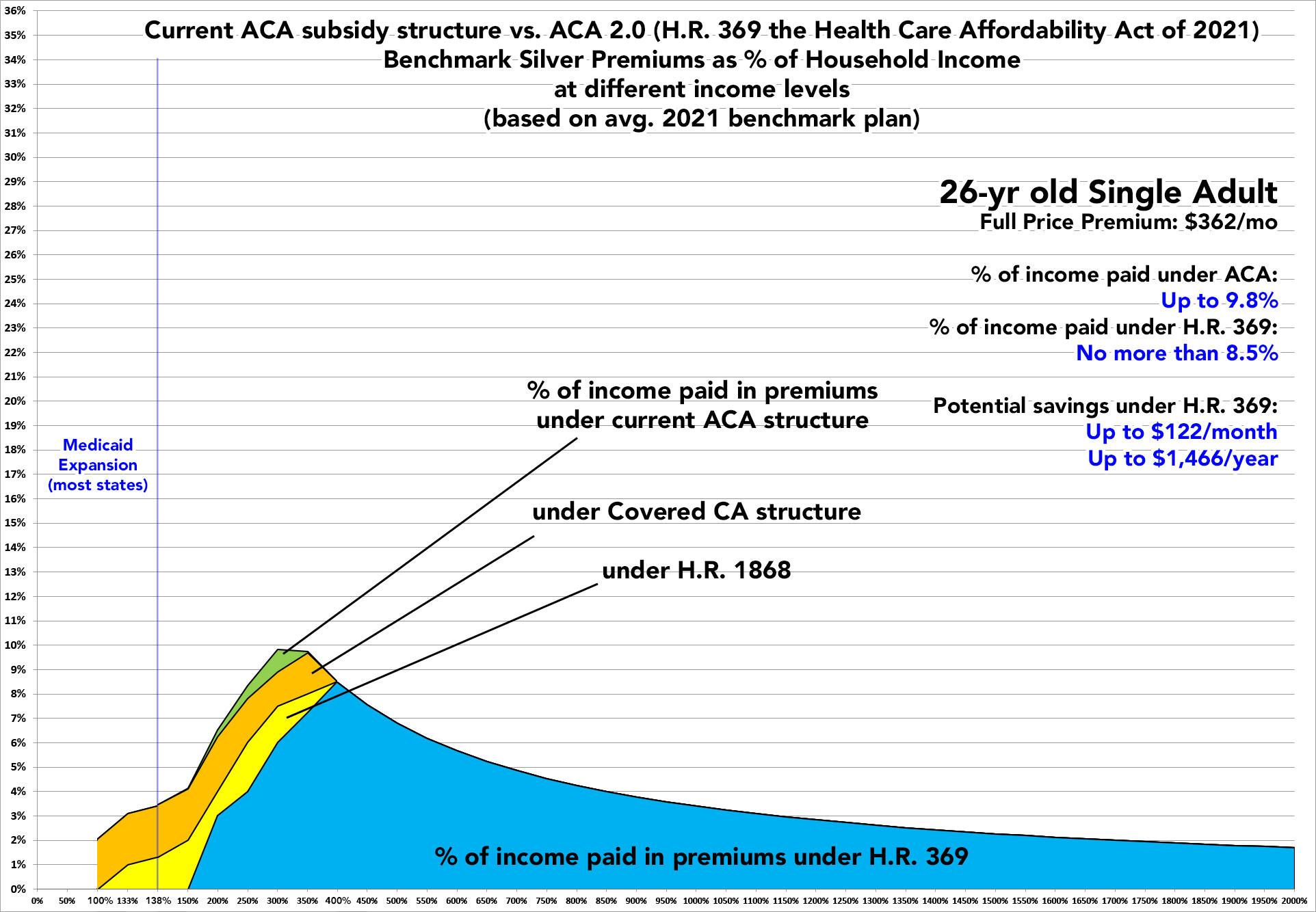
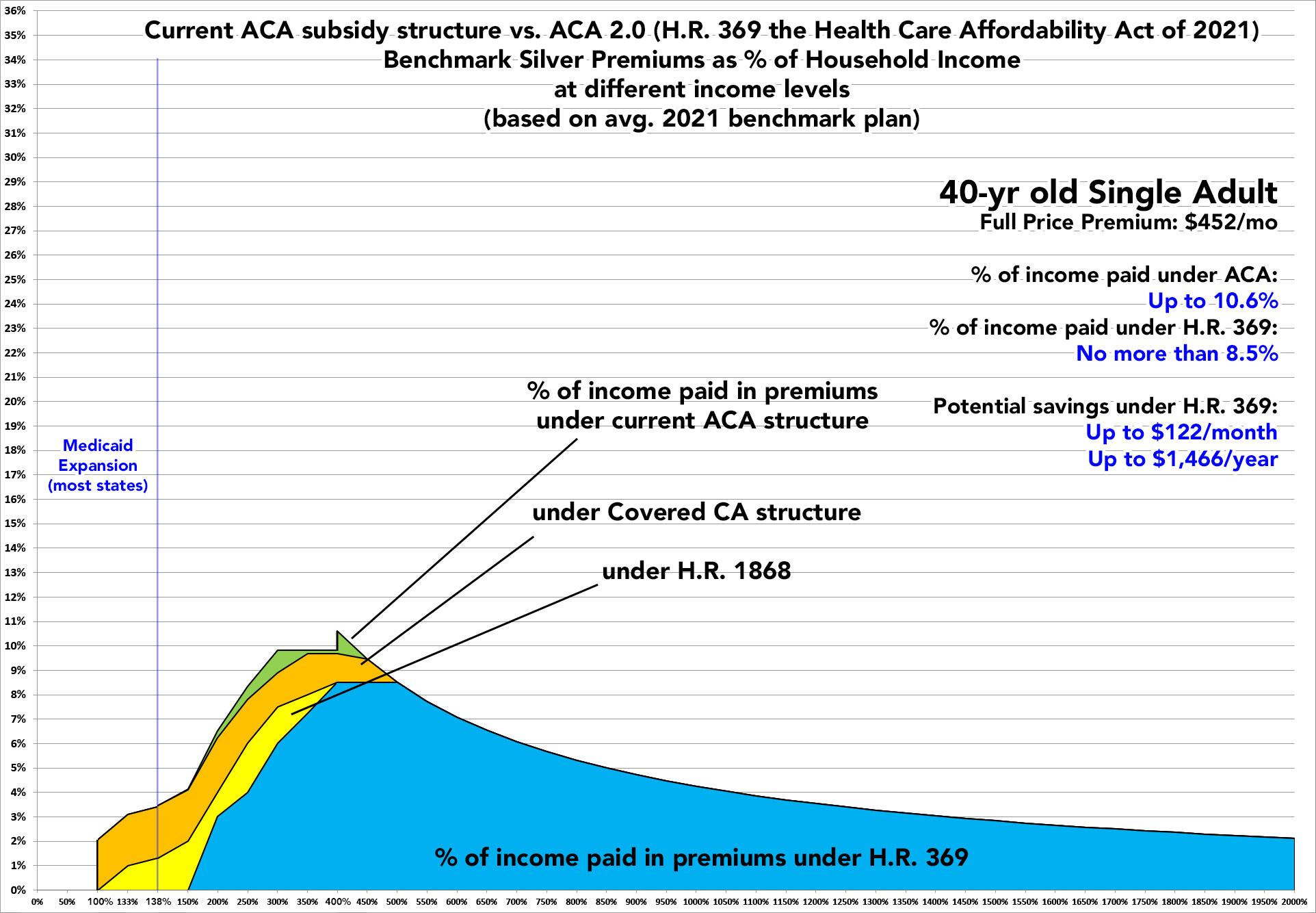
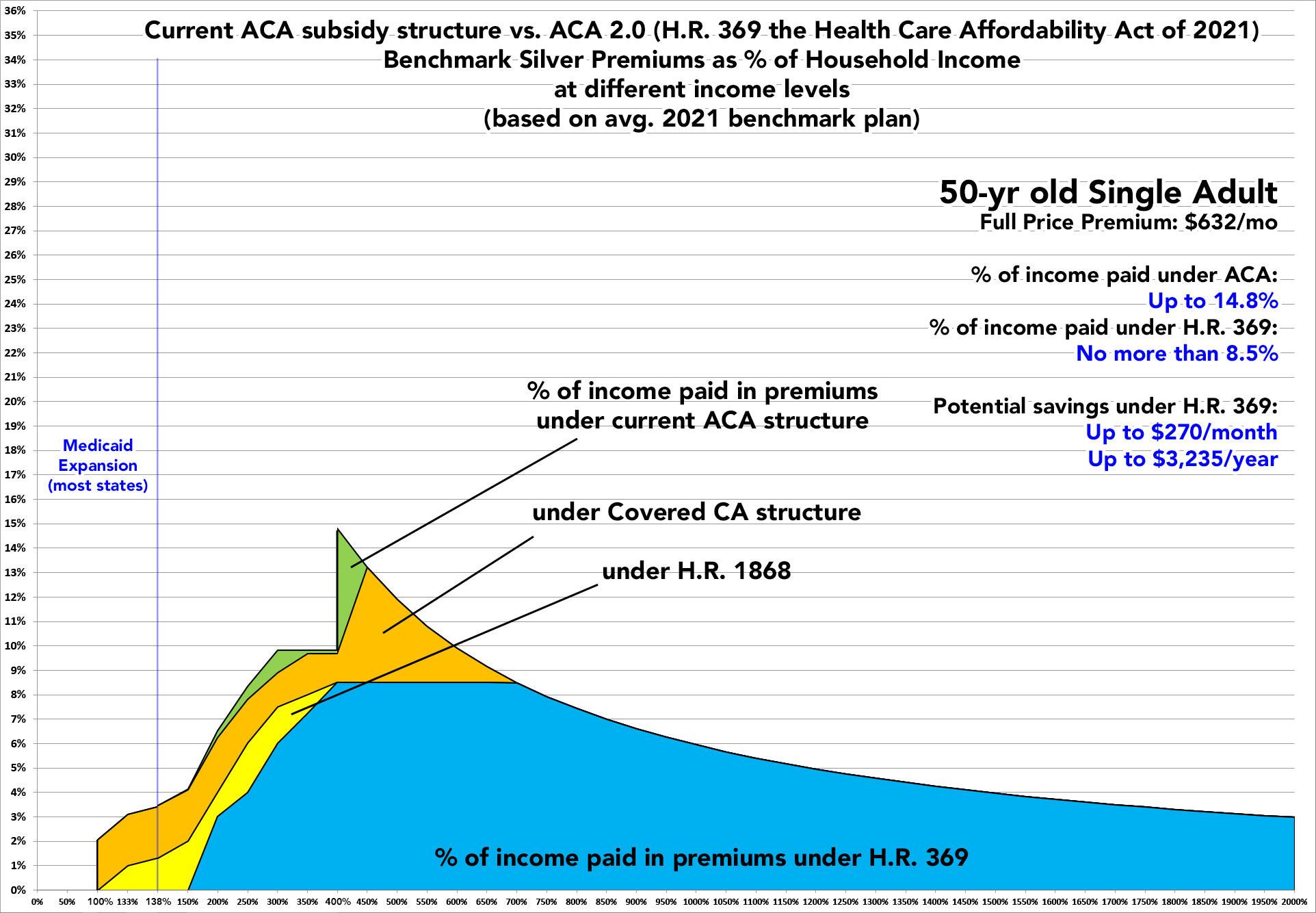
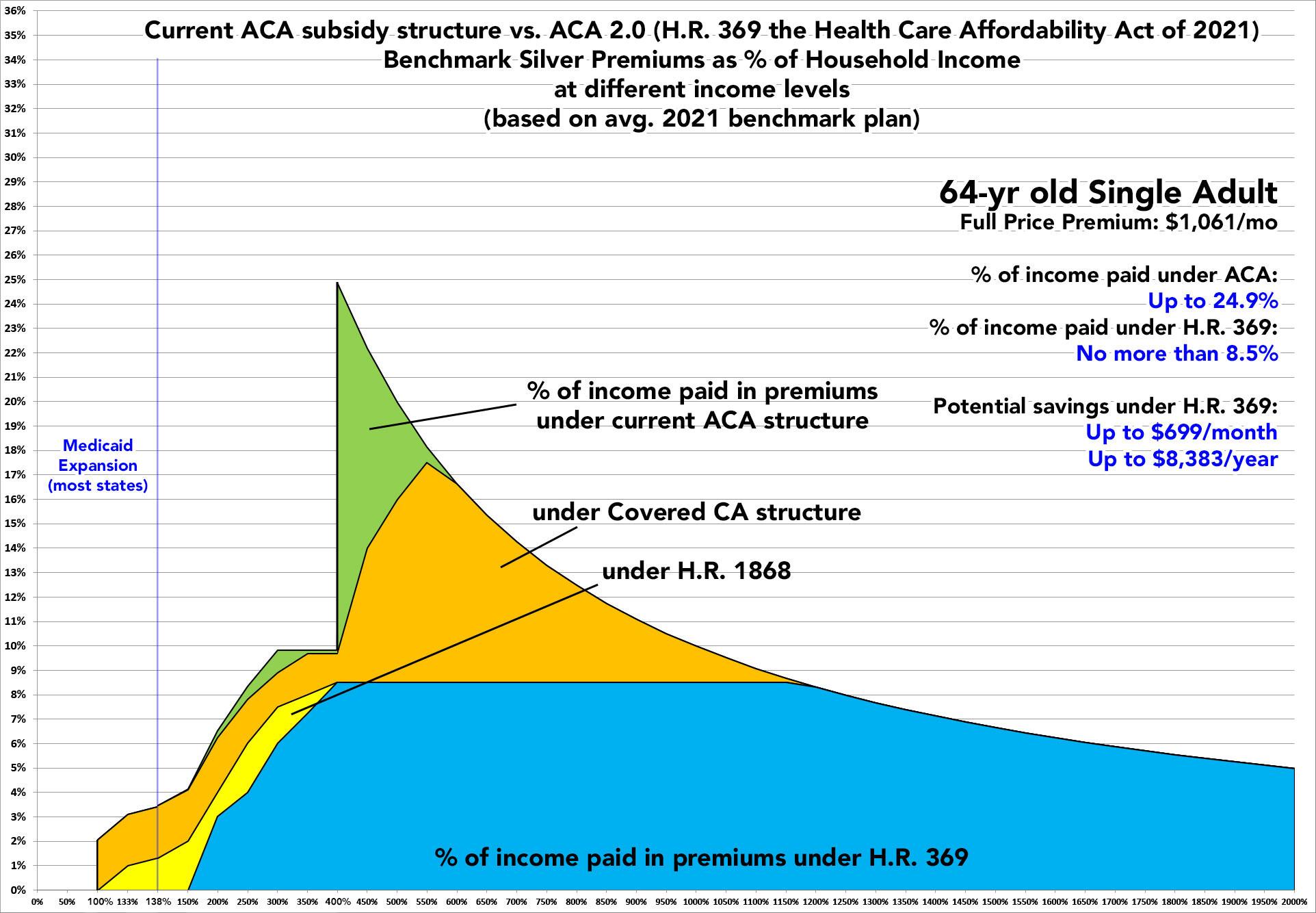
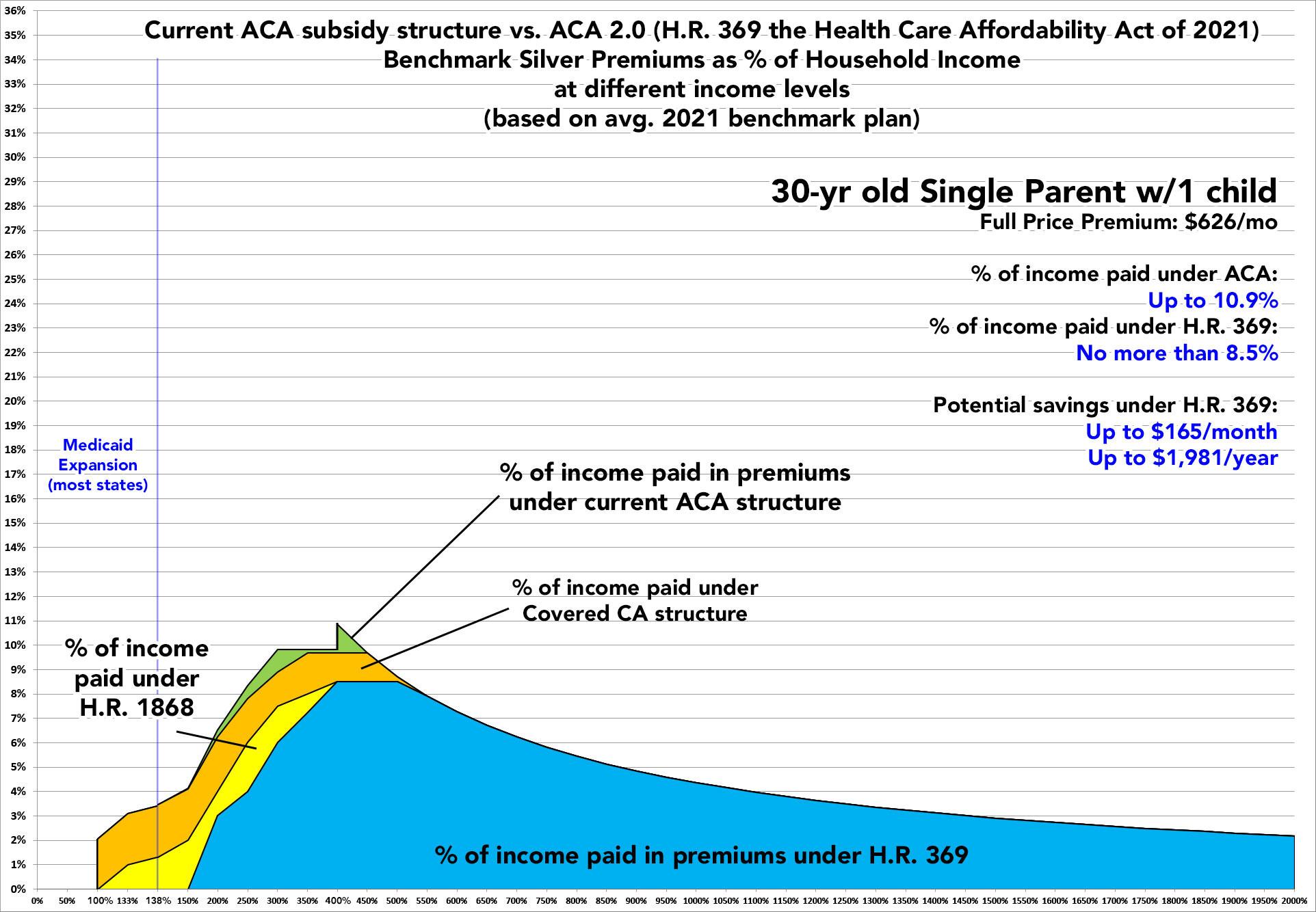
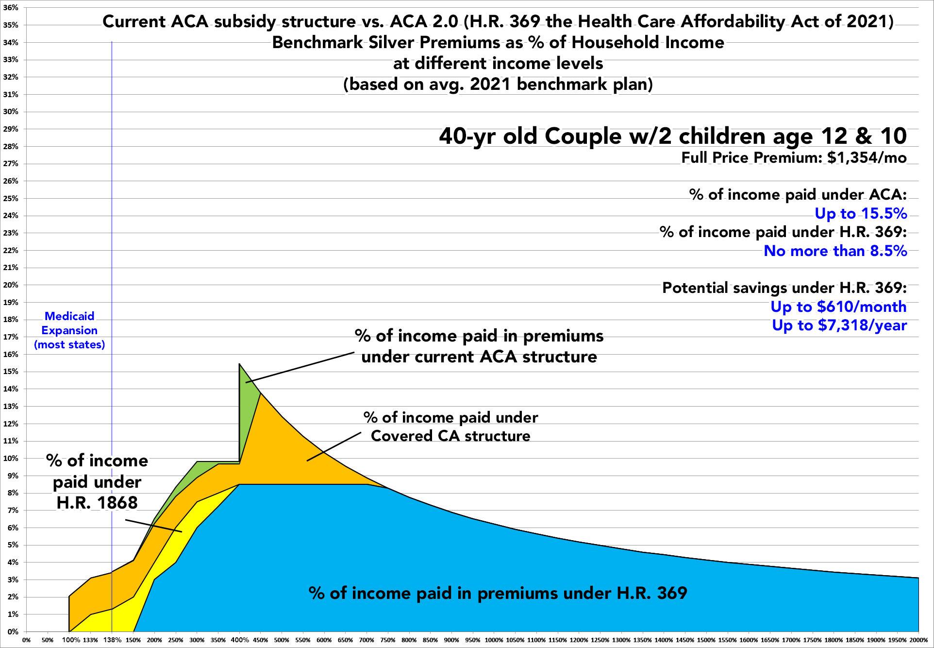
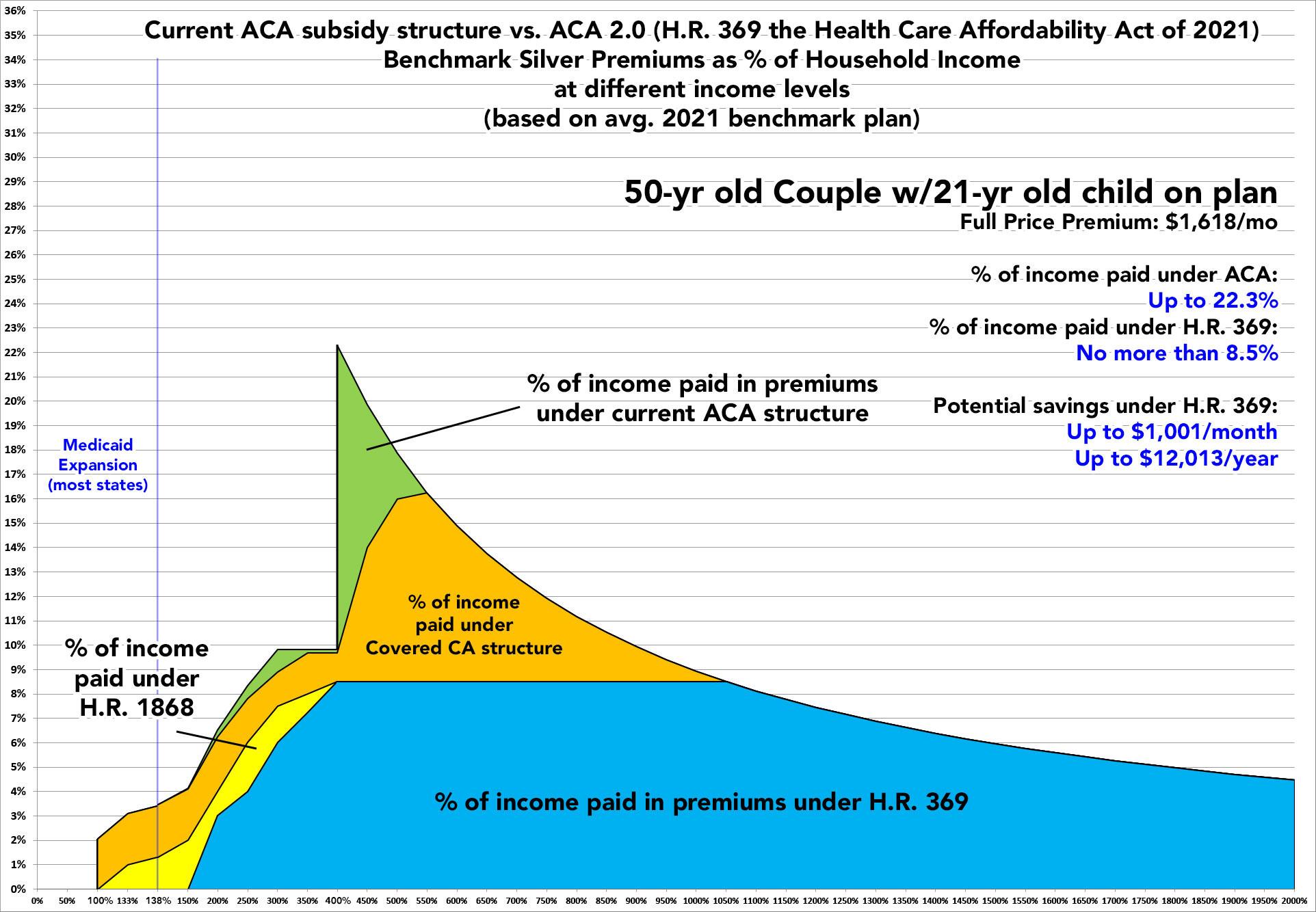
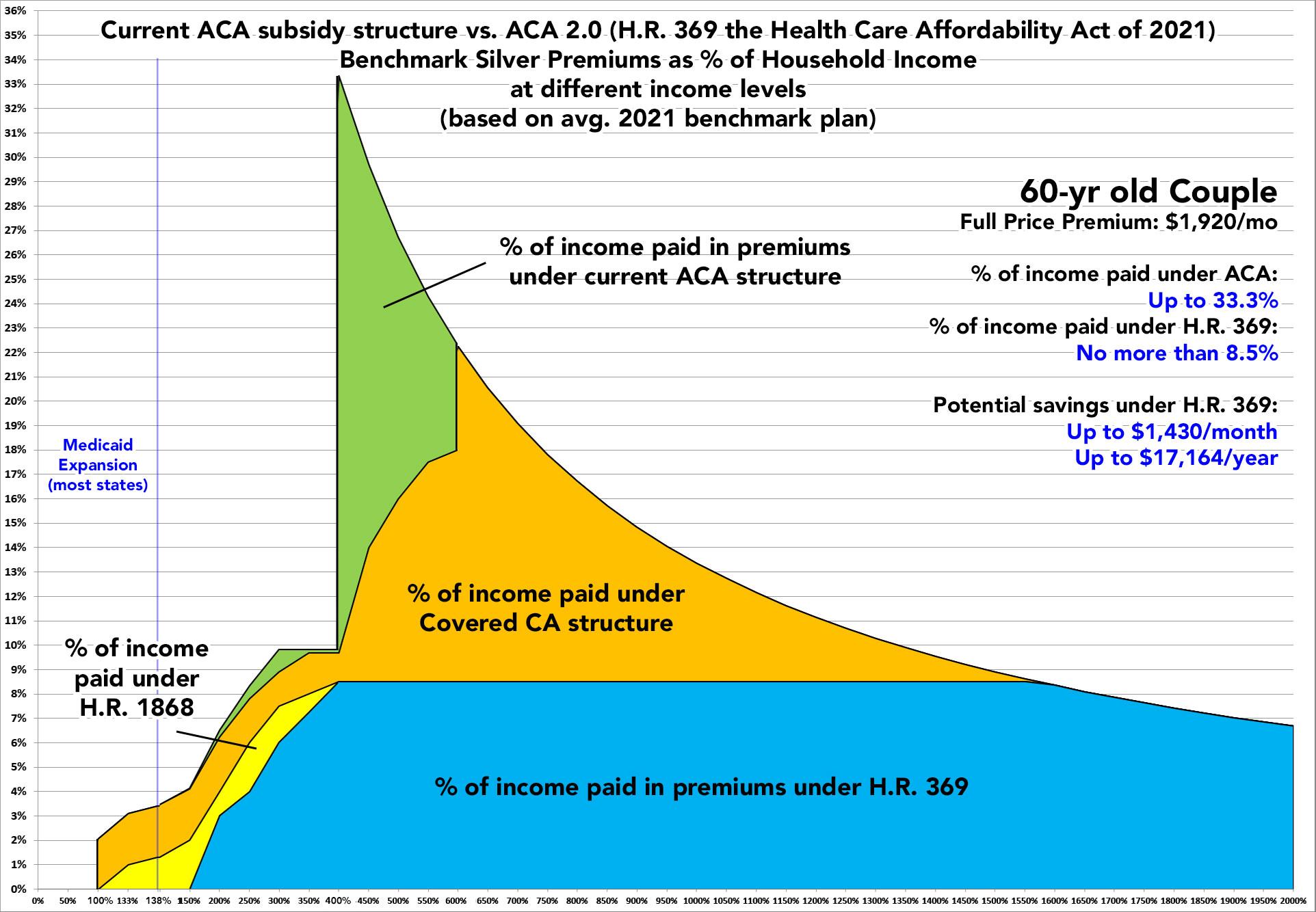
As I did in my earlier ACA 2.0 analyses, I'm using a total of eight different theoretical household examples:
- A single 26-year old adult ("Young Invincible")
- A single 40-year old adult
- A single 50-year old adult
- A single 64-year old adult (waiting for Medicare)
- A 30-year old single parent with 1 child age 8
- A 40-year old couple with 2 children age 12 & 10 (Nuclear Family)
- A 50-year old couple with 1 adult child on their plan age 21
- A 60-year old couple
For the actual full-priced benchmark Silver plan, I'm basing all eight graphs on the average national benchmark premium for a 40-year old single adult in 2021, according to the Kaiser Family Foundation ($452/month). I then figured out the full-price premium for each of the other seven households based on the ACA's 3:1 age band premium ratio table.
It's important to remember that this is based on the national average benchmark premium; the actual benchmark premium varies greatly from state to state and even from county to county, so the actual savings could be significantly higher or lower depending on where you live (as well as the makeup of your household, of course).
One other caveat: In addition to Medicaid expansion for adults earning up to 138% FPL, some states also allow minor children to enroll in the Children's Health Insurance Program (CHIP) or Medicaid at higher income levels as well. Since this varies so widely from state to state and the thresholds vary so much, I haven't included it in the "Single Parent" or "Nuclear Family" graphs.
OK, with all that out of the way, let's get to the graphs! (you can click on each to get high-res versions). After the graphs, I've also posted a summary table listing the maximum potential savings for each household beyond any ACA subsidies they're currently receiving from the federal government.
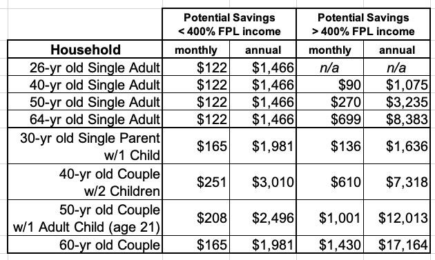
Again, the potential savings listed above are based on the average benchmark plan premium nationally and could vary greatly. According to the Kaiser Family Foundation, Wyoming still has the highest average benchmark prices ($791/month for a 40-year old), which means the savings for the same households above in that state would be substantially higher; Minnesota has the lowest average benchmark prices ($307/month), so the savings relative to that would be lower overall.
Advertisement
