

NCHS: 70% of COVID deaths since June have been among White people? (w/important caveats) (updated)
Mon, 12/27/2021 - 7:13pm
NOTE: See important updates towards the bottom, including age-adjusted versions of both the monthly & cumulative graphs.
Back in August, a very smart & savvy Twitter friend of mine who goes by the name of Propane Jane started a thread about the racial (and racist) aspects of the COVID pandemic response, both in terms of infection, death & vaccination rates as well as other societal policies like in-person schools, mask mandates and so forth. It's a great thread and I highly recommend reading the whole thing, which starts here.
She's continued to update the thread from time to time (the most recent update was on November 30th), but there was one tweet mid-thread which caught my eye the other day:
Much of the White peer pressure to refuse all Covid prevention strategies ignited after early reports showed Blacks/Hispanics/Natives were disproportionately dying from it. Now despite 58% of deaths occurring amongst Whites, many still presume both superiority and invincibility.
— Propane Jane (@docrocktex26) August 21, 2021
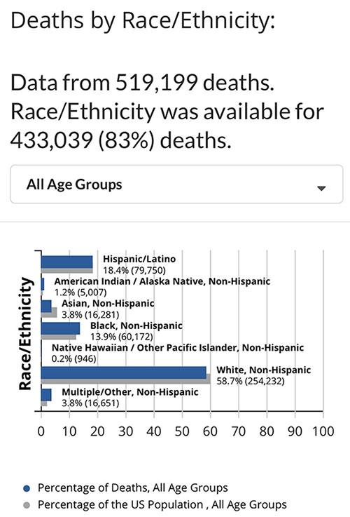
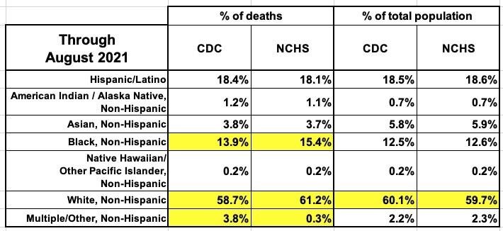
This tweet and the screen shot from the CDC's Demographic Trends of COVID-19 cases and deaths in the US reported to CDC were from August 21st, 2021.
At the time, the breakout looked like the table below. The death rate among Native Americans/Alaska Natives was massively disproportionate to their percent of the total U.S. population, while Asian Americans had been dying of COVID at a far lower rate relative to their total population.
Black Americans, Native Hawaiians & other Pacific Islanders were dying at a rate around 9-11% higher than their overall population, while Hispanic/Latinos were pretty much right in line proportionately.
Non-Hispanic White Americans, meanwhile, were slightly below their overall proportion:
The "Multiple/Other" category looks seriously out of whack, but it's combining people with ethnicities which don't fall into a simple category with people who define themselves as being multi-racial and so forth, so I'm not sure what to make of it.
It's important to note that this only incluced racial/ethnic status data for 433,000 deaths (the national total was around 632,000 at the time). It's also important to note this disclaimer:
CDC is working with states to provide more information on race/ethnicity for reported cases. The percent of reported cases that include race/ethnicity data is increasing.
These data only represent the geographic areas that contributed data on race/ethnicity. Every geographic area has a different racial and ethnic composition. These data are not generalizable to the entire U.S. population.
If cases were distributed equally across racial and ethnic populations, one would expect to see more cases in those populations that are more highly represented in geographic areas that contributed data.
Percentages displayed in the charts below represent the percent of cases or deaths for which the demographic variable of interest is known.
There's also a lengthy footnote at the bottom of the page, which includes this section which seems relevant here:
...Demographic data for COVID-19 cases and deaths is based on a subset of individuals where case-level data are reported by state and territorial jurisdictions to the Centers for Disease Control and Prevention (CDC) since January 21, 2020. Demographic data have varying degrees of missing data and are not generalizable to the entire population of individuals with COVID-19.
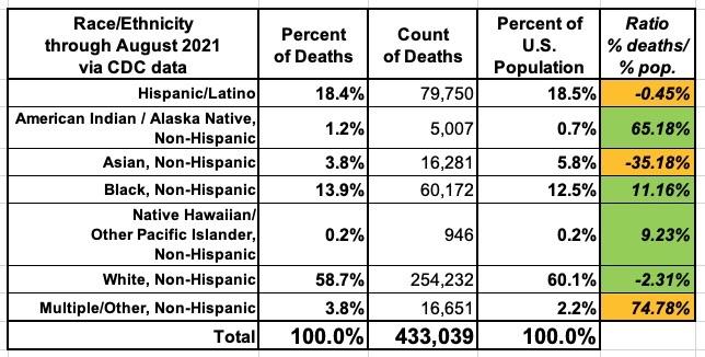
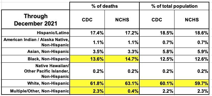
I decided to take another look at this CDC data to see where things stand today:
When you add another 4 months of COVID death data, you can see that the proportions have shifted within each category:
- Hispanic/Latino: From 18.4% to 17.4%, or from 0.5% lower than their national proportion to 6.1% lower.
- Native American/AK Native: From 1.2% to 1.1%...which may seem minor, but this means they're "only" dying at a rate 61.4% higher now instead of 65.2% higher.
- Asian: 3.8% to 3.5%...39% lower than their share of the U.S. population would indicate.
- Black: 13.9% to 13.6%...still higher than it "should" be, but "only" 8.5% higher now.
- Multiple/Other: Wow...it looks like they've made some major methodology/categorization improvements since August; this is now almost identical to the percent of the national population.
Notice how all 5 of the categories above have dropped as a portion of total deaths with racial/ethnic data available.
There's one exception, however: White Americans, who made up 58.7% of the total back in August, now make up 61.8%, a 3.1 percentage point increase. They went from running 2.3% less than their total portion of the U.S. population to 2.9% more.
This may not seem like a huge change, but the implications are enormous...especially when combined with the other COVID death rate trends I've been tracking for many months now.
However, I also found another interesting data file at the CDC website which relates to COVID death rates by racial/ethnic status which has some very different estimates:
Provisional COVID-19 Deaths: Distribution of Deaths by Race and Hispanic Origin
This data file contains the following indicators that can be used to illustrate potential differences in the burden of deaths due to COVID-19 according to race and ethnicity: Count of COVID-19 deaths, distribution of COVID-19 deaths, unweighted distribution of population, and weighted distribution of population.
Huh. That sure as hell sounds like the same thing as the tables above, doesn't it?
THIS data set comes from the National Center for Health Statistics, which is a subdivision of the Centers for Disease Control:
Note: Provisional death counts are based on death certificate data received and coded by the National Center for Health Statistics as of December 22, 2021. Death counts are delayed and may differ from other published sources (see Technical Notes). Counts will be updated every Wednesday by 5pm. Additional information will be added to this site as available.
Huh. OK...the Technical Notes include the following:
The provisional counts for coronavirus disease (COVID-19) deaths are based on a current flow of mortality data in the National Vital Statistics System. National provisional counts include deaths occurring within the 50 states and the District of Columbia that have been received and coded as of the date specified. It is important to note that it can take several weeks for death records to be submitted to National Center for Health Statistics (NCHS), processed, coded, and tabulated. Therefore, the data shown on this page may be incomplete, and will likely not include all deaths that occurred during a given time period, especially for the more recent time periods. Death counts for earlier weeks are continually revised and may increase or decrease as new and updated death certificate data are received from the states by NCHS. COVID-19 death counts shown here may differ from other published sources, as data currently are lagged by an average of 1–2 weeks.
Comparing data in this report to other sources
Provisional death counts in this report will not match counts in other sources, such as media reports or numbers from county health departments. Death data, once received and processed by National Center for Health Statistics (NCHS), are tabulated by the state or jurisdiction in which the death occurred. Death counts are not tabulated by the decedent’s state of residence. COVID-19 deaths may also be classified or defined differently in various reporting and surveillance systems. Death counts in this report include laboratory confirmed COVID-19 deaths and clinically confirmed COVID-19 deaths. This includes deaths where COVID-19 is listed as a “presumed” or “probable” cause. Some local and state health departments only report laboratory-confirmed COVID-19 deaths. This may partly account for differences between NCHS reported death counts and death counts reported in other sources. Provisional counts reported here track approximately 1–2 weeks behind other published data sources on the number of COVID-19 deaths in the U.S. (1,2,3).
Nature and sources of data
Provisional death counts are based on death records received and processed by NCHS as of a specified cutoff date. National provisional counts include deaths occurring within the 50 states and the District of Columbia. NCHS receives the death records from state vital registration offices through the Vital Statistics Cooperative Program. Provisional data are based on available records that meet certain data quality criteria at the time of analysis and may not include all deaths that occurred during a given time period especially for more recent periods. Estimates of completeness are provided. Therefore, they should not be considered comparable with final data and are subject to change.
Finally we get to the heart of the matter:
Estimated distributions of COVID-19 deaths and population size by race and Hispanic origin
The percentages of COVID-19 deaths by race and Hispanic origin were calculated by dividing the number of COVID-19 deaths for each race and Hispanic origin group by the total number of COVID-19 deaths. Percentages may not sum to 100 due to rounding.
In April and May 2020, the majority of COVID-19 deaths in the U.S. occurred in urban areas that have a larger percentage of their populations that are non-Hispanic black, non-Hispanic Asian, or Hispanic, and a smaller percentage that are non-Hispanic white. Weighted population distributions use county-level data to more closely align the population distributions with the specific areas where COVID-19 deaths were occurring. To account for the geographic clustering of COVID-19 deaths, weighted population distributions, which more closely matched the areas initially most affected by COVID-19 deaths, were provided in order to reflect differential risk within the areas most affected by COVID-19 deaths. As the pandemic has become more widespread across the U.S., there is less need to align the population distributions with the specific geographic areas experiencing COVID-19 outbreaks and mortality. While weighted estimates are no longer included in the data visualization, the estimates can still be found in the data file.
It then goes into a long paragraph explaining how the weighting is done...even though, if I'm understanding the above correctly, weighting is no longer really needed anyway (and likely hasn't been for some time now).
They also include a caveat regarding Hispanic/Latino, API & AIAN deaths:
Quality of Race and Hispanic Origin Data
Race and Hispanic origin data from death certificates are not available for 0.3% of all deaths and 0.7% of deaths involving COVID-19. Death data for Hispanic, non-Hispanic American Indian or Alaska Native (AIAN), and non-Hispanic Asian or Pacific Islander (API) persons should be interpreted with caution because of inconsistencies in reporting Hispanic origin or race on the death certificate compared with censuses, surveys, and birth certificates. The latest research on race and Hispanic origin misclassification on death certificates shows that deaths are underreported by 33% for non-Hispanic AIAN, 3% for non-Hispanic API, and 3% for Hispanic decedents.
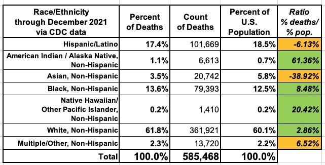
With all this in mind, here's what the COVID-19 racial/ethnic category death estimates from the National Center for Health Statistics looks like cumulatively through December 18, 2021:
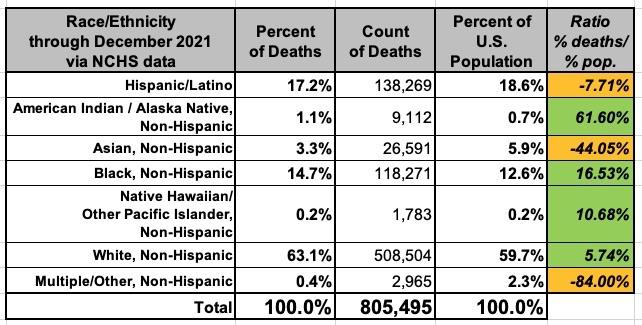
Unlike the CDC estimate, which only includes about 73% of all U.S. COVID deaths since the pandemic started, the NCHS estimate purports to include nearly all U.S. deaths to date (over 800K thru December 18th). Also notice that while there are some slight variances within each racial/ethnic category, overall most of them match within a tenth of a percentage point or two...and this is using the unweighted NCHS data:
So, which of these is more accurate? Honestly, I don't know, although both of them seem to be at least within the same ballpark. I even compared the NCHS's cumulative numbers from August to compare against the CDC's August 2021 numbers above, and they were reasonably close to each other at the time as well...again, using unweighted NCHS data:
I do know that the NCHS database includes monthly breakouts of deaths by racial/ethnic categories as well as including nearly 100% of all COVID deaths to date, giving me enough data to graph on both a month-by-month and over-time basis.
WITH ALL OF THIS IN MIND, here's what the NCHS racial/ethnic death data looks like for each month of the pandemic starting in March 2020. Keep in mind that the December 2021 bar only runs through 12/18. The dotted lines show what percent of the total U.S. population is composed of each racial/ethnic group:
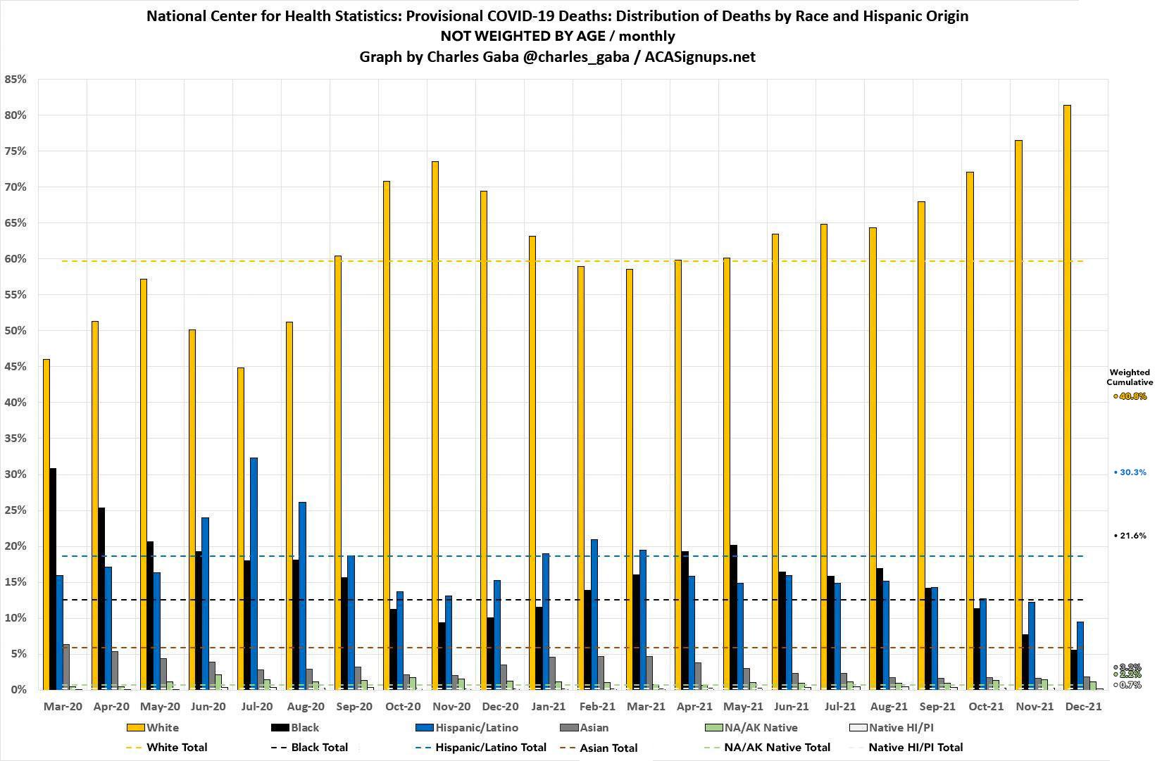
According to the NCHS data, White Americans have made up an increasing percentage of total U.S. COVID deaths since March 2021...which just happens to coincide with the point that the first vaccines were made widely available to all U.S. adults (and 12-17 year-olds shortly after that). In fact, it looks like the NCHS estimates that White Americans have made up over 80% of all U.S. COVID deaths in December.
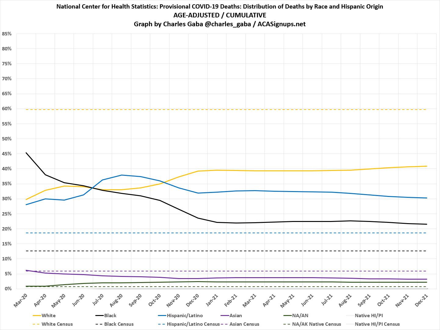
Here's what this looks like cumulatively over time:
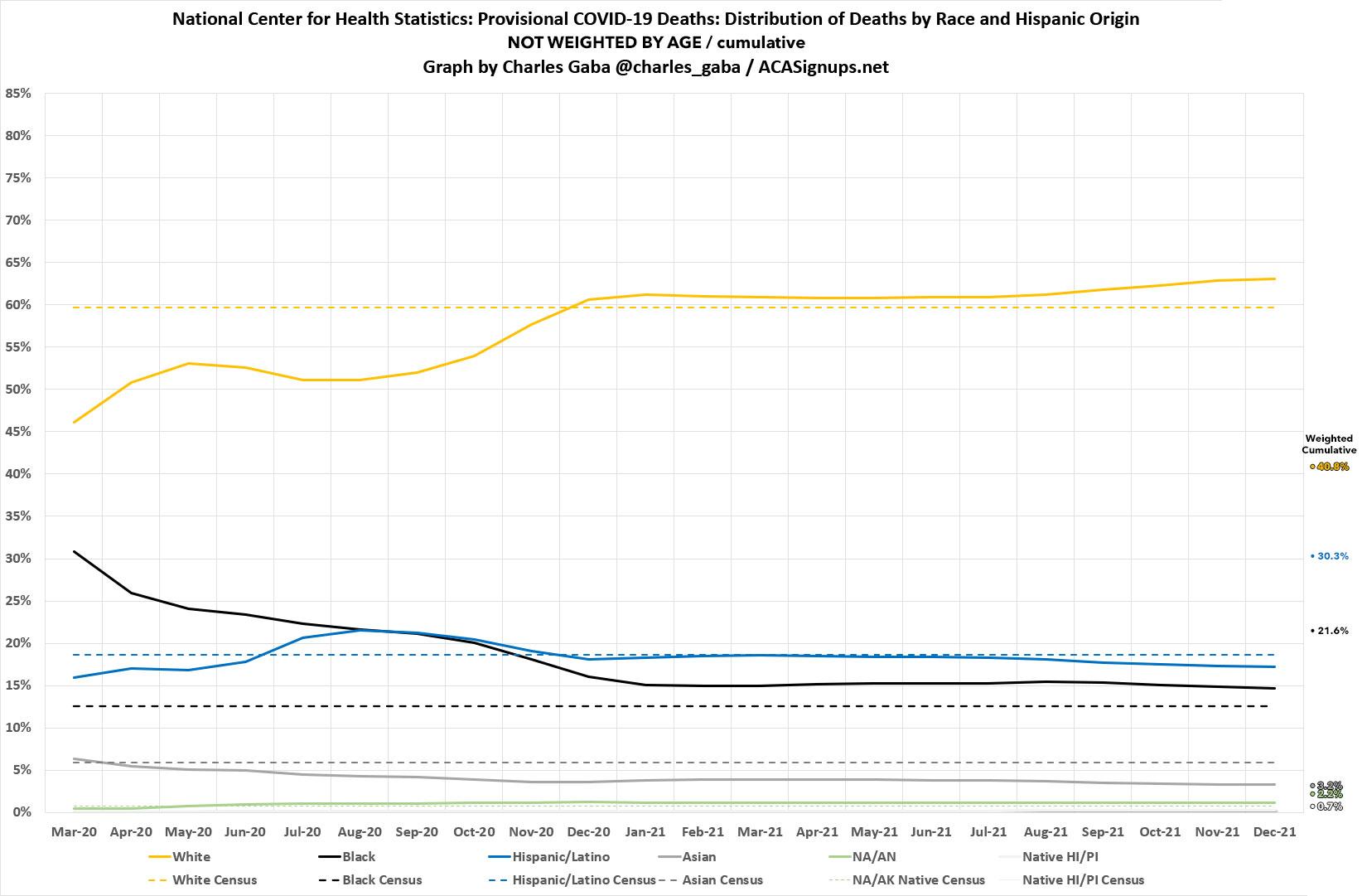
This is why I'm using the unweighted NCHS data, and it's also why I'm so confused by the weighting issue: The cumulative percentages match pretty closely to the CDC data in both August and December.
The Native American/Alaska Native and Native Hawaiian/Pacific Islander categories are nearly impossible to make out on these graphs because they make up such a small percentage of the totals, but the trend lines are clear for White, Black, Hispanic/Latino and Asian lines: White Americans are now dying of COVID-19 at disproportionately high (and increasingly higher) rates. In fact, it looks like White people have made up around 70% of all COVID deaths since the end of June.
while Hispanic/Latino and Asian Americans are dying at disproportinately low rates (increasingly lower). COVID deaths of Black Americans, meanwhile, are still disproportinately high cumulatively...but that trend line appears to have been dropping off rapidly, and at an increasing rate, since around May 2021.
UPDATE: OK, it looks like the NCHS has their own visual data section specifically devoted to the racial/ethnic categorization data:
Race and Hispanic origin
The figures and tables presented on this page contain the following indicators that can be used to illustrate potential differences in the burden of deaths due to COVID-19 according to race and Hispanic origin:
- Count of COVID-19 deaths: Number of deaths due to COVID-19 reported for each race and Hispanic origin group
- Distribution of COVID-19 deaths (%): Deaths for each group as a percent of the total number of COVID-19 deaths reported
- Unweighted distribution of population (%): Population of each group as a percent of the total population
- Weighted distribution of population (%): (shown in Table 1 only) Population of each group as percent of the total population after accounting for how the race and Hispanic origin population is distributed in relation to the geographic areas impacted by COVID-19. See the Notes section for more information.
It's this last bullet which is what kept tripping me up above...and yet, the "weighted distribution" factor shows up nowhere else in their entire presentation. Again, as far as I can tell, geographic weighting is no longer used by the NCHS and I was correct to use the unweighted percentages above after all...at least for the national data. My guess is that geographic weighting makes a much bigger difference at the state & county level, which I'm not looking at here.
What does show up here are "Age Standardized" modifiers:
Adjustments for age distributions: Another important factor that can be adjusted for is age. As death due to COVID-19 varies by age, the distribution of deaths across race and Hispanic origin groups will be affected by the age distribution of each of the groups. Differences between the percent of deaths among each race and Hispanic origin group and their corresponding percent of the weighted or unweighted population are shown by age group in order to provide information about how disparities in deaths vary by age.
The age-specific distributions are shown in two charts. One chart groups the horizontal axis by race and Hispanic origin, to more easily show disparities across all of the age groups within race and Hispanic origin groups. The second chart shows the horizontal axis grouped by age, which more easily shows disparities by race and Hispanic origin within each of the age groups. Additionally, age-standardized differences between a given group’s share of COVID-19 deaths and share of the population are shown. These age-standardized distributions show what disparities would look like if the age distribution was the same across all race and Hispanic origin groups for both COVID-19 deaths and the population.
When the national race/ethnicity death rate data is standardized by age, things look very different:
- White: Drops from 63.0% down to 40.6%.
- Hispanic: Increases from 17.1% to 30.3%
- Black: Increases from 14.6% to 21.7%
- Asian: Drops from 3.3% to 3.2%
- NA/AK: Increases from 1.1% to 2.2%
- HI/PI: Increases from 0.2% to 0.7%
Why is this? Well, I'm assuming it's because White Americans tend to have a significantly higher percentage of seniors than other groups in the first place:
(as of 2016) Over three-quarters of the 49.2 million older population was White. The proportions of the other groups’ older populations were less than their respective representations in the total population. Of those aged 65 and older, about 9 percent were Black and 8 percent were Hispanic. Less than 5 percent and about 1 percent of the older population were Asian and Two or More Races, respectively. The proportions of older individuals who identified as American Indian and Alaska Native, Native Hawaiian and Other Pacific Islander, and Some Other Race were each under 1 percent of those 65 and older. Among people 85 and older, Whites made up the highest percentage of the population at 81 percent. All the other groups each comprised less than 8 percent of those 85 and older.
However, none of this changes the fact that White Americans are still dying at an increasigly more disproportionate rate than their overall population level would indicate.
HOWEVER, I've updated both of the graphs above to include the weighted estimates for each racial/ethnic group as well for reference.
UPDATE x2: Holy cats: It looks like Denise Lu and Albert Sun of the New York Times also posted a big story this morning which (along with a bunch of other demographic data) includes the exact same NCHS racial/ethnicity data that I use above:
The change in death rates among groups is starker by race and ethnicity, and the death rate has risen particularly sharply for middle-aged white people. Covid-19 now accounts for a much larger share of all deaths for that group than it did before vaccines were widely available.
The graphs right below this paragraph clearly state:
Source: Provisional weekly death data from the C.D.C. through Nov. 27. Note: Only the four largest racial and ethnic groups are included. Universal vaccine eligibility was April 19, the date when all adults in the United States were eligible for vaccination.
It then goes on to state:
Some of the shift could be attributed to the lagging vaccination rates among white people overall. White people were vaccinated at a higher rate than Black and Hispanic people in the early months of the vaccination campaign — in part because people of color faced more obstacles to vaccine access.
In recent months, however, data from the C.D.C. shows that the vaccination gap has narrowed. White people are now less likely than Asians and Hispanics to be vaccinated, though somewhat more likely than Black people, and their death rates have risen in all but the oldest age groups.
Boom. There you have it.
As an aside, given my own recent dust-up with NPR over their picking my brain for COVID vaccination/death rate data and then initially not giving me credit for my assistance on their story, I should note that no, I've never consulted with (or even spoken to) either Denise Lu or Albert Sun, and in fact I don't think I'd ever heard of them before today. By the same token, neither of them contacted me about my own piece either.
To their credit, they've clearly been working on their story longer than I did on mine (I only stumbled across the NCHS database a day or two ago, in fact). UNLIKE the NPR incident, this one is a case of two analyses happening independently of each other using the same data.
UPDATE 1/01/22: In light of the whole age-adjustment brouhaha, here's what I think both the monthly and cumulative graphs should look like when each racial group is adjusted by age. I'm basing this on the NCHS's cumulative age-adjusted percentages for each, which puts the White death rate around 35% lower than the raw data has it at, the Black death rate around 47% higher than the raw data and so forth:
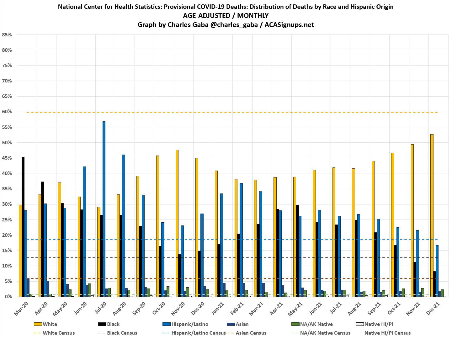
As you can see, when adjusted by age, White Americans are still well below their overall portion of the U.S. population...but that doesn't change the fact that even the adjusted trend has been increasing steadily since March 2021. In December 2021, it was "only" 12% below the national average, up from 37% below the average in March. Meanwhile, the trends for Black, Hispanic and Asian Americans has been dropping steadily since aroudn the same point (since May for Black Americans, February for Hispanic/Latino Americans & Asian Americans).
Here's what the age-adjusted cumulative trend lines look like. The Black and Hispanic/Latino death rates are still well above their total population averages, while the White death rate is still well below the total population average...but the downard trend of the former and the upward trend of the latter is still clear, which was the main point of this post in the first place.
Advertisement
