

Weekly Update: #COVID19 case/death rates by county, partisan lean & vaccination rate
Mon, 12/27/2021 - 10:17am
Here's the weekly look at the rate of COVID-19 cases & deaths at the county level since the end of June, broken out by partisan lean (i.e, what percent of the vote Donald Trump received in 2020).
As always:
- County-level 2020 Population data via U.S. Census Bureau's 2020 Census
- County-level 2020 Trump vote data via each state's Election Commission or Secretary of State websites
- County-level Case & Death data via Johns Hopkins University Center for Systems Science & Engineering for 47 states; NY Times COVID-10 in the United States github for NE & UT only; & the White House COVID-19 Team Community Profile Report for Florida only.
- BY POPULAR DEMAND, here's an updated Google Spreadsheet with all the relevant data.
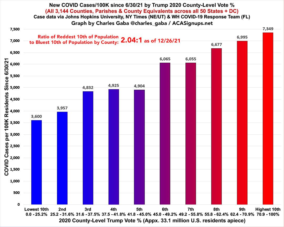
The partisan ratio of case rates are now only running 2.0x higher per capita in the reddest tenth of the country than the bluest tenth, down from 3.0x higher in late October and from 2.4x higher just a week ago:
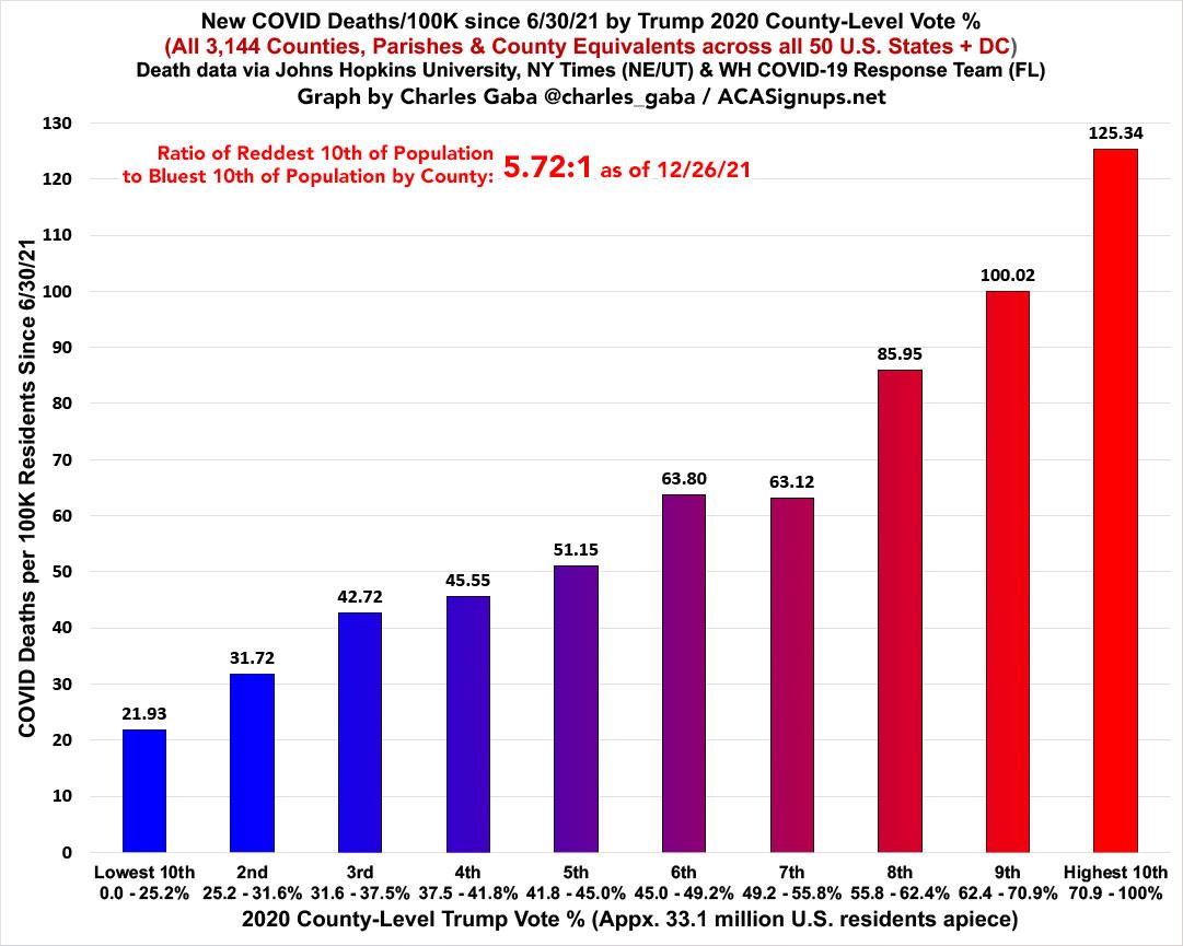
The partisan ratio of death rates since June is now 5.7x higher in the reddest tenth than in the bluest tenth...still down from 6.0x higher in late October, but up from 5.6x a week ago:
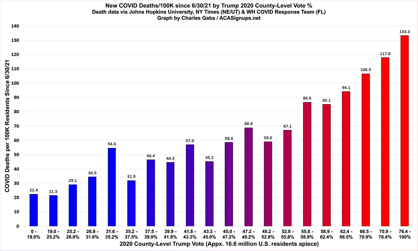
I've also decided to go one step further and break the total population into 20 brackets of roughly ~16.6 million apiece to look at the red/blue rate graph on an even more granular level. Sure enough, it's still a remarkably steady upward slope as the Trump vote percent increases:
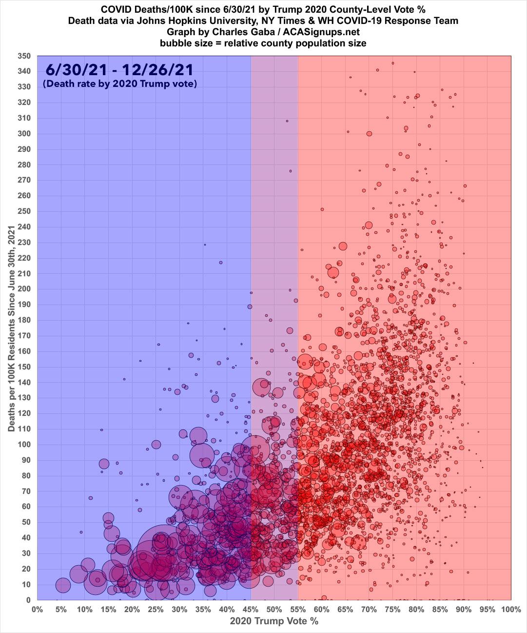
Here's the same death rate data since the end of June in scatter-plot format:
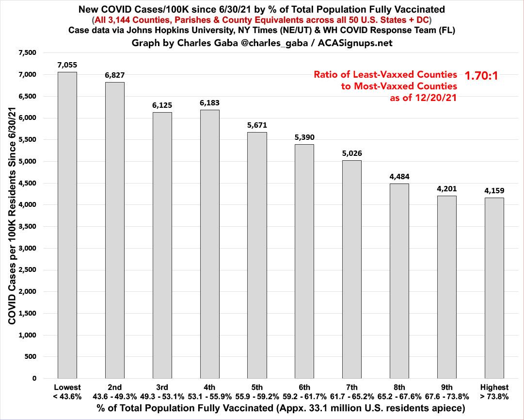
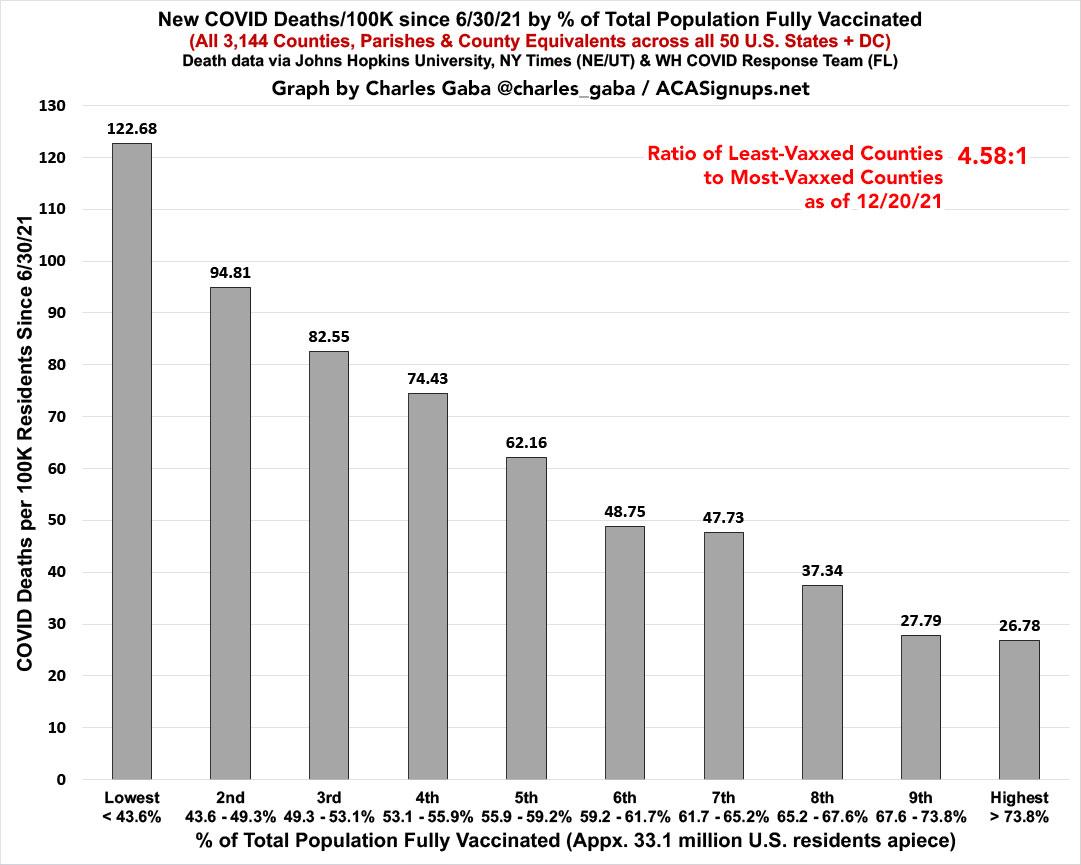
Meanwhile, here's what the same data looks like on a nonpartisan basis: Case and death rates based purely on vaccination rate of each county. The following graphs are up to date as of 12/23/21 (there was little reporting over the holiday weekend). Both measure the county-level case and death rates since the end of June compared against what percentage of the population is fully vaccinated (i.e., 2 doses of Pfizer/Moderna or 1 dose of Johnson & Johnson).
Again, I've broken the population of the 50 states +DC (~331 million people...this doesn't include the U.S. territories) has been broken out into ten brackets of roughly 33.1 million apiece.
Case rates since June are now 1.7x higher in the least-vaccinated tenth of the country than in the most-vaccinated tenth, down from twice as high just a week ago.
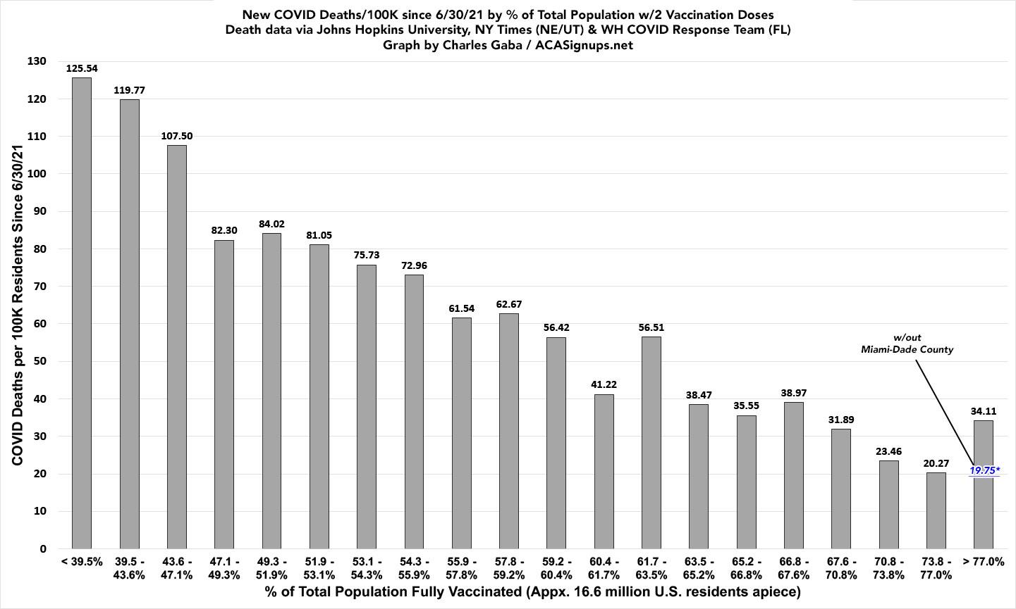
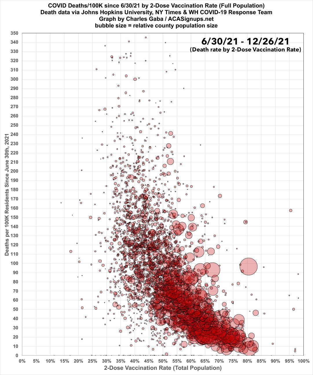
Note: As I explained in a recent blog post, Miami-Dade County, officially part of the "most-vaccinated bracket," is a massive outlier when it comes to the relationship of cases/deaths to the official vaccination rate, and I strongly suspect this is due to a substantially high incidence of "vaccine tourism" combined with the "snowbird" effect. It therefore likely belongs in the 7th or 8th brackets instead & both the case & death rates in the 10th bracket are likely a bit lower still than the official data would indicate.
...while when you look at the death rates, the contrast is even more stark:
Death rates in the least-vaxxed tenth since June are now 4.6x higher than in the most-vaxxed tenth, up from 4.5x higher just a week ago:
Here's the same data broken into 20 brackets of roughly ~16.6 million apiece. Again, the most obvious exception is the most-vaxxed bracket, with the Miami-Dade County outlier noted above:
Here's the same death rate data (since June 30th) in scatter-plot format. The massive Miami-Dade County outlier is obvious when displayed this way:
Get vaccinated & get boosted, dammit.
Advertisement
