

Florida's COVID death rate is FAR worse than the NPR analysis makes it out to be. As in, 15x worse. Seriously. (Updated)
Mon, 12/06/2021 - 9:00am
Yesterday there was a bit of a brouhaha caused when NPR reporters Geoff Brumfiel and Daniel Wood published an in-depth report on the partisan divide when it comes to county-level COVID-19 vaccination and death rates, which was heavily influenced by my own work over the past seven months, including two hour-long interviews in which we went into in-depth discussions of data sources, methodology and conclusions.
The controversial aspect was due to the fact that their published piece originally failed to mention my involvement or assistance in any way whatsoever.
After being called out on this by myself and others, Brumfiel called me to personally apologize and rectify the situation. To his credit, he took full responsibility and specifically noted that his colleague, Daniel Wood, had nothing to do with the oversight. Also to his credit, he arranged for the NPR story to be quickly updated to mention my assistance by name as well as to link to one of my own related COVID data analysis posts:
"In October, the reddest tenth of the country saw death rates that were six times higher than the bluest tenth, according to Charles Gaba, an independent health care analyst who's been tracking partisanship trends during the pandemic and helped to review NPR's methodology. Those numbers have dropped slightly in recent weeks, Gaba says: "It's back down to around 5.5 times higher."
Normally this would have been the end of it.
However, last night, someone emailed me with a heads up about something odd they noticed when they used NPR's interactive "search by county" tool in the piece (they specifically said that they don't want to be credited for catching this):
I'm seeing differences between your "snowbirds and vaccine tourism" data and the data from NPR's article, "Pro-Trump counties now have far higher COVID death rates. Misinformation is to blame" when I look at Florida data.
Example: Sumpter County NPR says 7 deaths/100K since May and your data says 145/100K since June. For Miami-Dade, NPR says 11/100K while you say 90/100K. If NPR data is correct, looks like we should all move to Florida, none of the top 20 or so counties exceed 11/100K. I'm from highly vaccinated Massachusetts and can't quite figure out what's going on. Hoping I'm making some sort of stupid mistake in interpreting their data and haven't stumbled on to some sort of major data error.
Huh?
Sure enough, if you plug Miami-Dade County into NPR's tool, you get the following:
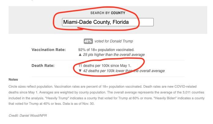
The moment I saw this I knew instantly what was going on.
As I had noted back in September:
...presumably inspired by a lawsuit versus Ron DeSantis' Florida Health Dept. which stopped reporting county-level COVID deaths as of June 3rd, 2021, the White House COVID-19 Team has gone ahead and started posting Florida's county death numbers anyway (as of Sept. 13th) as part of their COVID-19 Community Profile report.
Yes, that's right: Florida's Health Department quietly stopped reporting county-level COVID death data on June 3rd, and while I've been using the Community Profile Report from the White House COVID-19 Team, Joint Coordination Cell, Data Strategy and Execution Workgroup (that's a mouthful!) instead of CDC data for Florida, Mr. Wood apparently decided to stick with the Johns Hopkins github data for Florida instead...even though the Johns Hopkins data is still reporting the same June 3rd data for Florida.
UPDATE: The news about the WH Community Profile Report was originally reported by Kate Santich, Caroline Catherman and Cindy Krischer Goodman of the Orlando Sentinal, though they put the cut-off date at June 5th; the WH CPR data was first used (to my knowledge) by Jason L. Salemi, PhD, MPH, FACE.
This is particularly problematic because I specifically warned Brumfiel and Wood about the Florida data issue and recommended that they use the Community Profile Report instead during one of our two hour-long interviews.
Here's the methodology section of the NPR story:
Vaccination rate data are the rate of vaccination among all people 18 years of age or older, as of Nov. 30. They are from the Centers for Disease Control and Prevention.
COVID-19 deaths per 100,000 residents are calculated by dividing the deaths from COVID-19 in a county since May 1 by the county's population. County population data come from the U.S. Census Bureau's 2020 decennial census. May 1 was chosen as the start date of our analysis because that is roughly the time when vaccines became universally available to adults ages 18 and older. COVID-19 death data is collected by the Center for Systems Science and Engineering (CSSE) at Johns Hopkins University and is current as of Nov. 30.
2020 election result data are from MIT Election Data and Science Lab.
At first I figured that they decided to use Johns Hopkins data for every state in order to be consistent. However, they excluded three other states entirely for similar reasons:
Alaska does not report election results by county-equivalent area, so it is excluded from the analysis. Nebraska is excluded from the analysis because does not report county-level COVID-19 statistics. Hawaii is excluded because it does not report county-level vaccine data. Some counties that have reported no COVID-19 deaths since May 1 may have stopped reporting. These counties generally have very small populations and have a negligible impact on the weighted averages. Erring on the side of caution, we include all data unless it is known that they are in error.
Nebraska is particularly telling, because like Florida, Nebraska stopped reporting county-level COVID death data around the same time (if a few weeks later)...yet they kept Florida while omitting Nebraska.
I have no idea why they chose to do this. They should have either used the WH Community Profile Report for Florida (as I do) or they should have omitted Florida entirely...yet they chose to include it even though the death data was nearly 5 months out of date.
Ironically, it would have been a far smaller issue if they had kept Nebraska while omitting Florida, since Nebraska is a much smaller state and didn't experience the type of massive COVID death surge which Florida did this fall during the Delta wave.
How big of a difference did this make? The email sent to me last night gives two examples (Sumpter County and Miami-Dade County), but here's all 67 counties compared side by side:
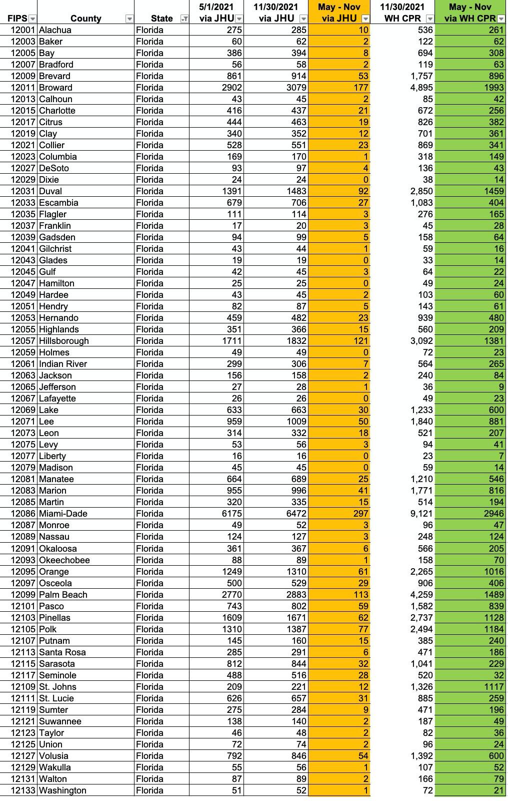
If you add up all 67 counties, the actual number of COVID deaths in Florida from May 1st - November 30th is 25,842, versus the NPR figure of just 1,734...or 14.9x higher.
Furthermore, 12,916 of those deaths happened in Florida counties where Trump received over 55% of the vote...vs. just 5,436 in the counties where he received less than 45% of the vote.
In other words, the actual Red/Blue divide is even worse than NPR reported when you account for Florida's death toll properly.
UPDATE: As of 2:30pm, the NPR county lookup tool has been updated to remove Florida entirely:
Alaska does not report election results by county-equivalent area, so it is excluded from the analysis. Nebraska and Florida are excluded from the analysis because they do not report county-level COVID-19 statistics. Hawaii is excluded because it does not report county-level vaccine data. Some counties that have reported no COVID-19 deaths since May 1 may have stopped reporting. These counties generally have very small populations and have a negligible impact on the weighted averages. Erring on the side of caution, we include all data unless it is known that they are in error.
Editor's Note: Dec. 6, 2021
This story has been updated to clarify the relationship of political partisanship to vaccination status.
Additionally, Florida's counties were removed from the analysis after publication because we learned that Florida has not updated county-level death numbers since June 3, 2021. With the removal of these 67 counties, heavily Trump counties go from a 2.73 times higher death rate than heavily Biden counties to 2.78 times more.
OK, then.
Advertisement
