Schrodinger's Graph: NewsWire publishes an ACA enrollment graph which is both "accurate" & incredibly misleading at the same time

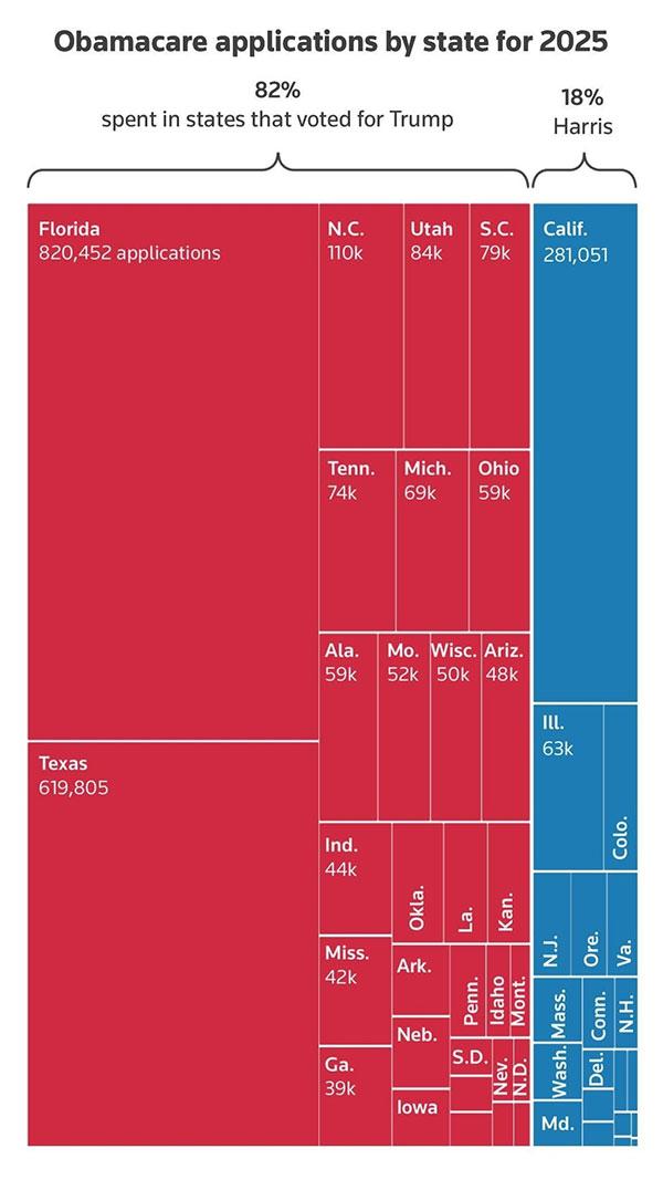
This morning, the Twitter account NewsWire_US, which claims to be a "U.S. and world news aggregator," posted an amazing-looking graph which purports to break out "Obamacare applications by state for 2025" by states which voted for Donald Trump vs. those which voted for Kamala Harris last month.
Here's the graph, which includes no further context (including any data sources...NewsWire claims it came from Reuters but I can't find the original link to a story by them with this graph) beyond making it look like a whopping 82% of ACA enrollees live in Trump states:
Technically speaking, this is accurate...but it's missing a TON of vital context.
So what's the problem?
Well, for starters, what this graph is actually showing is the number of Americans who newly enrolled or actively re-enrolled in ACA exchange health insurance policies for 2025 as of either November 16th or November 9th depending on the state. The data almost certainly originated in CMS's 2025 Open Enrollment Period "National Snapshot" report published on Nov. 22nd.
The 31 states hosted on the federal ACA exchange (HealthCare.Gov) had enrollment data available as of Nov. 16th; the 20 states operating their own state-based exchanges only had data available through Nov. 9th.
Since 16 of the 20 states with their own exchange voted for Kamala Harris (including California, the biggest one), this is already pretty misleading right off the bat.
Secondly, the numbers above only include people who had either newly enrolled for 2025 coverage or who are currently enrolled today but had actively re-enrolled for 2025 by that date.
This is important because it only adds up to around 3.9 million enrollees total...which means it's missing the 4.03 million people who were reported to have been automatically re-enrolled as of those dates across 16 states.
Third, both Nov. 9th and Nov. 16th were well over a month ago; CMS released a more recent snapshot report which brought the data up through Nov. 30th (31 states) & Nov. 23rd (20 states).
Fourth, one of the biggest reasons why red states like Florida, Texas etc. have such huge enrollment in ACA exchange plans is because they never expanded Medicaid under the ACA, which means that a large chunk of ACA enrollees in these states (ie, households earning between 100 - 138% of the Federal Poverty Level) who would have Medicaid coverage if their states had expanded it are enrolled in exchange plans instead.
How many? Well, according to CMS's 2024 Marketplace Open Enrollment Period Public Use File, at the end of the 2024 OEP, a whopping 5.83 million exchange enrollees in the ten non-expansion states (over 27% of the total nationally, and over 51% of the total within those states) last year earned between 100 - 138% FPL.
Don't get me wrong--this doesn't make the red states look any better, since they should have expanded Medicaid! But it does mean that the graph above is, once again, highly misleading in terms of what it purports to be saying.
This also brings me to problem number 5: Medicaid expansion is missing entirely from the graph, as are Basic Health Plan (BHP) enrollees in Minnesota, New York and Oregon!
Since the BHP programs are not only funded via the ACA but "cannibalize" enrollees who would otherwise be eligible for subsidized ACA exchange plans (similar to Medicaid expansion), they need to be included in order to run a proper apples to apples comparison.
There's currently over 1.72 million people enrolled in BHP plans in MN, NY & OR (all of which are Harris states, of course)...and a whopping 20.9 million enrolled in Medicaid via ACA expansion (mostly in Harris states).
Needless to say, this changes the math dramatically.
OK, so what would an more accurate depiction look like?
If you're limiting yourself to the most recent 2025 Open Enrollment Period data for ACA exchange coverage only, it would look like this:
- Trump States: 6,287,245 (as of 11/30 in most states, as of 11/23 in a few)
- Harris States: 4,400,708 (as of 11/23 in some states, as of later than that in others)
That's around 59% in the Trump states & 41% in the Harris states.
However, again, this is still not terribly helpful since the thru dates are all over the place and most of them are still missing over 3 weeks of enrollment data.
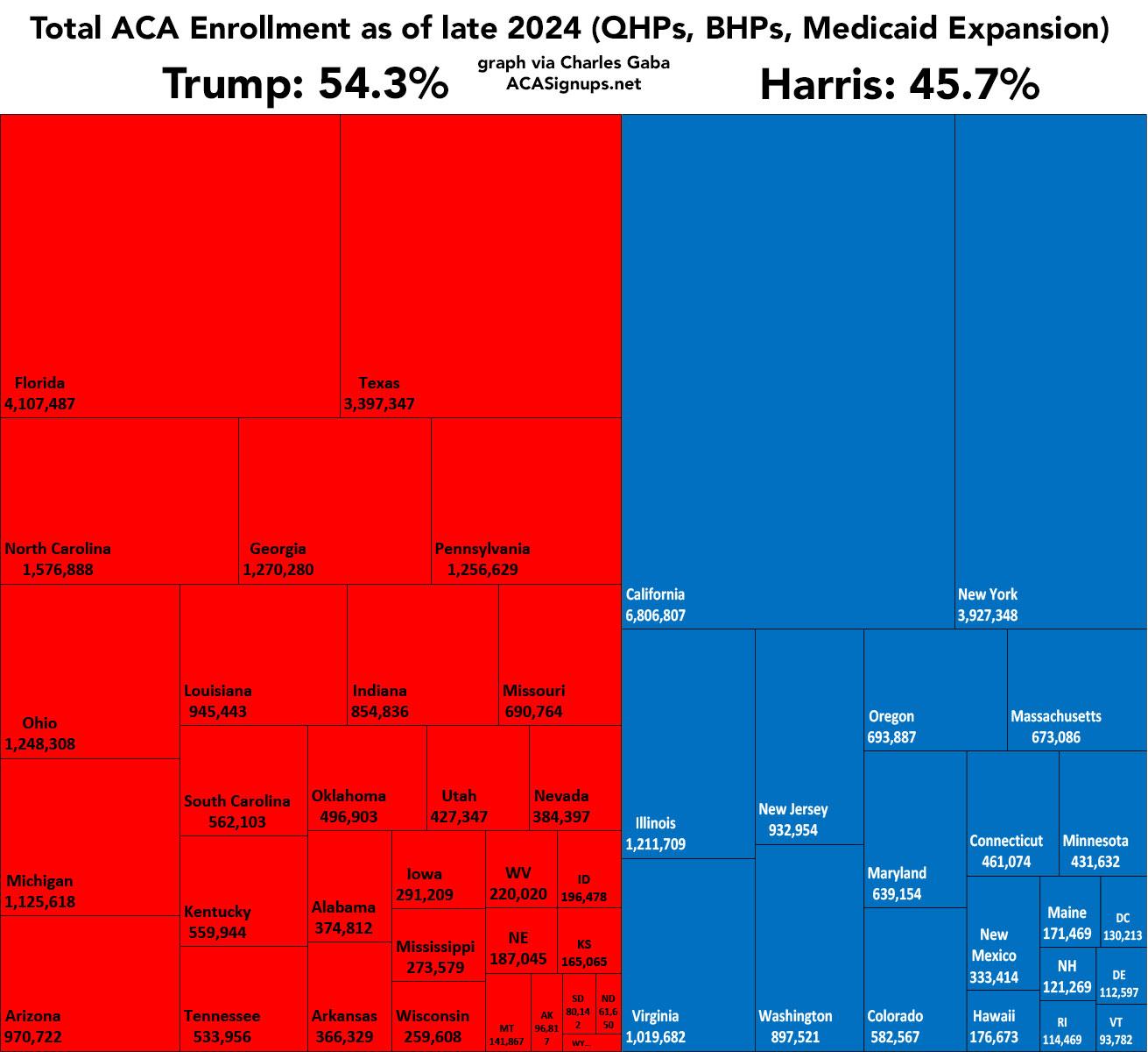
Until the final data is available for the 2025 OEP, the only way to accurately do this would be to use 2024 data for all three types of enrollment (ACA exchange plans, BHP plans & Medicaid expansion enrollment). When you do that, you get:
- Trump State ACA Enrollment: 16,036,751 QHPs + 0 BHPs + 7,792,284 Medicaid expansion = 23,829,035 total
- Harris State ACA Enrollment: 4,827,614 QHPs + 1,724,546 BHPs + 12,979,147 Medicaid expansion = 19,531,307 total
The exchange QHP ratio here is around 77% Trump states vs. 23% Harris states, which is pretty close to the NewsWire graph ratio.
However, when you include BHP & Medicaid expansion, it's a very different story: 55% Trump states vs. 45% Harris states.
The data I'm using here includes exchange QHPs as of February 2024, BHP enrollment as of November 2024, and Medicaid expansion as of June 2024.
As an aside, what about if you break it out even further into Congressional Districts using the same data set?
This changes things even more. You get 20,701,719 total in districts where the Republican nominee won (48%) vs. 22,640,066 in districts where the Democratic nominee won (52%).
Update: Here's a more accurate representation of total ACA enrollment by state & Presidential election results as of late 2024, including exchange QHP enrollments, Basic Health Plan enrollments, and ACA Medicaid expansion enrollments.


