

Weekly Update: COVID Case/Death Rates by Partisan Lean & Vaccination Rate (w/Miami-Dade Correction)
Sun, 03/27/2022 - 10:18am
For months I've posted weekly looks at the rate of COVID-19 cases & deaths at the county level since the point at which every U.S. adult could theoretically have received 2 COVID vaccination doses, broken out by partisan lean (i.e, what percent of the vote Donald Trump received in 2020), as well as by the vaccination rate of each county in the U.S. (nonpartisan).
For a long time I used July 1st, 2021 as my start point, but more recently I decided to back this up to May 1st, 2021 instead. Pinning down an exact date for this is a bit tricky since a) different populations were made eligible at different points in 2021, and b) it takes 3-4 weeks after getting your first vaccination dose before you can get the second one, but May 1st is what I've finally settled on. As it happens, this didn't change things that much since June 2021 in particular was the nadir of the pandemic's death rate since it began.
As always, here's my methodology:
- County-level 2020 Population data via U.S. Census Bureau's 2020 Census
- County-level 2020 Trump vote data via each state's Election Commission or Secretary of State websites
- County-level Case & Death data via Johns Hopkins University Center for Systems Science & Engineering for 47 states; NY Times COVID-10 in the United States github for NE & UT only; & the White House COVID-19 Team Community Profile Report for Florida only.
- BY POPULAR DEMAND, here's an updated Google Spreadsheet with all the relevant data.
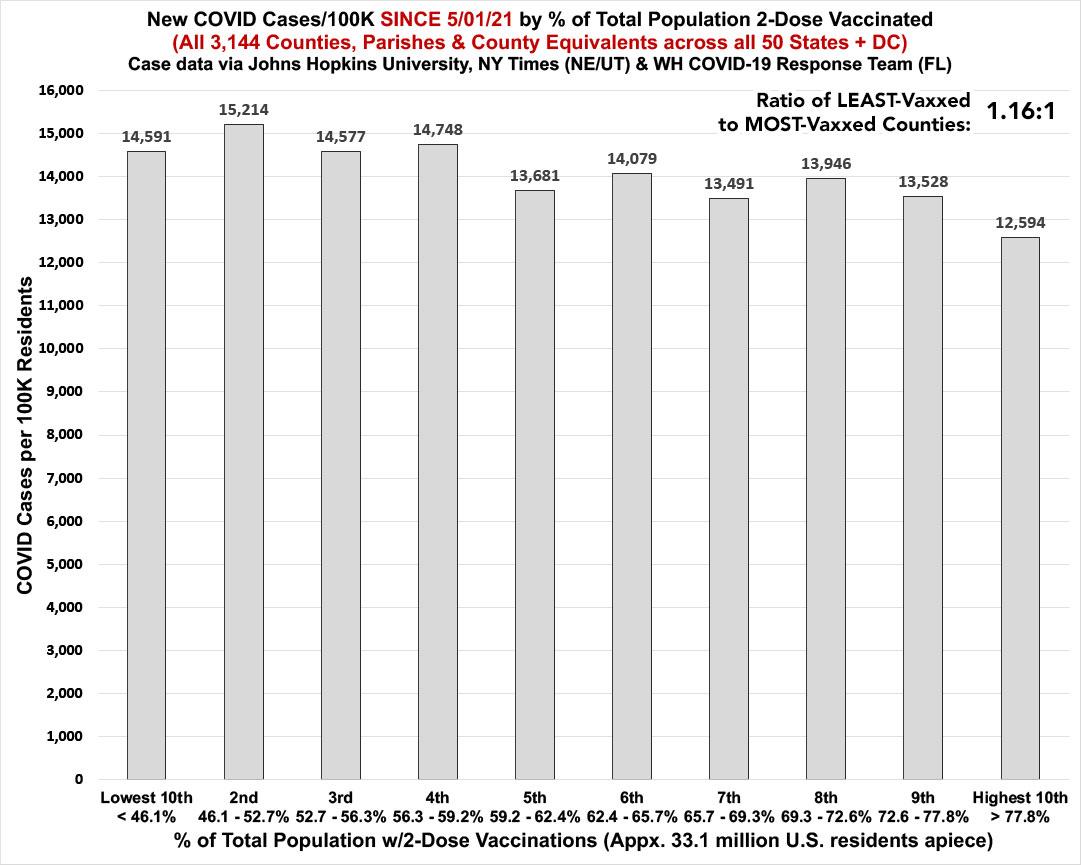
Remember: "Decile" means 1/10th or 10% of the total population (all 50 states + DC).
NOTE: This week's update also includes an important correction to Miami-Dade County's vaccination rate, which I first wrote about in September, updated in November and which has now been confirmed with hard data by the Palm Beach Post.
First, let's look at vaccination rates. These bracket sizes change slightly from week to week as more people in every bracket join the "2nd shot vaccinated" population, but for the most part they're pretty stable relative to each other. As you can see, since May 1, 2021, the official cumulative case rate hasn't actually varied much whether a given county has a high or low vaccination rate.
This wasn't the case at all for most of the summer and fall, when cases in low-vaccinated counties were running 4x or more higher than high-vaxx counties...but the infection gap was almost entirely wiped out during the Omicron wave in December - February. At this point, the least-vaccinated tenth of the country is only running 16% higher than the most-vaccinated tenth in terms of case rates:
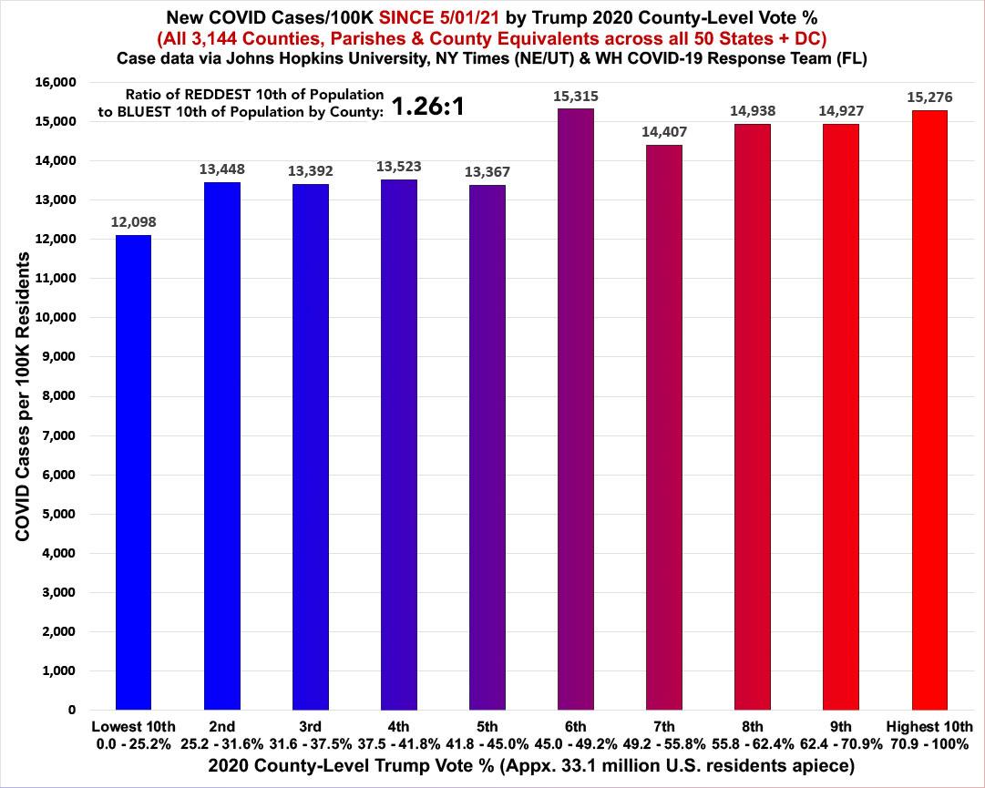
The same is pretty much the case when looking at case rates by red/blue partisan lean...they're only running 26% higher in the reddest tenth of the country than the bluest, which doesn't seem to signify much...
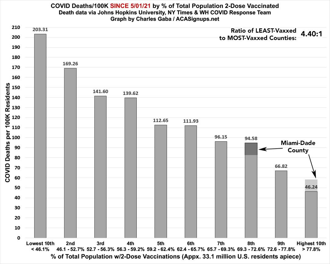
...HOWEVER, when it comes to death rates, there's still a clear and dramatic correlation between how much of the population has been 2-dose vaccinated and its COVID death rate since last May. The least-vaccinated decile has a death rate 4.4x higher than the most-vaccinated decile.
NOTE: I've marked the Miami-Dade County change noted above on the graph...to get an idea of just how dramatic this correction is, if Miami-Dade was still listed in the highest-vaccinated decile the lowest/highest ratio would only be around 3.3x higher. Instead it's actually 4.4x higher...or a full 1/3 larger discrepancy than the data had been indicating until now:
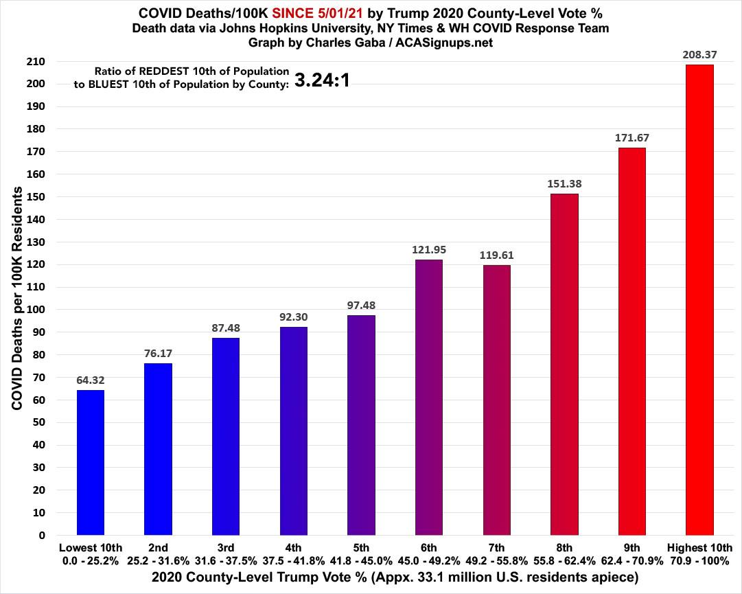
As always, what's even more disturbing is how closely the death rate by partisan lean matches the death rate by vaccination rate; they're mirror images of each other:
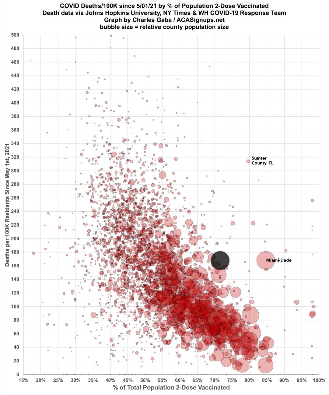
Here's another view of the vaccination rate-based death rate breakout since 5/01/21. The large black circle represents (roughly) where Miami-Dade County should be when corrected per the recent Palm Beach Post data correction:
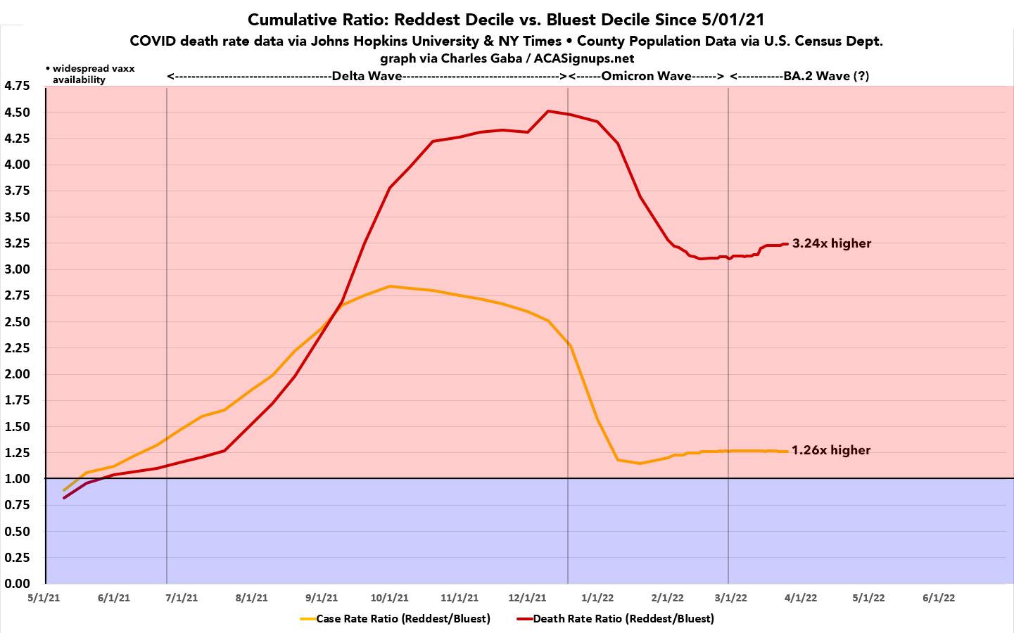
The graph below shows how the ratio of case and death rates in the reddest and bluest deciles have changed over time. The gap reached a peak of 4.5x higher at the height of the Delta wave last fall before dropping significantly during the Omicron wave...but since then it's flattened out and is now moving back up again. Note that the small bump a couple weeks ago was due to a one-time data adjustment by the Massachusetts Health Dept.:
The final graph below shows the 14-day moving average of the death rates in the reddest & bluest deciles, dating all the way back to January 1, 2021. As I predicted back in late December, after reaching near parity in late January, the death rate in the reddest parts of the country is again on the rise relative to the bluest parts. Axios recently posted a state-level version of this graph, although in that case they went with states where Trump or Biden won by 15 points or more:
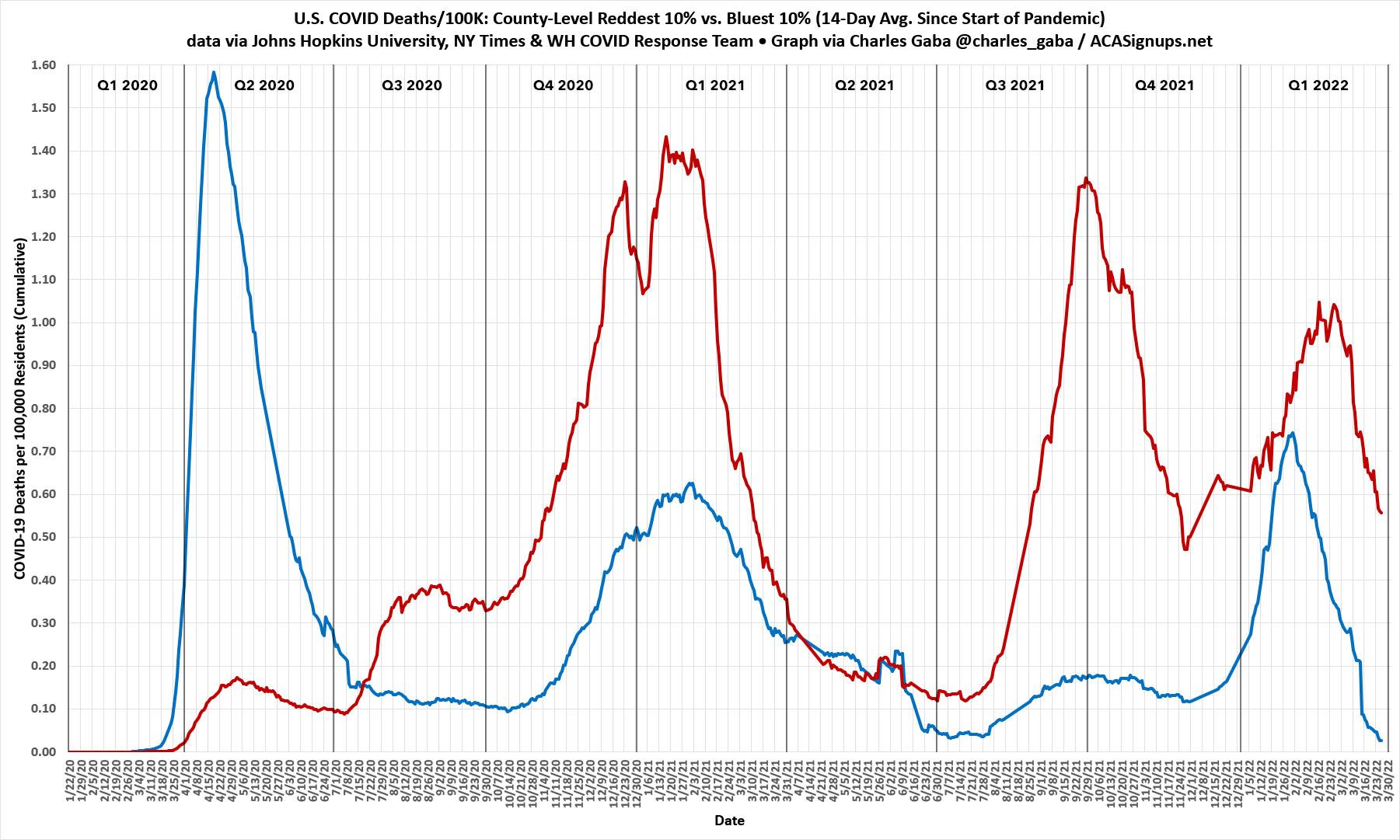
Note that there's a few stretches where there's data missing due to absurdly massive outliers (either high or low) caused by one-time backlogged data dumps which skew the daily ratios (even on a moving average basis).
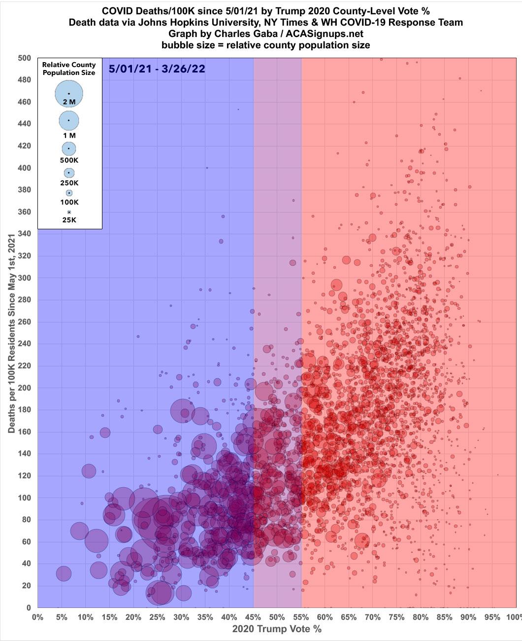
Finally, here's the scatter plot version of the partisan-based graph above:
Advertisement
