COVID case/death rates by vaccination levels, or what the hell is going on in Miami-Dade County?
For the past couple of months now, most of my COVID scatter-plot charts...whether measuring vaccination rates, new case rates or new death rates...have been based primarily on partisan lean. That is, at both the state and county levels, I've been using the percent of the 2020 Presidential vote won by Donald Trump as the basis for comparison.
I've also looked at vaccination rates by other criteria, of course: Population density, urban vs. rural status, education level and median household income levels...but none of these have had nearly as high a correlation as sheer partisan lean has (although I haven't checked any of those in over a month; perhaps the situation has changed by now).
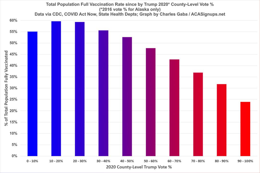
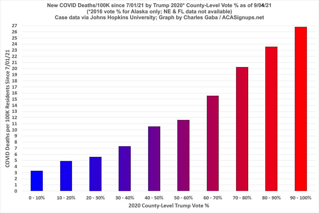
Last week I decided to switch from scatter-plot graphs to a simpler, cleaner bar graph format to see how the partisan lean of both vaccination rates and case/death rates is shaping up, and the results were pretty striking. I've updated all three to reflect the latest data as of Saturday, Sept. 4th, 2021:
Today I wanted to take a look at the same data from a nonpartisan perspective...by simply measuring new COVID case and death rates against the vaccination rate of every county regardless of its red/blue status.
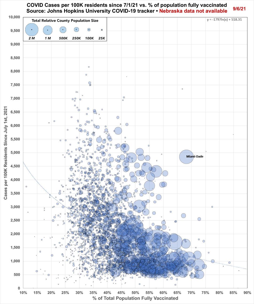
First, let's look at the scatter plot version of each. First, new COVID cases per capita since July 1st (which is the point that the Delta variant really started to take hold in the U.S.). Unfortunately, Nebraska stopped posting their county-level COVID data as of June 30th, so I wasn't able to include the cornhusker state, but otherwise every single county, parish, borough and other census area in the other 49 states (+DC) is included:
As you might expect, there's a clear drop-off in new COVID cases per capita as the vaccination rate of the counties goes up. There seems to bea slight drop-off starting around 50% fully vaccinated, followed by a steep drop-off starting around 65% vaxxed. There's a third drop-off at around 75%, but there's literally only a handful of counties which have achieved that high a vaccination rate so far anyway.
HOWEVER, there's one major outlier over the 65% threshold...Miami-Dade County.
According to the Centers for Disease Control, Miami-Dade has fully vaccinated 68% of their entire population (1.84 million out of 2.72 million residents). I use the slightly lower official 2020 U.S. Census popualtion count for Miami-Dade County (2,701,767), which makes the vaccination rate slightly higher still: 68.24%.
And yet, somehow the 10th-largest county in the United States, which has the 6th highest vaccination rate of any county over 1 million residents, also has the highest new case rate of any county over 1 million residents.
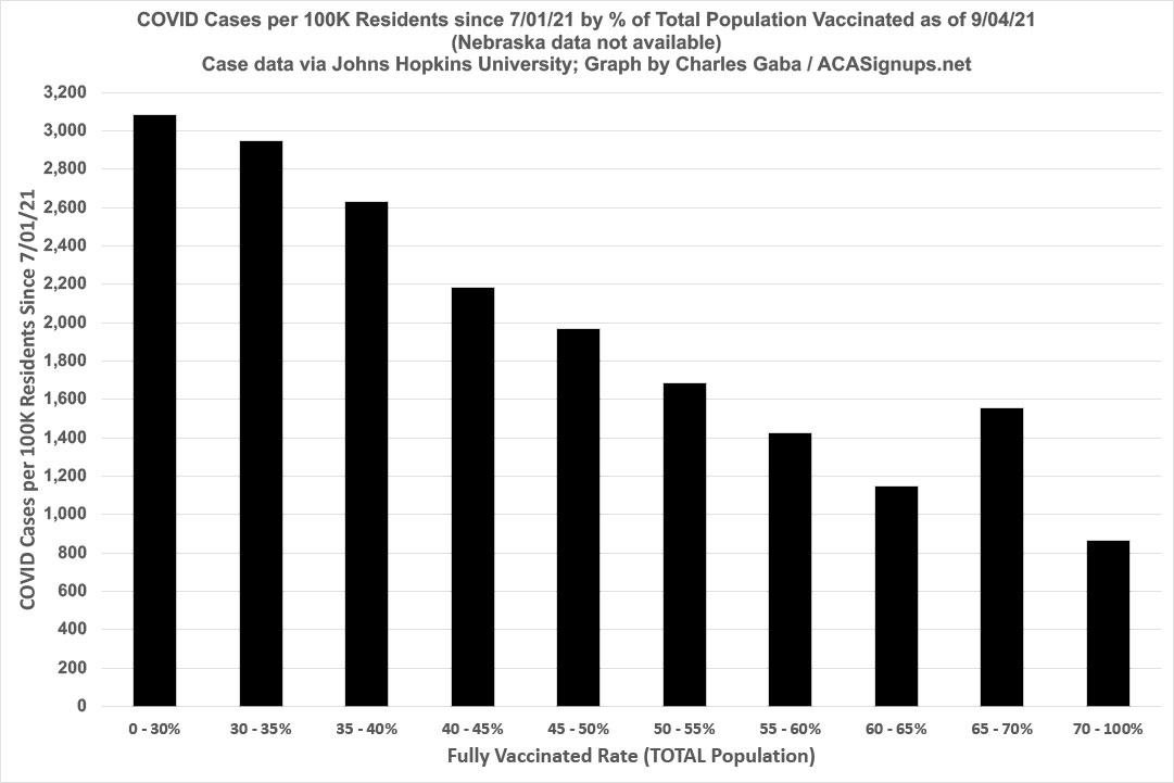
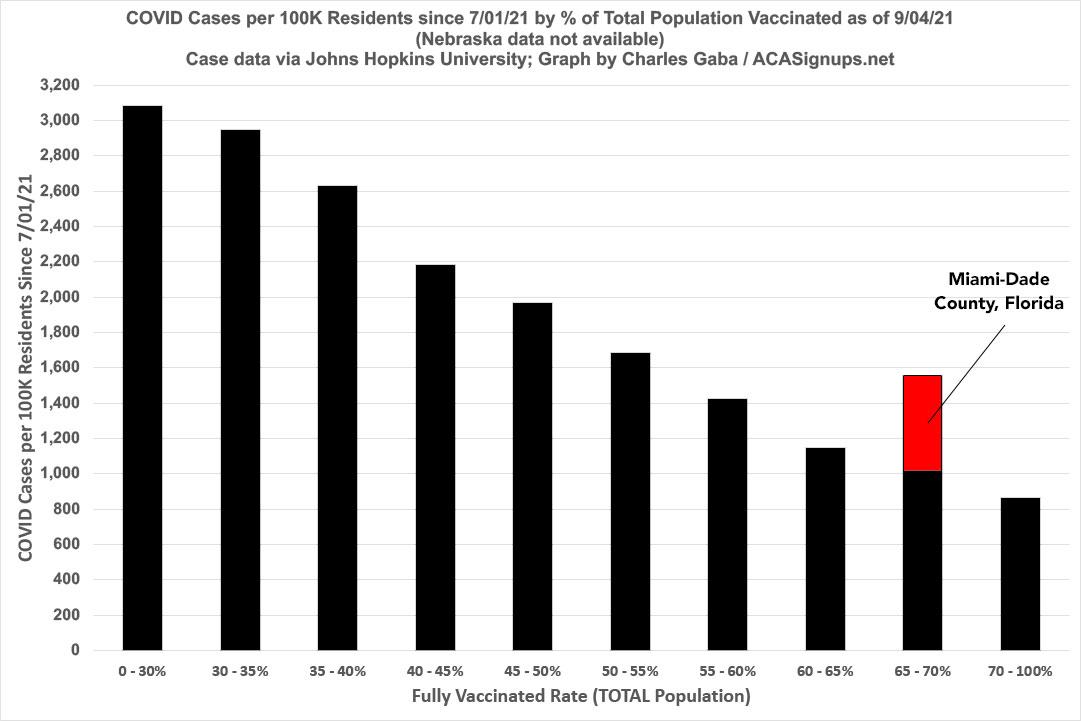
Here's what the case rates by vaxx rate graph looks like when using the bar layout:
I've lumped together all counties below 30% vaccinated or over 70% vaccinated since there's so few of either; only around 6.4 million Americans live in counties under 30% vaxxed and 6.5 million in counties over 70% vaxxed.
Between 30 - 70%, however, I've broken every other county out in 5-point increments...and it's a disturbingly clean, steady trend line as you move up...right up until you hit the 65-70% bracket, where the case rate jumps up out of nowhere before dropping down again over that threshold.
Guess what single county makes up all of that discrepancy? That's right...here's what it looks like if you remove Miami-Dade from the equation:
So what the hell is going on, not just in Florida generally (I have plenty of suspicions about that) but in Miami-Dade County in particular?
Well, there's only three things which could be causing this: Either the actual case rate since 7/01/21 is a lot lower than reported (highly unlikely), the vaccination rate is a lot higher than reported, or some combination of both.
I've received a bunch of responses from folks via Twitter; the most common thinking is that it's a combination of lots of snowbirds (seniors who live up north and only spend the winter in Miami-Dade) who got vaccinated in M-D back in January/February before flying back up north for the rest of the year) and "Medical Tourism"...i.e., folks from other countries flying into M-D, getting vaccinated and then flying back to their home country.
It was my understanding that the CDC vaccination data is supposed to be specifically for residents of each county, but that might vary depending on the state, and if a snowbird is legally listed as "residing" in Florida even though they spend 3/4 of the year out of state that would help explain it.
This thread in response to one of my posts gives a more detailed explanation:
Hi guys: MIA is a major international hub with direct flights from all over Latin & South America. We effectively set ourselves up for vaccine tourism, with shots given at the airport, on the sands of South Beach, etc. Which I supported! All humans deserve shots, but the data collection was clearly not set-up to account for that. But to your original point re: international tourism, it's yet another way that Miami is not like the rest of Florida. In fact: we now have the busiest international airport in America.
If this is accurate, it suggests that Miami-Dade County has actually only fully vaccinated as little as perhaps 58% of its actual total population, a full 10 percentage points less than the official 68% rate...or as much as a whopping 270,000 fewer residents than reported.
And if that's correct, given that Miami-Dade has around 12.6% of Florida's total population, that 10-point difference could mean Florida's statewide fully-vaxxed rate is as much as 1.3 points lower than the official numbers indicate.
I want to be clear: I am not saying that this is being done deliberately. There's a lot f big red flags surrounding how Florida's health department has been gathering and reporting COVID cases, hospitalizations and deaths lately...but this particular vaccination data issue could be an honest, unintentional outlier.
In addition, Miami-Dade is hardly the only county in the country where a percentage of COVID vaccinations are actually going to non-residents; I'm sure there's some of that happening in every major international hub. It's definitely possible that it's happening in M-D at a far higher rate than other counties, however.
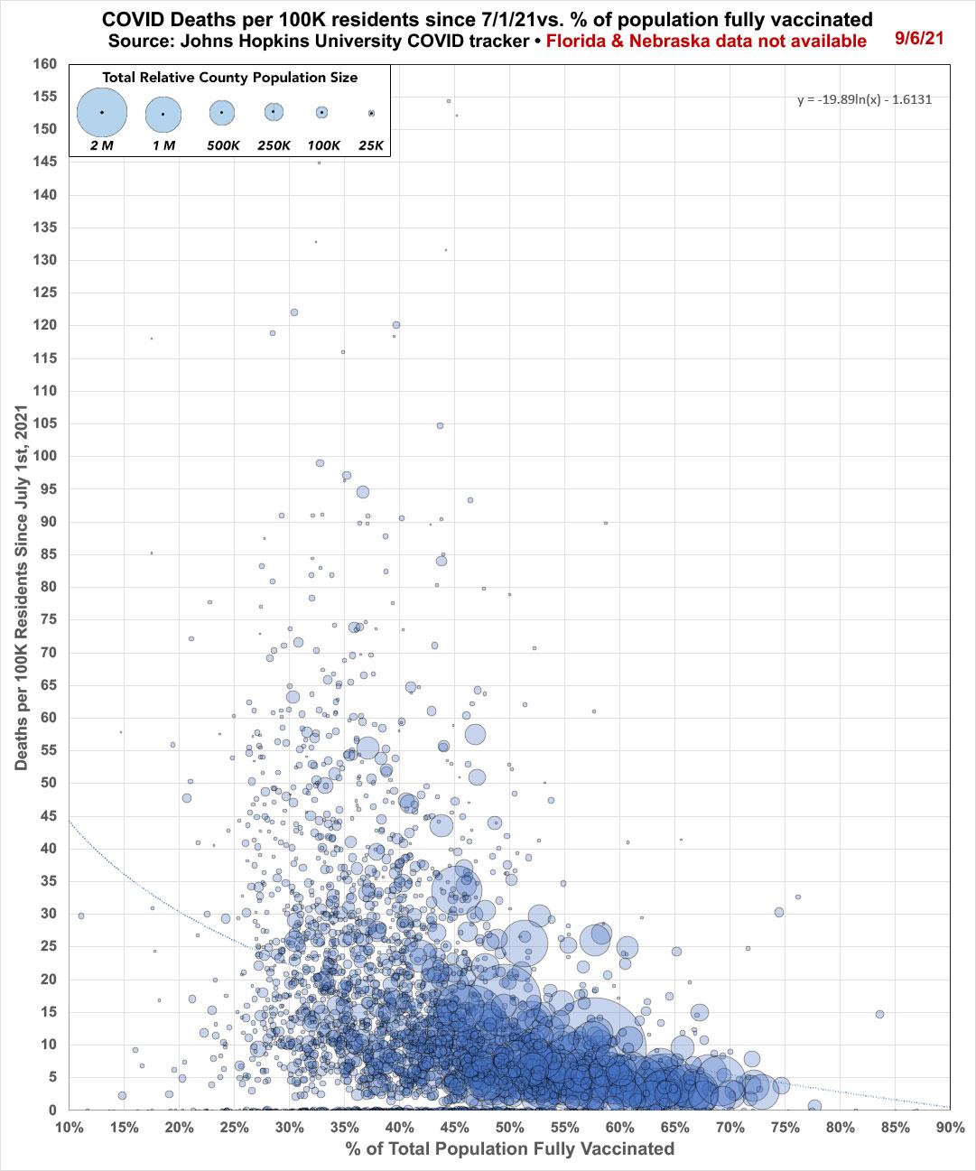
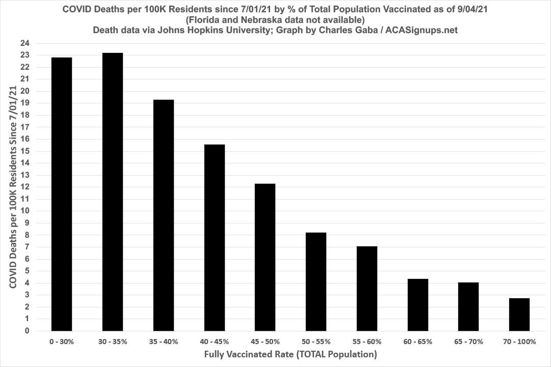
In any event, here's what the new COVID death rates since 7/01/21 look like by vaccination rate, in both the scatter-plot and bar graph formats.
Unfortunately, neither Nebraska nor Florida have provided county-level COVID death data since June, which means I can't include either state in the death-rate graphs. This likely doesn't make much of a difference for Nebraska, which has fewer than 2 million residents and which hasn't been hit with the massive Delta surge to the extent of most other states (yet)...but Florida's county data missing no doubt makes a massive difference in the graphs below:


