

U.S. #COVID19 vaccination levels by county OVER TIME
Wed, 08/11/2021 - 7:08pm
As regular readers know, I've become a bit obsessive over tracking COVID-19 vaccination rates at both the state and county levels over the past month or so. I post the daily rate levels daily on Twitter, and once a week I've been updating the county-level vaxx rates here at ACA Signups.
I've long maintained that the single biggest factor determining how a given state or county's rate of their residents getting vaccinated isn't about household income, whether they live in a rural or urban area, the population density or their education level, though these are all certainly factors. It's not even race or ethnicity, though there's certainly significant racial inequalities which play into it.
No, the single biggest factor appears to be partisanship...and more specifically, whether or not someone voted for Donald Trump for President in 2020.
This has been bourne out by numerous national surveys and polls by respected outlets, and of course both my state- and county-level scatter plot graphs have supported this conclusion as well.
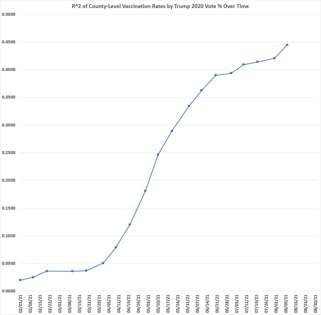
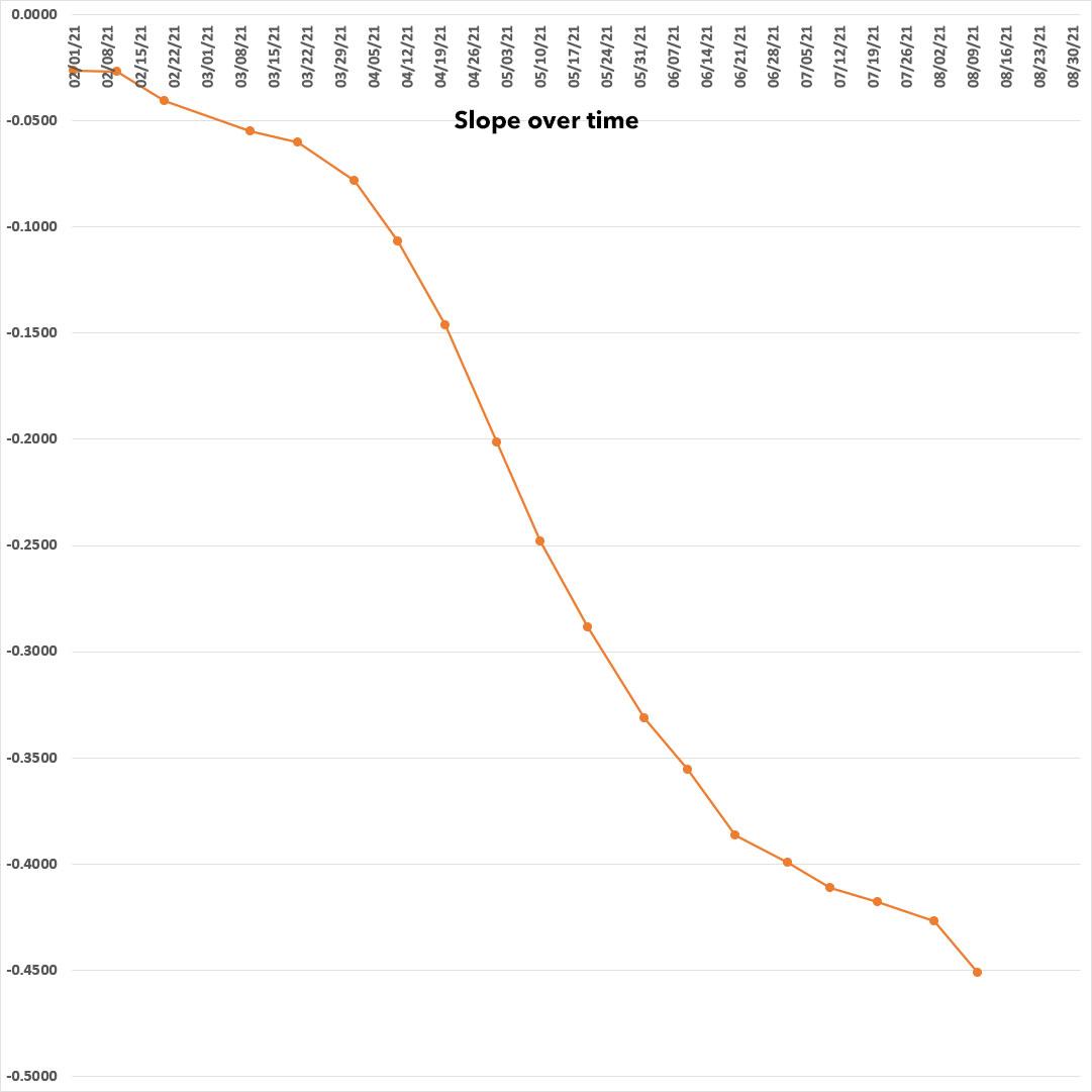
One thing I've been noting is that the R-squared (coefficient of determination) for the graphs at both the state & county levels seems to have been inching up higher over the past month or two...that is, the outlier counties seem to be gradually moving closer to the graph's trend line.
Furthermore, the slope of the trend line seemed to be moving upwards as well over time. Both of these mean that not only is there a clear correlation between a county's 2020 partisan lean and how quickly their residents are getting vaccinated, that correlation is only increasing over time.
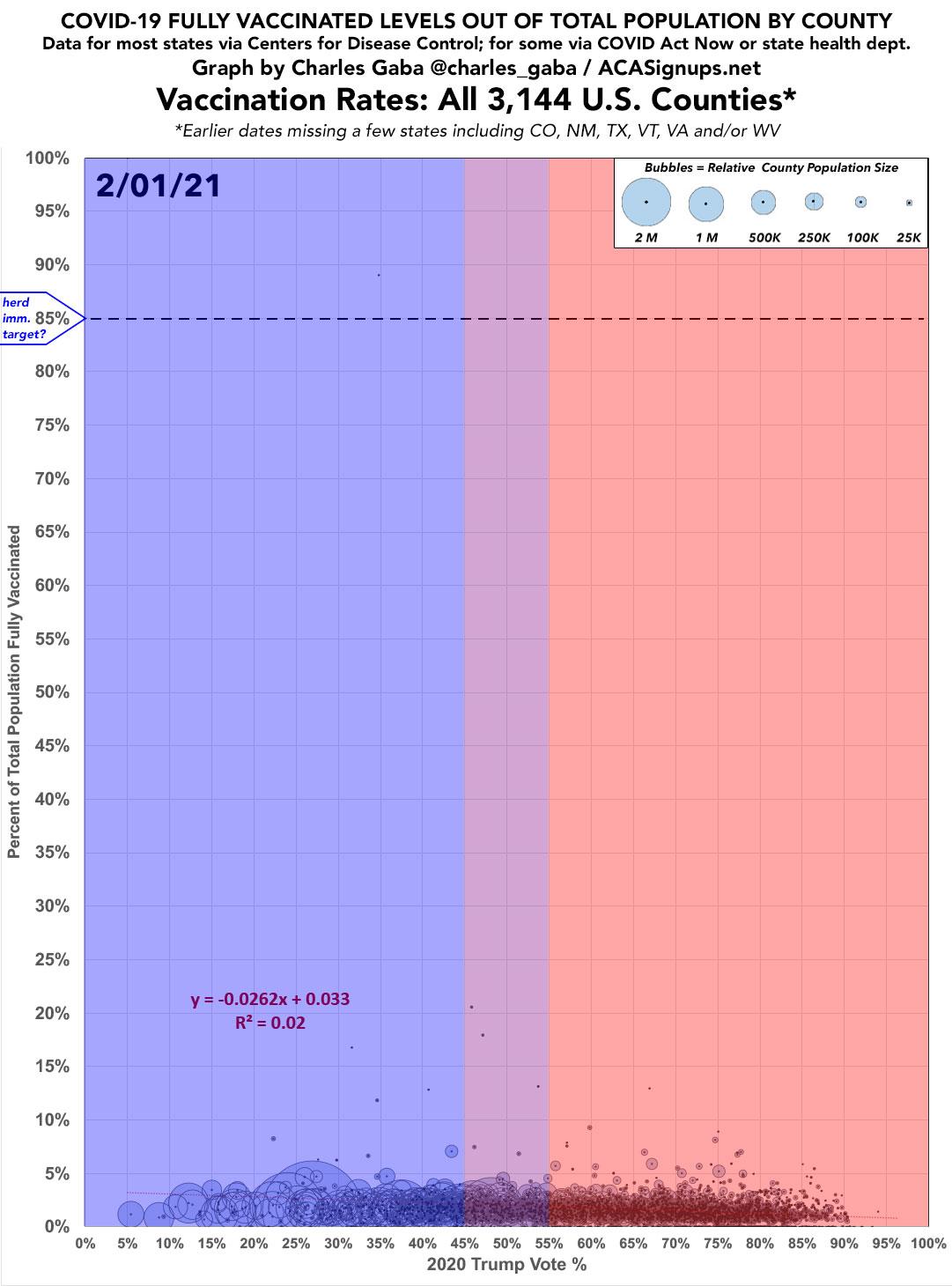
I decided to check to see whether this was an anomaly (just a temporary thing) or not by going back to the county-level vaccination data all the way back to February 1st, 2021. At that point supplies of both the Pfizer and Moderna vaccines were ramping up, but getting vaccinated was still limited mostly to senior citizens 65 and older in the United States.
Unfortunately, this proved to be a much bigger project than I expected. Not only didn't I even start tracking the vaccination rates in late May, but I didn't really delve deeply into it until July. Even then, I didn't think to save my weekly data once I posted the graphs and blog entries; I simply copied over it each week.
This made my job a hell of a lot harder, because I had to dig back through the CDC's county-level vaccination database again to pull out all 3,000+ counties for every day I was plotting out. I decided to go with every 10 days instead of every week to ease the burden on myself a bit.
On top of that, the CDC's data is only really complete for 42 states; they don't post any county-level data for Hawaii or Texas; they only have very incomplete data for Colorado, Georgia, New Mexico, Vermont, Virginia and West Virginia; and for California and Massachusetts they have complete data for most counties but are missing it for a handful of smaller ones.
For the missing counties in these states, I've been relying on either the individual state health department websites (CO, GA, NM, TX) or the COVID Act Now database instead. Even then, CO & NM don't seem to keep their historic vaccination data available; like me, they seem to be just copying it over every day. As a result, they're missing from most of the slides in the animation below. TX doesn't provide historic data either, but I happen to have downloaded their daily spreadsheets for over half the days. Data for GA, VT, VA & WV are missing for the first few slides but I was able to dig it up for everything past April or so.
Here's what it looked like on February 1st...
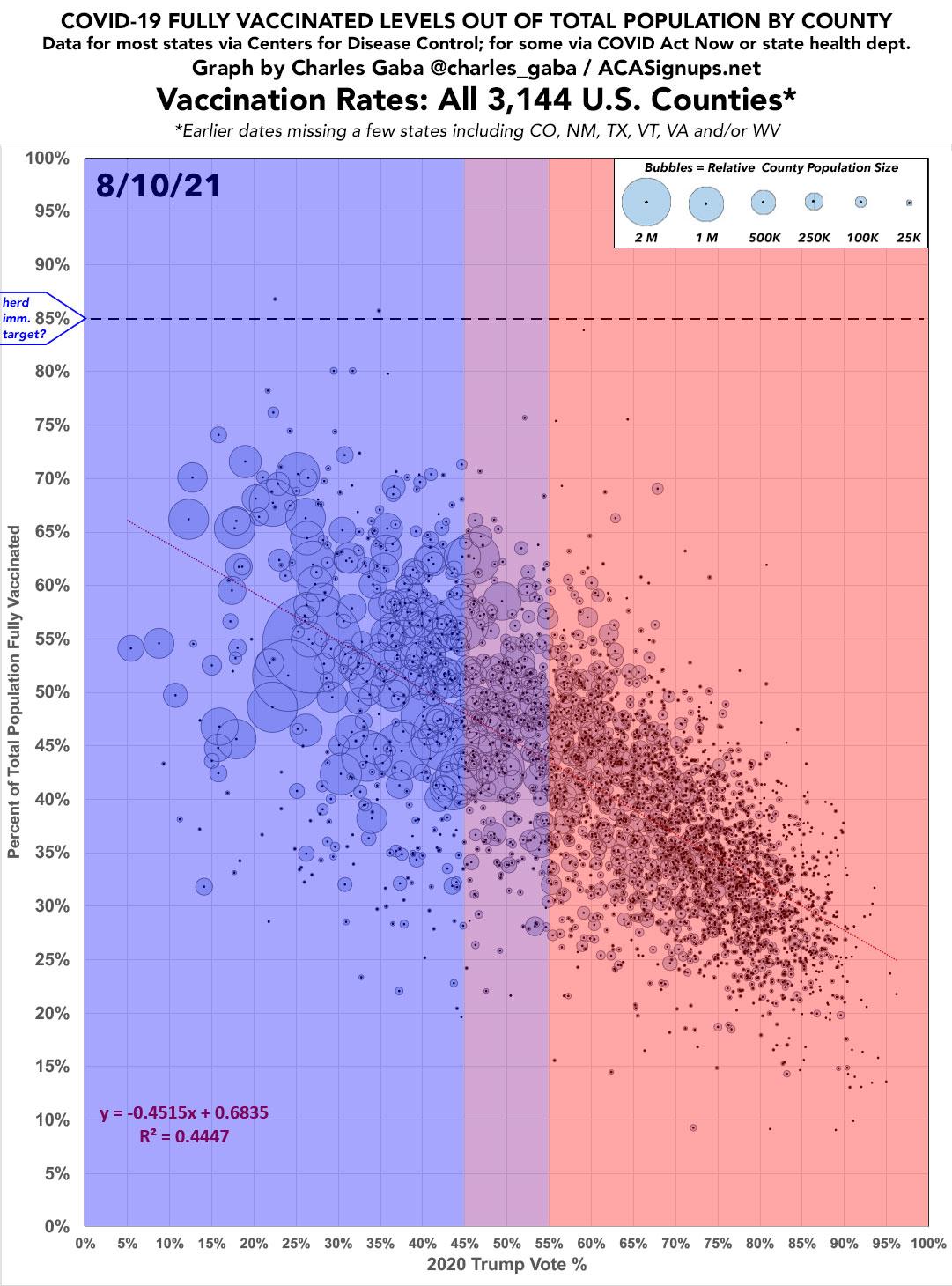
...and here's what it looked like as of yesterday, August 10th:
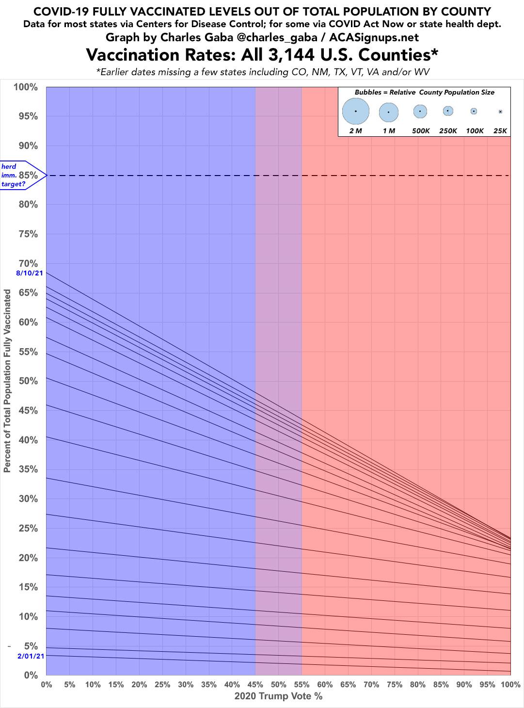
When I remove everything except the trend lines for each date and overlay them on top of each other, it looks like this:
It's also important to keep in mind that I base my work on the entire population of every county, not just adults or those 12+. Children under 12 can't get vaccinated yet, and they make up roughly 15% of the total U.S. population. This means that for nearly every county, reaching the 85% "herd immunity target" threshold really amounts to nearly 100% of their entire eligible population getting vaccinated.
This means that sooner or later the slope will have to start reversing itself, simply because the Bluest counties will begin bumping up against their vaccination ceilings...at least until the COVID vaccine is finally approved for children under 12, at least.
Here's how the R^2 has increased over time. It's been remarkably steady overall, with just a couple of odd shifts here and there which are likely due to a few states are missing on some dates but not others. The sudden jump right at the end (yesterday) is likely due to that being the only date for which I have data for all 3,144 counties (ie, including all 50 states + DC):
Similarly, here's the slope formula over time; it seems to form an even smoother curve:
Finally, just for the hell of it, I put all 19 dates together from February - August into an animation so you can see how it's changed over the past six months:

Advertisement
