

Weekly Update: A picture's worth a thousand words
Wed, 06/02/2021 - 4:13pm
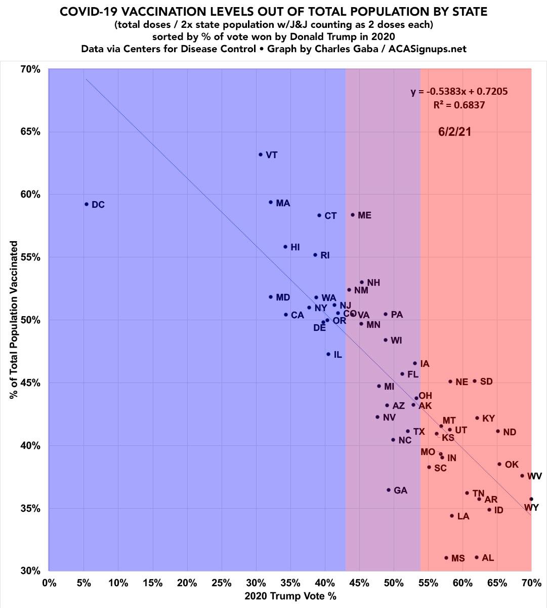
The vaccination levels for each state below are based on taking the total number of COVID-19 doses administered to date according to the Centers for Disease Control), then and dividing that into double the state population (since each person needs two doses to be fully vaccinated) as of April 2020 according to the U.S. Census Bureau.
I then adjust each state by counting the single-dose Johnson & Johnson vaccine twice (since it's effectively similar to getting 2 Pfizer or Moderna doses).
The percent of 2020 Presidential election vote won by Donald Trump comes from Wikipedia, which in turn gets their data from the Federal Election Commission.
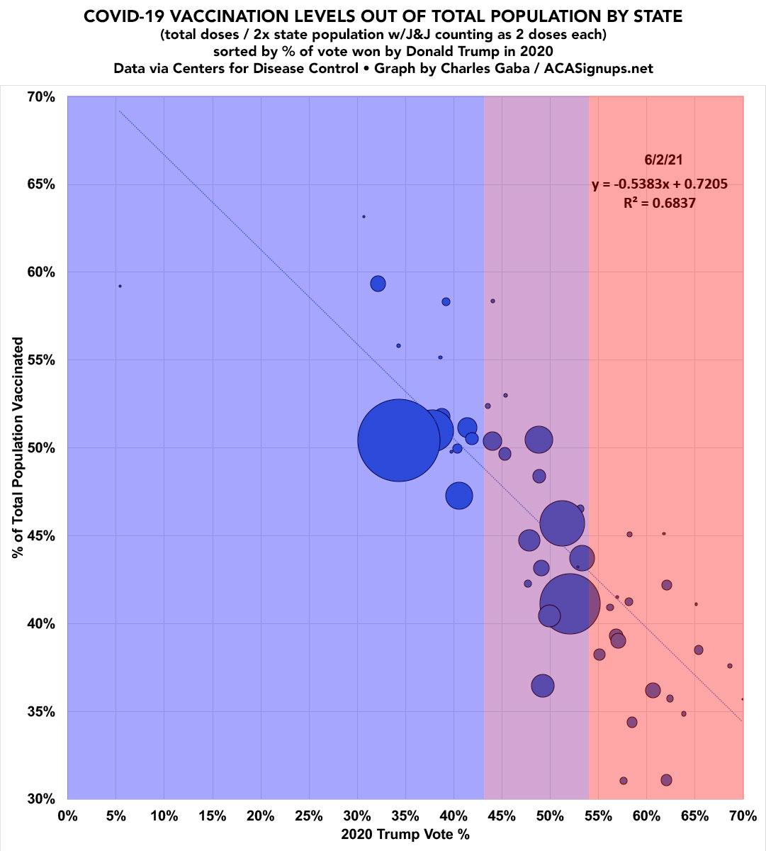
Here's the same graph with the states sized proportionately by total populatoin. Note, however, that the R2 trend line is not weighted by population, though I suspect it would be higher if it was:
I've added another version which plots out each state by Educational Attainment (% of population over age 25 w/a Bachelor's Degree or higher, according to the U.S. Census Bureau). As you can see, there's also a strong correlation here, but not as strong as by partisan lean:

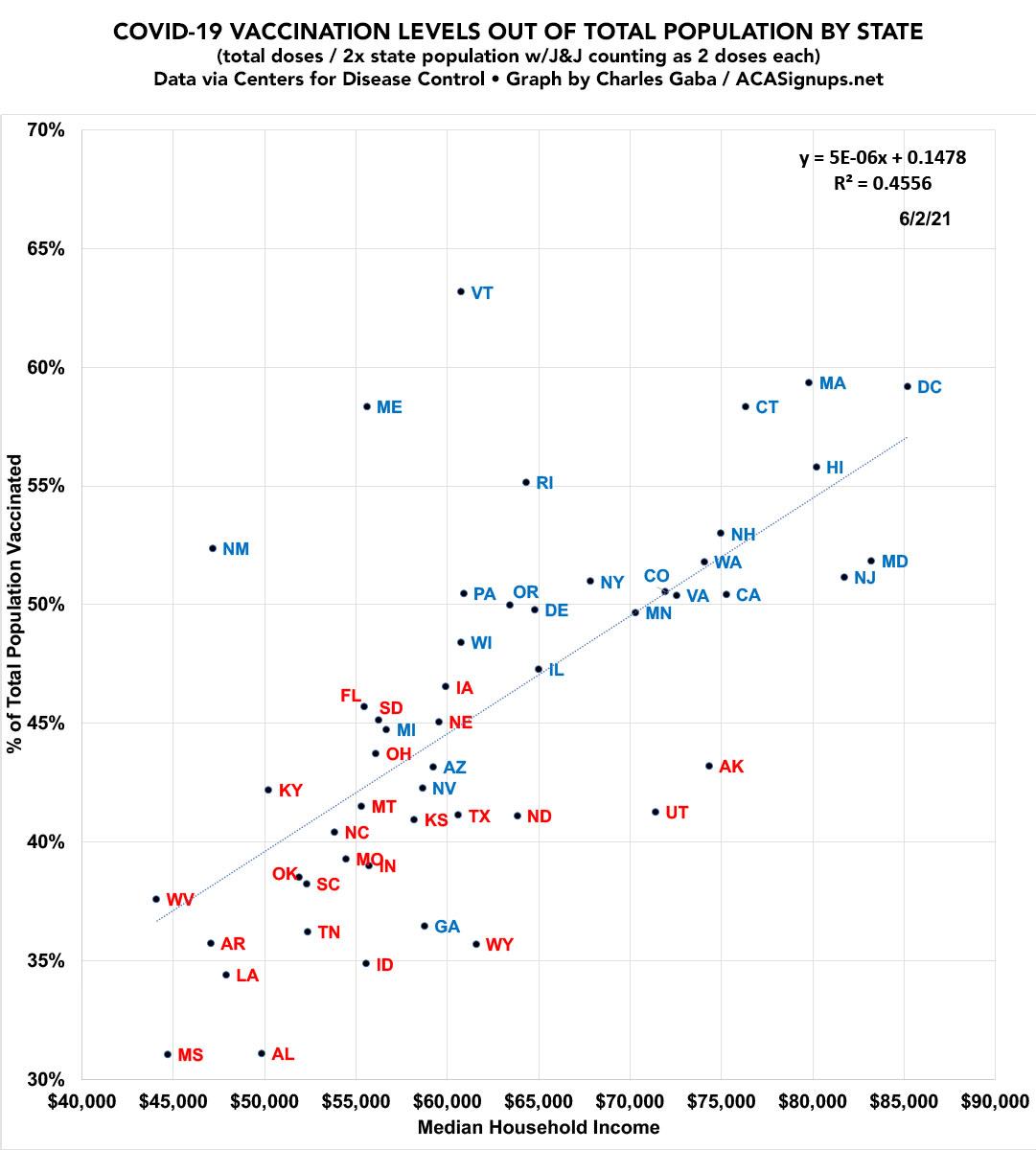
I've also plotted it out by Median Household Income (as of 2018, via the American Community Survey). Again, a definite correlation but not as strong as when ranked by partisan lean.
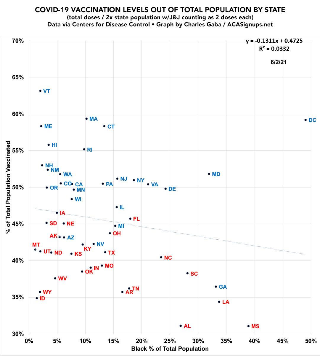
I've also plugged in a RACIAL DEMOGRAPHIC version based on the percent of each state's popualtion which is Black, according to 2018 Census Bureau estimates (by way of BlackDemographics.com). Obviously there's also Hispanic, Native American, Asian American/Pacific Islanders etc, but this illustrates things the most clearly:
Advertisement
