UPDATED: I don't want to hear any more criticism about my tracking #COVID19 along partisan lines.

Back in March, I launched my own COVID-19 case/fatality tracking spreadsheet project which mostly duplicates any number of existing sites, but with a couple of additional twists:
- I've included the estimated total population of every U.S state/territory via Wikipedia (as of July 2019) which allows me to add new columns listing both the confirmed COVID-19 cases and deaths per capita. This gives a much clearer picture of how relatively ugly things have gotten in each state/territory to date.
- I've added columns to rank the daily percent increase in both confirmed cases and deaths for each state/territory (on the right side), which is important for tracking the rate of the virus' spread.
- I've added the Presidential partisan lean of each state as well as which party holds the governor's seat. This may seem incredibly inappropriate (and it is), but it's sadly necessary because Donald Trump has apparently decided to only grant his favor and any substantial assistance to states which a) voted for him and b) whose governors kiss his ass enough.
I've taken some amount of criticism from people who got the vapors and claimed that I was "politicizing" the pandemic, which is laughable in the Trump era, where everything has been politicized by the Trump Administration.
Cut to Vanity Fair, yesterday:
Six months into the pandemic, the United States continues to suffer the worst outbreak of COVID-19 in the developed world. Considerable blame belongs to a federal response that offloaded responsibility for the crucial task of testing to the states. The irony is that, after assembling the team that came up with an aggressive and ambitious national testing plan, Kushner then appears to have decided, for reasons that remain murky, to scrap its proposal.
...The plan crafted at the White House, then, set out to connect the dots. Some of those who worked on the plan were told that it would be presented to President Trump and likely announced in the Rose Garden in early April. “I was beyond optimistic,” said one participant. “My understanding was that the final document would make its way to the president over that weekend” and would result in a “significant announcement.”
But no nationally coordinated testing strategy was ever announced. The plan, according to the participant, “just went poof into thin air.”
...the effort ran headlong into shifting sentiment at the White House. Trusting his vaunted political instincts, President Trump had been downplaying concerns about the virus and spreading misinformation about it—efforts that were soon amplified by Republican elected officials and right-wing media figures. Worried about the stock market and his reelection prospects, Trump also feared that more testing would only lead to higher case counts and more bad publicity.
...Most troubling of all, perhaps, was a sentiment the expert said a member of Kushner’s team expressed: that because the virus had hit blue states hardest, a national plan was unnecessary and would not make sense politically. “The political folks believed that because it was going to be relegated to Democratic states, that they could blame those governors, and that would be an effective political strategy,” said the expert.
...On April 27, Trump stepped to a podium in the Rose Garden, flanked by members of his coronavirus task force and leaders of America’s big commercial testing laboratories, Quest Diagnostics and LabCorp, and finally announced a testing plan: It bore almost no resemblance to the one that had been forged in late March, and shifted the problem of diagnostic testing almost entirely to individual states.
And there you have it: The Trump Administration decided that more Democrats would get sick and/or die from COVID-19 than Republicans, so they didn't give a rat's ass.
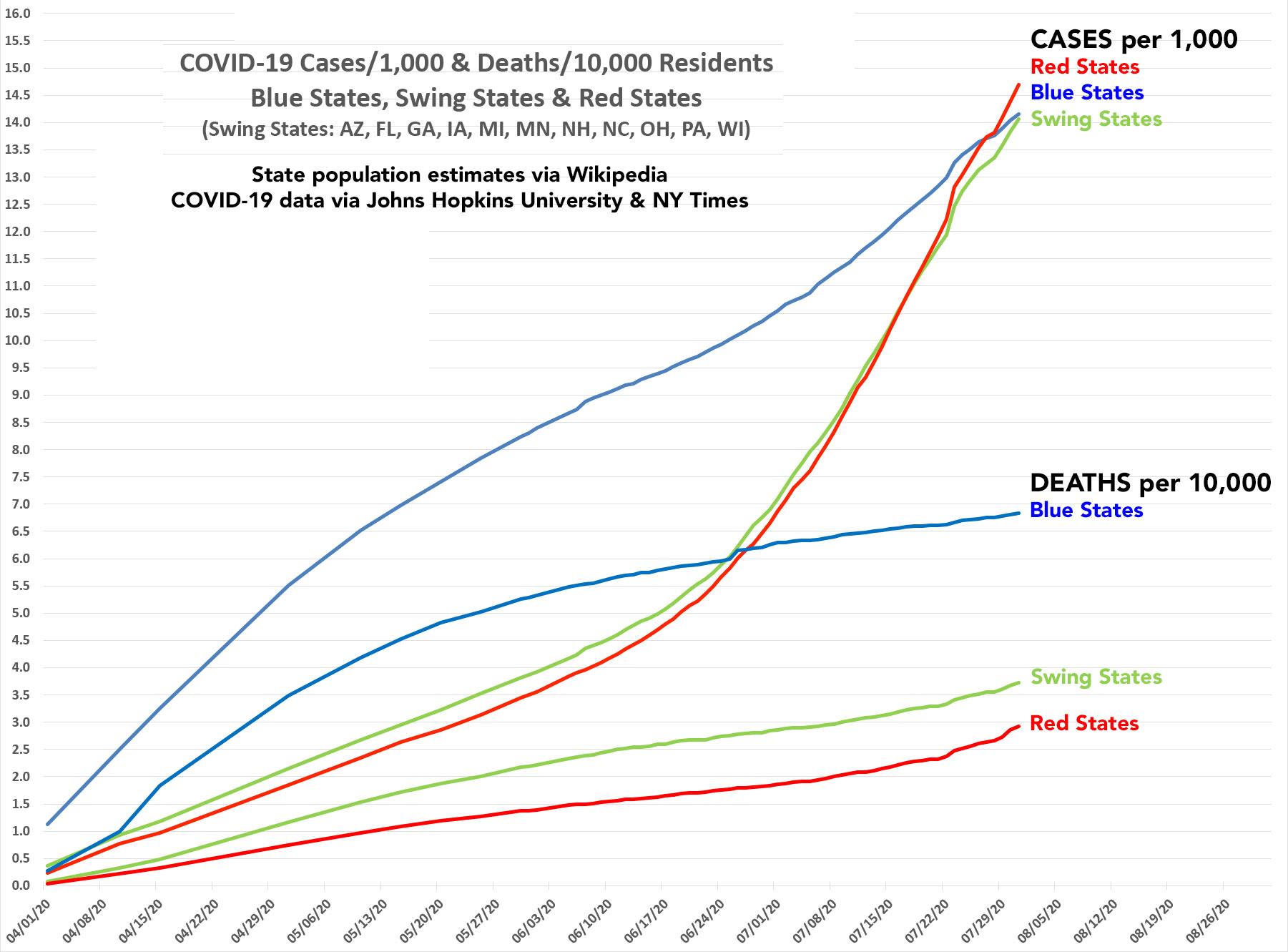
With that in mind, here's where things stand as of today. The table below tracks cumulative COVID-19 cases and fatalities on a per capita basis, broken out into three groups: Solid red states (Alabama, Wyoming, Oklahoma, etc.); solid blue states (New York, California, Massachusetts, etc) and Swing states, including Michigan, Wisconsin, Pennsylvania and so forth. Obviously your definition of "Swing State" may vary...I've included Georgia and Arizona, neither of which would be considered remotely "swingable" a few years ago.
On a per capita case level, the red states just bypassed the blue states a few days ago, with swing states about to do the same. In terms of mortality, the blue states are still clearly far higher than either of the other groups (roughly 2.4x as high a rate as the red states), but that will likely change within a couple of months at their current trajectories.
Of course, there's no way of knowing what the partisan breakout is within each state. Here in Michigan, for instance, as of yesterday, the city of Detroit (Hillary Clinton received 96% of the vote in 2016) had 13,531 known cases and 1,572 known COVID19 deaths out of 89,781 and 6,443 statewide. That's 15.1% of Michigan cases and 24.4% of MI COVID deaths respectively even though the city only has 6.7% of the state's population.
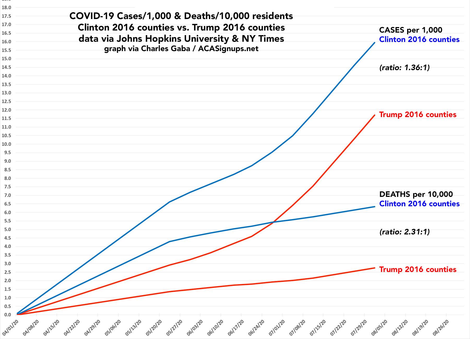
Once a week I run these numbers at the county level nationally as well; this is a much larger job as there are over 3,100 counties, parishes & county-equivalents in the U.S. versus just 50 states plus DC (I also track Puerto Rico and the other U.S. territories, but they don't really play into the traditional "red/blue" partisan breakout). The graph below is several days out of date and only includes cases per capita, not deaths.
UPDATE 8/02: OK, strike that...I've updated the county-level graph through August 1st and have gone back and added mortality rates as well. It now matches the state-level graph above (although for the county level I only have it broken out into Clinton/Trump counties, not "swing counties").
The trend is the same, though at a less dramatic rate; as of 8/01, blue counties were still running around 36% higher than red counties in case rates and 130% higher in mortality. Again, even solidly red or blue counties could have substantial portions of the population which lean the other way and which are being hit harder:
In any event, I hope the Vanity Fair article puts to rest any complaints that it's "inappropriate" for me to be viewing the data through a partisan lens...because when the President of the United States, the HHS Dept., the Centers for Disease Control and the rest of the executive branch of the federal government is doing so, it means policy is being determined based on it. Pretending it "doesn't matter" because it shouldn't matter doesn't magically make it so.


