

HealthCare.Gov continues to improve, but...
Thu, 11/03/2016 - 12:11pm
Last week, ahead of the launch of the 2017 Open Enrollment Period, I took a look at what's new over at HealthCare.Gov this year. For the most part I was pretty impressed; they've made it more mobile-friendly, added refinements and changed the plan filtering interface so that it's consistent across both desktop, laptop and mobile devices.
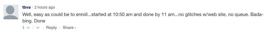
The actual enrollment process itself also appears to be running smooth as silk; here's a comment from just this morning:
However, there are still a few user interface glitches which need to be addressed, at least on the "Window Shopping" tool. Here's two of them (three, really, although two are the same problem for different functions):
Problem #1. The "Household Member" Glitch:
When you start plugging in info about the members of your household, it asks you to enter your age, gender, whether you're pregnant and so on. You then click "Continue" and move onto other members of the household, who are listed below the box with your info.
HOWEVER, what happens if, instead of clicking "Continue", you skip over that and click "Change" for "Your Spouse"? The "Change" box should be greyed out until after you click "Continue" on your own info to make sure yours is locked in.
Instead, you can go ahead and click "Change" on your spouse's section, with no indication that your own age/etc hasn't been saved. Here's what happens after that:
As you can see, since there's no age listed for you, the system assumes that there's only 2 members of the household and therefore, even though a $50,000 income should qualify you for tax credits for a 3-person household, it claims you're not eligible. Even worse, if you try to click "Continue" after viewing the summary page, not only is the household info wrong, but the next page is completely blank.
SOLUTION: Make sure that people are unable to edit anyone else in the household until after they've clicked "Continue" on whoever they're currently editing.
Problem #2 and #3: The "Metal Level" and "Plan Type" Filter Glitch:
When you actually start comparison shopping, there's a handy filtering tool which allows you to minimize the clutter/confusion by filtering out plan options by different criteria, just like Amazon and other major ecommerce sites. Filtering options include premium price ranges, deductible range, Metal Levels, Plan Type and specific Carriers, among others.
Here's the problem: For both "Metal Level" and "Plan Type" (which means HMOs vs PPOs, etc), you're supposed to be able to select more than one option at a time...only Gold and Silver, for instance, or only PPOs and EPOs.
Instead, even though the system displays checkboxes (intended for multiple-choice options) instead of radio buttons (which are intended for single-choice options), here's what happens:
SOLUTION: Well...you know...fix it so that you can actually compare two or more Metal Levels or Plan Types...
Advertisement
