A few days ago, CMS announced that they're retooling the ACA's SHOP program (at least on the federal exchange) so that instead of small businesses using HealthCare.Gov for eligibility verification, enrollment and payments, going forward it will only be used for verification, with the businesses then being kicked over to the actual insurance carrier website in order to actually enroll in the policies and make payments.
Although the Trump Administration and HHS Secretary Tom Price are hell bent on killing off the ACA altogether, this move didn't bother me for several reasons. For one thing, the SHOP program has always been kind of a dud anyway, with only around 230,000 people being enrolled in it nationally. For another, a business signing up their employees for coverage is a very different animal from an individual signing their family up for a policy. Finally, for several reasons, SHOP enrollment across the dozen or so state-based exchanges is actually higher than it is across the 3 dozen states covered by HC.gov, and the state-based exchanges aren't impacted by this policy anyway.
While poking around in the SERFF rate filing database for different states, I occasionally find filings which DON'T apply to ACA-compliant policies or enrollees but which are of interest to healthcare nerds such as myself. I've decided to bundle these into a single post as they pop up, so check this entry once in awhile.
IOWA: Big Kahuna carrier Wellmark submitted a filing for non-ACA compliant small group policies (either grandfathered or transitional) which have effective/renewal dates of July, August or September 2017. The requested rate increase is 7.0% on average, which is pretty typical for small group plans, and it appears that Wellmark had 51,003 people enrolled in such policies as of 12/31/16. Nothing odd there.
Julie McPeak is the Tennessee Insurance Commissioner. She was appointed by a Republican Governor, Bill Haslam, and while the position itself appears to be nonpartisan, I've found several links indicating that yes, she's a Republican herself. This is hardly surprising in Tennessee, of course, and there's nothing wrong with it...but it's noteworthy given that Tennessee is among the 19 states which has been fairly hostile towards the ACA in general over the years (no state exchange, no Medicaid expansion, total GOP control and so forth).
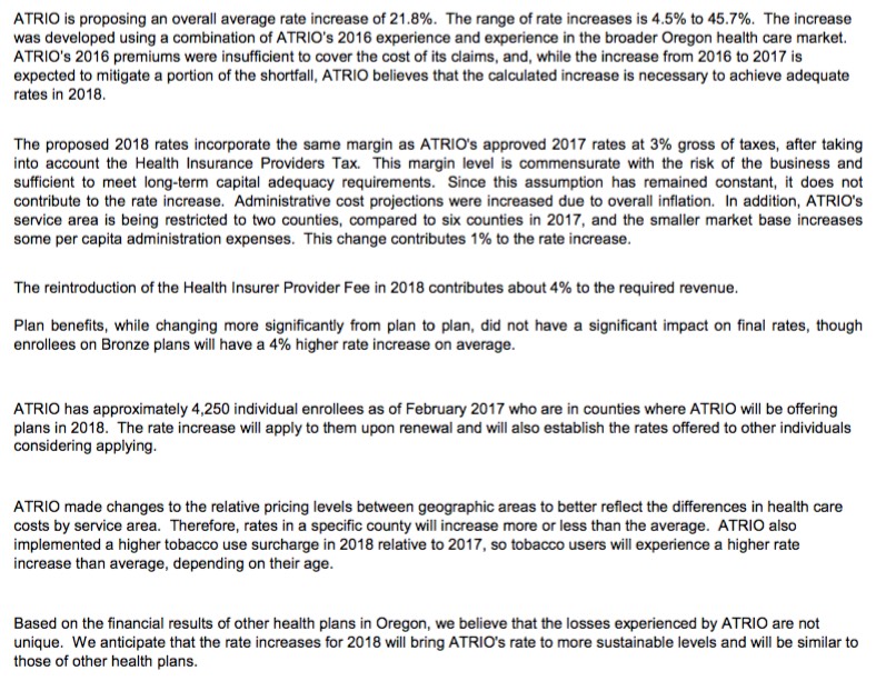
Oregon is the 5th state to post their initial 2018 rate filings. Last year their weighted average increase was roughly 26.5% across 10 individual market carriers. This year I only see 8 carriers offering policies on the indy market, but the two missing are "Trillium" and "ZOOM", neither of which had more than a handful of enrollees to begin with.
As you can see, ATRIO Health Plans was refreshingly clear in their rate justification letter, not only listing the key numbers (covered lives, average increase) but the reasons for it: 4% due to the reinstatement of the ACA's carrier tax; 1% due to them choosing to shrink their own coverage area from 6 counties to just 2; an increase for smokers., etc. They list 4,250 people being impacted by the increase; I don't know the population of the other 4 counties they're pulling out of, but assuming they're roughly equal, around 8,000 current enrollees will have to shop around this fall.
Regular readers know that generally speaking, I support the ACA overall. They also know that I also have significant criticisms of the law, and have compiled a lengthy list of fixes/improvements both small and large which I feel are necessary to stabilize the individual market. I've also written on occasion about the SHOP provision of the ACA: The small business version of the ACA exchanges.
The idea was to give small businesses with fewer than 50 employees an open marketplace to comparison shop, similar to the individual exchanges, and also to provide some amount of financial assistance to them along the lines of APTC for indy market enrollees. The ACA requires businesses with over 50 full-time employees to provide coverage, but it's voluntary for those under 50, so SHOP has always been more of a courtesy program than a necessary one.
Vermont is the 4th state to post their initial 2018 rate filings. Vermont has a couple of unusual policies re. their healthcare market: First, while they do technically have an off-exchange individual market, those policies are all fully ACA-compliant QHPs and are tracked exactly the same as on-exchange QHPs, meaning this dashboard report from February includes just about all of their individual market enrollees: 28,775 on exchange + 5,662 off-exchange, for a total of 34,437 ACA-compliant enrollees. Vermont didn't allow transitional plans, so aside from an unknown number still enrolled in grandfathered plans, that should represent their entire individual market.
Assuming this ratio hasn't shifted much over the past 8 years, around 28% of the total U.S. population are mothers,
Of course, women over 64 (mostly on Medicare) are much more likely than the general population to be mothers...but girls under 18 are far less likely to be (well...under 16, anyway...the birth rate varies from state to state, of course), so I'm assuming that these cancel each other out, resulting in that 28% rate being roughly accurate.
Senate Republicans are working on a potential breakthrough that could help push through an Obamacare repeal bill – by making insurance subsidies look a lot like Obamacare.
There’s growing support for the idea of pegging the tax credits in the House repeal bill to income and making aid more generous for poorer people. But those moves — while they may win consensus among Senate moderates — are unlikely to sit well with House conservatives.
The financial assistance in the House bill “is just not robust enough to make sure that low-income individuals can actually afford a [health] plan,” said Sen. John Hoeven (R-N.D.). “If you bring those income limits down for people who really need the help, you can give them more help.”
Over the past year or so, Andrew Sprung of Xpostfactoid, Michael Hiltzik of the L.A. Times and I have repeatedly noted that as much as most insurance carriers may be griping about the individual market, their bread and butter is generally in other divisions, including the large group market but especially Managed Medicaid and Medicare Advantage:
The expansion of Medicaid benefits, thanks largely to the Affordable Care Act, helped increase enrollment in private health plans by 3.4 million in the last year,according to a new report from consulting firm PwC.
...PwC said 73% of Medicaid beneficiaries — or 54.7 million of the 75.2 million Americans covered by the health benefit program for the poor – are enrolled in private plans that contract with the Medicaid program.
...But the growth in the last year wasn’t as fast as 2015 when health plans added more than 8 million Medicaid beneficiaries as more states agreed to expand such coverage under the ACA.