

Updated: A Full Year of U.S. COVID Vaccinations by Partisan Lean...Animated
Tue, 02/22/2022 - 2:04pm
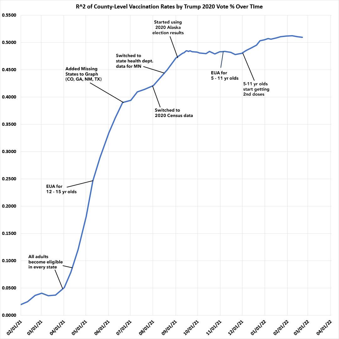
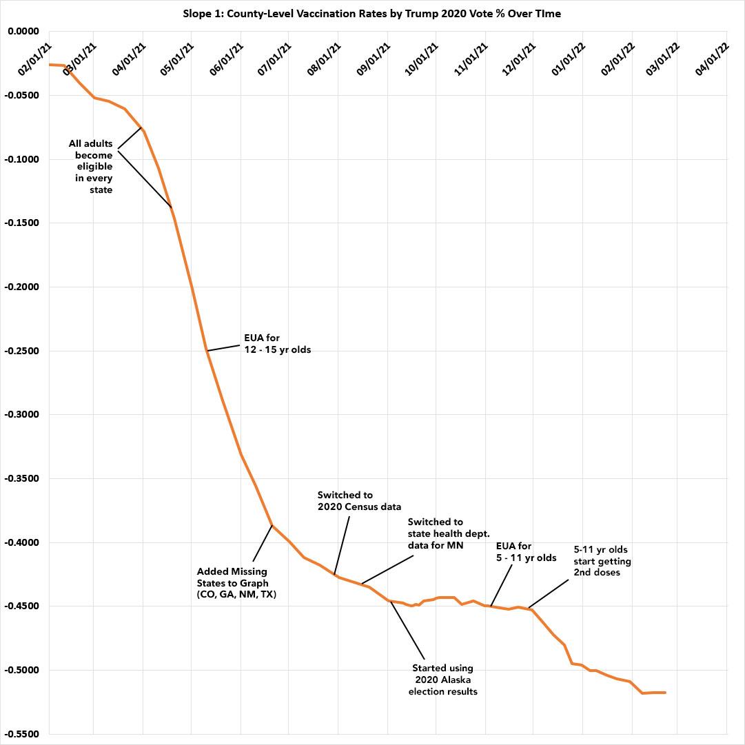
Last summer, I pulled together the occasional vaccination rate scatter plot graphs I'd been compiling for months into a single animated GIF image to show how both the correlation (R^2) and steepness (slope) of the partisan COVID vaccination divide grew from almost nothing at all to a gaping chasm over a six month period, from February 2021 through August 2021.
Today, I'm presenting an updated version of this animation which not only includes the following six months as well (September 2021 - February 2022), but also cleans up & standardizes the layout of each graph as much as possible. This includes making sure the thru date is in the upper right-hand corner on all of them, moving the population key to the lower-right corner, removing the (naive in retrospect) "herd immunity target" line, and moving the R^2 stamp immediately below the thru date to make the graph itself as clean as possible.
Methodology reminders:
- I go by county residents who have received the 2nd COVID-19 shot only (or 1st in the case of the J&J vaccine).
- I base my percentages on the total population via the 2020 U.S. Census as opposed to adults only or those over 11 years old (or even over 4 years old).
- For most states + DC I use the daily data from the Centers for Disease Control, but there are some where the CDC is either missing county-level data entirely or where the CDC data is less than 90% complete at the county level. Therefore:
- For Vermont and West Virginia, I'm using data from the COVID Act Now Risk & Vaccine Tracker database
- For Virginia, I recently switched from using COVID Act Now data to the official state health department dashboard due to some weirdness with the former re. VA data.
-
- For California, Colorado, Georgia, Hawaii, Minnesota and Texas, I'm using their COVID vaccine dashboards set up by the state health departments.
- For Massachusetts, I use CDC data for most counties but the official Massachusetts Health Dept. weekly data report for Barnstable, Dukes & Nantucket counties, which the CDC only has partial data for.
- Alaska's 2020 election results are estimated thanks to an updated analysis by RRH Elections (all other states +DC have been using 2020 county-level election data all along).
- Some of the earlier snapshots were missing a handful of states including Texas, Colorado, New Mexico, Hawaii and Georgia. I also switched New Mexico from CDC data to state health dept. data and back again at a couple of points due to some odd data gaps at different points.
- In mid-August, I started tracking the U.S. territories as well by listing their vaccination rates on the right-hand side of the graphs (they can't be included in the main graph since they don't vote for President in the general election, of course).
- In mid-August I also briefly started labeling a couple dozen outlier counties, but quickly gave up on this after a couple of weeks.
- In the most recent updates, I've started capping the maximum vaccination rate for any county at 98% to reflect the uncertainty over some of the data (there's a few counties which would come in over 100% vaccinated if you went by the official numbers, which is obviously impossible). I also recently changed the title from "Fully Vaccinated" to "2-Dose Vaccinated" to reflect the reality of 3rd/booster shots being necessary to provide maximum protection against the Omicron variant.
With all this in mind, I present a full year of COVID-19 vaccination rates over time, sorted by 2020 partisan lean:
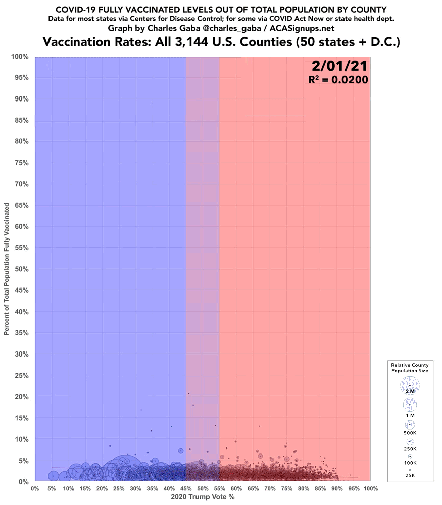
As I've been noting for awhile now, the most telling thing about this is how there was virtually no partisan gap in the first couple of months (February & March), when only seniors, healthcare workers and certain immunocompromised & other select groups were eligible to get vaccinated.
Starting in early April, however--at pretty much the exact point that all U.S. adults became eligible for the vaccine--the partisan divide started to ramp up quickly. This was followed in early May by President Biden's stated goal of at least 70% of all U.S. adults getting their first shot by July 4th.
The red/blue divide increased month after month regardless of other factors (children 12-15 becoming eligible; missing states being added; changing my population data from the U.S. Census Bureau's 2019 estimates to their official 2020 Census results; etc.) until around September, when it finally tapered off.
It didn't drop at that point, mind you...it simply flattened out...right up until around Thanksgiving, when 5-11 yr olds began receiving their 2nd Pfizer shots, at which point both the slope and correlation levels started rising again, if only slightly. Sadly, this means that young children of MAGA folks are disproportionately suffering due to their parents anti-science zealotry.
Advertisement
