

"Won't Someone Think of the Children??" Apparently not.
Tue, 02/08/2022 - 9:47am
Back in November, after the FDA & CDC gave the green light for children age 5 - 11 to get vaccinated against COVID-19, I said:
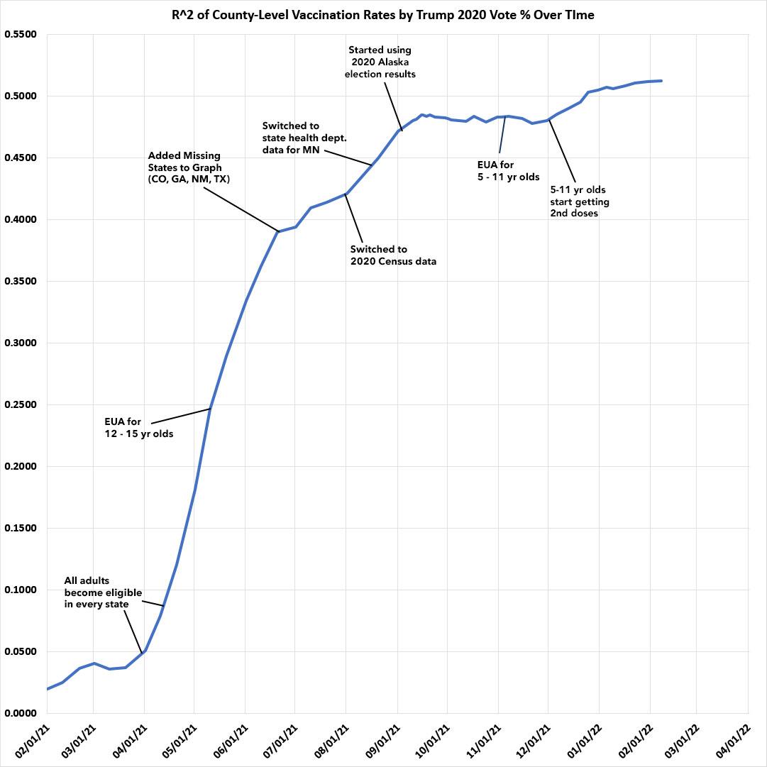
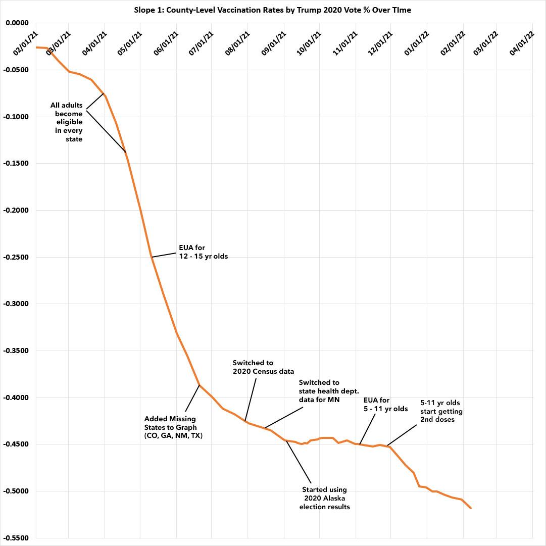
It's also important to note that after both the R2 (correlation) and slope formulas have pretty much plateaued over the past few weeks.
It'll be interesting to see what happens starting around Thanksgiving now that the FDA has given final approval to the Pfizer vaccine for 5-11 year olds (remember, I only track fully-vaccinated people, and the second Pfizer shot isn't given until 3 weeks after the first; assuming the first batch of younger kids starts getting their initial dose tomorrow (November 3rd), that means they should start getting their second dose around November 24th).
I was referring, of course, to the massive partisan gap in COVID-19 vaccination rates across the country. This wasn't really a thing when only senior citizens were eligible to get vaccinated back in January/February 2021...but the moment all U.S. adults became eligible, it was astonishing how quickly blue/Democratic-leaning regions of the country jumped onboard while red/Republican-leaning areas lagged behind. The gap between the increased dramatically over the next seven months or so before finally leveling off sometime in mid-September.
Both metrics remained virtually flat for a solid two months or so until, exactly as I expected, immediately after Thanksgiving weekend, the following happened (see both graphs below):
Here's what I said in response to both lines starting to move higher/lower again:
The most noteworthy thing is that both the R-squared and the slope are well over the 0.5 threshold and continue to inch upwards each week.
As I predicted back in mid-November, the most obvious reason for this is that 5 - 11 year-olds started receiving their 2nd Pfizer shot around Thanksgiving. The parents who were most likely to have gotten vaccinated themselves earlier this year are pretty clearly the ones most likely to get their children vaccinated, and the parents least likely to get vaccinated are, sadly, also those least likely to vaccinate their children either:
So, was this timing a coincidence? Well, that seems unlikely, but yesterday political strategist Rachel Bitecofer issued the following challenge:
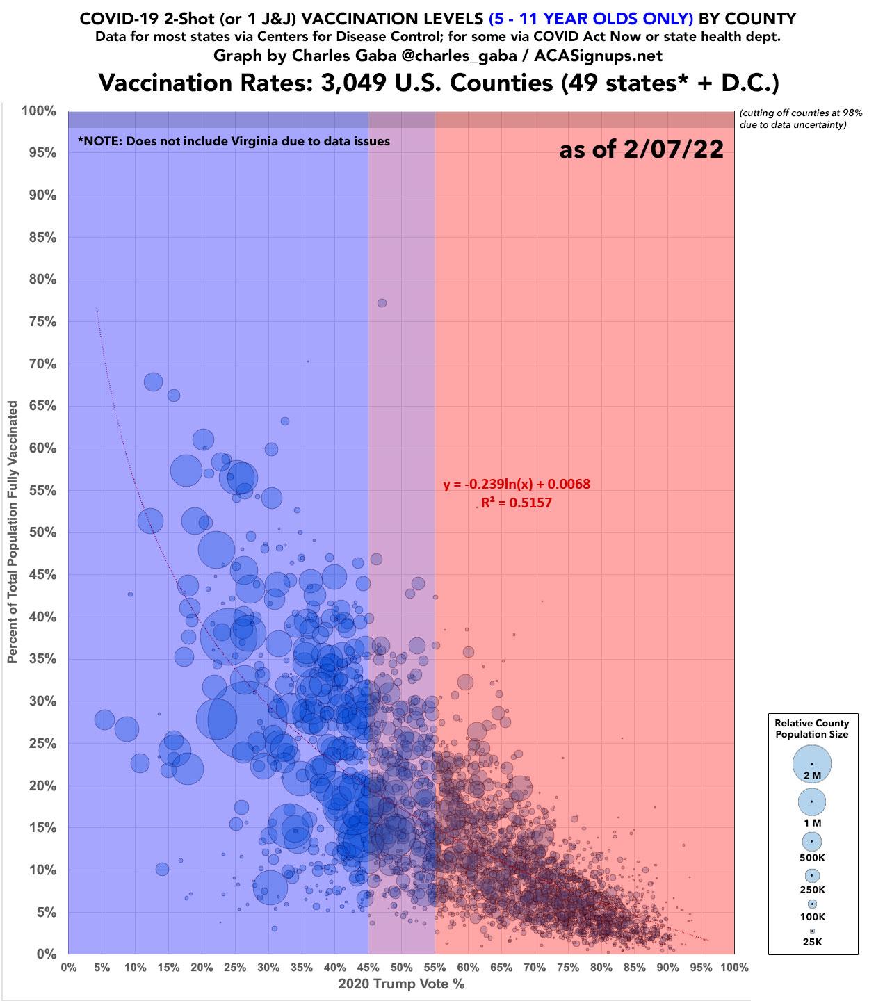
Someone data savvy like @charles_gaba can probably show us that the whopping 25% of kids 5-11 vaxxed are clustered in blue areas within states & predominately dispersed on the 2 coasts.
In other words, only Ds & Never Trump got the vaxx. https://t.co/n3DErBr5us
— Rachel Bitecofer (@RachelBitecofer) February 7, 2022
I responded by noting the R^2 graph above, and then decided to take up her challenge more formally. The following is the exact same red/blue county-level vaccination rate graph which I've become somewhat known for over the past 8 months or so, but with a twist: This version only includes the percent of the 5-11 year old population which has been 2-dose vaccinated in each county.
My data sources are mostly the same as usual (U.S. Census Bureau, Centers for Disease Control, a few state health dept. dashboards, etc.) but with a couple of caveats:
- I had to leave out Virginia entirely, as the CDC data is too incomplete and the VA Health Dept. dashboard doesn't allow you to view or export county-level data in a table/CSV/spreadsheet format.
- There's also a handful of tiny counties in California & Texas where this level of granular data is either unavailable or can't be shared publicly for legal/privacy reasons.
- The total 5-11 yr old population for each county comes from U.S. Census Bureau's July 2019 estimates. The actual age bracket they provied is 5-13; I'm using 7/9ths of that for each county to get the 5-11 yr portion. While this isn't ideal, it's consistent throughout all 3,000+ counties included below.
My initial response to Bitecofer was a bit crude--it was missing a half-dozen states and I was using less-reliable & less-consistent estimates for the total 5-11 population sizes, as well as missing the title, legend and red/blue background colors which make it more clear.
With that in mind, I'd say the graph below speaks for itself. Note that unlike my total population graphs, the trend line here is logarithmic instead of linear in order to fit the curve more closely. I have no idea whether this is the right one to use or not; I'm sure stats pros can correct me on that:
Advertisement
