

UPDATED: Time to check in on the COVID red/blue divide again.
Fri, 09/17/2021 - 10:34am
Two weeks ago I was inspired by a fellow wonk named Christopher Ingraham of The Why Axis to plot out COVID vaccinations, cases and deaths via bar graphs instead of my usual scatter plot graphs.
Today I'm posting updated versions of all three, with two major data updates:
- First, I finally have 2020 county-level election results for Alaska (until now I only had Alaska data for 2016).
- Second, presumably inspired by a lawsuit versus Ron DeSantis' Florida Health Dept. which stopped reporting county-level COVID deaths as of June 3rd, 2021, the White House COVID-19 Team has gone ahead and started posting Florida's county death numbers anyway (as of Sept. 13th) as part of their COVID-19 Community Profile report.
This means that I now have (mostly) up to date case/death data for every state except Nebraska, which stopped posting county-level data as of June 30th.
With these updates in mind, along with the continuing Delta variant surge nationally, let's take a look at where things stood as of yesterday (Sept. 16th).
First, here's the vaccination rate breakout. I've added a line at the 85% threshold to note that children under 12 yrs. old, who make up about 15% of the U.S. population on average, can't get vaccinated yet; our goal until that time should be for every bar to be as close to 85% as possible:
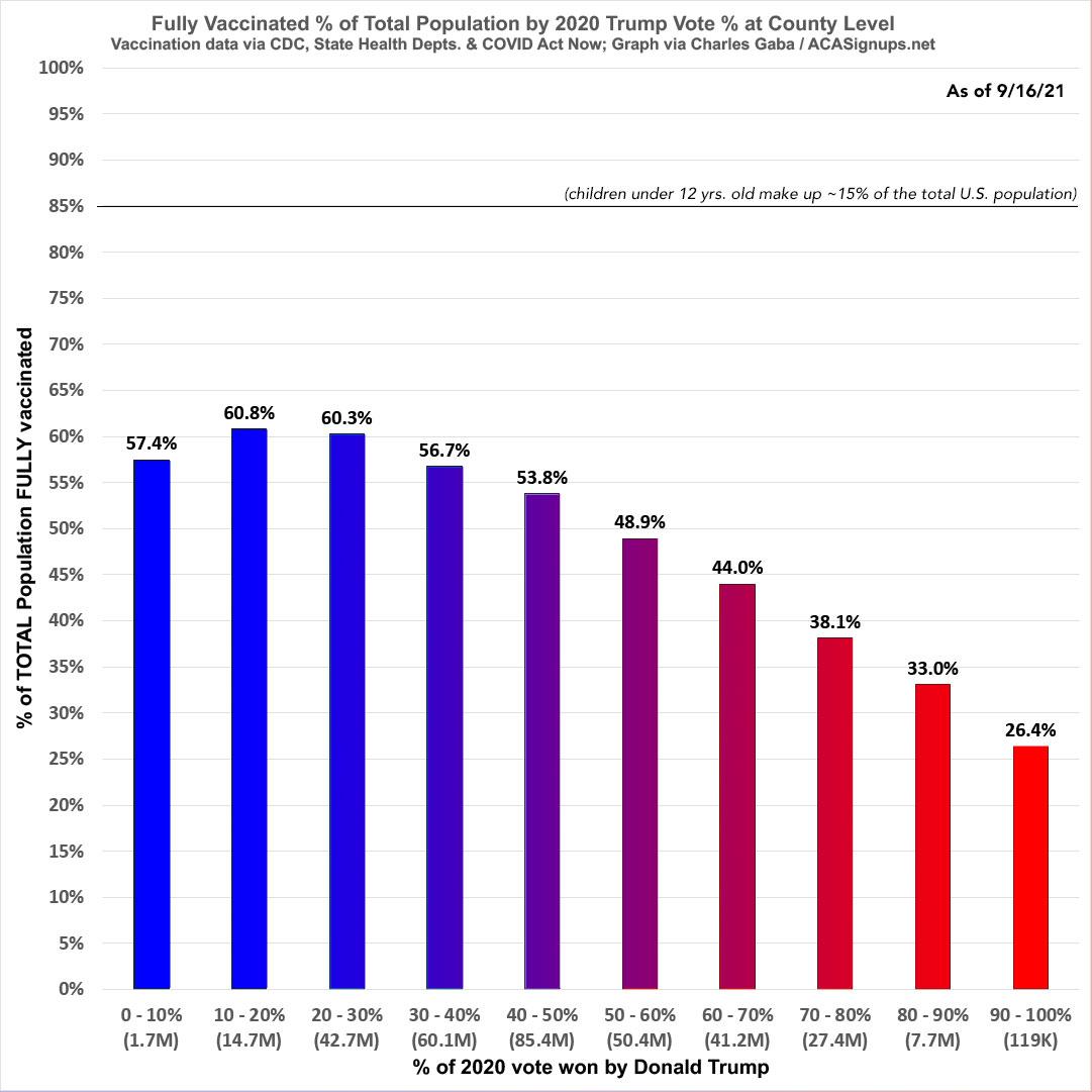
It's important to note that the first bracket only includes 4 counties total...nearly all of which is made up of the District of Columbia and Prince George County, Maryland. While that first bar messes with the otherwise smooth trend line, due to the low total population in this bracket they'd only have to have around 60,000 more fully-vaccinated residents in order to "match" the rest of the line (that would bring them to 61% vaccinated).
On the flip side, here's new COVID cases per capita since the end of June...a complete reversal of the vaccination graph, to no big surprise:
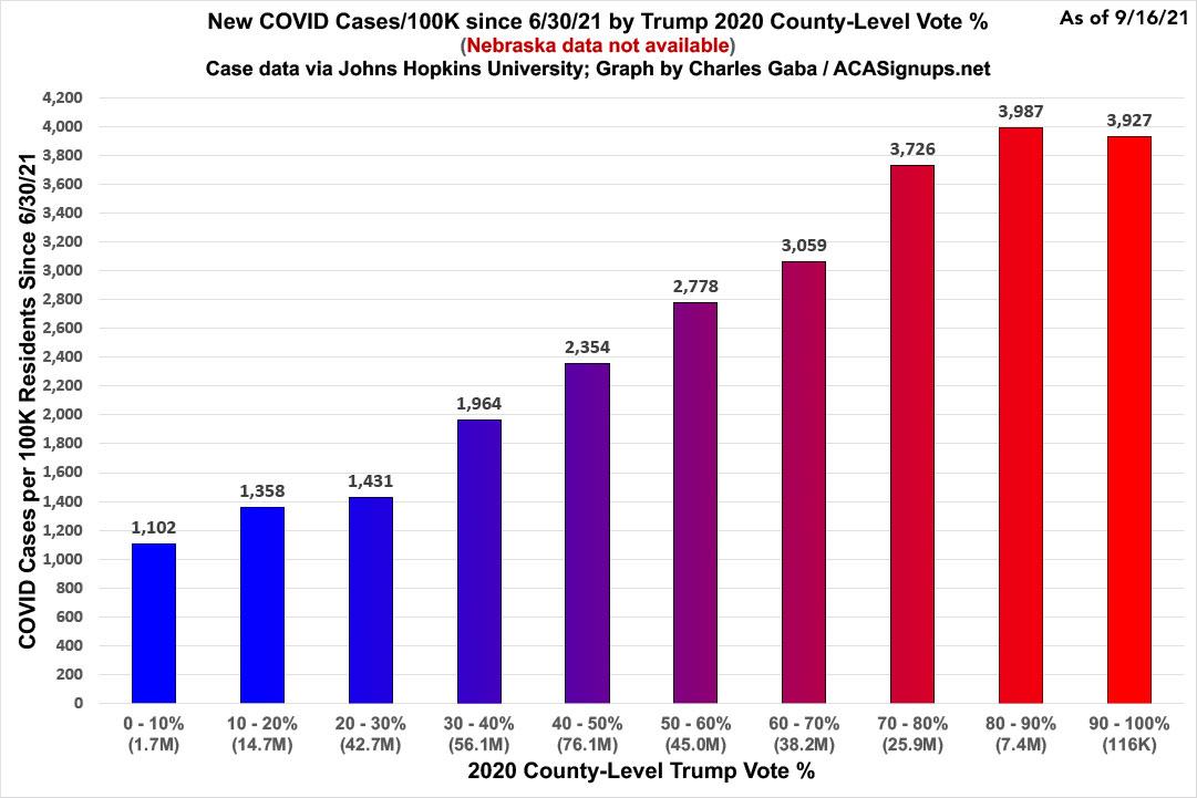
Again, note that this doesn't include several thousand cases in Nebraska and other states where the county of residence is unknown.
The case rate since 6/30/21 in the reddest counties is 3.6x higher than in the bluest counties, but given the tiny number of residents of those counties, it's more representative to compare the 8th & 2nd brackets, where the recent case rate is 2.9x higher.
Finally, here's death rates since the end of June...now including Florida, as noted above:
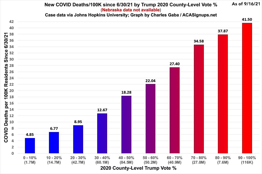
Note that this doesn't include Nebraska and is still missing over 1,000 deaths in Florida due to their reporting methodology change and the fact that even the CDC's report is still several days out of date.
Again, while the highest bracket is 8.6x higher than the lowest one, it's more representative to use the 2nd & 8th brackets: The death rate in the reddest counties are around 5.6x higher than in the bluest counties since June 30th.
UPDATE: I've found a way to resolve the issue of some of the brackets above having wildly larger or smaller total populations than others (the 40-50% bracket has 84.5 million people, the 90-100% bracket only has 116,000...meaning the former has over 700x more people, potentially skewing the results dramatically).
I've therefore broken all 3,114 counties nationally from lowest Trump vote percent to highest as evenly as possible, in groups of as close to 33,145,000 people apiece as I could get them. I couldn't do this exactly since most brackets cut off a counties with several hundred thousand or even over a million residents, meaning the bracket will either be a few hundred thousand lower or higher than the target, but it's the best I can do.
As you can see, while both the case and death rate graphs show a somewhat less dramatic (and less even) trend line doing it this way, they're both still clearly telling the same story:
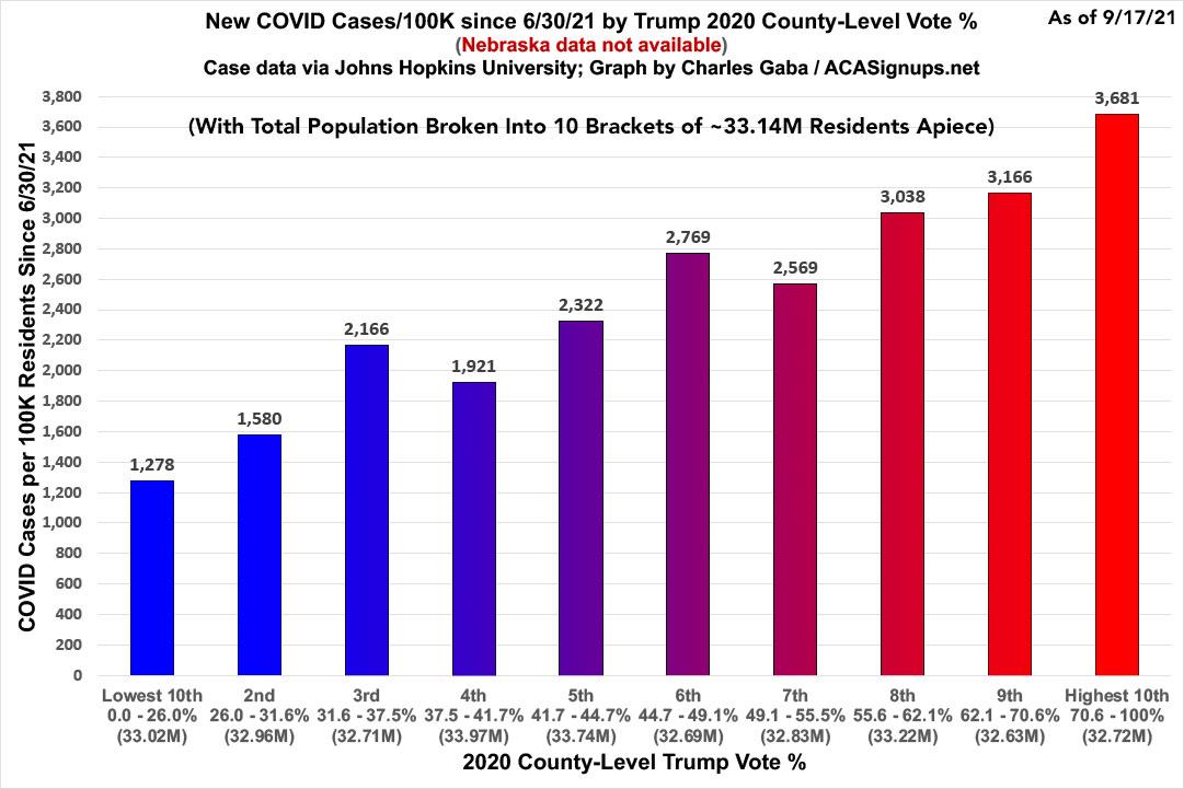
Instead of the case rate in the reddest counties being 3.56x higher than in the bluest counties, it's more like 2.88x higher here.
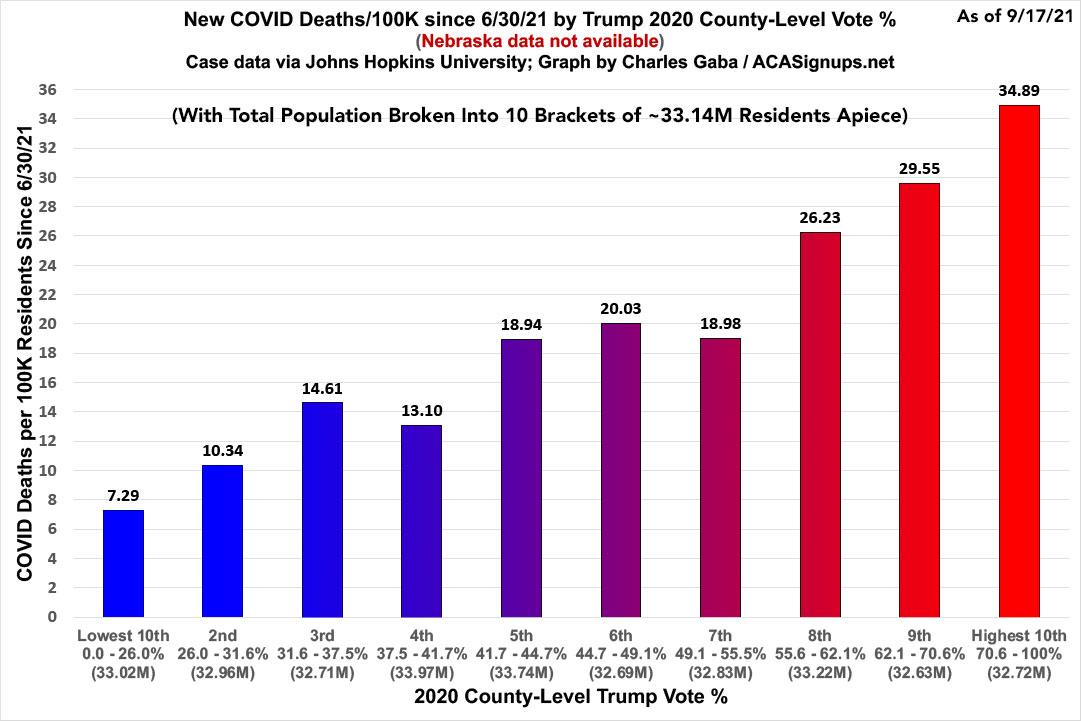
Instead of the death rate in the reddest counties being 8.56x higher than in the bluest counties, it's more like 4.79x higher, which is still pretty jaw-dropping.
Here's the vaccination rate graph using the same "1/10th of the total population" layout. In this case it actually makes the trend line more consistent, although again it's less dramatic; the bluest tenth of the population is only 1.65 as vaccinated than the reddest tenth versus the 1.84x ratio in the other version.

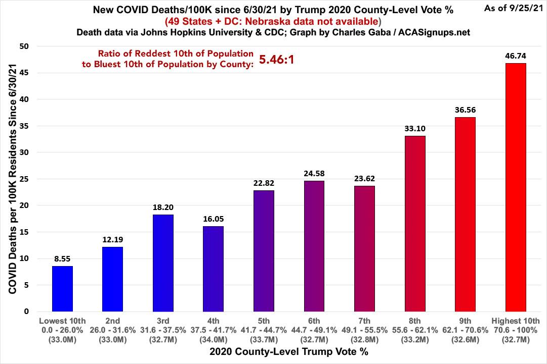
UPDATE 9/26/21: I'll be posting a full updated version tomorrow, but in the meantime, here's the decile-view death rate as of 9/25/21. As you can see, the ratio between the highest and lowest bracket has increased further yet, from 4.79x higher to 5.46x higher in just 8 days:
Advertisement
