

Let's look at the Red/Blue COVID divide in a different way...
Thu, 09/02/2021 - 5:31pm
I've gotten a lot of attention for my COVID "scatter plot bubble graphs" over the summer, laying out the COVID vaccination and case/death rates across every county nationally (well, mostly; Nebraska has stopped posting county-level data entirely, and Florida has only been posting county-level case data, not deaths, since June).
Data visualization is a tricky thing, though; sometimes line graphs are the way to go (that's what I did last year); other times scatter plots are more appropriate. But some people don't "get" either of these, so today let's look at some bar graphs.
A few days ago, Christopher Ingraham of The Why Axis posted a piece titled, quite bluntly, "GOP Covid Policy is killing GOP voters." It mostly covers the same ground and makes similar points to mine, but it also includes another graph which illustrates the point even better than my bubble graphs do. He groups most of the U.S. population into 5 brackets based on how much of the vote Trump got last year (0 - 20%, 20 - 40%, etc), with vertical bars showing the COVID death rate since July 31st in each group.
As you might expect, the higher the Trump vote share, the higher the death rate.
Ingraham includes some important caveats:
- First, his graph doesn't include Nebraska, Florida or Alaska--the first two because they stopped releasing county-level death data earlier this summer; the third because Alaska publishes their voter data based on legislative districts, not boroughs or census areas.
- Second, he limits his graph to counties which have more than 10,000 residents since tiny counties have a high noise ratio, which is reasonable.
- Third, he chose July 31st as his starting point.
I, however, decided to take Ingraham's work to the next level:
- First, I've generated three bar graphs: In addition to recent death rates, I've also generated similar version for the recent case rates and vaccination rates (as of today).
- Second, I include Alaska since I was able to find a credible analysis of Alaska's borough/county-equivalent level Presidential vote from the 2016 election (I can't imagine that this changed that much from 2016 to 2020)
- Third, for the case & death rate graphs, I've included every county (except for Nebraska and Florida) regardless of size just for completeness' sake.
- Fourth, instead of 5 Trump vote brackets, I've broken it out into 10 brackets of 10 percentage points apiece.
- Fifth, all of my case & death data starts on July 1st instead of July 31st, so I have two months to work with instead of just one.
So, what's that all look like? Let's take a look. First, vaccination rates as of today, September 2nd, 2021:
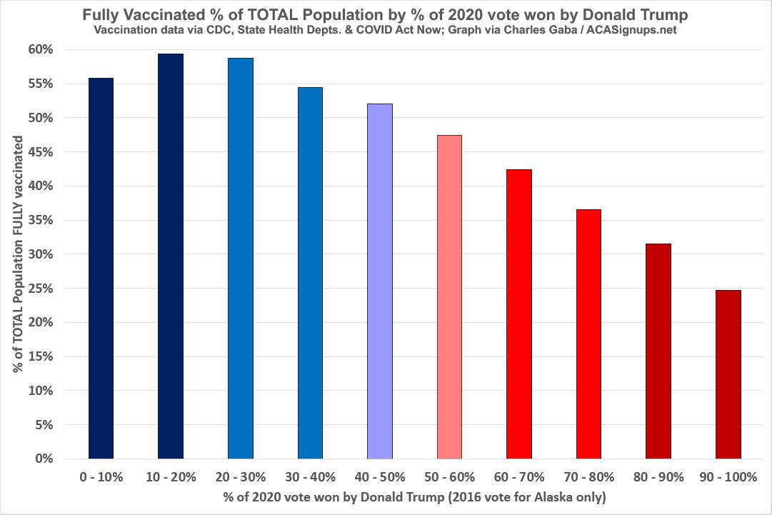
The only outlier is the 0 - 10% bracket, which only includes 1.67 million people, or just 0.5% of the total U.S. population. This bracket only includes four counties, two of which are Prince George County, Maryland...and the entire District of Columbia.
Aside from that, however, the rest of the graph shows a remarkably clear downward progression from 59.3% down to a pathetic 24.7% of the total population fully vaccinated.
So, what impact is this having on COVID case and death rates?
Again, the graphs below use July 1st, 2021 as their starting point, since that's pretty much the point that the Delta variant started popping up in the United States.
First, the case rate:
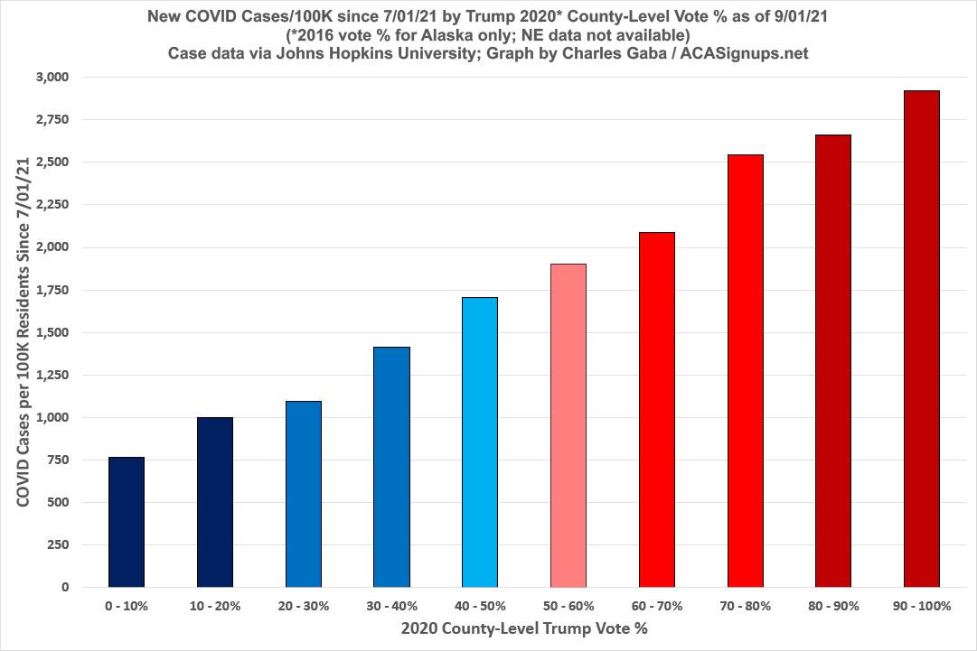
And there you have it. Keep in mind that this does not include any cases from Nebraska (which has also been removed from the denominators for accuracy).
What about COVID death rates since July 1st?
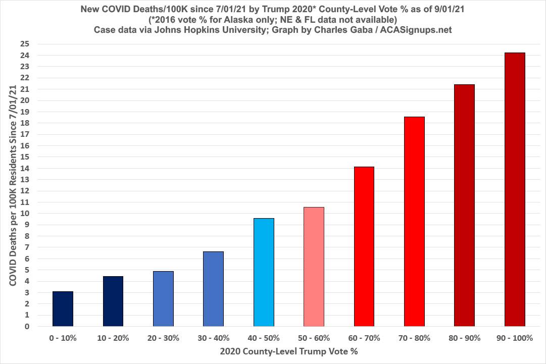
Oh dear. Again, in this case, both Nebraska and Florida data are missing since the state health departments have stopped releasing county-level death data for the past couple of months.
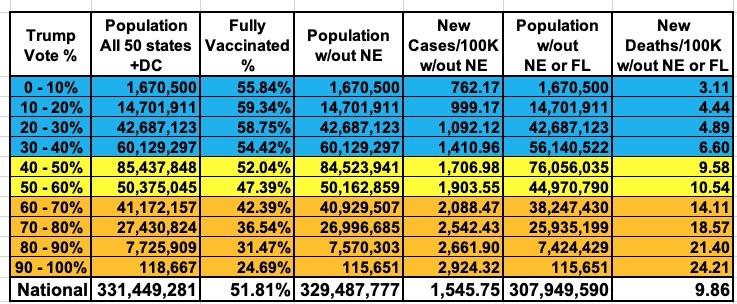
UPDATE: Here's a summary table which shows the relative population breakout between all 10 brackets. Again, I had to break it out three ways to account for Nebraska missing from the Case Rate graph and both Nebraska and Florida missing from the Death Rate graph. Obviously there are far fewer residents living in the lowest (1.67 million) and highest (119K) brackets, but since all of this is based on per capita rates, that shouldn't make much difference:
Advertisement
