

Last vaxx post of the week, I promise: The partisan vaccination divide appears to be GROWING.
Wed, 08/04/2021 - 2:41pm
Last night I posted my weekly look at the county-level vaccination rates nationally by partisan lean, based on what percent of the vote was won by Donald Trump in the 2020 election. I closed it out by noting that:
...Blue Counties (ones where Donald Trump received less than 45% of the vote last November) have increased their collective vaccination rate by 10% more per capita than the Red Counties (where Trump received more than 55% of the vote) since July 21st. This is the first time that I've compared how the relative rates have changed over time, so I have no idea if this gap represents an increase or decrease from earlier this spring or summer.
A 10% vaccination rate increase over 13 days may not sound very significant, but it gets more interesting when you separate the low-vaxx counties from the rest of the country. This is a project which I started to do last week but screwed up on at the time. As you may recall, as of July 21st, there were 146 "Lo-Vaxx Blue" counties (less than 45% vaccinated, less than 45% Trump vote) and 2,103 "Low-Vaxx Red" counties (less than 45% vaxxed, more than 55% Trump vote).
I've since corrected my data error and can now properly plot out not only how quickly vaccination rates are increasing in the Red and Blue counties respectively, but also how quickly they're ramping up in subsets of those categories:
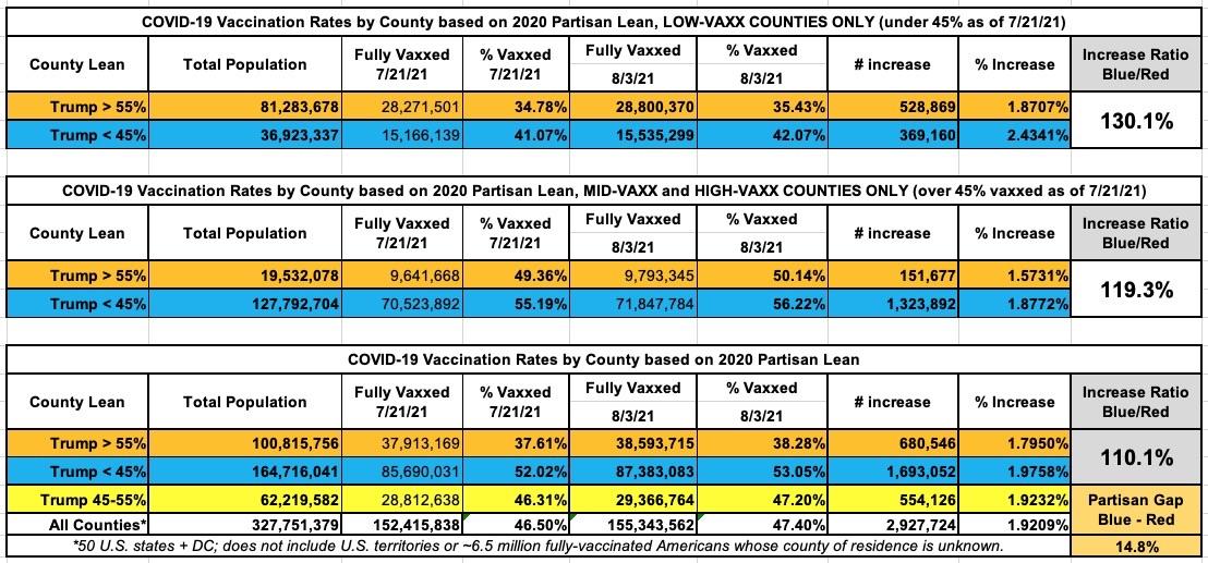
That's right; since July 21st...
- Across every county, Blue counties have vaccinated 10% more residents per capita.
- In the High- and Mid-Vaxx counties, Blue counties have vaccinated 19% more residents per capita.
- In the Low-Vaxx counties, Blue counties have vaccinated 30% more residents per capita.
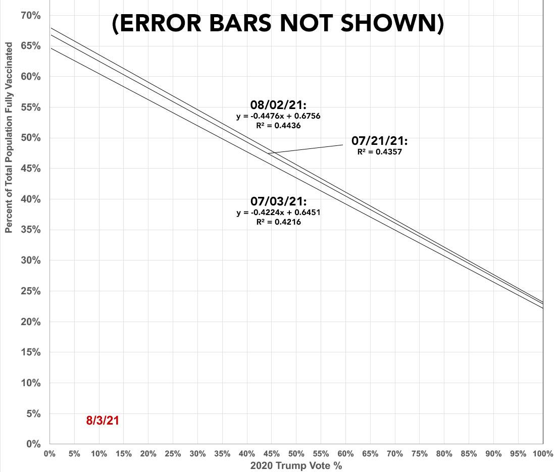
Here's a simplified visual of what this looks like (this is for all counties)...and I've even thrown in July 3rd as well to show the pattern. I've obviously stripped away the actual data plots and am only displaying the trendlines here; obviously there's significant error bars for all 3 lines, unfortunately I don't have the ability to display those so keep that in mind when viewing this graph):
As I concluded last night:
It's possible that this trend will reverse itself once the effects of the Republican Party's recent vaccination messaging turnaround starts to kick in. Since I'm only reporting fully-vaccinated data, any such impact won't start showing up on my graph until around August 11th and beyond, since that will be roughly 3 weeks after the GOP did a 180 and started pushing their base to actually get vaccinated after all (i.e., that's when anyone who ran out and got their first Pfizer shot the week of July 21st will be getting their second one; for Moderna it will take another week beyond that).
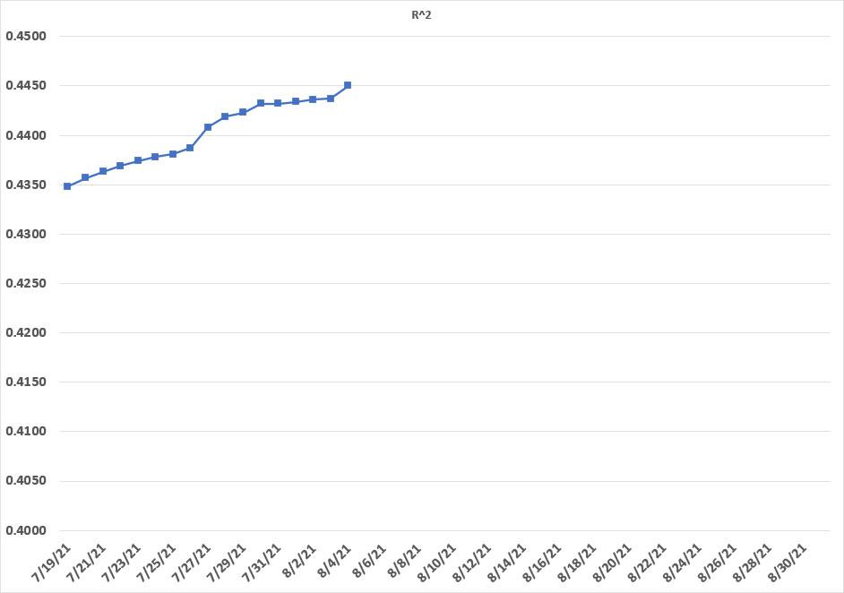
As an aside, this is also interesting...the R2 value has been gradually increasing as time passes. Since none of the county vaccination rates will decrease, this suggests that the lowest-vaxxed counties are catching up to the higher-vaxxed counties, since the range is narrowing:
Advertisement
