

State Performance by the Numbers
Thu, 02/12/2015 - 12:48am
This is the last time I'll be running a full comparison of how all 50 states (+DC) are doing before the final weekend surge; it'll be interesting to run before/after comparisons. Some important caveats, however:
1) While most of the states are current through at least February 2nd, 4 of them (CO, DC, HI & ID) haven't been updated since mid- to late January. Then again, both DC and Hawaii are already well over the top anyway.
2) For Massachusetts, I've dropped my personal target from 300K to 200K. Yes, it's lame to change my "predictions" so close to the finish, but in MA's case I completely botched my methodology in the first place; I thought they had a lot more people in their special "temporary coverage" who were eligible for QHPs than actually were. It would be a bit unfair to rank them at the bottom for failing to meet a completely unrealistic goal.
3) For Rhode Island and Washington, I'm using a different number than the other states; RI is the QHP selections, but after past-due non-paid ones have been purged from the total; in WA, they're only reporting the paid QHPs at all, so I don't know what the total selections are to begin with.
Aside from that, this is about about as fair an apples-to-apples comparison as I can put together, so here we go:
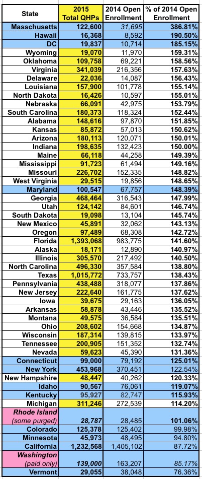
2015 QHP Selections vs. 2014 QHP selections: No contest here: Massachusetts is pulverizing 2014's number this year. Of course, they have a special situation: Last year, for the most part, only those who didn't qualify for tax credits at all could get through, which meant a good 85% of the enrollees had to be shifted into a special "temporary coverage" program. Otherwise, two small blue states, Hawaii & DC are leading the way (yeah, I know DC isn't a state)...but after that, aside from Delaware and Virginia (purple), it's a sea of red until you get to Maine. Note how most of the state-based exchanges are lumped together at the bottom; this is partially due to the special circumstances of RI & WA, but mostly because the state exchanges tended to outperform HC.gov last year, so they have a higher bar to overcome this time around. |
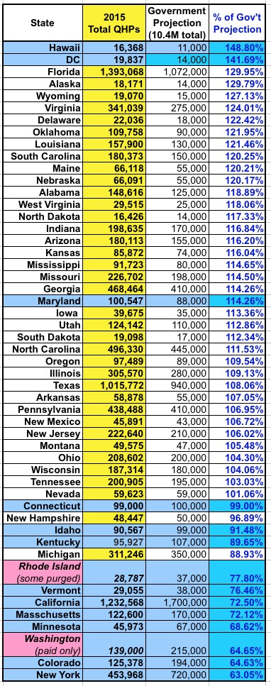
2015 QHP Selections vs. HHS/State Exchange Targets: HI & DC are again at the top. Beyond that, it's pretty much the same story. Florida is kicking butt, but they also set a fairly low bar for themselves anyway (only 9% higher than last year). At the opposite end of the spectrubm, New York is actually bringing up the rear here because they set their target way too high (a 94% increase!). |
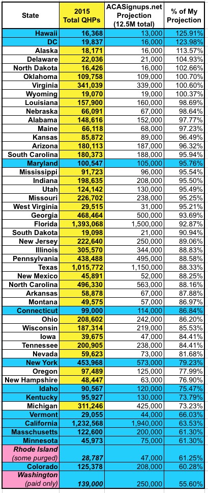
2015 QHP Selections vs. MY Targets: Not too different, excpet that Florida and New York have moved down and up respectively, as I've assigned both of them more reasonable targets. Washington State is bringing up the rear, partly due to their "paid enrollments only" policy...but even if they included total selections, I still doubt they'd be higher than 65%. |
|
Finally, here's the lineup versus the total number of people in each state actually eligible to purchase a private policy via the exchange. This includes people who are already insured privately, but who might consider switching to an exchange policy...even if they don't qualify for any tax credits.
In this view, the order changes dramatically. Vermont's exchange may not be performing very well...but they hardly have anyone who actually needs insurance anyway. DC's exchange works fairly well, but again, not too many residents fall into the exchange QHP zone to begin with. After that, however, the big story is Florida: Nearly 56% of their total pool of potential enrollees have already been mopped up, and it could hit as high as 60% by the end of Open Enrollment. Compare that to last year's big kahuna, California, which is only running a middling 38% at the moment; if they do hit their target of 1.7M, they'll still only be at 52% of maximum enrollment. As for the bottom of the pack, it's mostly a bunch of small red states...but Minnesota is the odd man out, coming in dead last at just 17% of their total potential enrollment number. I'm not sure how much of this has to do with MinnesotaCare, how much has to do with the PreferredOne debacle or how much is connected to lingering technical problems with the website, but it sticks out like a sore thumb down there. Hopefully they'll get things in gear over this final week. |
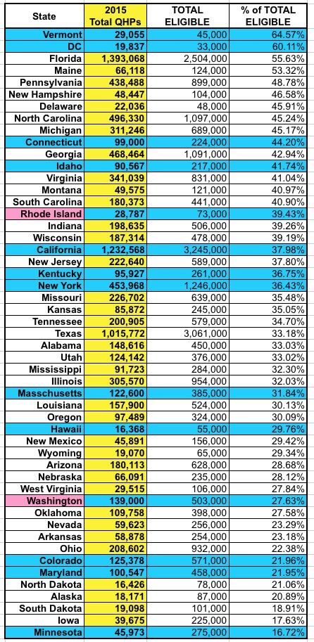 2015 QHP Selections vs. Total Eligible Population:
Advertisement
