

Weekly Update: COVID Case/Death Rates by Partisan Lean & Vaccination Rate
Mon, 02/21/2022 - 12:14pm
For months I posted weekly looks at the rate of COVID-19 cases & deaths at the county level since the end of June, broken out by partisan lean (i.e, what percent of the vote Donald Trump received in 2020), as well as by the vaccination rate of each county in the U.S. (nonpartisan).
This basically amounts to the point when the Delta Variant wave hit the U.S., although it had been quietly spreading under the radar for a few months prior to that.
Now that we're a full two months into the Omicron Variant wave, I've updated my case/death rate tracking to reflect that as well...because the data so far is showing a completely new chapter as we enter the 3rd year of the Coronavirus Pandemic.
As always, here's my methodology:
- County-level 2020 Population data via U.S. Census Bureau's 2020 Census
- County-level 2020 Trump vote data via each state's Election Commission or Secretary of State websites
- County-level Case & Death data via Johns Hopkins University Center for Systems Science & Engineering for 47 states; NY Times COVID-10 in the United States github for NE & UT only; & the White House COVID-19 Team Community Profile Report for Florida only.
- BY POPULAR DEMAND, here's an updated Google Spreadsheet with all the relevant data.
Remember: "Decile" means 1/10th or 10% of the total population (all 50 states + DC).
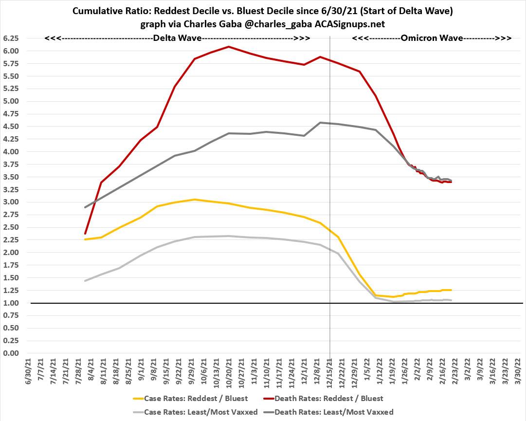
Here's the final ratios for the Delta wave (6/15/21 - 12/15/21):
- Delta wave CASE rates: 2.46x higher in the reddest decile than the bluest decile
- Delta wave DEATH rates: 5.77X higher in the reddest decile than the bluest decile
- Delta wave CASE rates: 2.12 higher in the least-vaccinated decile than the most-vaccinated decile
- Delta wave DEATH rates: 4.77x higher in the least-vaccinated decile than the most-vaccinated decile
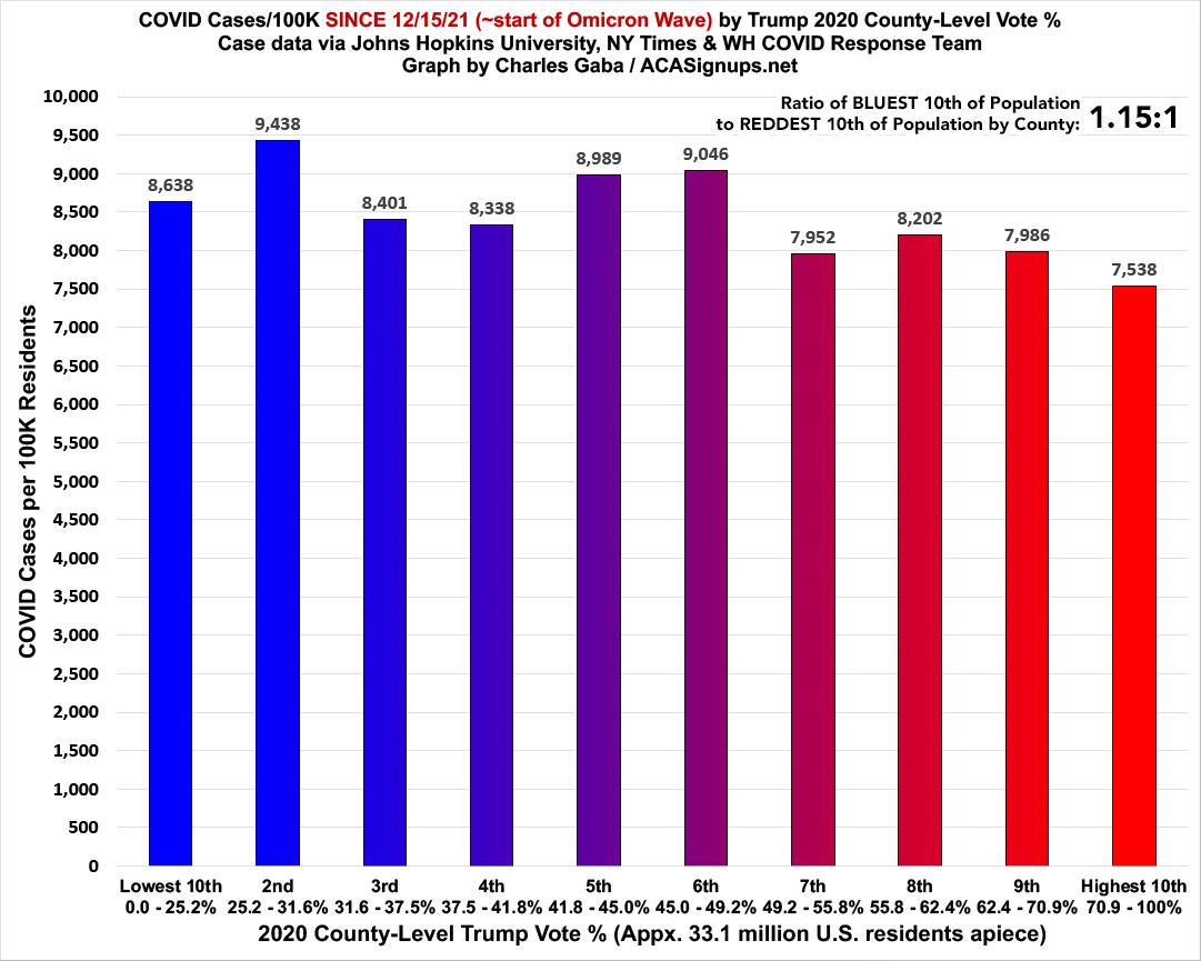
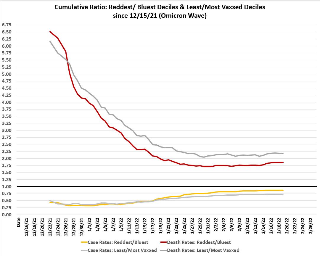
What about Omicron?
First, the partisan breakout: The case rate ratio is a very different picture under Omicron. For the first two months of Omicron, case rates are 1.15x higher in the BLUEST decile than the reddest. It's worth noting, however, that this is down from 2.2x higher six weeks earlier:
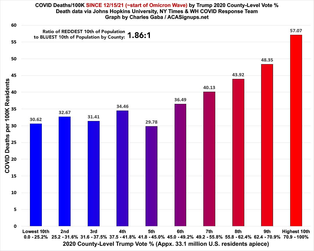
Death rates since Omicron started still swing red, as the death rate in the reddest decile is 1.86x higher than in the bluest. This is down from 2.9x higher six weeks earlier, however, and down from nearly 5.8x higher during the Delta wave. On the other hand, it's up from 1.76x higher last week, which I'll be talking about more below...
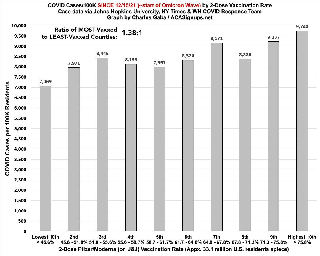
It's a similar story with the nonpartisan vaccination rate ratios:
Case rates since mid-December are now 1.4x higher in the most-vaccinated counties...except that this is down from 2.4x higher six weeks earlier:
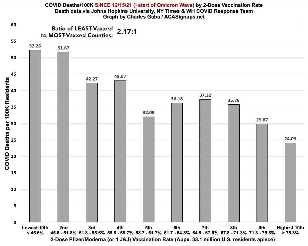
The death rate, however, is still 2.17x higher in the least-vaccinated decile than the most. This is down from 3.3x higher six weeks ago, and way down from the 4.8x higher ratio during the Delta wave...but again, it's up slightly since last week...
Here's what all four of the ratios above look like over time; the lines compare the Reddest vs. Bluest Deciles and the Least- vs. Most-Vaccinated Deciles. As you can see, the case rate ratios (at the bottom) are gradually moving back up to the 1:1 threshold again, while the death rate ratio has started to creep back up again.
What's also remarkable is how closely the two completely different criteria mirror each other every step of the way:
This shift over time is even more obvious (at least on the case rate side) when I go back to June 30th. As I recently noted, by mid-January, Omicron had almost completely cancelled out the "Red/Blue divide" in terms of cumulative case rates since June, which had reached as high as a 3:1 ratio before starting to recede...and as you can see below, all four lines have either flattened out or begun to creep back higher again:
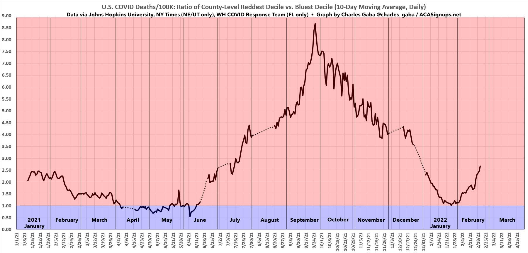
FINALLY, I've added a new graph. This one shows the 10-day moving average of the ratio between the DAILY death rates in the reddest & bluest deciles, dating all the way back to January 1, 2021.
The dotted lines are data gaps; these are due to a few absurdly massive outliers (either high or low) caused by one-time backlogged data dumps which skew the daily ratios (even on a moving average basis).
As you can see, aside from a brief period from early April through mid-June last year, the daily COVID death rate in the reddest 10% of the United States has been running several times higher than in the bluest 10% every day for over a year now. The discrepancy reached its peak at the height of the Delta Wave in late September, when it was briefly running nearly nine times higher in the reddest bracket than the bluest.
Since then it's gradually dropped off as the Delta wave subsided and the Omicron wave took hold, and at one point in January the gap was nearly erased...but not quite. Starting at the beginning of February, this reversal...reversed itself again, and the red/blue gap is now shooting upwards again at a pretty fast clip.
Remember, the graph below is the daily ratio, not cumulative, which means it won't start pulling the cumulative ratios back up again until it starts running higher than whatever the cumulative ratios are as of that date. The 12/15/21 (Omicron only) graph has already started to inch back up again; the 6/30/21 (Delta + Omicron) graph is still dropping ever so slightly, since it's at around 3.4x while the moving average is still below 3.0x.
Stay tuned...
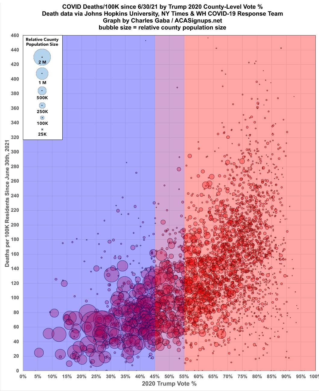
UPDATE: I haven't posted this particular graph in awhile but figured today would be a good day to do so. This is the county-level death rate since 6/30/21 broken out by partisan lean in scatter plot format:
Advertisement
