

Weekly Update: Whole new wave, whole new ballgame re. case/death rates
Mon, 01/10/2022 - 5:21pm
For months I've been posting weekly looks at the rate of COVID-19 cases & deaths at the county level since the end of June, broken out by partisan lean (i.e, what percent of the vote Donald Trump received in 2020), as well as by the vaccination rate of each county in the U.S. (nonpartisan).
This basically amounts to the point when the Delta Variant wave hit the U.S., although it had been quietly spreading under the radar for a few months prior to that.
Now that we're several weeks into the Omicron Variant wave, I've decided that it's time to update my case/death rate tracking to reflect that as well...because the data so far is showing a completely new chapter as we enter the 3rd year of the Coronavirus Pandemic.
The "start" of the Delta Wave was fairly easy to lock in, at least for my purposes, because thanks to the initial vaccination surge, both cases and deaths from COVID had dropped off dramatically right up until around the end of June. The Delta Wave started showing up in the daily deaths pretty quickly as July started, as shown below.
The transition from the Delta to Omicron variant waves, on the other hand, is a lot harder to pin down for a couple of reasons. For one thing, unlike last summer, both new cases and deaths were still running strong from Delta at the same time that Omicron raised its ugly head. In addition, this more amorphous transition was happening in the middle of the U.S. holiday season. This meant significant case & death reporting gaps over the long Thanksgiving, Christmas and New Year's Eve weekends, followed by bulk reporting the following weeks; all of this muddied the waters.
Having said that, I've decided to use December 15th as my personal transition point from the Delta to Omicron waves:

I'm including two sets of graphs below:
- The first run from June 15th - December 15th, 2021 (Delta Wave)
(I went back & forth on what start date to use but ultimately decided to shift back 2 weeks to June 15th).
- The second run from December 15th until now (Omicron Wave)
Note that the Omicron graphs could change dramatically from week to week for awhile, since the numerators are being divided into a smaller denominator...today's Omicron graphs only include less than one month of data, while the final Delta graphs include six months.
As always, here's my methodology:
- County-level 2020 Population data via U.S. Census Bureau's 2020 Census
- County-level 2020 Trump vote data via each state's Election Commission or Secretary of State websites
- County-level Case & Death data via Johns Hopkins University Center for Systems Science & Engineering for 47 states; NY Times COVID-10 in the United States github for NE & UT only; & the White House COVID-19 Team Community Profile Report for Florida only.
- BY POPULAR DEMAND, here's an updated Google Spreadsheet with all the relevant data.
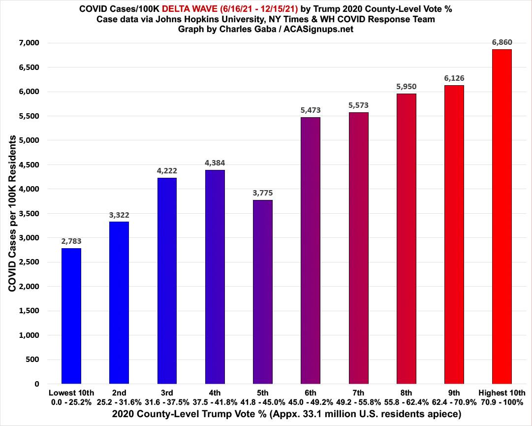
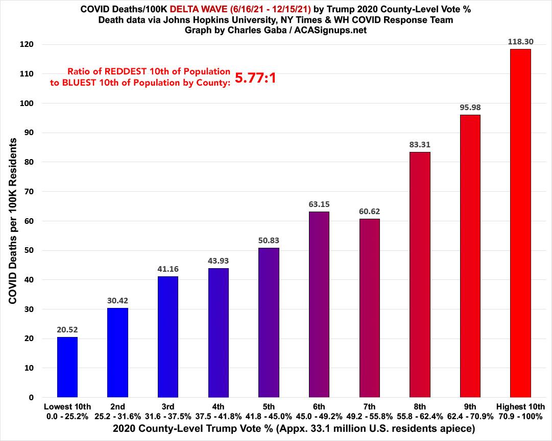
FIRST, here's my final Delta wave graphs, which run from June 15th, 2021 - December 15, 2021. For that period of time, new COVID-19 case rates ran 2.46x higher in the reddest tenth of the U.S. than the bluest tenth...while COVID-19 death rates ran 5.77x higher:
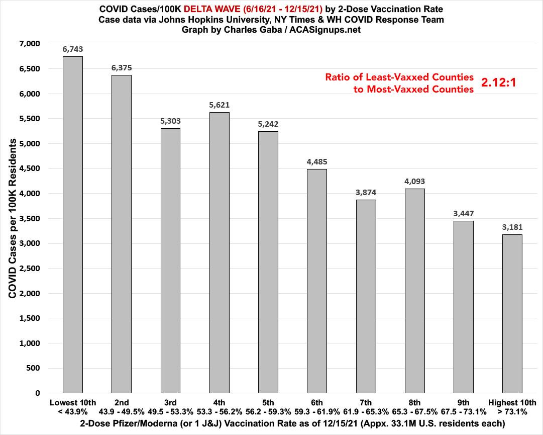
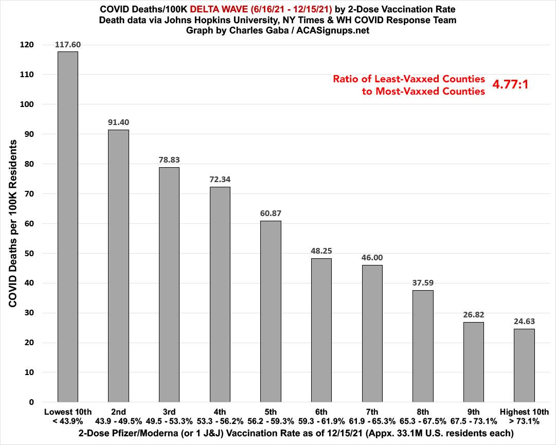
Here's the same data from a NONPARTISAN view: This is based purely on 2-dose vaccination rates (as of 12/15/21). Case rates in the least-vaccinated tenth of the U.S. ran 2.1x higher than in the most-vaccinated tenth, while death rates ran nearly 4.8x higher:
OK, so that's the Delta wave. What about Omicron?
Well, again, this is only based on 25 days of data so far, but here's what all four of the above graphs look like if you start on December 15th, 2021.
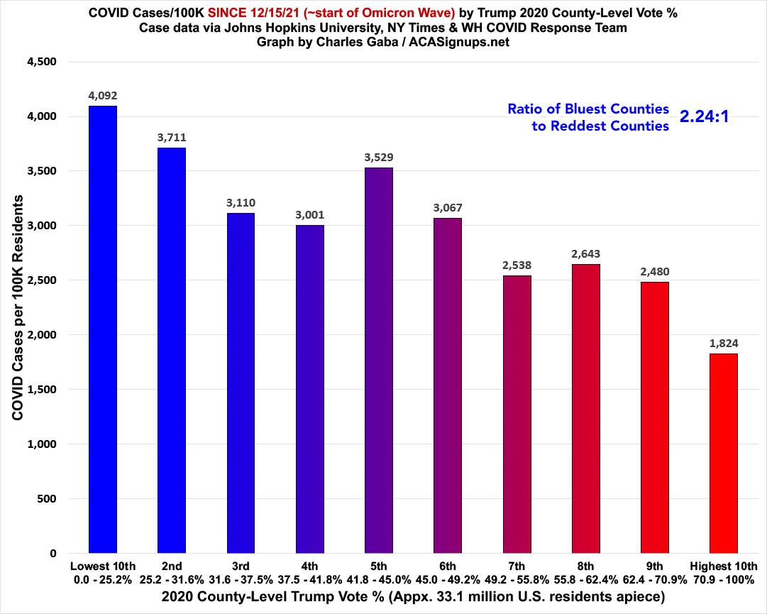
First, the partisan breakout...where you can immediately see that the case rate ratio is a very different picture under Omicron than it was during the Delta wave. During Delta, the reddest bracket was nearly 2.5x higher than the bluest...but for the first few weeks of Omicron, it's the complete opposite: Case rates are 2.2x higher in the bluest bracket than the reddest:
When it comes to death rates, on the other hand, Omicron still looks a lot closer to Delta. The death rate since 12/15 is still 2.9x higher in the reddest tenth of the country than the bluest. This is far less dramatic than the 5.8x ratio over the prior 6 months, though:

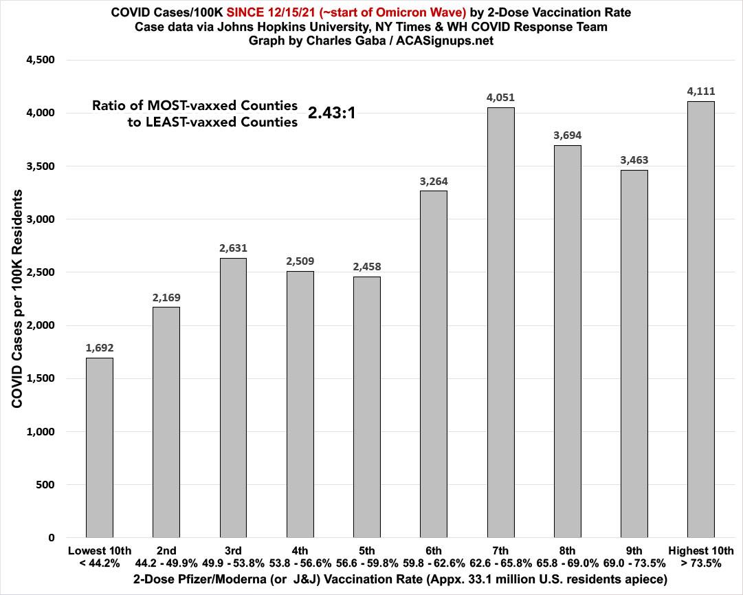
It's a similar story with the nonpartisan vaccination rate ratios: Case rates have gone from being 2.1x higher in the least-vaccinated counties to being 2.4x higher in the most-vaccinated counties...
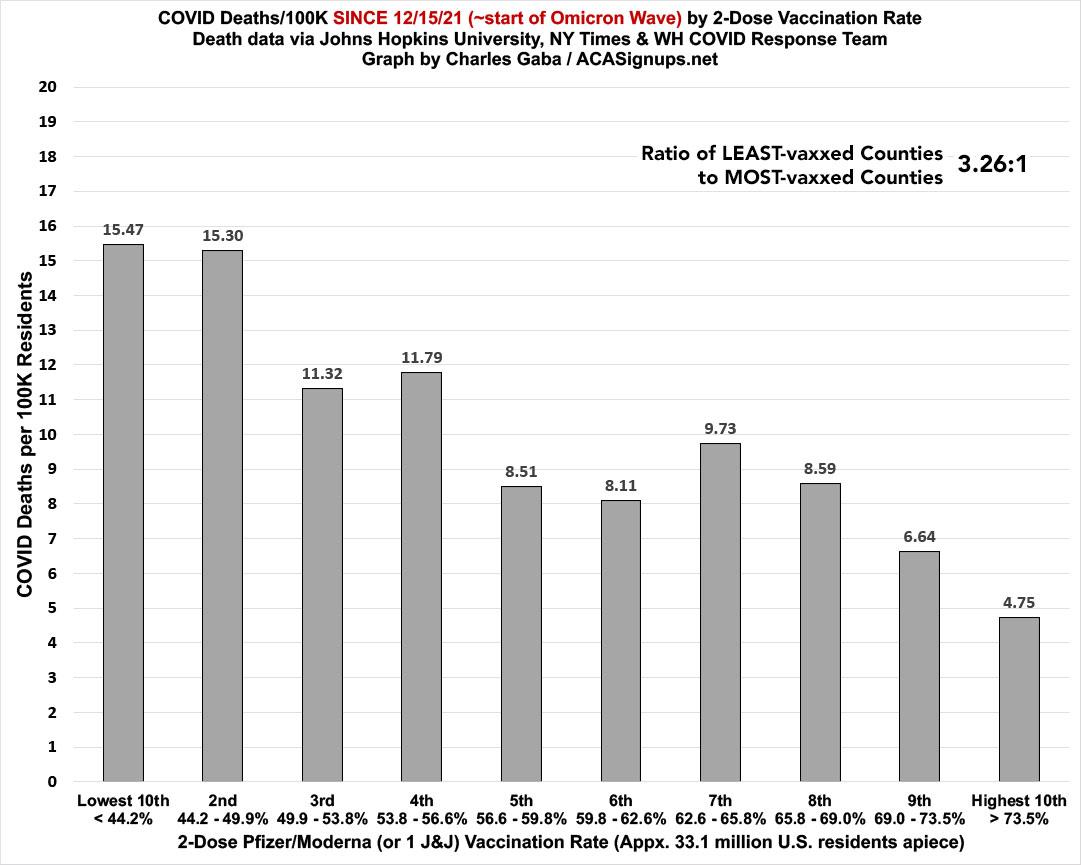
...while the death rate over the past 3-4 weeks remains nearly 3.3x higher in the least-vaccinated parts of the U.S. Again, this is still significant, but far less so than the 4.8x ratio during the Delta wave:
It should be interesting to see how (and if) these bar graphs shift around as more Omicron wave data comes in over the coming weeks and months.
In the meantime, get vaccinated & get boosted, dammit.
Advertisement
