

Weekly Update: The Great Omicron Reversion to Form Has Begun
Mon, 02/14/2022 - 10:26pm
For months I posted weekly looks at the rate of COVID-19 cases & deaths at the county level since the end of June, broken out by partisan lean (i.e, what percent of the vote Donald Trump received in 2020), as well as by the vaccination rate of each county in the U.S. (nonpartisan).
This basically amounts to the point when the Delta Variant wave hit the U.S., although it had been quietly spreading under the radar for a few months prior to that.
Now that we're a full two months into the Omicron Variant wave, I've updated my case/death rate tracking to reflect that as well...because the data so far is showing a completely new chapter as we enter the 3rd year of the Coronavirus Pandemic.
The "start" of the Delta Wave was easy to lock in for my purposes; both cases and deaths from COVID had dropped off dramatically right up until around the end of June. The Delta Wave started showing up in the daily deaths pretty quickly as July started. The transition from the Delta to Omicron was a lot fuzzier, but I've decided to go with December 15th as my transition point.
As always, here's my methodology:
- County-level 2020 Population data via U.S. Census Bureau's 2020 Census
- County-level 2020 Trump vote data via each state's Election Commission or Secretary of State websites
- County-level Case & Death data via Johns Hopkins University Center for Systems Science & Engineering for 47 states; NY Times COVID-10 in the United States github for NE & UT only; & the White House COVID-19 Team Community Profile Report for Florida only.
- BY POPULAR DEMAND, here's an updated Google Spreadsheet with all the relevant data.
Remember: "Decile" means 1/10th or 10% of the total population (all 50 states + DC).
Here's the final ratios for the Delta wave (6/15/21 - 12/15/21):
- Delta wave CASE rates: 2.46x higher in the reddest decile than the bluest decile
- Delta wave DEATH rates: 5.77X higher in the reddest decile than the bluest decile
- Delta wave CASE rates: 2.12 higher in the least-vaccinated decile than the most-vaccinated decile
- Delta wave DEATH rates: 4.77x higher in the least-vaccinated decile than the most-vaccinated decile
What about Omicron?
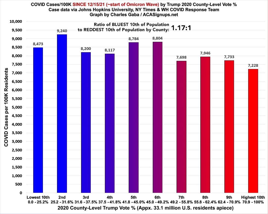
First, the partisan breakout: The case rate ratio is a very different picture under Omicron. For the first two months of Omicron, case rates are 1.17x higher in the BLUEST decile than the reddest. It's worth noting, however, that this is down from 2.2x higher five weeks earlier:
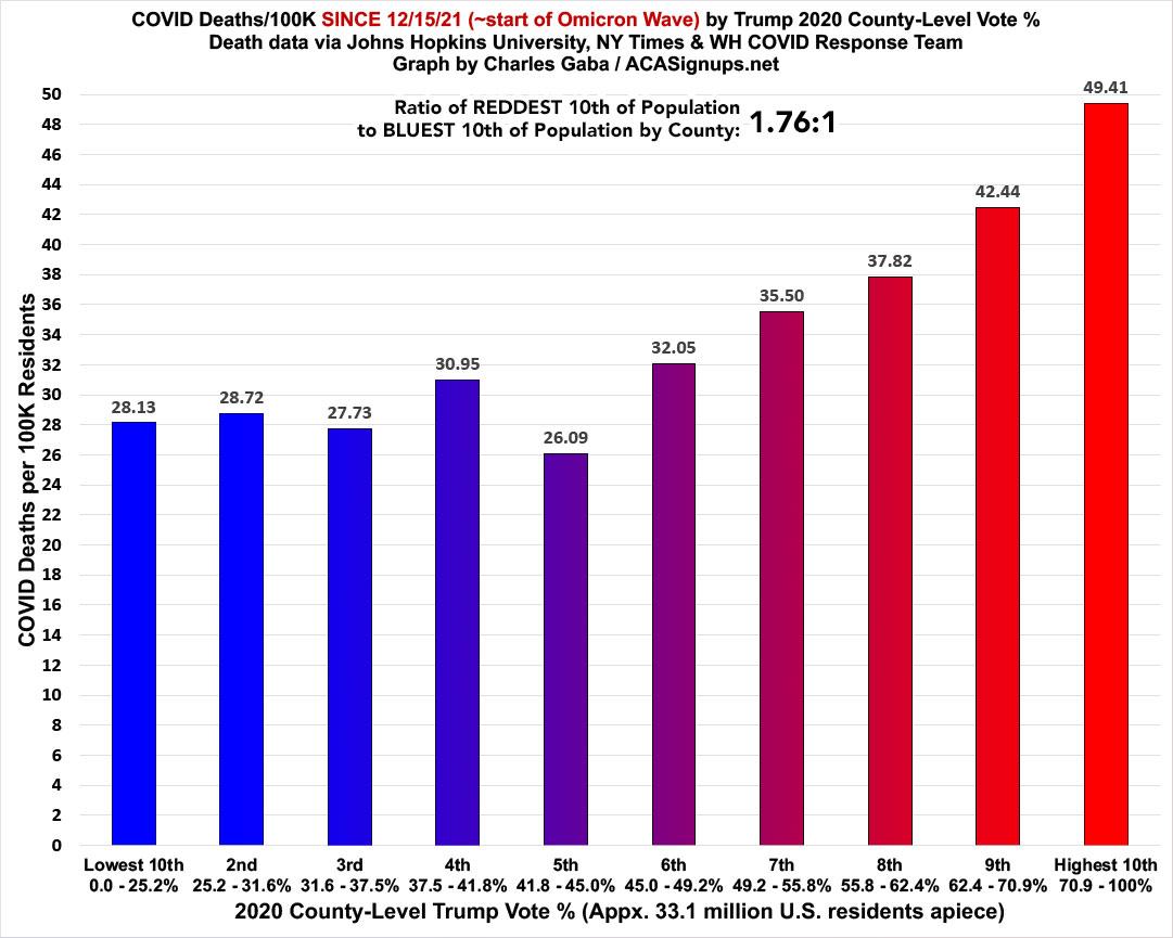
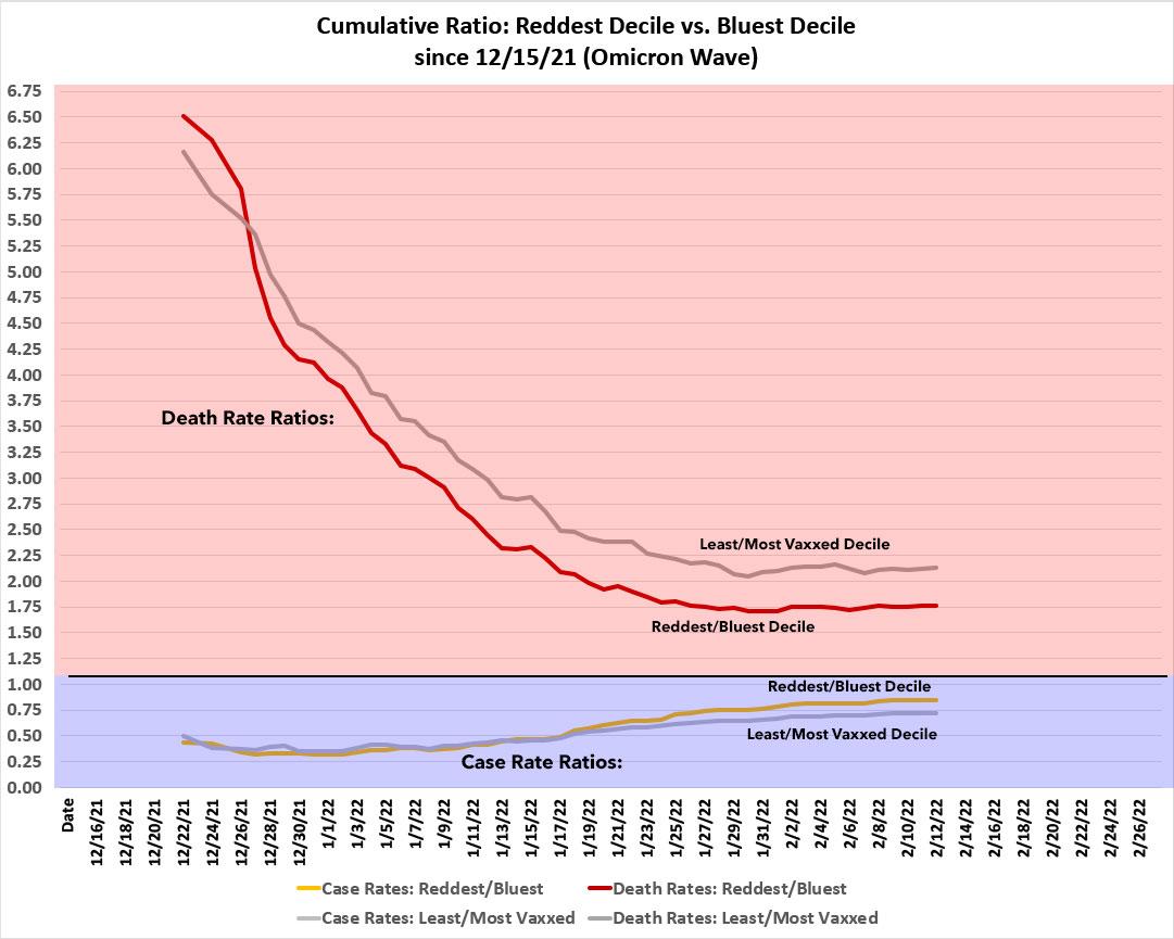
Death rates since Omicron started still swing red, as the death rate in the reddest decile is 1.76x higher than in the bluest. This is down from 2.9x higher five weeks earlier, however, and down from nearly 5.8x higher during the Delta wave. Remember, deaths tend to lag new cases by about 3 weeks, so it actually makes sense that the two would be shifting in opposite directions at the moment:
It's a similar story with the nonpartisan vaccination rate ratios:
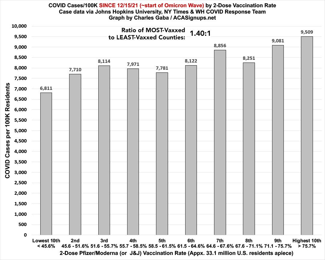
Case rates since mid-December are now 1.4x higher in the most-vaccinated counties...except that this is down from 2.4x higher five weeks earlier:
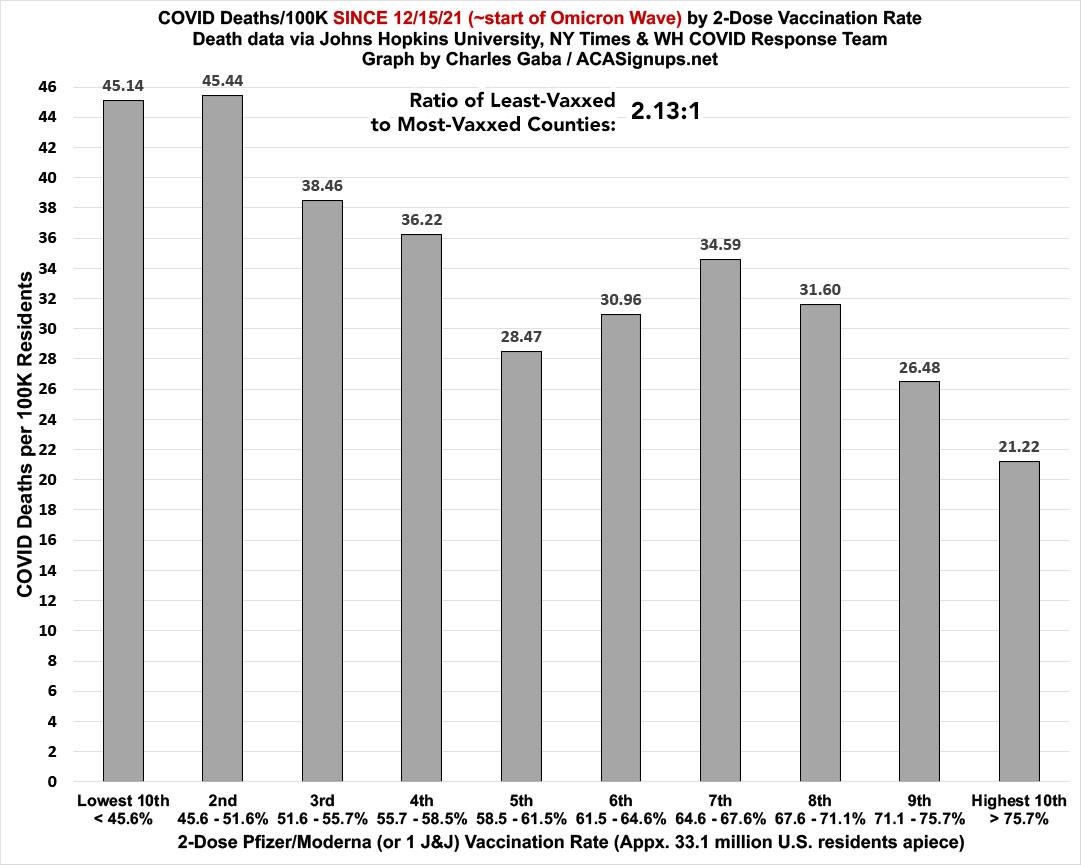
The death rate, however, is still 2.13x higher in the least-vaccinated decile than the most. This is down from 3.3x higher five weeks ago, and way down from the 4.8x higher ratio during the Delta wave:
Here's what all four of the ratios above look like over time; the lines compare the Reddest vs. Bluest Deciles and the Least- vs. Most-Vaccinated Deciles. As you can see, the case rate ratios (at the bottom) are slowly moving back up to the 1:1 threshold again, while the drop in the death rate ratio has either flattened out (partisan lean line) or nearly done so (vaxx rate line).
What's also remarkable is how closely the two completely different criteria mirror each other every step of the way:
This shift over time is even more obvious (at least on the case rate side) when I go back to June 30th. As I recently noted, by mid-January, Omicron had almost completely cancelled out the "Red/Blue divide" in terms of cumulative case rates since June, which had reached as high as a 3:1 ratio before starting to recede...but the death rate was still 4x higher in the reddest counties in the U.S. than the bluest as recently as a month ago.
As noted above, that's still dropping (it's down to around 3.5x higher through this week), but the rate of that drop has slowed substantially. Again, given the 3 week lag between cases and deaths (give or take), I'd expect the red line below to start reversing itself and moving back upwards again in another couple of weeks (this may have already started):
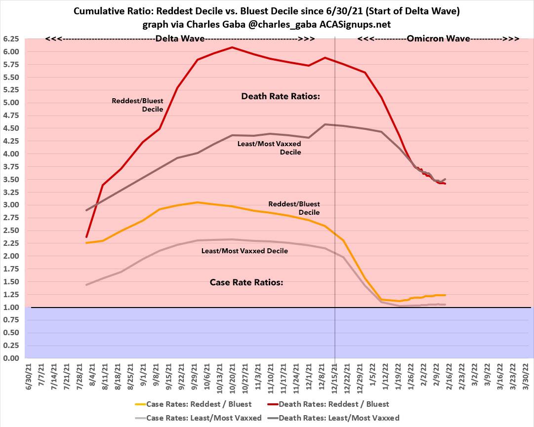
I should note that the vaccination rates in the graph above are based on the current (mid-February) vaccination rates for every county, not the rate as of that date, which is what I've been tracking since the Omicron wave began. I doubt this makes that much difference, but some counties have shifted their relative position over time since last spring.
However, I don't expect to see anything close to the 6:1 ratios we saw during Delta; it'll probably hit perhaps 4.5:1 or so by May or June, I'd imagine.
In the meantime, get vaccinated & get boosted, dammit.
Advertisement
