

Weekly Update: #COVID19 case/death rates by county, partisan lean & vaccination rate
Mon, 12/13/2021 - 1:34pm
Here's the weekly look at the rate of COVID-19 cases & deaths at the county level since the end of June, broken out by partisan lean (i.e, what percent of the vote Donald Trump received in 2020).
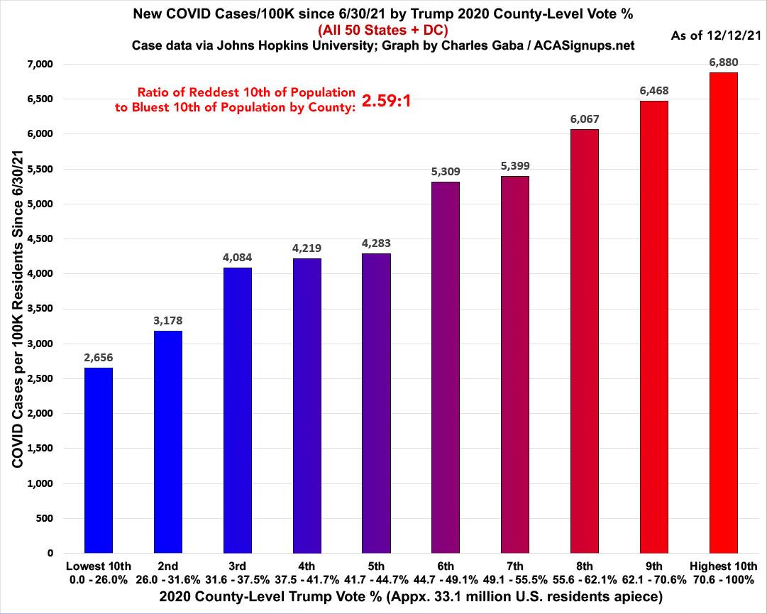
The ratio of case rates has started to drop; new cases are now running 2.59x higher per capita in the reddest tenth of the country than the bluest tenth, down from 3.0x higher seven weeks ago:
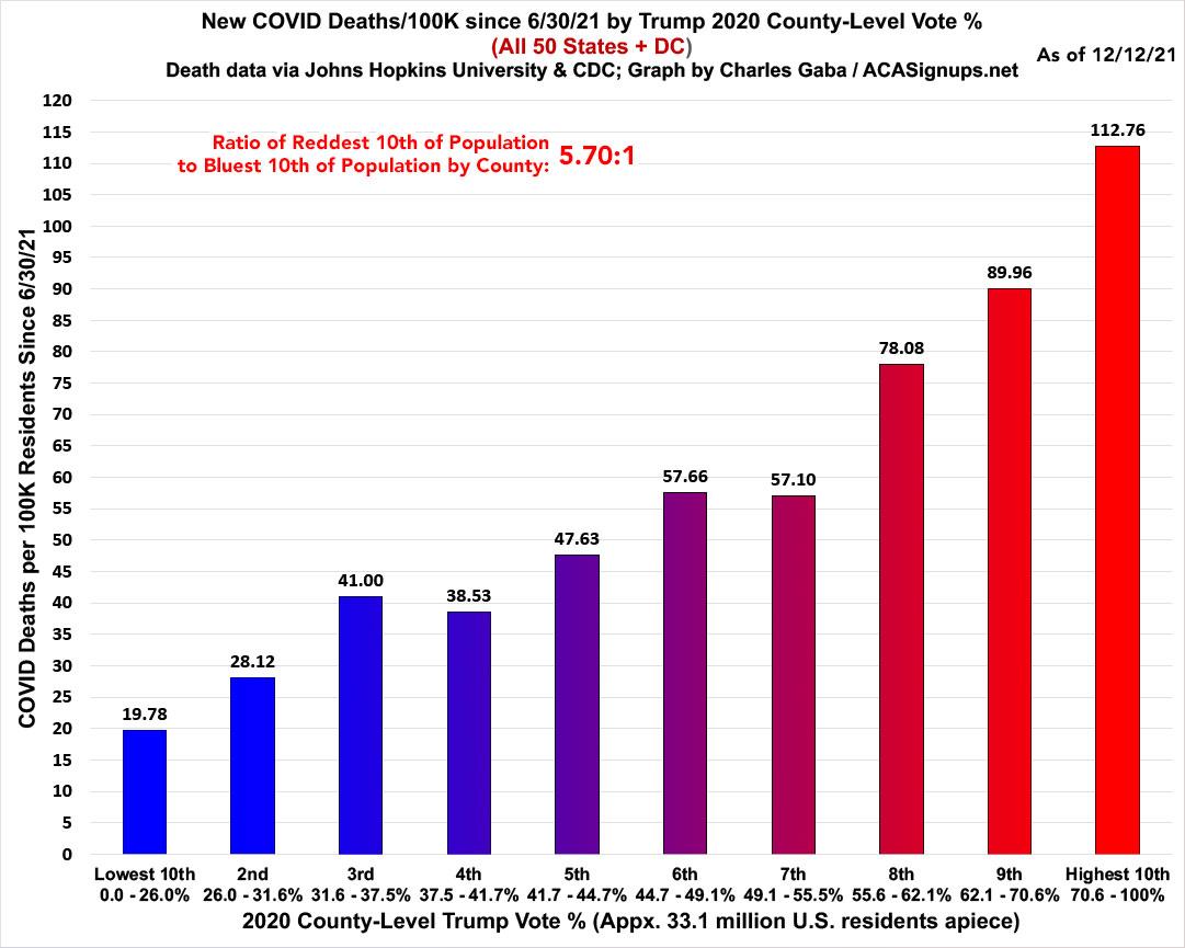
The ratio of death rates has also begun to shrink, with the rate in the reddest tenth now 5.7x higher than in the bluest tenth...which is still down from 6.0x higher seven weeks ago:
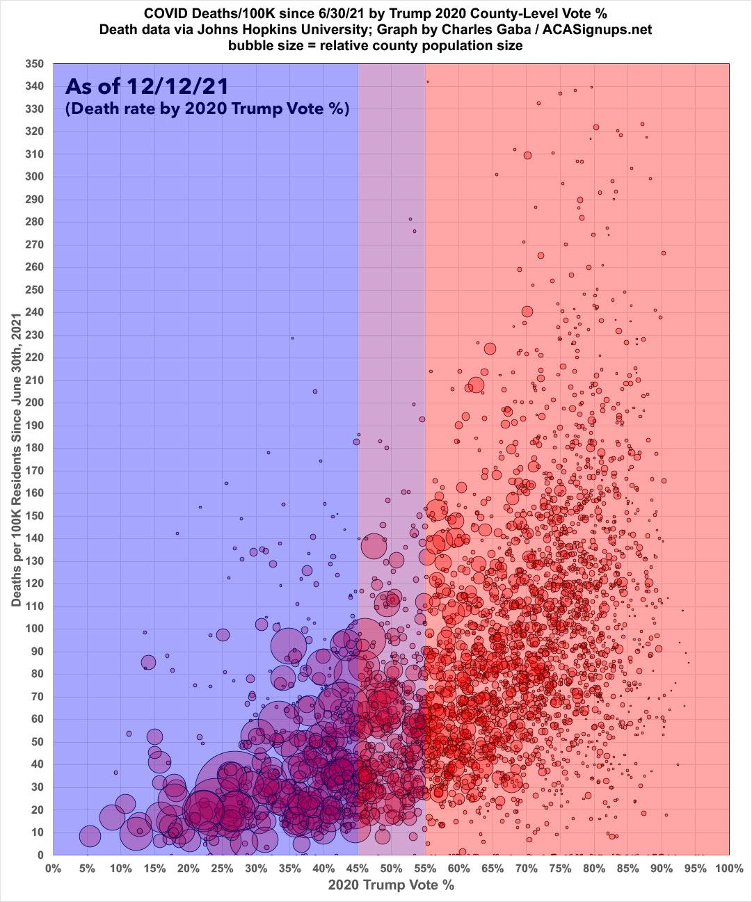
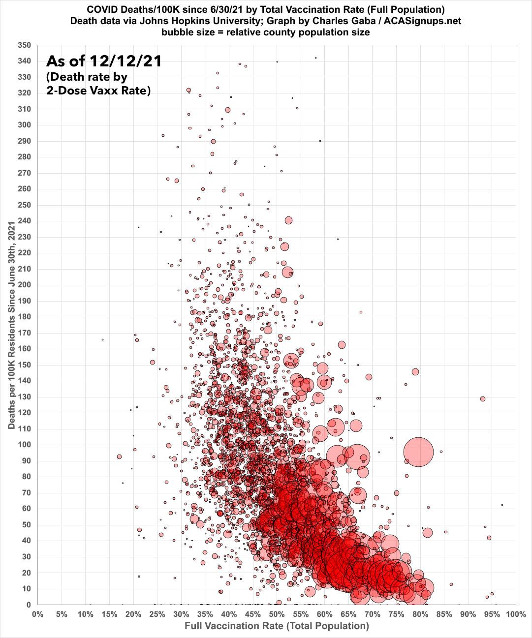
Here's the same death rate data (from 6/30/21 - 12/12/21) in scatter-plot format:
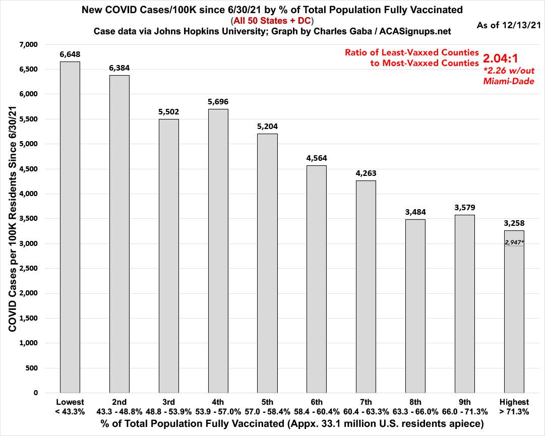
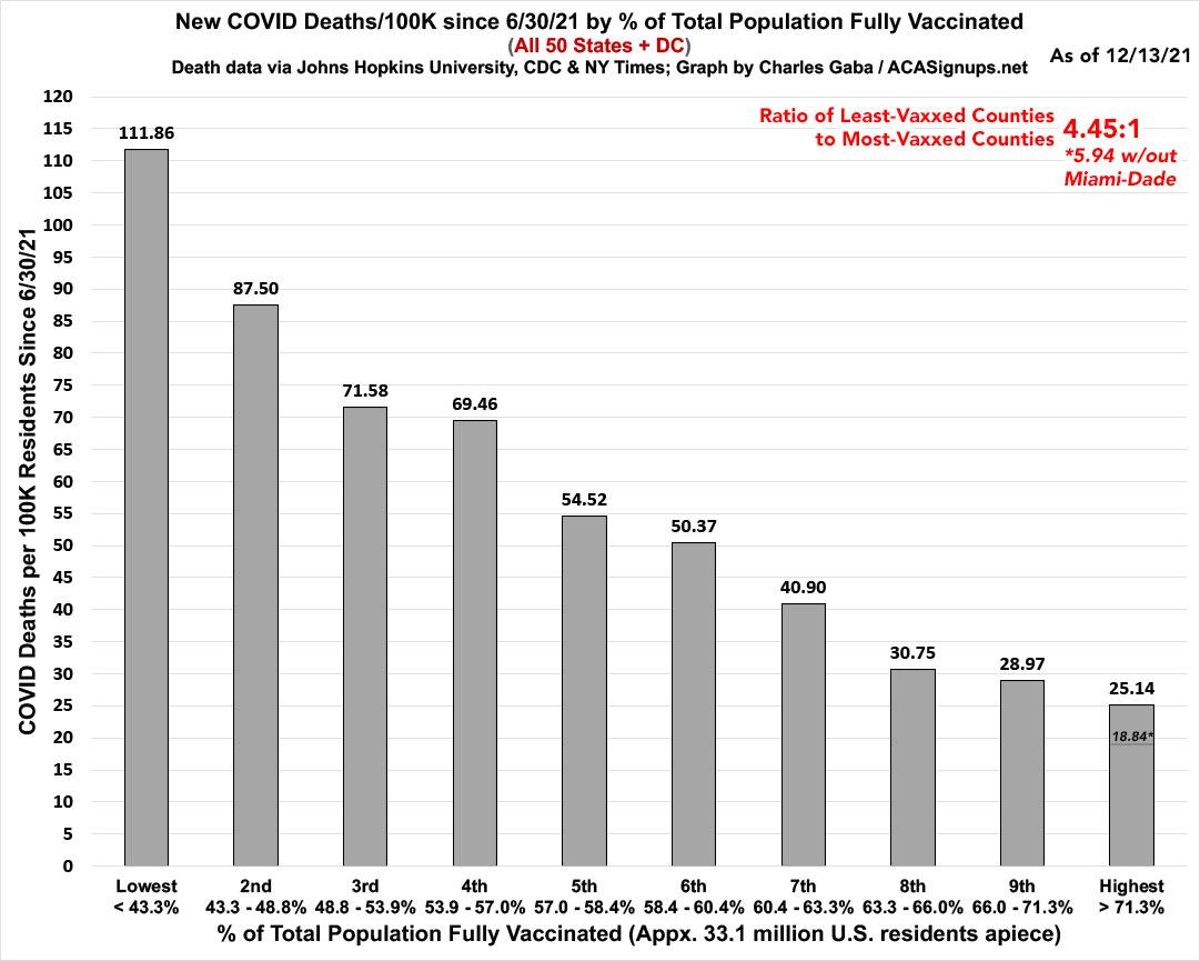
Meanwhile, here's what the same data looks like on a nonpartisan basis: Case and death rates based purely on vaccination rate of each county. The following graphs are up to date as of 12/06/21. Both measure the county-level case and death rates since the end of June compared against what percentage of the population is fully vaccinated (i.e., 2 doses of Pfizer/Moderna or 1 dose of Johnson & Johnson).
Again, I've broken the population of the 50 states +DC (~331 million people...this doesn't include the U.S. territories) has been broken out into ten brackets of roughly 33.1 million apiece.
As you can see, case rates since June are twice as high in the least-vaccinated tenth of the country than in the most-vaccinated tenth.
Note: As I explained in a recent blog post, Miami-Dade County is a massive outlier when it comes to the relationship of cases/deaths to the official vaccination rate, and I strongly suspect this is due to a substantially high incidence of "vaccine tourism" combined with the "snowbird" effect. As such, I've started also breaking out what the most-vaccinated tier would look like in terms of both case & death rates if Miami-Dade County was disregarded. As you can see, it's pretty dramatic in both cases:
...while when you look at the death rates, the contrast is even more stark: Death rates in the least-vaxxed tenth are 4.45x higher than in the most-vaxxed tenth. If you disregard Miami-Dade County entirely, it's a whopping 5.9x higher:
Here's the same death rate data (from 6/30/21 - 12/05/21) in scatter-plot format. The massive Miami-Dade County outlier is obvious when displayed this way:
Note that the first batch of fully-vaccinated children have finally started showing up in the data.
Get vaccinated, dammit.
Advertisement
