

Weekly Update: #COVID19 case/death rates by county, partisan lean & vaccination rate
Mon, 11/22/2021 - 1:20pm
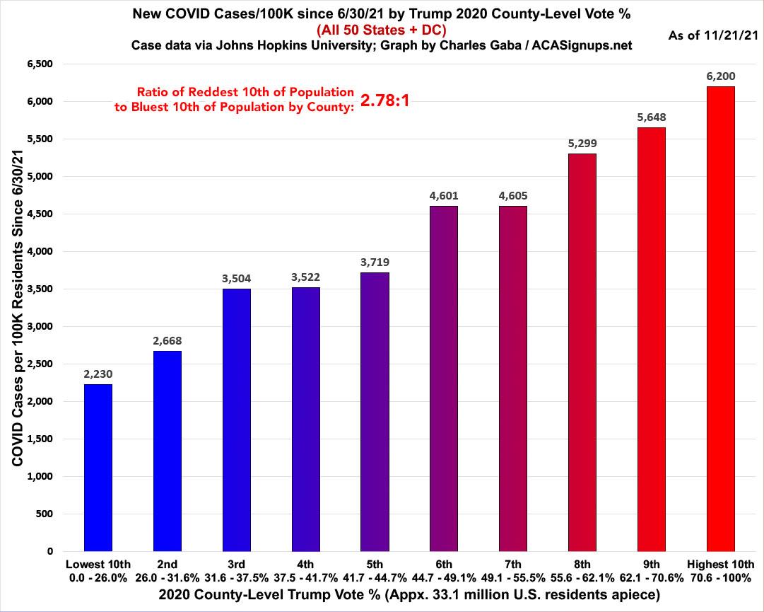
Here's the weekly look at the rate of COVID-19 cases & deaths at the county level since the end of June, broken out by partisan lean (i.e, what percent of the vote Donald Trump received in 2020).
The ratio of case rates has started to drop; new cases are now running 2.78x higher per capita in the reddest tenth of the country than the bluest tenth, down from 3.0x higher a month ago:
The ratio of death rates has also begun to shrink, with the rate in the reddest tenth now 5.63x higher than in the bluest tenth, down from 6.0x higher a month ago:

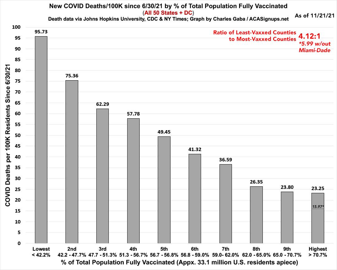
Meanwhile, here's what the same data looks like on a nonpartisan basis: Case and death rates based purely on vaccination rate of each county. The following graphs are up to date as of today (11/15/21). Both measure the county-level case and death rates since the end of June compared against what percentage of the population is fully vaccinated (i.e., 2 doses of Pfizer/Moderna or 1 dose of Johnson & Johnson).
Again, I've broken the population of the 50 states +DC (~331 million people...this doesn't include the U.S. territories) has been broken out into ten brackets of roughly 33.1 million apiece.
As you can see, case rates since June are 2.15x higher in the least-vaccinated tenth of the country than in the most-vaccinated tenth...slightly lower than a couple of weeks ago.
Note: As I explained in a recent blog post, Miami-Dade County is a massive outlier when it comes to the relationship of cases/deaths to the official vaccination rate, and I strongly suspect this is due to a substantially high incidence of "vaccine tourism" combined with the "snowbird" effect. As such, I've started also breaking out what the most-vaccinated tier would look like in terms fo both case & death rates if Miami-Dade County was disregarded. As you can see, it's pretty dramatic in both cases:
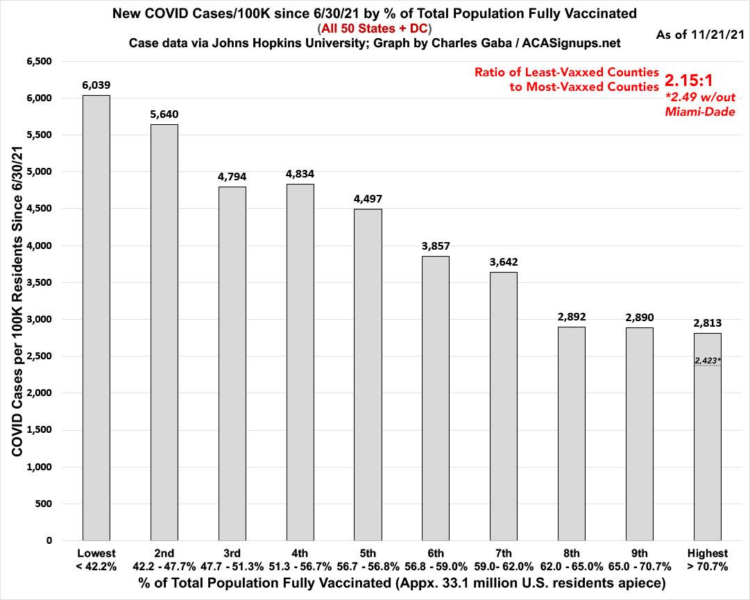
What I find most interesting about the case rate graph is that it seems to basically flatten out once you hit around 60% of the population fully vaccinated. Keep an eye on those last three columns going forward.
...while when you look at the death rates, the contrast is even more stark: Death rates in the least-vaxxed tenth are 4.12x higher than in the most-vaxxed tenth...down from 4.4x higher a week ago:
It will be fascinating to see how (or if) this pattern changes as time goes on, especially given the two newest factors: 3rd-shot boosters (which I'm not really tracking yet) and the recent approval of the Pfizer vaccine for children 5 - 11 years old. Note that the first batch of fully-vaccinated children won't start showing up in the data/graphs here until next week, when they'll start receiving their second dose.
Get vaccinated, dammit.
Advertisement
