

Time to check in on the COVID red/blue divide again.
Mon, 09/27/2021 - 7:55am
A month or so ago I was inspired by a fellow wonk named Christopher Ingraham of The Why Axis to plot out COVID vaccinations, cases and deaths via bar graphs instead of my usual scatter plot graphs.
This morning my most recent update of this analysis was linked to by David Leonhardt of the New York Times.
Today I'm posting updated versions of all three, with some important data/methodology updates:
- First, I finally have new case rate data at the county level for Nebraska. Between this and the CDC recently starting to provide county-level death data for Florida, this means I now have case data for all 50 states and death data for 49 of them (Nebraska is still refusing to post death data at the county level).
Second, and much more importantly, I've decided to focus on a decile view for all three graphs; here's why:
- Breaking the vaccination and case/death rates into even 10% brackets (0-10%, 10-20%, etc.) is a problem because the U.S. population isn't evenly spread from 0 - 100%. Over 84 million Americans live in counties which gave Trump between 40-50% of the vote in 2020, while only 1.7 million live in counties where he received 0 - 10% of the vote...and only 118,000 live in the 90 - 100% bracket.
- A decile graph means that the population is instead broken from lowest to highest into 10 brackets of roughly ~31.1 million Americans apiece, which is far more representative. It's even more helpful for the vaccination rate graph, since there's barely any counties which are below ~25% or above ~80% vaccinated.
I should note that none of the brackets have exactly 31.1 million residents because the counties which cut across that threshold are usually several hundred thousand in size. Since there's no way to slice the county in half, I have to include them in one or the other. I have them broken out as evenly as possible, however.
With these updates in mind, along with the continuing Delta variant surge nationally, let's take a look at where things stood as of yesterday (Sept. 26th).
First, here's the vaccination rate breakout. I've added a line at the 85% threshold to note that children under 12 yrs. old, who make up about 15% of the U.S. population on average, can't get vaccinated yet; our goal until that time should be for every bar to be as close to 85% as possible:
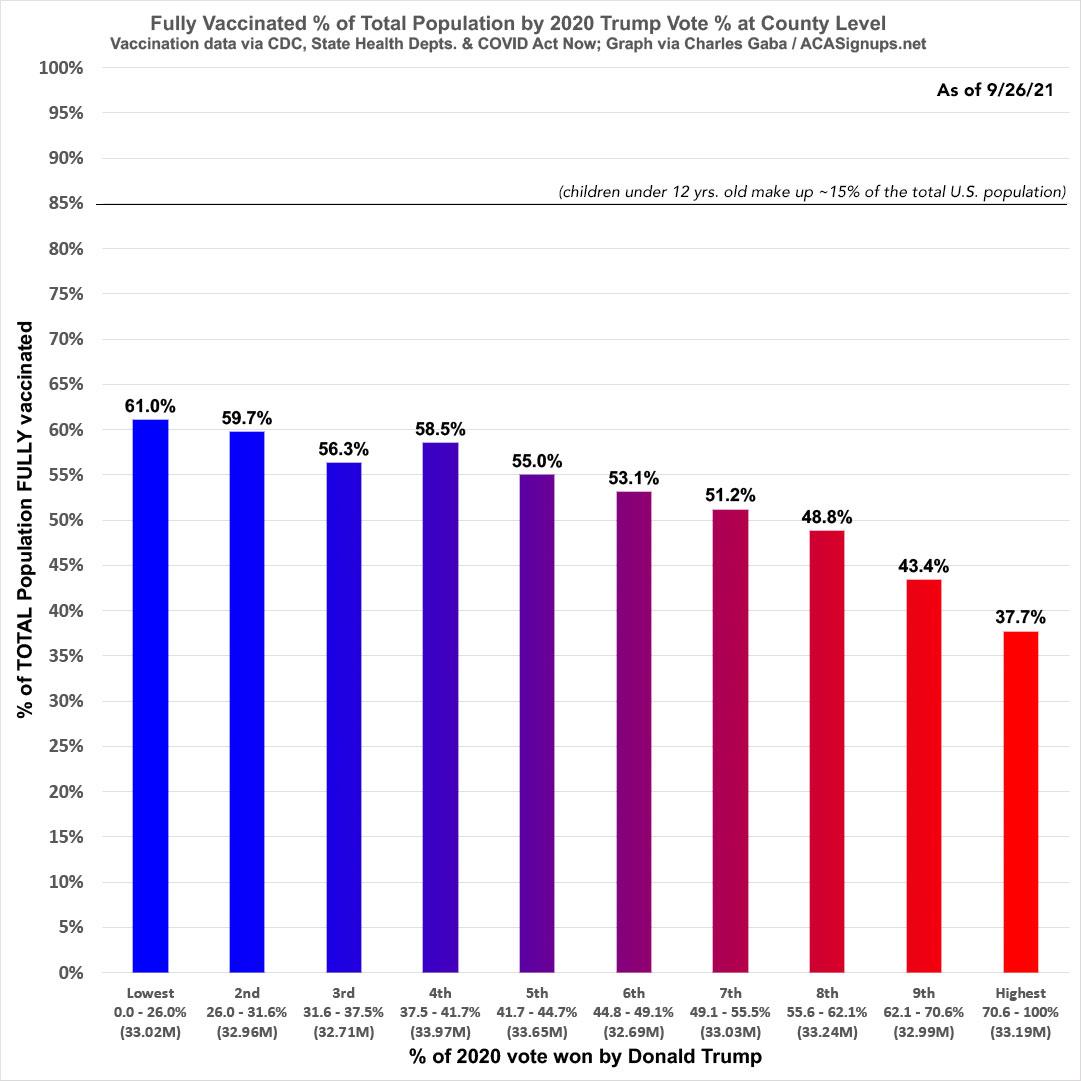
As you can see, the reddest tenth of the population has a vaccination rate 38% lower than the bluest tenth (37.7% vs. 61.0%).
On the flip side, here's new COVID cases per capita since the end of June...a complete reversal of the vaccination graph, to no big surprise:
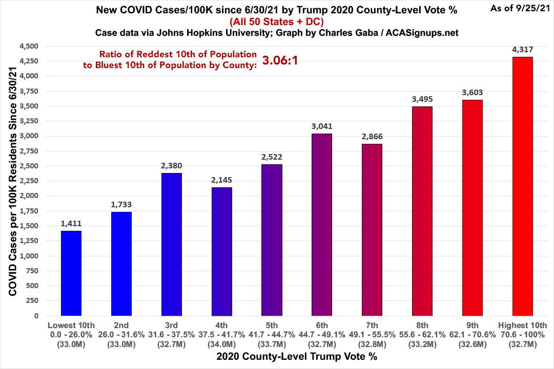
Note that this doesn't include several thousand cases where the county of residence is unknown.
The case rate since 6/30/21 is 3.1x higher in the reddest counties (Trump >70%) than in the bluest counties (Trump < 26%).
Next, here's death rates since the end of June...now including Florida, as noted above:
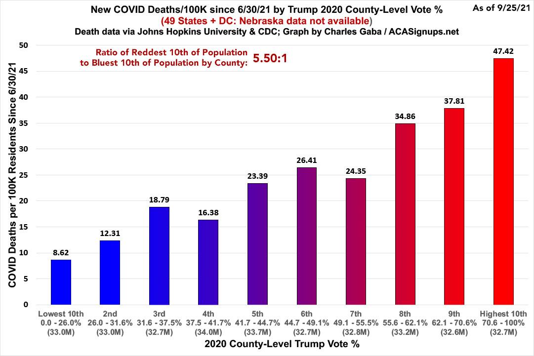
Note that this doesn't include Nebraska.
The death rate in the reddest counties are around 5.5 higher than in the bluest counties since June 30th.
The usual caveats apply:
- These graphs only include the 50 U.S. states + DC (well, 49 in the case of the death rate graph). U.S. territories aren't included since they don't vote for President in the general election.
- The case & death rate graphs only start as of 7/01/21. As I've noted before, both graphs looked very different in spring/summer of 2020, fall/winter 2020, and spring of 2021...and that could change again one way or the other going forward.
- Most importantly: These graphs only lay out where the higher/lower vaccination, case and death rates are, not necessarily WHO. Remember, the reddest counties still usually have blue patches and vice-versa.
Advertisement
