

#COVID19 cases/deaths now 68% & 115% higher per capita in red counties since July 1st
Mon, 08/30/2021 - 12:09pm
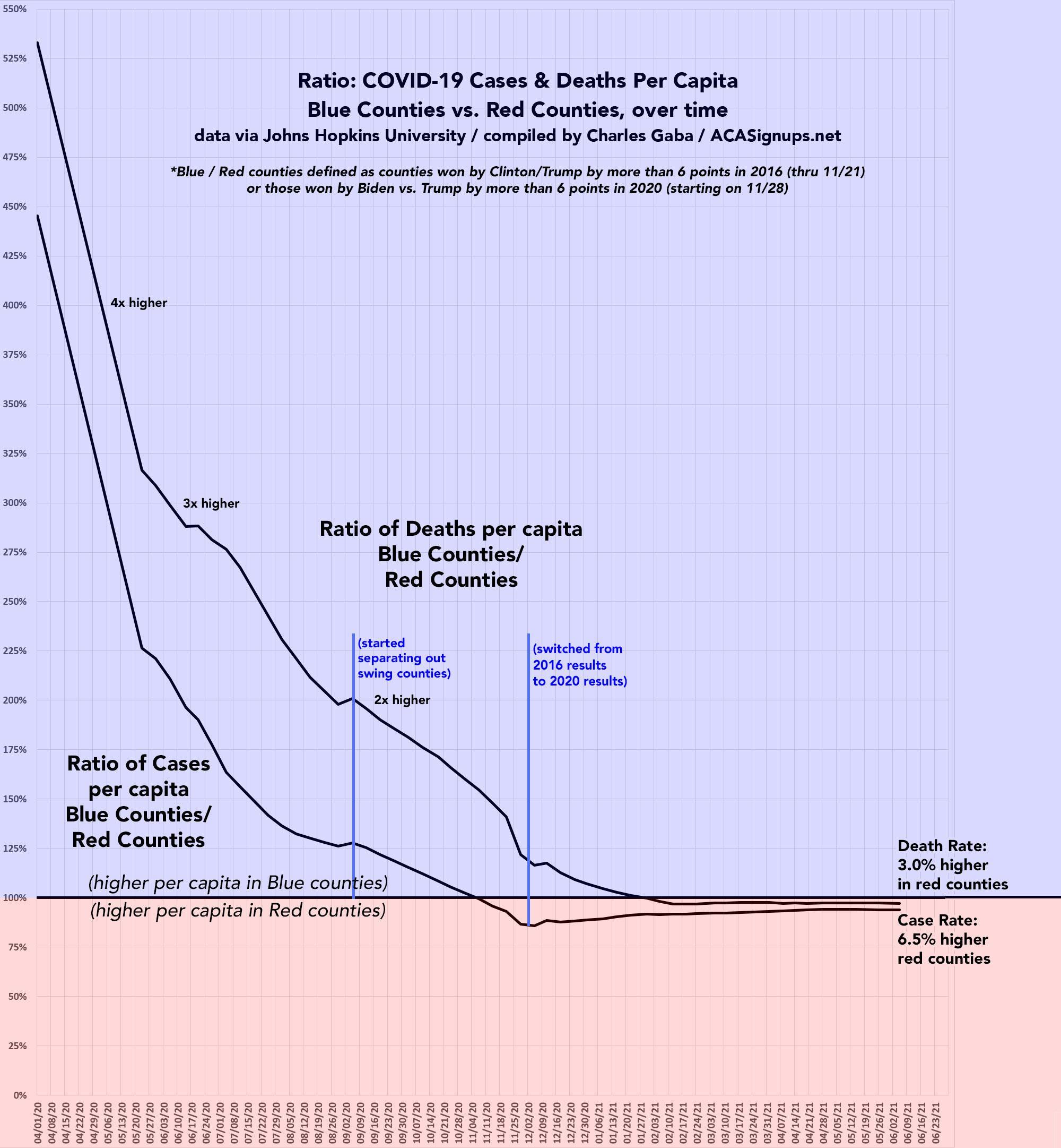
For nearly a year, I posted a weekly analysis of the 100 U.S. counties (out of over 3,100 total) which had the highest cumulative rates of COVID-19 cases and deaths per capita. In addition, I also included a running graph which compared the ratio of COVID cases & deaths per capita between blue and red counties to track how this changed over time.
The results were extremely telling: In the early days of the pandemic back in March/April 2020, the blue counties were devastated for a variety of reasons, including heavy population density, the fact they were mostly located along the coasts (usually in cities with major international ports/airport hubs), and so forth. Democrats tend to live in heavily-populated urban areas, while Republicans are prone to live in more sparsely-populated rural areas, so this made sense.
For the first few months, both case and death rates were running as much as 4-5x higher in counties which voted solidly for Hillary Clinton in 2016/Joe Biden in 2020 than in those which voted for Trump in either 2016 or 2020.
As time went on, however, this ratio began to drop at a dramatic rate. By June 2020, cumulative case rates were only 2x higher in Blue American and death rates were down to 3x higher. By September, total cases per capita were just 25% higher and the mortality rate was only 2x higher.
By Election Day in early November, there were an equal number of COVID-19 cases per capita in both Red and Blue counties alike, and by Thanksgiving the cumulative death rate had also equalized between the two nationally. In fact, the ratio for each actually inched its way into the Red Zone around that time, with cumulative cases and deaths per capita running anywhere from 3-8% higher in the red counties than in the blue ones.
Interestingly, since early January the ratio for both measurements has remained pretty much stable--inching slightly more blue one week, slightly more red the next. Since both of these are measuring cumulative cases and deaths since the beginning of the pandemic, the plummetting numbers of each as more and more people started getting vaccinated meant that you had smaller numerators being divided into a huge denominator. As a result, even dramatic shifts one way or the other wouldn't move the cumulative needle more than a nominal amount.
I stopped tracking cumulative case and death rates in this manner in early June. Here's what the last chart looked like:
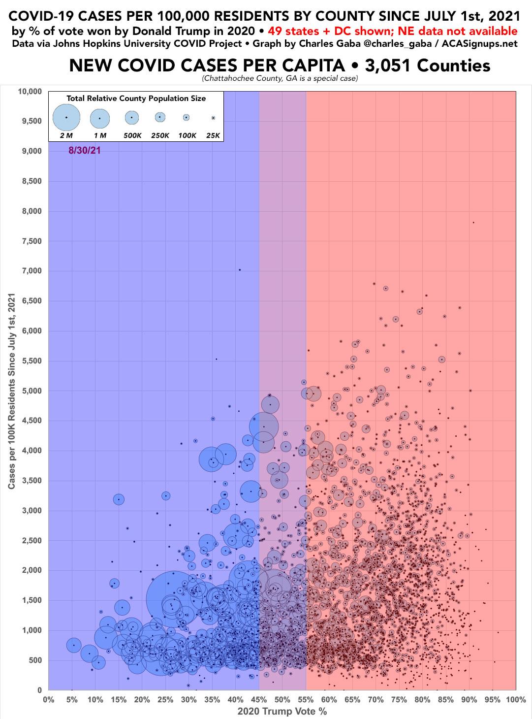
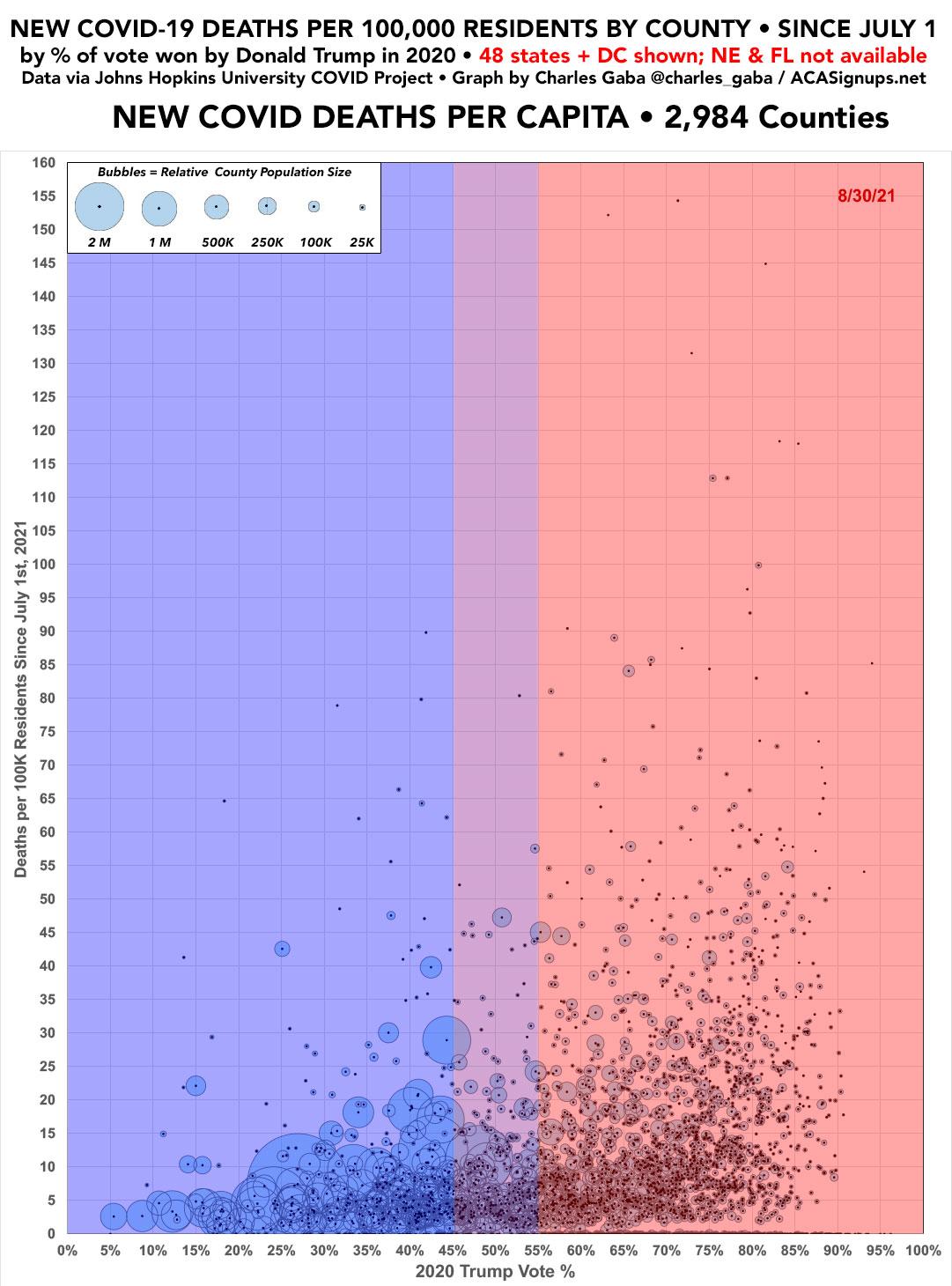
Now that it's become crystal clear that there's a massive discrepancy between the blue and red counties when it comes to COVID-19 vaccination rates, combined with the fact that the much more dangerous Delta variant has now become the dominant version of COVID spreading across the U.S., I decided it was time to revisit the county-level case data to see if that huge Blue/Red vaccination divide is showing up in newer cases.
The COVID pandemic situation is an entirely different animal today, so it didn't make much sense to just pick up where I left off. Instead, the graphs below display new case and death rates since July 1st, 2021. I've also decided to switch from a line graph to a scatter plot layout in order to match my county/state-level vaccination rate graphs. I've also changed the scale from cases per 1,000 residents to cases per 100K since that seems to be what most media outlets are going with. Finally, I've slightly tweaked my definition of "swing county" to any county where Trump received between 45 - 55% of the vote.
The results, once again, are pretty eye-opening: Based on daily tracking data from the Center for Systems Science and Engineering (CSSE) at Johns Hopkins University, new COVID-19 case rates are now running more than 68% higher in Red counties than in Blue counties, while new COVID-19 death rates are now running nearly 2.2x higher in Red counties.
IMPORTANT: Nebraska stopped reporting county-level COVID data entirely at the end of June, so Nebraska isn't included in either graph, while Florida has stopped reporting county-level death data entirely, so they're not included in the death rate graph.
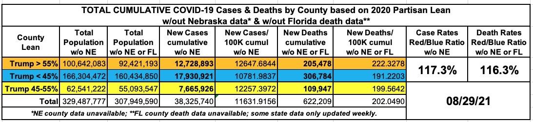
Here's a summary of where things stand on both the case and death rate front as of 8/29/21. The denominator (population size) has been adjusted to remove Nebraska for both cases & deaths and Florida for deaths only:
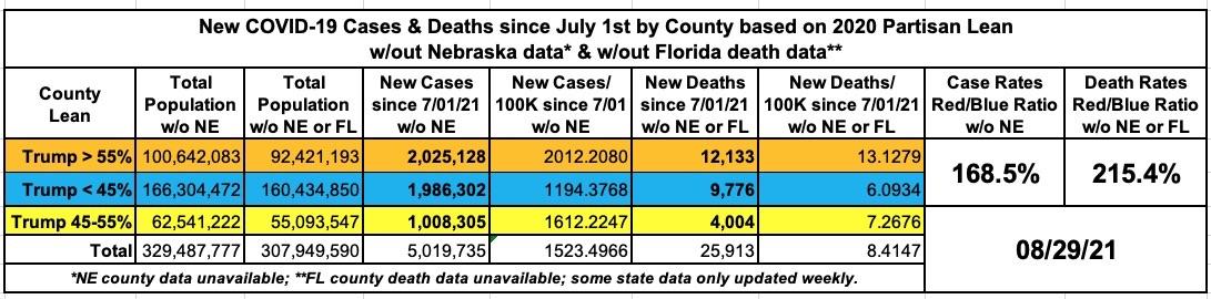
Oh, as for the cumulative rates (that is, total cases/deaths since the pandemic started 18 months ago), both the case and death rates in the Red counties now stands at roughly 16 - 17% higher than in the Blue counties:
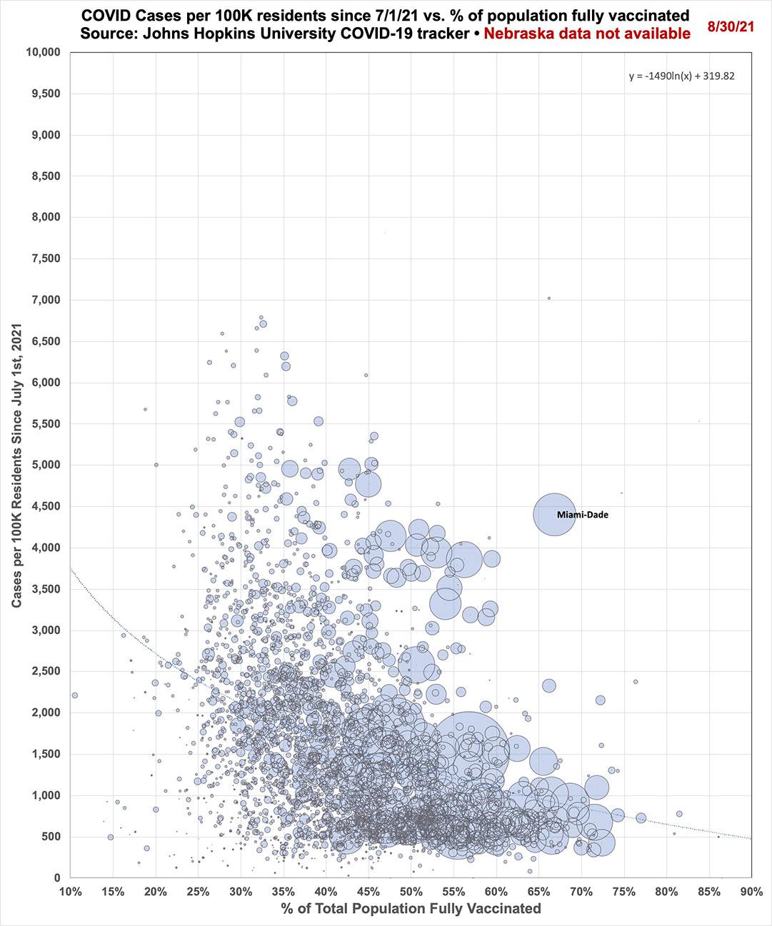
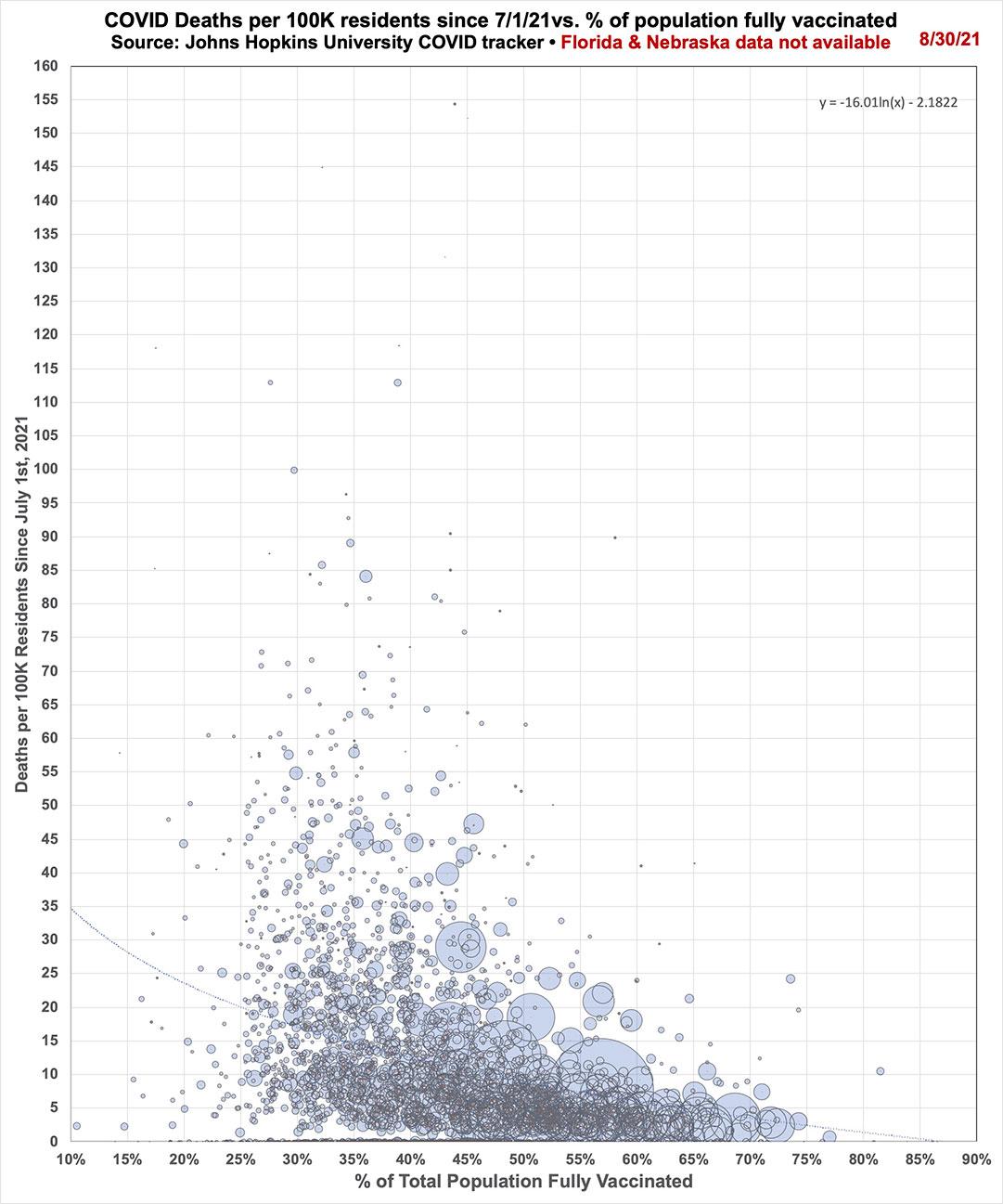
Meanwhile, here's nonpartisan graphs showing the new case and death rates compared to the vaccination rates of every U.S. county. Again, Nebraska isn't included in either one, and Florida is missing from the second graph.
There's a clear pattern developing, although Miami-Dade county is one hell of an outlier in the first graph:
Regardless of where you live, #GetVaxxedNOW, dammit.
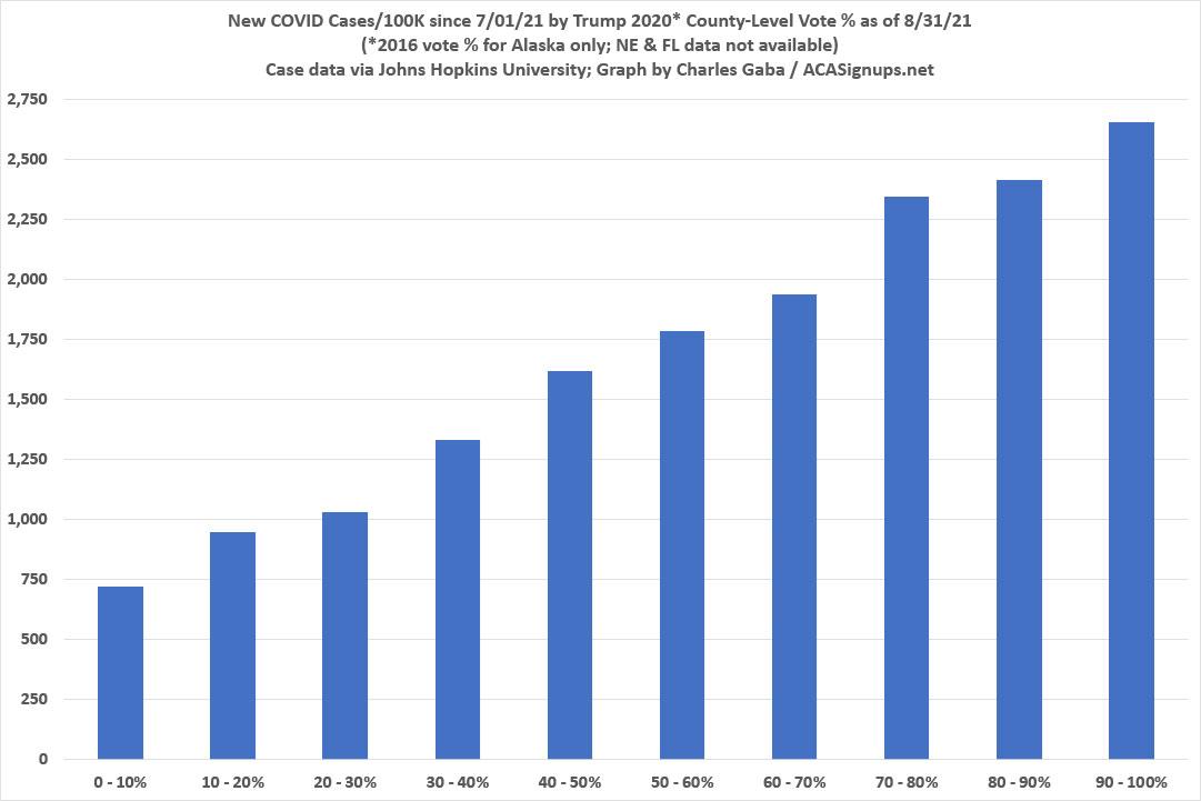
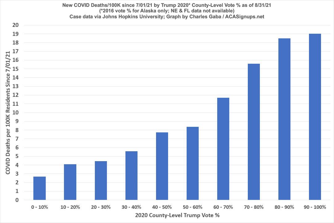
UPDATE: Earlier today, Christopher Ingraham of The Why Axis posted a piece about this very topic called, quite simply, "GOP Covid Policy is killing GOP voters." It mostly covers the same ground I have in this and prior pieces, but it also includes another graph which illustrates the point even better than my bubble graphs do. He groups most of the U.S. population into 5 brackets based on how much of the vote Trump got last year (0 - 20%, 20 - 40%, etc), with vertical bars showing the COVID death rate since July 31st in each group.
As you might expect, the higher the Trump vote share, the higher the death rate.
Ingraham includes some important caveats:
First, his graph doesn't include Nebraska, Florida or Alaska--the first two because they stopped releasing county-level death data earlier this summer; the third because Alaska publishes their voter data based on legislative districts, not boroughs or census areas.
Second, he limits his graph to counties which have more than 10,000 residents since tiny counties have a high noise ratio, which is reasonable.
I decided to take Ingraham's work to the next level:
- First, I'm including Alaska since I was able to find a credible analysis of Alaska's borough/county-equivalent level Presidential vote from the 2016 election (I can't imagine that this changed that much from 2016 to 2020)
- Second, I'm including every county (except for Nebraska and Florida) regardless of size just for completeness' sake.
- Third, instead of 5 Trump vote brackets, I've broken it out into 10 brackets of 10 percentage points apiece.
- Fourth, I whipped up a second bar graph to see if the same pattern is true of cases per capita as well as deaths per capita (spoiler: yep).
- Fifth, all of my case & death data starts on July 1st instead of July 31st, so I have two months to work with instead of just one.
Sure enough...well, take a look:
Advertisement
