

CMS releases official 2021 OEP report; confirms 12.0 million #ACA exchange enrollees
Wed, 04/21/2021 - 11:10pm
It's been nearly a month since I posted my final estimate of the official national and state-level tally for the 2021 Open Enrollment Period (OEP). At the time, I pegged the final total at just barely over 12.0 million QHP selections nationally...the first time an ACA OEP had hit that threshold since the end of the Obama Administration (this seems fitting for obvious reasons).
Earlier today, the Centers for Medicare & Medicaid (CMS) issued the official 2021 OEP report, as well as the accompanying Public Use Files (PUFs) which break the data out in all sorts of ways. Let's dig in!
- Plan Selections: Approximately 12.0 million consumers selected or were automatically reenrolled in a Marketplace plan during the 2021 OEP in the 50 states plus the District of Columbia (DC). This is approximately a 5 percent increase from 11.4 million consumers in the 2020 OEP.
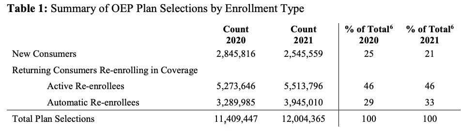
- New Consumers: Nationally, 21 percent of consumers with a plan selection during the 2021 OEP were new to the Marketplaces through which they enrolled, compared to 25 percent during the 2020 OEP.
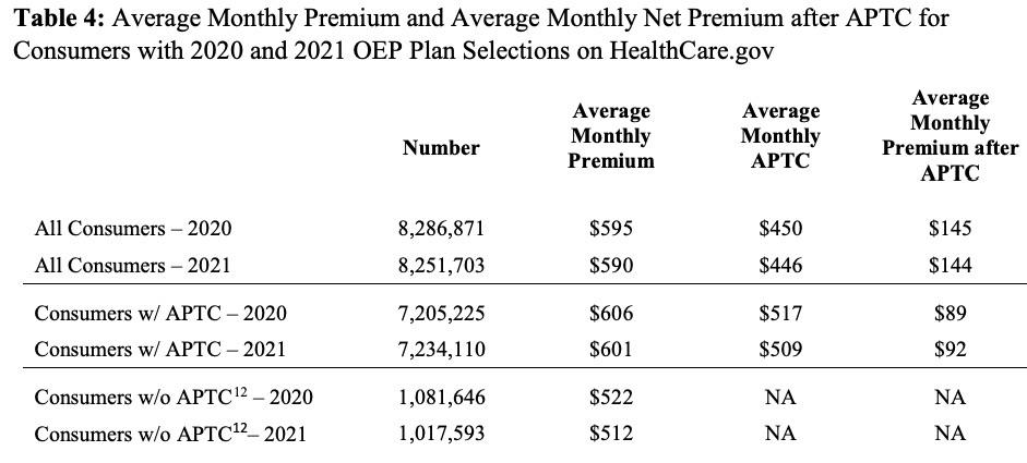
- Financial Assistance: Eighty-eight percent of consumers in states that use the HealthCare.gov platform received APTC in the 2021 OEP, which is a one-percentage point increase from eighty-seven percent in the 2020 OEP. Among consumers receiving APTC, the average APTC amount covered 85 percent of the total premium in both the 2020 and 2021 OEP.
- • Net Premiums: After application of APTC, the average monthly net premium for consumers receiving APTC was $92 in the 2021 OEP, compared to $89 in the 2020 OEP.
More specifically, here's the state-by-state breakout, compared to my final estimates for the 15 state-based exchanges:
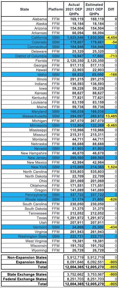
Not bad! I was off by fewer than 1,000 people (905 to be precise), but the final total was still just barely over 12.0 million as I expected. On a percentage basis, I was off by less than 0.5% in every state except Vermont (1.7%), Rhode Island (2.0%), Massachusetts (4.6%) and Minnesota (8.4%...ouch!)...except that I had previously noted that MNsure's press release was a bit confusing and could be off by as much as 7-8% or so.
Next, let's compare year over year:
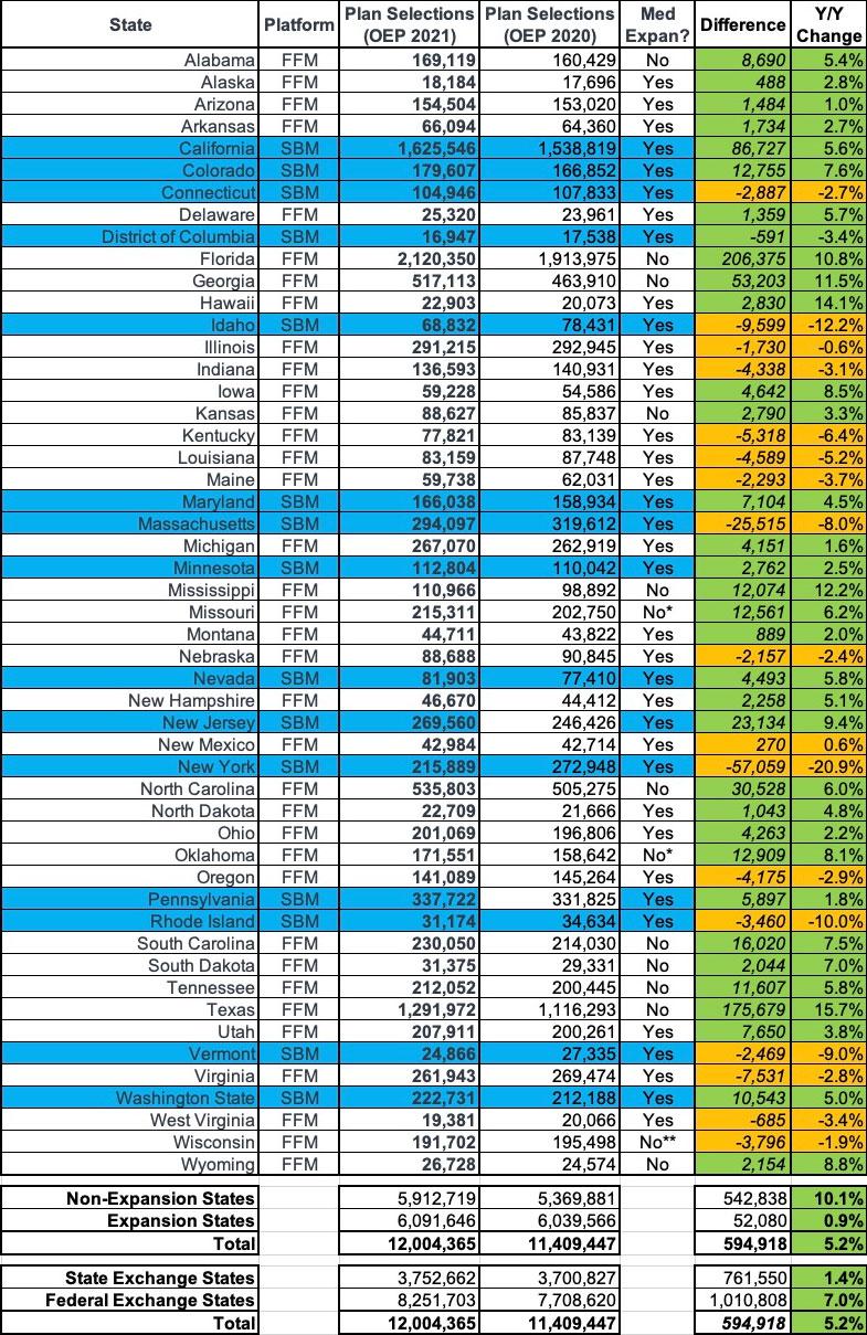
Oddly, the official 2020 OEP report says that total enrollment was around 14,000 fewer last year than I thought, presumably due to last-minute data cleanup, terminations, etc. In any event, the final numbers are still very close to what I had them pegged at for both years:
- Medicaid expansion states only saw a 0.9% enrollment increase, while non-expansion states went up by over 10%...because of the 100 - 138% FPL income "overlap" income bracket. Basically, anyone whose income fell below 138% FPL was re-routed towards Medicaid in expansion states, but many of them remained ACA subsidy-eligible in the non-expansion states.
- For the first time since 2016, enrollment in Federal Exchange states increased by a greater percent (7.0%) than the state-based exchanges did collectively (1.4%)...even after accounting for New Jersey and Pennsylvania splitting off onto their own exchanges. This was also largely connected to Medicaid expansion, since every one of the state-based exchanges has also expanded Medicaid under the ACA, while about 1/3 of the federal exchange states haven't.
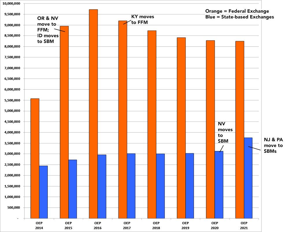
Here's what this looks like since 2014...it's difficult to do a proper apples to apples comparison since several states have shifted from state-based to federal-based exchanges or vice-versa over the years. This year in particular, it looks like the state exchanges outperformed the federal exchange, but that's because both New Jersey and Pennsylvania split off onto their own exchange:
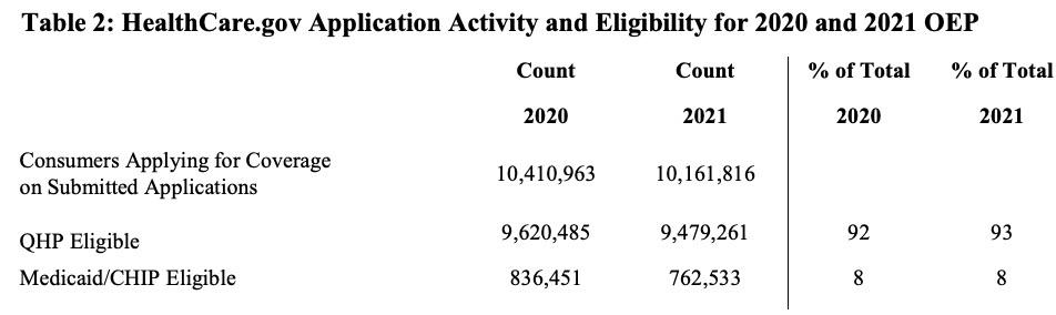
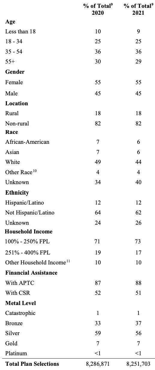
There's several tables included in the OEP report, but to be honest, most of the stats aren't terribly interesting, or at least there's ot a whole lot that's jumping out at me compared to last year. Most of the percentages stayed pretty much the same year over year, which is a bit surprising given the turmoil caused by COVID-19:
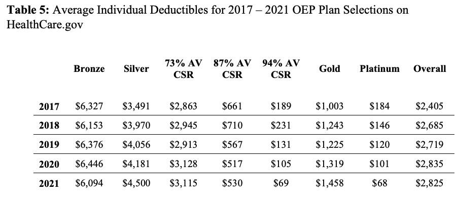
The last table is one I haven't seen before and this one's kind of interesting...it shows the average deductibles for the different metal levels each year, including a breakout of the 3 different Cost Sharing Reduction (CSR) tiers. This helps give an idea of just how much CSR helps lower-income enrollees, since each is compared against the average Silver plan.
Basically, in 2021, a CSR enrollee earning up to 150% FPL saw their deductible drop by an average of $4,431; CSR enrollees earning 150 - 200% FPL saved $3,970 and CSR enrollees from 200 - 250% FPL saved $1,385 apiece on their deductibles:
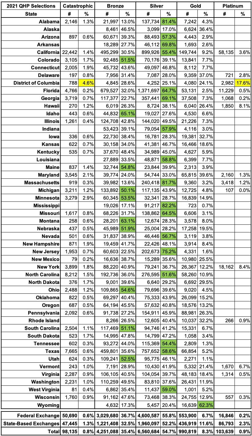
I've broken out the metal levels selected by 2021 OEP enrollees for every state, and have highlighted the states where more than 50% of all enrollees selected either Bronze, Silver or Gold plans. The only state where Gold dominated is Wyoming, which makes sense given the lopsided Silver Loading pricing there.
As usual, fewer than 1% of all enrollees selected either Catastrophic or Platinum plans (in fact, these aren't even offered in some states), but the District of Columbia has some very unusual numbers--not only did more than 22% of all DC enrollees choose Catastrophic or Platinum plans, but the other 3 tiers are split nearly evenly (29% Bronze, 25% Silver, 24% Gold). I'm assuming this has a lot to do with Medicaid eligibility extending all the way up to 215% FPL for childless adults (vs. 138% in most states), but beyond that I'm not sure what's going on there:
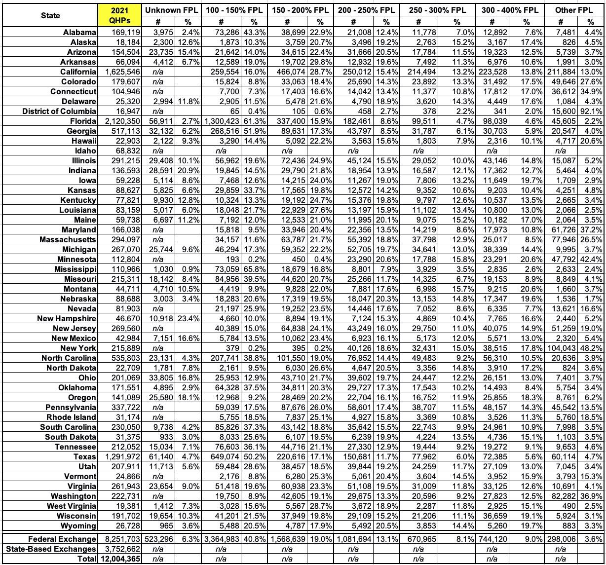
I've also broken out the income brackets for enrollees in every state (except Idaho, where it isn't available):
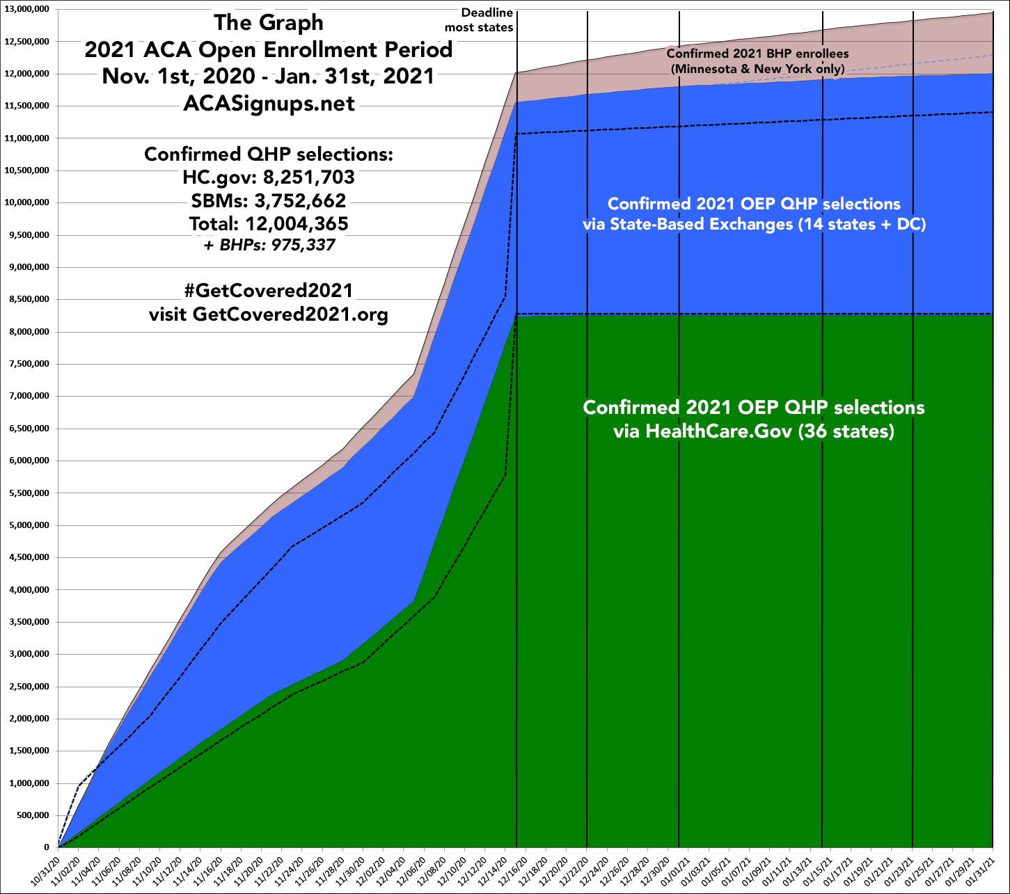
Finally, here's the final version of The Graph, mostly for sentimental value:
Advertisement
