

UPDATE: I Was Close Part 2: ACTUAL 2018 rate hikes vs. my projections by state
Wed, 04/04/2018 - 2:54pm
A few days ago, I ran a comparison of the average unsubsidized (full price) 2018 premium increases for each state which I had projected last fall against a study last month by the Urban Institute in which they reported the actual average premium increases, by state, of some of the ACA policies available on the exchange. Urban wasn't able to examine every plan, but they did a full analysis on the Lowest Cost Silver, 2nd Lowest Cost Silver (benchmark plan) and Lowest Cost Gold policies in each market and statewide.
Urban's analysis concluded that depending on how you looked at their data, the overall national average increase was between 29-32% year over year...versus my own national projection of around 29.7%.
I didn't fare so well at the state level: I was within 5 percentage points of their actual averages in 31 states, and within 10 points in 6 more. I was way off in the other 14 for various reasons.
Yesterday afternoon, however, the Centers for Medicare and Medicaid finally released the official 2018 Open Enrollment Period report with all sorts of demographic data breakouts by state. By comparing the 2018 enrollment numbers, premiums, tax credits and so forth against the 2017 data, I could fine-tune this comparison more accurately.
The good news is that unlike the Urban Institute report, CMS's data includes every exchange-based policy: EVERY Silver and Gold plan, as well as every Bronze plan and even the couple hundred thousand who signed up for Catastrophic or Platinum policies.
The bad news is that CMS's report still has a few holes in the data. They didn't have average full-price premiums for 2017 for California, DC, New York or Washington State. Fortunately, I was able to fill in 3 of those 4 blanks last summer, although I'm suspicious of the Washington State numbers--I might have made a mistake there.
In addition, just as with the Urban study, there's no way for me to include the 3-4 million people enrolled in off-exchange ACA-compliant policies, which are part of the same risk pool. These should be fairly close to the exchange-based numbers, but could skew higher or lower.
In any event, after filling in most of the blank spots (the tan cells in the table below), I was able to compare the actual state-by-state averages against my own projections from last fall:

As with the Urban Institute report, nationally, the actual average unsubsidized premium increase turned out to be 29.1%...only 0.6 points lower than my 29.7% projection.
At the state level, again, I had a spottier accuracy record. I was within 5 percentage points in 24 states, and within 10 points in 12 more. I was more than 10 points off in the other 14 others (I don't know how close I was in DC).
The only states which are true outliers are Iowa and Washington State. I was way off for Iowa in the Urban Institute comparison as well, so I definitely missed something there, but for Washington State there's clearly a clerical/data entry glitch, because I was only off by 4.5 points compared to Urban's estimates. In fact, CMS's report includes 2 big red flags: First, it suggests that average premiums shot up from $388 to $853 in one year (120% increase??), while also claiming that only 3.7% of WA exchange enrollees are receiving CSR assistance (well below the 53% national average). I'll have to look into both of these to see what's going on.
Other than IA and WA, however, I think I did pretty well all things considered.
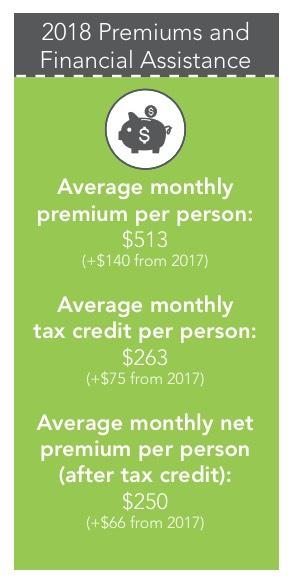
UPDATE: Sure enough, that $853 unsubsidized premium average CMS has down for Washington State is way too high. I've confirmed with the Washington HealthPlanFinder that the actual full-price average premium in 2018 is $513/month, or 32.2% higher than 2017 (see Page 15 of the WA exchange report):
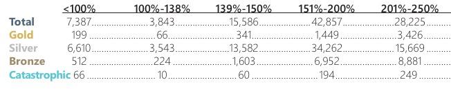
In addition, a trusted WA-based contact of mine confirms that the 8,892 figure CMS's report has for CSR enrollees in Washington State is way too low. This is clearly shown on Page 5 of the same report, where they state that 67,056 enrollees earning between 100-250% FPL enrolled in Silver plans...which should by definition mean they're all receiving CSR assistance. It could be as high as 73,666 enrollees if you include the 6,610 earning below 100% FPL on silver plans, although I'm not sure if they receive CSR or not.
In short, CMS screwed up royally in Washington State at least. I'm not sure how this happened--if it was simply forgetting to add a 0 to the end the total would come out at nearly 89,000, which would be too high--but it seems to be limited to WA only. I think.
UPDATE x2: OK, I think I know what happened in Iowa.
In 2016, there were (officially) 6 carriers participating in the individual market, although two of them only had a handful of enrollees between them and two were really just divisions of a single carrier (Wellmark).
Wellmark finally jumped onto the ACA exchange in 2017...only to bail again for 2018, dumping their 21,000 ACA enrollees. The other carrier, Aetna, also bailed shortly thereafter, leaving Medica holding the IV bag, so to speak, leaving Medica with their 42,000 or so enrollees. That's up to 63,000 people who were theoretically dropped in Medica's lap--even though Medica appears to only have had around 1,800 ACA enrollees total in 2016 (I'm not sure how many they had last year).
Not all of these Aetna/Wellmark enrollees did so, of course, and Medica might have had significantly more enrollees than that last year, but the point is that the "average rate increase" for any carrier only applies to their current enrollees.
Let's say Medica had 5,000 enrollees in 2017 paying $500/month and raised their premiums 50%, to $750/month.
Meanwhile, let's say there were 45,000 Aetna/Wellmark enrollees who had been paying $400/month in 2017.
Combined, that's an average premium of ($360 x 90%) + ($500 x 10%) = $410.
If all 45,000 move to Medica plans, the average increase for all 50,000 would be an 83% average increase even though Medica "only" raised their rates 50%.
The actual numbers are somewhat different from this, of course, but it illustrates the point. Collectively, with hundreds of carriers and millions of enrollees spread across 50 states, these sorts of discrepancies tend to cancel each other out, but when you drill down to a single state with only 3 carriers at play, it can make a massive difference.
Advertisement
