

Damn, I was close. ACTUAL unsubsidized 2018 premium hikes confirmed to average 29 - 32% nationally
Sun, 04/01/2018 - 1:11am
Regular readers know that I've developed a tradition over the past three years of tracking the average unsubsidized premium rate increases for the ACA-compliant individual market, painstakingly poring over the rate filings for every carrier in every state and running a weighted average by their market share.
Every year there are numerous challenges and headaches which get in the way, including things as obvious as "not every carrier publishes the number of enrollees they have covered" to complex situations like "carrier X is dropping out of the on-exchange market in half the counties of the state but is sticking around in the off-exchange market". In addition, many carriers submit an initial rate request...followed a few months later by a revised one...neither of which might end up matching the final premium changes approved by state regulators. Sometimes there may be 2-3 more revised filings along the way which muddy the waters even further.
- In mid-October 2015, I projected that the overall average rate increases for 2016 would be roughly 12-13% nationally...which was confirmed by mid-December, when the Robert Wood Johnson Foundation released a report which, when you weighted the averages by metal level market share, came in at around 11.6% across the entire ACA exchange market. The off-exchange market wasn't included by RWJF, but unless it was significantly higher or lower, that 11.6% should be pretty darned close.
- In 2016, I concluded that the average unsubsidized rate hikes for 2017 would likely be about twice as high: Around 25% nationwide. When the official ASPE report came out sometime later, they concluded that the average Silver benchmark policy was going up around 22%...except that they only included 44 states, only included the on-exchange market, and again, only included the benchmark Silver plan, whereas I included all metal levels wherever possible (Bronze, Silver, Gold and Platinum).
2017 was even more difficult to pin down for several obvious reasons, all of which began with the Congressional GOP and ended with Donald Trump. The massive uncertainty and confusion caused by the half-dozen attempts to repeal the ACA outright culminated in Trump pulling the plug on Cost Sharing Reduction reimbursement payments altogether. The timing of his pulling the trigger meant that most carriers (but not all) ended up having just barely enough time to refile new 2018 premiums which were adjusted to account for the CSR cut-off.
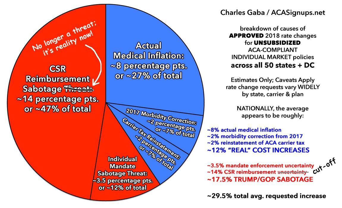
My conclusion was that unsubsidized premiums for 2018 would end up increasing by a national weighted average of around 30%, with roughly 3/5ths of that being due specifically to a combination of Trump's CSR cut-off and a few carriers taking pre-emptive action in case the ACA's individual mandate was also repealed (sure enough, this is exactly what happened, although not until after 2018 rates had been locked in, and it won't take effect until the 2019 Open Enrollment Period anyway).
Since no one knew for sure whether Trump would cut off CSR payments until pretty late in the game, I had to compile two sets of state-level rate hike projections: One which assumed that CSRs would continue to be paid and that the mandate wouldn't be repealed, and one which assumed CSRs would be cut off and the mandate would be repealed.
Here's how I broke it out in the end:

OK, so how did I do this year? Well, the Urban Institute* has once again released their own analysis of the actual average individual market rate increases for 2018 on a state-by-state and national level now that the dust has settled, and let's just say that I'm feeling pretty good about my analytical skills today:
There have been widespread reports of very large marketplace nongroup premium increases in most states in 2018. Below, we provide national estimates for changes in the lowest silver and gold plan premiums between 2017 and 2018. The national average increase was 32.0 percent for the lowest-priced silver plans and 19.1 percent for gold plans, but the increases varied by states. Several reasons are behind these large increases. The premium increases reflect significant policy changes and policy debates specifically affecting insurer decisions for the 2018 plan year as well as more typical annual considerations such as trend and healthcare costs. We delineate the factors that contributed to large 2018 marketplace premium increases, provide state-by-state estimates of average premium increases in silver (70 percent actuarial value) and gold (80 percent actuarial value) plans in the marketplaces and provide more detailed analysis of changes in select markets within 20 states.
Other findings include the following:
- Increases in the lowest silver plan premiums tended to be larger than the increases in the lowest gold premiums, but there were several exceptions.
- There was tremendous variation across states in rates of increase. Some of the smallest increases (including some decreases) were in states with high 2017 premiums.
- The average lowest silver premiums remained below the average lowest gold premiums in each state we studied, but the difference between the two ranged from 3.0 percent (District of Columbia suburbs in Maryland) to 77.4 percent (Augusta, Georgia), in the selected large markets analyzed.
- More insurers exited markets than entered new markets in 2018 in our study areas.
- States with Medicaid managed care organizations and/or many competing insurers offering marketplace coverage tended to have the lowest premiums.
OK, there's some important caveats/disclaimers here:
- The national average rate hike was 32.0% for the lowest-priced Silver plans
- It was 19.1% for the lowest-priced Gold plans.
We also analyzed percentage changes in the benchmark (second lowest cost silver) premiums in each rating region and found them similar to the percentage changes in the lowest silver premiums; these are shown in Appendix Table A-1
- Appendix Table A-1 shows a national average rate hike was 34.3% for the second-lowest-priced Silver plans
I don't know what the natoinal metal level breakout is this year because CMS still hasn't released either an ASPE report or the Public Use Files yet , but in 2017, over 75% of all ACA exchange enrollees chose either a Silver or Gold plan. Unfortunately, Bronze plans were not analyzed here, which is a shame because they comprised 23% of all exchange enrollees in 2017, and could skew the averages up or down significantly. I'm not bothered by the omission of Catastrophic or Platinum plans, however, as they were chosen by only 1.9% last year.
I don't know the breakout between the 1st and 2nd Silver plans, but assuming an even split, that means a Silver average of 33.2% and 19.1% for Gold nationally.
In 2017, if you ignore Bronze, Catastrophic and Platinum plans and stick to Silver and Gold (9,186,119 exchange enrollees), there was an enrollment ratio of 94.6% Silver (8,691,150) to 5.4% Gold (494,969).
Proportionately, that gives you:
- Silver: 33.2% x 0.946 = 0.314072
- Gold: 19.1% x 0.054 = 0.010314
- TOTAL: 0.324386 = 32.4% weighted national average
...or a couple of points higher than my 29.5% projection. However, there's still the Bronze factor. Let's assume Bronze plans (along with Catastrophic and Platinum) went up around the same amount as Gold plans percentage-wise (since the CSR load was restricted to Silver plans in nearly every state). If so, again using 2017 numbers, that would mean around 24.8% chose Bronze/Cat/Plat, around 71.1% chose Silver and 4.1% chose Gold. This would give us:
- Bronze/Catastrophic/Platinum: 24.8% x 19.1% = 0.047368
- Silver: 71.1% x 33.2% = 0.236052
- Gold: 4.1% x 19.1% = 0.007831
- TOTAL: 0.291251 = 29.1% weighted national average
In other words, depending on how you run the numbers, the national weighted average was likely somewhere between 29 - 32%, vs. my projected average of 29.5%. Not bad!
Now, there are two other important caveats to consider. First of all, the Urban Institute study only examined on-exchange enrollment, which means whatever's left of the off-exchange marketplace isn't accounted for. I suspect a good 2/3 of the individual market is on-exchange by now.
More importantly is that all of my numbers above are based on 2017 enrollment choices, not 2018. There's no way for me to predict how many people will switch from their current plan, whether Bronze, Silver or Gold, to another metal tier in the future, so the 29.5% estimate assumes that everyone stuck with what they had last year. Obviously that's not what happened, especially this year. Thanks in large part to "Silver Loading" and the "Silver Switcharoo", millions of people presumably either upgraded from Silver to Gold or downgraded from Silver to Bronze. That's true every year, however.
UPDATE: In addition to analyzing the actual average unsubsidized rate increases, the Urban Institute study also examined the reasons for the increases...and again, there's nothing shocking to be found here:
Elimination of Federal Reimbursements of Cost-Sharing Reductions. The U.S. Department of Health and Human Services has stopped reimbursing insurers for the cost-sharing reductions (CSRs) that marketplace insurers are legally required to provide eligible enrollees with incomes below 250 percent of the federal poverty level (FPL). The Congressional Budget Office (CBO) estimates that this change will increase the federal deficit by $194 billion over 10 years.
Without the federal reimbursement for CSRs, CBO estimates that insurers would increase silver premiums by an estimated 20 percent in 2018; this increase would be over and above increases due to medical cost inflation or other reasons. The CBO assumption, consistent with other analyses, is that the insurers’ costs for the CSRs would be incorporated entirely into the silver marketplace premiums because there was no economic reason to adjust premiums for gold, bronze, or nonmarketplace plans. As originally legislated, eligible individuals could receive CSRs only if they purchased silver marketplace premiums using a tax credit. An insurer that spread CSR costs into plans not eligible for CSRs would charge premiums higher than the value associated with that plan, leaving them at a competitive pricing disadvantage relative to insurers who did not.
In other words, the CBO's "20% CSR hike in 2018" assumed that all of the CSR load would be placed onto on-exchange Silver plans only (aka "the Silver Switcharoo" approach). I concluded that the CSR loading alone tacked on around 14 percentage points to 2018 premiums when spread across all ACA-compliant policies.
In the end, however, the federal government allowed states to decide how insurers could address this issue. States could require insurers to select from several approaches, from exclusive loading of costs into silver marketplace premiums to spreading the costs across plans in all metal tiers on and off the marketplace. Corlette, Lucia, and Kona found that 26 states had insurers allocate the CSR costs to silver marketplace premiums alone, 8 states had the costs allocated to silver plans on and off the marketplaces, three states had insurers spread the costs across all metal tiers in the marketplace, three had insurers spread the costs across all metal tiers on and off the marketplace, and in three states’ approaches varied across insurers. Information on the remaining states was not available.
The state breakout listed here is different from the findings of myself, David Anderson, Louise Norris and Andrew Sprung. Last fall we determined that 20 states were going "full Switcharoo", 16 were "Silver Loading", 6 were "Broad Loading", 3 weren't loading CSR costs at all and 6 were taking a mixed approach:
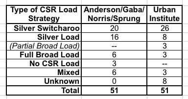
In addition to Urban having 6 more Silver Switch states and half as many Silver Load states, they also added another category which Anderson/Norris/Sprung and I hadn't really considered: "Partial Broad Load" where the CSR load is spread across all metal levels but only for on-exchange policies. Huh. Interesting. I'll have to compare notes to see what they found that we didn't.
Policy Changes Anticipated to Reduce Enrollment in Private Nongroup Coverage. Beyond adjustments to account for elimination of federal reimbursement for CSRs, premiums increased for other reasons. Throughout 2017, the Trump administration indicated it might not enforce the individual mandate penalties, and the Tax Cuts and Jobs Act of 2017 explicitly set the penalties to zero beginning in 2019. The virtual elimination of advertising funds, the large reduction in enrollment assistance funds, the shortened open enrollment period in the federally facilitated marketplaces and some state-based marketplaces, and reduced hours of access to the healthcare.gov enrollment platform, all further increased the uncertainty in the market. Insurers feared that these changes would reduce enrollment, leave a less healthy risk pool, increase average claims costs per enrollee, and provide insurers strong incentives to increase premiums at all coverage levels. Such incentives affect premiums both on and off the marketplaces because the entire nongroup insurance market is risk adjusted as a uniform pool.
In my pie chart above, I pegged "concerns about mandate repeal" at around 3-4 percentage points, but it also includes the other items noted above (slashed marketing/outreach funding, half-length enrollment period, etc etc).
Annual Adjustments Based on the Prior Year’s Experience. Finally, the 2018 premium increases that we observe reflect how insurers felt about the adequacy of their 2017 premiums. First, if the risk pool was better or worse than had been anticipated in 2017, insurers likely adjusted their risk expectations (and their premiums) for 2018. Second, if there is significant market competition, insurers will not increase premiums more than necessary because large premium increases would risk losing market share. Larger-than-necessary premiums also mean insurers would be forced to provide rebates because of medical loss ratio regulations. However, if an insurer is facing little or reduced competition (perhaps due to other insurers exiting the market in 2018 or low prior insurer participation), premium increases tend to be higher. Third, premiums are adjusted based on medical inflation or expectations of changes in the intensity of health care service use.
This covers...well, pretty much the entire blue section of the pie chart. This is more simply labelled as the "non-sabotage" portion of the average rate increase: Normal medical inflation and other factors.
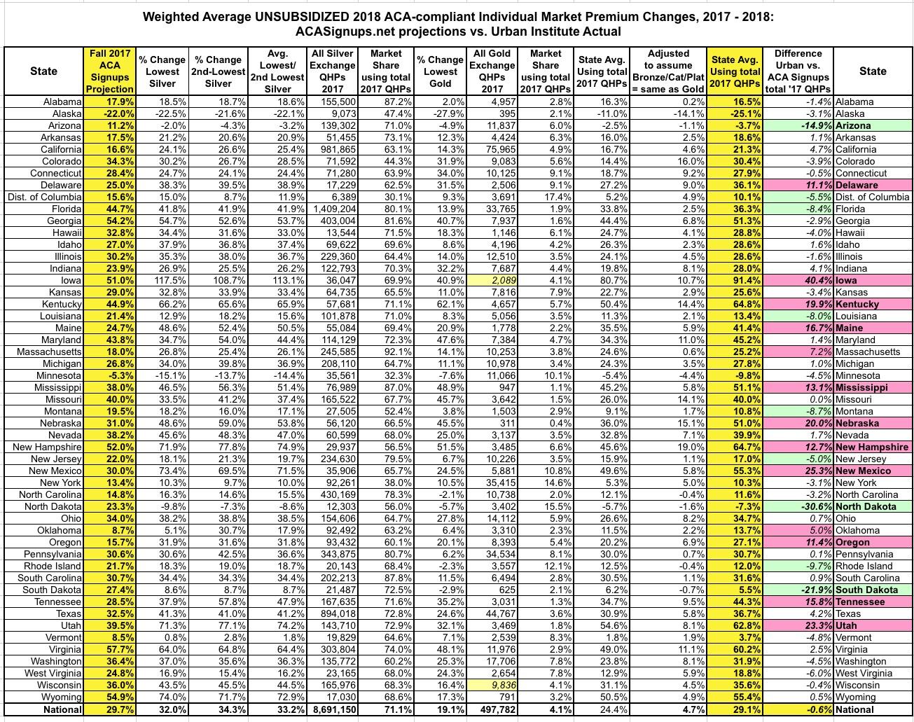
UPDATE: OK, so I was on target at the national level, but what about on a state-by-state basis? Well, that's a slightly different story. In the spreadsheet below, I've used the same methodology as above. Since estimating Bronze plans at the same average as Gold didn't really move the needle much anyway, to keep things simple, I only looked at this scenario at the state level:
Hmmmm...well, I was within +- 5 percentage points of the actual averages for 31 states, which I think is pretty good considering how insane things were and all the variables at play, and I was within +/- 10 points in another 6 states. There's about a dozen where I was way off, however:
- I seriously underestimated the average rate increases in Delaware, Iowa, Kentucky, Maine, Mississippi, Nebraska, New Hampshire, New Mexico, Oregon, Tennessee and Utah (especially Iowa, where rates nearly doubled this year, which is no doubt connected to their recent decision to effectively scrap the ACA exchange rules altogether).
- I seriously overestimated the average rate increases in Arizona, North Dakota and South Dakota. In fact, in Arizona the average premiums actually dropped by 3.7% instead of going up by 11.2% as I was expecting.
There's no doubt a whole story/explanation behind each of these misses, high or low, but this post is getting pretty lengthy already, so I'll leave it at that.
*(Full disclosure: The Urban Institute is funded by the Robert Wood Johnson Foundation, which has a banner ad agreement with ACA Signups)
Advertisement
