

Forget percentages, how much will avg. premiums increase in DOLLARS next year?
Mon, 09/21/2015 - 11:14am
I've spent tons of time the past few months obsessing over the average percentage increase in monthly premiums for ACA-compliant individual market policy enrollees, and as I wrap up this project, I've concluded that, assuming EVERYONE sticks with their current policies and doesn't bother shopping around, the overall national average increase will likely end up being between 11-15%.
However, aside from a few hypothetical examples, I haven't even touched on what this means in terms of the actual dollar amounts.
This is no small thing. "Percentage" changes can be very misleading, if you don't know what the actual dollar figure is in the first place. Consider this:
- State A raises their premiums a shocking 35% on average...from a current weighted average of $200/month.
- State B only raises their rates a nominal 5% on average...from a current weighted average of $300/month.
That 35% hike sounds pretty ugly for State A, and perhaps it is...but a 35% hike "only" brings rates there up to $270/month, while the seemingly mild 5% hike in State B means enrollees will be paying $315/month, still 17% more than their neighbors. Don't get me wrong, that $70/month hike still stinks for the people in State A, but from a Big Picture POV this is an important distinction.
Anyway, I was hoping to be able to post a single table showing the overall, weighted average monthly premium being paid by all current ACA-compliant individual market enrollees this year, in order to see how the states might end up comparing against each other in 2016.
Unfortunately, pinning those premium dollar amounts down to a single number for each state is a bit trickier than I would've figured. I've found several different reliable sources for different portions of this info, but none of them is comprehensive.
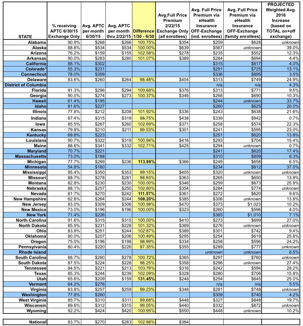
First, there's the official HHS Dept. ASPE report from March 10, 2015 (p. 50-51), which covers all exchange-based QHP selections as of 2/22/15 for the 37 states using HealthCare.Gov this year.
Unfortunately, this doesn't include the 14 state-based exchanges, it doesn't include off-exchange enrollees (who make up perhaps 40% of the total ACA-compliant individual market), and it doesn't account for changes in actual effectuated enrollment in the 7 months which have passed since the end of Open Enrollment (remember, only around 9.9 million people were still enrolled as of the end of June vs. the 11.7 million who had selected QHPs as of late February).
In order to address the last point, there's the CMS division's June 30, 2015 effectuated enrollment snapshot. This does include all 50 states (+DC), and it's much more up to date, of course...but it doesn't list the actual full-price premiums, just the percent receiving APTC (federal tax credits) in each state, and the dollar amount of APTC received on average. Furthermore, that average is based only on those receiving APTC assistance at all. This skews the numbers further for the following reason:
- Let's say that State A has 100,000 exchange enrollees, 85% of whom receiving APTC, with total monthly APTC assistance of $30 million even.
- The ASPE report seems to be dividing the APTC amount by 100,000 to get their per-enrollee average, which would be $300/each in this case.
- The CMS report, however, is only dividing the APTC amount among "(for all APTC enrollees)" which seems to suggest only the 85% (85,000) who actually receive the payments. This would result in a "per-APTC enrollee" average of $353/each.
Having said that, by comparing the APTC amounts I can get a general idea of how much of a shift there was between those who selected plans as of 2/22 and those who were enrolled in plans as of 6/30. As you'll see below, for most states, the average APTC amount only changed slightly between February and June. The exceptions are Michigan, Nevada, New Hampshire and Utah, each of which saw the avg. APTC dollar figure increase anywhere from 8 - 31%.
In addition, again, the CMS report still doesn't include off-exchange enrollees. For that, Louise Norris helpfully pointed me towards this eHealth Insurance 2015 Price Index report which, on p. 18-19, gives the off-exchange average monthly full-price premium amounts for each state.
Unfortunately, again, there's some major caveats. First of all, eHealth has split the off-exchange market into "individual" and "family" enrollments, instead of a single "average per enrollee" table. Second, the eHealth data is still cut off as of February. Finally, a few states are stll missing even here: They don't have individual or family data for Rhode Island and they don't have family data for Alaska, Maine, Mississippi, New Hampshire, South Dakota or Wyoming. eHealth also has no off-exchange data at all for DC or Vermont...but that's because there is no off-exchange individual market in either DC or Vermont anymore; everything is run through their respective exchanges.
As a result of all of these overlapping caveats, there's simply no way for me to easily compile a single, "here's the average per state" dollar figure for the entire ACA-compliant market for 2015 yet, but the following table may still prove handy for others to parse through (click image for higher-res version).
The bottom line? SHOP AROUND, SHOP AROUND, SHOP AROUND.
Advertisement
